转自:
https://www.hidroh.com/2015/02/16/support-multiple-themes-android-app/
https://www.hidroh.com/2015/02/25/support-multiple-themes-android-app-part-2/
1. Part 1
Recently, I have been working on my news reader app for Hacker News, Materialistic. As in any news reader apps, one of the most popular user feature request is ability to choose between light/dark theme for reading preference. Fortunately, supporting multiple themes in Android is quite easy and natural (given that you started properly). This blog explains the approach used by Materialistic to support multiple themes.
What you need:
- At least 2 app themes that extend from base light/dark Android themes. If you use latest appcompat-v7 it would be
Theme.AppCompat.LightorTheme.AppCompat.Light.DarkActionBar(light version) andTheme.AppCompat(dark version). - Color palette1 for each of your theme.
- [Optional] tinted options menu icons for each of you theme. Depends on your implementation approach, tinting can be done automatically, which means you only need one set of icons for one theme; or in my case, I choose to have multiple sets for simplicity.
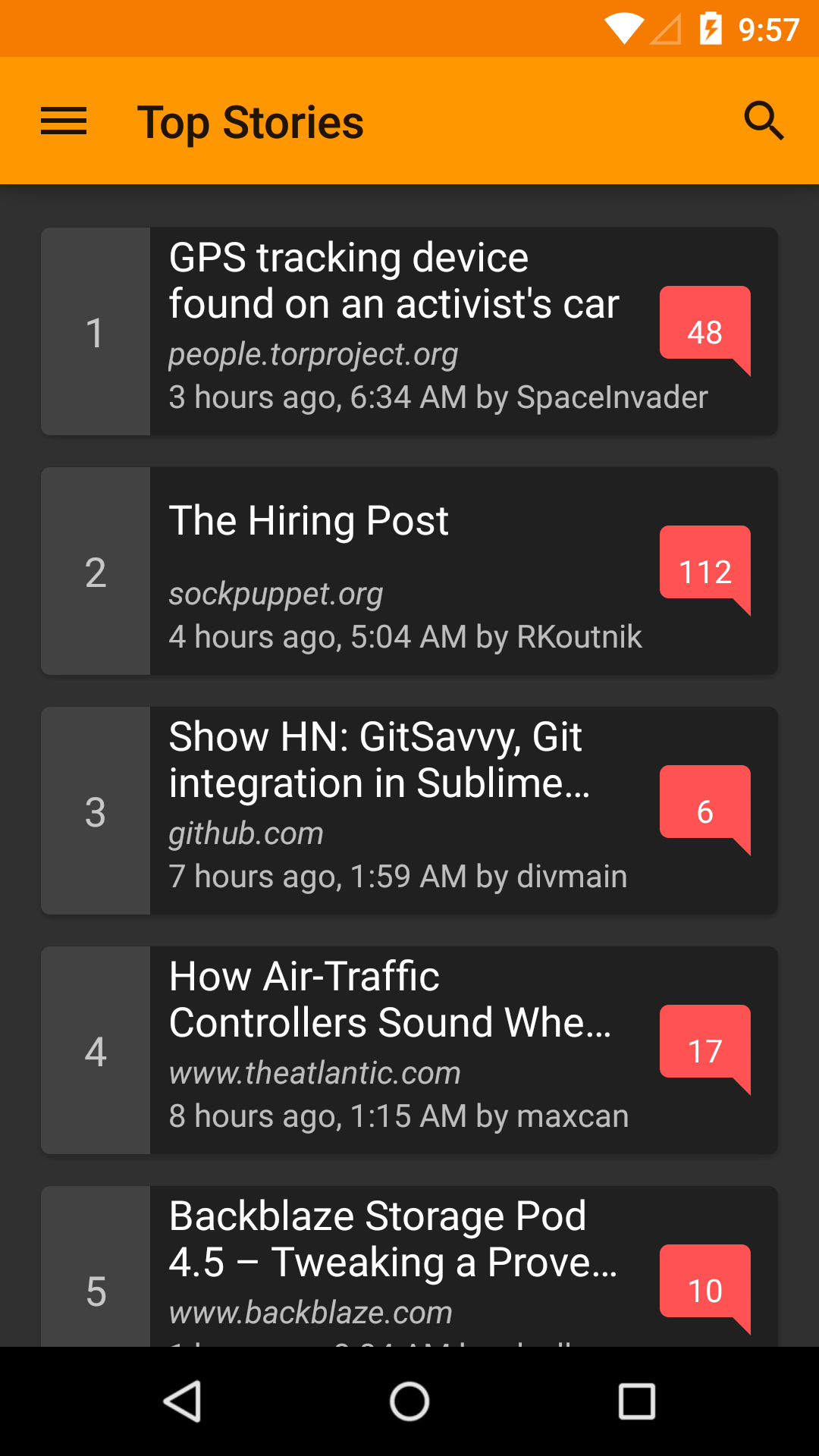
Let’s start with a light theme for our app:
values/styles.xml
<style name="AppTheme" parent="Theme.AppCompat.Light">
    <item name="colorPrimary">@color/colorPrimary</item>
    <item name="colorPrimaryDark">@color/colorPrimaryDark</item>
    <item name="colorAccent">@color/colorAccent</item>
    <item name="android:textColorPrimary">@color/textColorPrimary</item>
    <item name="android:textColorSecondary">@color/textColorSecondary</item>
    <item name="android:textColorPrimaryInverse">@color/textColorPrimaryInverse</item>
    <item name="android:textColorSecondaryInverse">@color/textColorSecondaryInverse</item>
    <!-- some other theme configurations for actionbar, overflow menu etc. -->
    ...
</style>
values/colors.xml
<!-- brand color: orange -->
<color name="colorPrimary">#FF9800</color>
<color name="colorPrimaryDark">#F57C00</color>
<color name="colorPrimaryLight">#FFE0B2</color>
<!-- accent color: red -->
<color name="colorAccent">#FF5252</color>
<!-- text color: white -->
<color name="textColorPrimary">#FFFFFF</color>
<color name="textColorSecondary">#9E9E9E</color>
<!-- inverse text color: 87% black -->
<color name="textColorPrimaryInverse">#DE000000</color>
<color name="textColorSecondaryInverse">#9E9E9E</color>
AndroidManifest.xml
<application android:name=".Application" android:theme="@style/AppTheme">
    ...
</application>
Explanation for some theme attributes can be found on Android Developers blog2.
Tip
Make a minimal app and try out the style attributes to see what attribute/value we need to set to achieve our desired theme first. As comprehensive as they are, Android documentations on theme attributes, especially withappcompat, are surprisingly lacking.Options menu icons should have the same color as action bar text color, in our case it’s specified via android:textColorPrimary3, and is #FFFFFF, so we should provide a set of white options menu icons for the action bar.
Tip
Google have made some of the material design icons public on Github.menu/my_menu.xml
<menu xmlns:android="http://schemas.android.com/apk/res/android">
    <item android:id="@id/menu_comment"
        android:icon="@drawable/ic_mode_comment_white_24dp" />
    <item android:id="@id/menu_story"
        android:icon="@drawable/ic_subject_white_24dp" />
    <item android:id="@id/menu_share"
        app:actionProviderClass="android.support.v7.widget.ShareActionProvider" />
</menu>
To enable consistent color, and make our views and texts ready for multiple themes, it’s best that we specify their colors as color resource reference, e.g. android:textColor="@color/textColorPrimary", or via style, e.g. textEmptyStyle style below, using only a limited set of colors from your chosen color palette.
values/styles.xml
<style name="textEmptyStyle">
    <item name="android:textColor">@color/textColorSecondary</item>
    <item name="android:textSize">@dimen/abc_text_size_headline_material</item>
    ...
</style>
That should be sufficient for a simple light-themed material design Android app. In the second part of this blog post, we will make a dark theme and add setting to switch theme during runtime.
-
http://www.google.com/design/spec/style/color.html#color-color-palette ↩
-
http://android-developers.blogspot.sg/2014/10/appcompat-v21-material-design-for-pre.html ↩
-
http://developer.android.com/training/material/theme.html#StatusBar ↩
2. Part 2
In the first part of this post, we have created a light theme and made initial preparation to support multiple themes. In this blog post, we will continue that effort, creating another theme and allowing dynamic switching of themes during runtime.
Ideally, if we treat theme as a configuration, we should be able to specify theme-specific resources under a ‘theme-qualifier’ resources directory, e.g. values-dark for dark theme resources and values-light for light theme resources. Unfortunately, this is not yet an option at the time of this post.
So how should we specify resources for multiple themes? If we look at how resources are organized in appcompat, we will have a rough idea of how the Android team organize their theme specific resources. Materialistic also employs a similar approach.
Theming
values/styles.xml
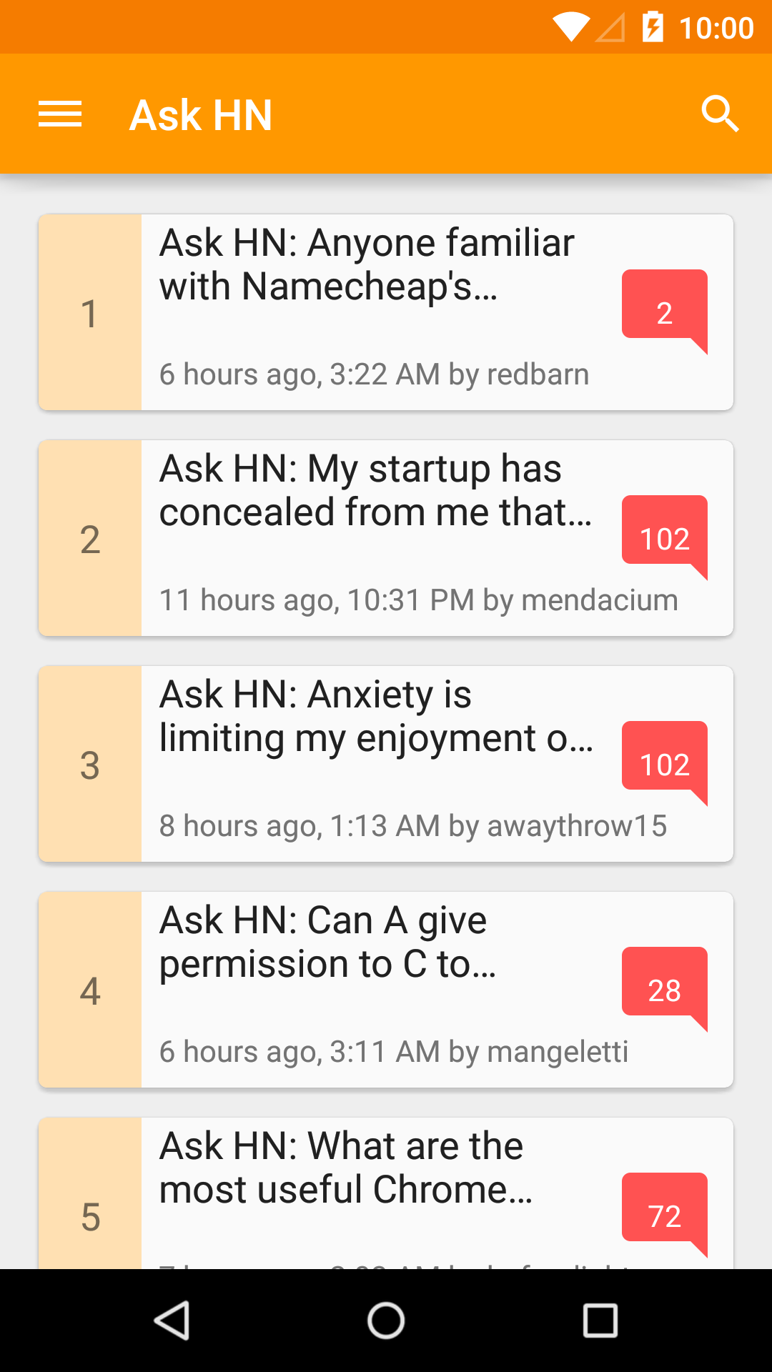
<style name="AppTheme" parent="Theme.AppCompat.Light">
    <!-- original theme attributes -->
    ...
</style>

<style name="AppTheme.Dark" parent="Theme.AppCompat">
    <item name="colorPrimary">@color/colorPrimaryInverse</item>
    <item name="colorPrimaryDark">@color/colorPrimaryDarkInverse</item>
    <item name="colorAccent">@color/colorAccentInverse</item>
    <item name="android:textColorPrimary">@color/textColorPrimaryInverse</item>
    <item name="android:textColorSecondary">@color/textColorSecondaryInverse</item>
    <item name="android:textColorPrimaryInverse">@color/textColorPrimary</item>
    <item name="android:textColorSecondaryInverse">@color/textColorSecondary</item>
    ...
</style>
values/colors.xml
<!-- original color palette -->
...
<!-- alternative color palette -->
<color name="colorPrimaryInverse">...</color>
<color name="colorPrimaryDarkInverse">...</color>
<color name="colorAccentInverse">...</color>
Here we add a new dark theme called AppTheme.Dark, and for style and color consistency, we extend from appcompat’s theme Theme.AppCompat (a dark theme). Unfortunately, since our two themes extend two different base themes, we cannot share any common attributes (the same way a class in Java cannot extend two or more classes).
The two themes should have appropriate (different if applicable) values for base Android and appcompat theme attributes, e.g. android:textColorPrimary for dark theme should be light, and for light theme should be dark. By convention, here we suffix alternative theme colors with Inverse.
Tip
Try out your alternative theme by temporary switchingandroid:theme for application in AndroidManifest.xml to see what extra colors/style you need to create. For certain cases a color may look okay in both dark and light theme.Theme-specific resources
At this point, we should have a pretty decent dark theme for our app, except for some anomalies here and there, e.g. drawables used for action bar menu items. A dark action bar expects light-color menu items, and vice versa. In order to tell Android to use different drawables for different app themes, we create custom attributes1 that allow specifying reference to the correct drawable, and provide different drawable references as values for these custom attributes under different themes (the same way appcompat library provides custom attributes such as colorPrimary).
values/attrs.xml
<attr name="themedMenuStoryDrawable" format="reference" />
<attr name="themedMenuCommentDrawable" format="reference" />
...
values/styles.xml
<style name="AppTheme" parent="Theme.AppCompat.Light">
    <!-- original theme attributes -->
    ...
    <item name="themedMenuStoryDrawable">@drawable/ic_subject_white_24dp</item>
    <item name="themedMenuCommentDrawable">@drawable/ic_mode_comment_white_24dp</item>
</style>

<style name="AppTheme.Dark" parent="Theme.AppCompat">
    <!-- alternative theme attributes -->
    ...
    <item name="themedMenuStoryDrawable">@drawable/ic_subject_black_24dp</item>
    <item name="themedMenuCommentDrawable">@drawable/ic_mode_comment_black_24dp</item>
</style>
menu/my_menu.xml
<menu xmlns:android="http://schemas.android.com/apk/res/android">
    <item android:id="@id/menu_comment"
        android:icon="?attr/themedMenuCommentDrawable" />
    <item android:id="@id/menu_story"
        android:icon="?attr/themedMenuStoryDrawable" />
    <item android:id="@id/menu_share"
        app:actionProviderClass="android.support.v7.widget.ShareActionProvider" />
</menu>
Similar implementation can be used to specify most custom attributes you need for theme specific resource values. One hiccup to this approach is that attribute resolving in drawable resources seems to be broken before API 21. For example, if you have a drawable which is a layer-list of colors, their values must be fixed for API <21. See this commit from Google I/O 2014 app for a fix.
An alternative approach to avoid duplicating drawable resources for different themes is to use drawable tint. This attribute is available from API 21. Dan Lew in his blog2 shows how to do this for all API levels. Personally I would prefer to keep my Java implementation free of view logic if possible, so I choose to have different drawable resources per theme.
Dynamic theme switching
Now that we have two polished themes ready to be used, we need to allow users to choose which one they prefer and switch theme dynamically during runtime. This can be done by having a SharedPreferences, says pref_dark_theme to store theme preference and use its value to decide which theme to apply. Application of theme should be done for all activies, before their views are created, so onCreate() is our only option to put the logic.
BaseActivity.java
public abstract class BaseActivity extends ActionBarActivity {
    @Override
    protected void onCreate(Bundle savedInstanceState) {
        if (PreferenceManager.getDefaultSharedPreferences(this)
                .getBoolean("pref_dark_theme"), false)) {
            setTheme(R.style.AppTheme_Dark);
        }
        super.onCreate(savedInstanceState);
    }
}
Here, since our app already has a default light theme, we only need to check if default preference has been overriden to override dark theme. The logic is put in the ‘base’ activity so it can be shared by all activities.
Note that this approach will only apply theme for activities that are not in the back stack3. For those that are already in current stack, they will still exhibit previous theme, as going back will only trigger onResume(). Depends on product requirements, the implementation to handle these ‘stale’ screens can be as simple as clearing the back stack, or restarting every single activity in the back stack upon preference change. Here we simply clear back stack and restart current activity upon theme change.
SettingsFragment.java
public class SettingsFragment extends PreferenceFragment {
    ...

    @Override
    public void onActivityCreated(Bundle savedInstanceState) {
        super.onActivityCreated(savedInstanceState);
        mListener = new SharedPreferences.OnSharedPreferenceChangeListener() {
            @Override
            public void onSharedPreferenceChanged(SharedPreferences sharedPreferences, String key) {
                if (!key.equals("pref_dark_theme")) {
                    return;
                }

                getActivity().finish();
                final Intent intent = getActivity().getIntent();
                intent.setFlags(Intent.FLAG_ACTIVITY_NEW_TASK | IntentCompat.FLAG_ACTIVITY_CLEAR_TASK);
                getActivity().startActivity(intent);
            }
        };
    }

    ...
So that’s it. Now we have an app with two polished themes for even the most picky users! Head over to hidroh/materialistic GitHub repository to checkout complete implementation!
-
http://developer.android.com/training/custom-views/create-view.html#customattr ↩
-
http://blog.danlew.net/2014/08/18/fast-android-asset-theming-with-colorfilter/ ↩
-
http://developer.android.com/guide/components/tasks-and-back-stack.html ↩
其他参考链接:
http://alexzh.com/tutorials/support-multiple-themes-in-android-application/
https://stackoverflow.com/questions/38668263/how-to-update-my-project-creating-a-multi-theme-app
https://www.urbanpro.com/android-application-development-training/android-support-multiple-themes-in-an-android-applica
http://blabadi.blogspot.com/2015/01/android-multiple-themes-for-one.html