我们的应用程序内容仍然粘在信箱的角落里。要微调布局,可以向上一步添加的控件添加空白和填充。
我们将使用SAPUI5提供的标准类,而不是手工向控件添加CSS。这些类负责一致的分级步骤、从左到右的支持和响应性。
Preview
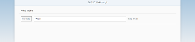
The layout of the panel and its content now has margins and padding
Coding
You can view and download all files at Walkthrough - Step 13.
webapp/view/App.view.xml
<mvc:View

        controllerName="sap.ui.demo.walkthrough.controller.App"

        xmlns="sap.m"

        xmlns:mvc="sap.ui.core.mvc"

        displayBlock="true">

        <App>

               <pages>

                       <Page title="{i18n>homePageTitle}">

                               <content>

                                      <Panel

                                              headerText="{i18n>helloPanelTitle}"

                                              class="sapUiResponsiveMargin"

                                              width="auto">

                                              <content>

                                                     <Button

                                                             text="{i18n>showHelloButtonText}"

                                                             press="onShowHello"

                                                             class="sapUiSmallMarginEnd"/>

                                                     <Input

                                                             value="{/recipient/name}"

                                                             valueLiveUpdate="true"

                                                             width="60%"/>

                                                     <Text

                                                             text="Hello {/recipient/name}"

                                                             class="sapUiSmallMargin"/>


                                              </content>

                                      </Panel>

                               </content>

                       </Page>

               </pages>

        </App>

</mvc:View>
如果你减小屏幕尺寸,那么你就可以看到空白也减小了。顾名思义,页边距是响应性的,并根据设备的屏幕大小进行调整。平板电脑将获得更小的利润率,而处于纵向模式的手机将无法获得利润率,从而节省这些小屏幕的空间。为了布局面板,我们添加了CSS类sapUiResponsiveMargin,它将在面板周围添加一些空间。我们必须将面板的宽度设置为auto,否则空白将被添加到默认宽度100%并超过页面大小。
页边距可以添加到所有类型的控件中,并且在许多不同的选项中可用。我们甚至可以通过向按钮添加类sapUiSmallMarginEnd按钮和输入字段之间添加空间。
为了单独格式化输出文本,我们从输入字段中删除描述并添加一个具有相同值的新文本控件。在这里,我们也使用一个小的空白,以使其与其他内容对齐。类似地,我们可以添加标准的填充类来布局容器控件的内部部分,比如面板,但是由于它在默认情况下已经带来了填充,所以这里不需要这样做。
Conventions
如果可能的话,使用标准的SAPUI5 CSS类进行布局。
Parent topic: Walkthrough
Previous: Step 12: Shell Control as Container
Next: Step 14: Custom CSS and Theme Colors
Related Information