CSS编写顺序
0)float,position,z-index
1)display:block,inline,inline-block,none;
2)盒模型相关属性
3)background:color url(../images/xx.jpg) repeat attachment position (size clip origin)
4)字体属性font(family,size,weight,style),text(align,transform,indent),word(letter)-spacing word-break,word-wrap
5)CSS3 border-radius(圆角边框),opacity,text-shadow(文本阴影),box-shadow(盒阴影),linear-gradient(线性渐变),background-size(clip,origin)图像的尺寸,trasition,tranfrom,animation
box-shadow: h-shadow v-shadow blur spread color inset;
h-shadow    必需。水平阴影的位置。允许负值。
v-shadow    必需。垂直阴影的位置。允许负值。
blur    可选。模糊距离。
spread    可选。阴影的尺寸。
color    可选。阴影的颜色。请参阅 CSS 颜色值。
inset    可选。将外部阴影 (outset) 改为内部阴影。
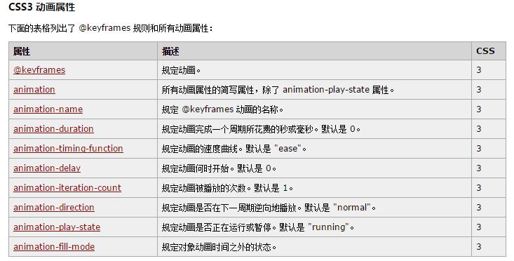
CSS3动画
角度单位 deg度、grad梯度、rad弧度、turn转/圈
1、transition:property duration timing-function delay
transition-property     规定设置过渡效果的 CSS 属性的名称。  all 所有属性都将获得过渡效果
transition-duration        规定完成过渡效果需要多少秒或毫秒。
transition-timing-function 规定速度效果的速度曲线。
linear                规定以相同速度开始至结束的过渡效果(等于 cubic-bezier(0,0,1,1))

ease                  规定慢速开始,然后变快,然后慢速结束的过渡效果(cubic-bezier(0.25,0.1,0.25,1))

ease-in               规定以慢速开始的过渡效果(等于 cubic-bezier(0.42,0,1,1))。

ease-out              规定以慢速结束的过渡效果(等于 cubic-bezier(0,0,0.58,1))。

ease-in-out           规定以慢速开始和结束的过渡效果(等于 cubic-bezier(0.42,0,0.58,1))。

cubic-bezier(n,n,n,n) 在 cubic-bezier 函数中定义自己的值。可能的值是 0 至 1 之间的数值。

transition-delay    定义过渡效果何时开始。


.box{
    width: 300px; height: 200px;
    background: #f60;
    /*transform: rotate(30deg);  旋转
    transform-origin:30% 30%;*/  旋转元素的基点位置
    transition:width 0.5s,height 0.5s;
}
.box:hover{
    width: 600px;height: 300px;
}
<div class="box"></div>

实例1:
.triangle > span{
  margin-left: 10px;
  border-top: 10px solid transparent;
  border-bottom: 10px solid transparent;
  border-left: 20px solid #f60;
  display: inline-block;
  transform-origin:0 50%;
  transition-property:transform; /* CSS属性名称 */
  transition-duration:0.5s; /* 执行时间 */
  transition-timing-function:ease-in; /* 动画速度曲线 */
  /*transition-delay:1s; 开始时间 */
  /*transition:transform 2s ease-in 1s;*/
}
.triangle:hover > span{
  transform:rotate(90deg);
}

<div class="triangle">卡卡<span></span></div>

实用的文本框实例:
input[type=text]{
  width: 100px;
  transition:width 0.5s;
  /*transition-delay:2s;*/
}
input[type=text]:focus{
  width: 500px;
}

<form>
<input type="text" class="search" placeholder="请输入关键字">
</form>
animation
加载:
.loading_bar{
  width: 100%; height: 3px;
  position: relative;
  margin-top: 20px;
  outline: 2px solid #666;
  background: #666;
}
.loading_bar::after{
  content: "";
  position: absolute; top: 0; left: 0;
  width: 0; height: 3px;
  background: #f60;
  animation:loading_bar 10s linear infinite;
}
@keyframes loading_bar{
  0% {width: 0;}
  50% {width: 50%;}
  100% {width: 100%;}
}

.loading,.loading::after{
  width: 50px;height: 50px;
  border-radius: 50%;
}
.loading{
  position: relative;
  margin-top: 20px;
  border: 3px solid rgba(0,0,0,0.2);
  border-left-color: #f60;
  animation:loading 5s linear infinite;
}
.loading::after{
  position: absolute;
  content: "";
}
@keyframes loading{
  0%{
  transform:rotate(0deg);
  }
  100%{
  transform:rotate(360deg);
  }
}

<div class="loading"></div>
CSS选择器
1. 标签选择器
h1{color:red;}
h3,h4,p{font-size:12px;}  多个用 " , " 隔开
2. 类选择器
.main{color:red;}
3. 后代选择器
.main h3{color:red;}
4. 子选择器
.main > h3{color:red;}  子选择器 不是孙级

<div class="main">
    <h3>h3标题</h3>  这个h3会显示红色
    <div>
         <h3>h3标题2</h3>  他不会显示红色
    </div>
</div>
5. 兄弟选择器
.main ~ h3{color:red;}  中间可以隔元素

<div class="main"></div>
<a href="javascript:;">元素</a>
<h3>兄弟1</h3>
<h3>兄弟2</h3>
6. 相邻选择器
.main + h3{color: #f60;}    中间不可以隔元素,可以有文字,应用下面的一个元素

<div class="main"></div>
打快点撒
<h3>兄弟1</h3>
<h3>兄弟2</h3>
7. 属性选择器
input[type="text"]{color:red;}

<form>
    <input type="text">
</form>
7.1 [title]{带有title属性的所有元素}
7.2 [class="title"]{class属性值为title的元素}
7.3 [class^=main]{class属性值以main开头的元素}
7.4 [class$=main]{class属性值以main结尾的元素}
7.5 [class*=main]{class属性值包含mian字符的元素}
7.6 [class~=main]{class属性值用 ‘空格’ 隔开的元素}
7.7 [class|=main]{class属性值用 ‘-’ 隔开的元素}
css伪类&伪元素
伪类
:hover , :link , :active , :visited  , :focus , :blur{}   动态伪类
:disabled(不可编辑的), :enabled , :read-only(只读), :read-write , :focus    UI伪类
CSS3伪类
:nth-child(选择器匹配属于其父元素的第 N 个子元素,不论元素的类型) , :nth-last-child(n) , :first-child , :last-child
:nth-of-type(选取父元素的第 N 个指定类型的子元素) , :nth-last-of-type(n) , :last-of-type , :last-of-type
:not(h3) 否定伪类 不是h3
伪元素
::before , ::after , ::first-letter(第一个字符), :first-line(第一段), ::selection(选取到文字时)
h-shadow 必需。水平阴影的位置。允许负值。
v-shadow 必需。垂直阴影的位置。允许负值。
blur 可选。模糊距离。
spread 可选。阴影的尺寸。
color 可选。阴影的颜色。请参阅 CSS 颜色值。
inset 可选。将外部阴影 (outset) 改为内部阴影。