flex布局
flex( flexible box:弹性盒布局模型),是2009年w3c提出的一种可以简洁、快速弹性布局的属性。主要思想是给予容器控制内部元素高度和宽度的能力。
flex坐标

使用flex布局的容器(flex container),它内部的元素自动成为flex项目(flex item)。容器拥有两根隐形的轴,水平的主轴(main axis),和竖直的交叉轴。主轴开始的位置,即主轴与右边框的交点,称为main start;主轴结束的位置称为main end;交叉轴开始的位置称为cross start;交叉轴结束的位置称为cross end。item按主轴或交叉轴排列,item在主轴方向上占据的宽度称为main size,在交叉轴方向上占据的宽度称为cross size。
此外,需注意使用flex容器内元素,即flex item的float,clear、vertical-align属性将失效。
弹性盒容器属性
1.弹性盒
如果不设置子元素的高度,弹性盒将会保持子元素的高度一致。
通过子元素的flex属性确定子元素的宽度。
2. flex-direction 伸缩流方向
决定主轴的方向,即项目排列的方向,有四个可能的值:
flex-direction:row(默认) | row-reverse | column | column-reverse
row:主轴为水平方向,项目沿主轴从左至右排列
column:主轴为竖直方向,项目沿主轴从上至下排列
row-reverse:主轴水平,项目从右至左排列,与row反向
column-reverse:主轴竖直,项目从下至上排列,与column反向
3. flex-wrap 伸缩换行
默认情况下,item排列在一条线上,即主轴上,flex-wrap决定当排列不下时是否换行以及换行的方式,可能的值:
flex-wrap:nowrap(默认) | wrap | wrap-reverse
nowrap:自动缩小项目,不换行
wrap:换行,且第一行在上方
wrap-reverse:换行,第一行在下面
4. justify-content 主轴对齐
决定item在主轴上的对齐方式,可能的值有:
flex-start(默认)| flex-end | center | space-between | space-around
当主轴沿水平方向时,具体含义为:
flex-start:左对齐
flex-end:右对齐
center:居中对齐
space- between:两端对齐
space-around:沿轴线均匀分布
5. align-items 侧轴对齐
决定了item在交叉轴上的对齐方式,可能的值有:
flex-start(默认)| flex-end | center | baseline | stretch
当主轴水平时,其具体含义为:
flex-start:顶端对齐
flex-end:底部对齐
center:竖直方向上居中对齐
baseline:item第一行文字的底部对齐
stretch:当item未设置高度时,item将和容器等高对齐
示例代码
主轴相关属性示例代码
<!DOCTYPE html>
<html lang="en">
<head>
<meta charset="UTF-8">
<title>Title</title>
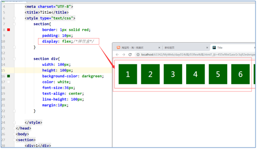
<style type="text/css">
section{
border: 1px solid red;
padding: 10px;
display: flex;/*弹性盒*/
flex-direction: row;/*伸缩流方向*/
flex-wrap:wrap ;/*伸缩流换行*/
justify-content: space-around;/*主轴对齐*/
}
section div{
100px;
height: 100px;
background-color: darkgreen;
color: white;
font-size:36px;
text-align: center;
line-height: 100px;
margin:10px;
border-radius: 50px;/*圆角边框*/
}
</style>
</head>
<body>
<section>
<div>1</div>
<div>2</div>
<div>3</div>
<div>4</div>
<div>5</div>
<div>6</div>
<div>7</div>
<div>8</div>
</section>
</body>
</html>
侧轴对齐示例代码
<!DOCTYPE html>
<html lang="en">
<head>
    <meta charset="UTF-8">
    <title>Title</title>
    <style type="text/css">
        section{
            border: 1px solid red;
            padding: 10px;
            display: flex;/*弹性盒*/
            flex-direction: row;/*伸缩流方向*/
            flex-wrap:wrap ;/*伸缩流换行*/
            justify-content:  space-around;/*主轴对齐*/
            align-items: center;/*侧轴对齐*/
        }

        section div{
             100px;
            background-color: darkgreen;
            color: white;
            font-size:36px;
            text-align: center;
            line-height: 100px;
            margin:10px;
        }

        section div:nth-child(odd){
            height: 300px;
            background-color: #ffea6d;
        }

        section div:nth-child(even){
            height: 100px;
        }

    </style>
</head>
<body>
<section>
    <div>1</div>
    <div>2</div>
    <div>3</div>
    <div>4</div>
    <div>5</div>
    <div>6</div>
    <div>7</div>
    <div>8</div>
</section>
</body>
</html>
子元素占据空间比例示例代码
<!DOCTYPE html>
<html lang="en">
<head>
    <meta charset="UTF-8">
    <title>Title</title>
    <style type="text/css">
        section{
            border: 1px solid red;
            padding: 10px;
            display: flex;/*弹性盒*/
        }

        section div{
            background-color: darkgreen;
            color: white;
            font-size:36px;
            text-align: center;
            line-height: 100px;
            margin:10px;
        }

        section div:nth-child(1){
            flex: 1;
        }

        section div:nth-child(2){
            flex: 3;
        }

    </style>
</head>
<body>
<section>
    <div>1<br>1<br>1<br>1<br>1<br></div>
    <div>2</div>
</section>
</body>
</html>