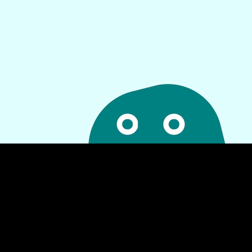
效果预览
在线演示按下右侧的“点击预览”按钮可以在当前页面预览,点击链接可以全屏预览。
https://codepen.io/comehope/pen/VdOKQG
可交互视频
此视频是可以交互的,你可以随时暂停视频,编辑视频中的代码。
请用 chrome, safari, edge 打开观看。
https://scrimba.com/p/pEgDAM/c43ekUL
源代码下载
本地下载每日前端实战系列的全部源代码请从 github 下载:
https://github.com/comehope/front-end-daily-challenges
代码解读
定义 dom,容器中包含 2 个元素,分别代表怪兽的身体和眼睛:
<div class="monster">
    <span class="body"></span>
    <span class="eyes"></span>
</div>
设置背景色:
body {
    margin: 0;
    height: 100vh;
    background-color: black;
}
设置前景色:
.monster {
     100vw;
    height: 50vh;
    background-color: lightcyan;
}
画出怪兽的身体:
.monster {
    position: relative;
}

.body {
    position: absolute;
     32vmin;
    height: 32vmin;
    background-color: teal;
    border-radius: 43% 40% 43% 40%;
    bottom: calc(-1 * 32vmin / 2 - 4vmin);
}
定义怪兽眼睛所在的容器:
.eyes {
     24vmin;
    height: 5vmin;
    position: absolute;
    bottom: 2vmin;
    left: calc(32vmin - 24vmin - 2vmin);
}
用伪元素画出怪兽的眼睛:
.eyes::before,
.eyes::after {
    content: '';
    position: absolute;
     5vmin;
    height: 5vmin;
    border: 1.25vmin solid white;
    box-sizing: border-box;
    border-radius: 50%;
}

.eyes::before {
    left: 4vmin;
}

.eyes::after {
    right: 4vmin;
}
为怪兽定义轻轻跳起的动画,结合后面的动画效果,让它具有果冻的弹性:
.body {
    animation:
        bounce 1s infinite alternate;
}

@keyframes bounce {
    to {
        bottom: calc(-1 * 32vmin / 2 - 2vmin);
    }
}
让怪兽的身体转动起来:
@keyframes wave {
    to {
        transform: rotate(360deg);
    }
}
让怪兽徘徊行走:
.monster {
    overflow: hidden;
}

.body {
    left: -2vmin;
    animation:
        wander 5s linear infinite alternate,
        wave 3s linear infinite,
        bounce 1s infinite alternate;
}

.eyes {
    animation: wander 5s linear infinite alternate;
}

@keyframes wander {
    to {
        left: calc(100% - 32vmin + 2vmin);
    }
}
最后,让怪兽的眼睛眨一眨:
.eyes::before,
.eyes::after {
    animation: blink 3s infinite linear;
}

@keyframes blink {
    4%, 10%, 34%, 40% {
        transform: scaleY(1);
    }

    7%, 37% {
        transform: scaleY(0);
    }
}
大功告成!
原文地址:https://segmentfault.com/a/1190000015484852