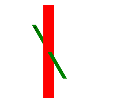
3D属性
 1     <style>
 2         .wrap {
 3             position: relative;     /*相对定位*/
 4             margin: 100px auto;
 5             width: 400px;
 6             height: 300px;
 7             background: red;
 8             transform: rotateY(85deg);        先于Y轴旋转
 9             transform-style: preserve-3d;
10         }
11
12         .box {
13             font-size: 28px;
14             width: 150px;
15             height: 200px;
16             background: green;
17             position: absolute;
18             left: 50%;
19             top: 50%;
20             margin-left: -50px;
21             margin-top: -100px;
22             transform: rotateX(30deg);
23         }
24     </style>
<!--
    transform-style:
        flat 让嵌套子元素以2d平面展示
        preserve-3d 让嵌套子元素以3d空间展示
-->

<div class="wrap">
    <div class="box">111111</div>
</div>
 1     <style>
 2         .wrap {
 3             float: left;
 4             width: 200px;
 5             height: 300px;
 6             border: 1px solid red;
 7             margin: 100px 0 0 100px;
 8             perspective:500px;
 9         }
10
11         .wrap img {
12             transition: 0.5s;
13         }
14
15         .wrap:nth-child(1):hover img {
16             transform: translateZ(100px);
17         }
18
19         .wrap:nth-child(2):hover img {
20             transform: translateZ(-100px);
21         }
22     </style>
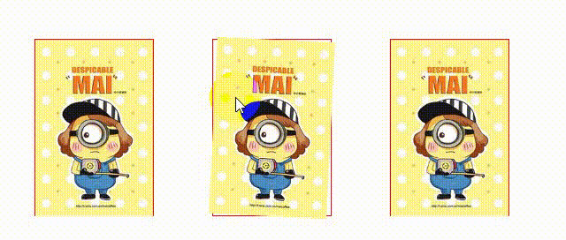
<!--
    perspective: 视距  让3D变换的子元素拥有透视效果(近大远小)
        加给父元素
        只对3d变换的元素有效

        值越小透视效果越明显
        无穷大时接近于none

        通常:500px-800px

    translateZ() 沿z轴平移
        正值:向前(越近)
        负值:向后 (越远)
-->

<div class="wrap">
    <img src="pic02.jpg"/>
</div>


<div class="wrap">
    <img src="pic02.jpg"/>
</div>
3D旋转
 1     <style>
 2         .wrap{
 3             float: left;
 4             width:200px;
 5             height:300px;
 6             border:1px solid red;
 7             margin:100px 0 0 100px;
 8             perspective:500px;
 9         }
10         .wrap img{transition:0.5s;}
11         .wrap:nth-child(1):hover img{transform:rotateX(30deg);}
12         .wrap:nth-child(2):hover img{transform:rotateX(-30deg);}
13         .wrap:nth-child(3):hover img{transform:rotateY(30deg);}
14         .wrap:nth-child(4):hover img{transform:rotateY(-30deg);}
15         .wrap:nth-child(5):hover img{transform:rotateZ(30deg);}
16         .wrap:nth-child(6):hover img{transform:rotateZ(-30deg);}
17
18     </style>
<body>
<!--
    perspective: 视距  让3D变换的子元素拥有透视效果(近大远小)
        加给父元素
        只对3d变换的元素有效

        值越小透视效果越明显
        无穷大时接近于none

        通常:500px-800px

    translateZ() 沿z轴平移
        正值:向前(越近)
        负值:向后 (越远)

     rotateX()  沿X轴旋转
        正值:向上
        负值:向下
     rotateY() 沿y轴旋转
        正值:向右
        负值:向左
     rotateZ() 沿z轴旋转
-->

<div class="wrap">
    <img src="pic02.jpg"/>
</div>


<div class="wrap">
    <img src="pic02.jpg"/>
</div>


<div class="wrap">
    <img src="pic02.jpg"/>
</div>


<div class="wrap">
    <img src="pic02.jpg"/>
</div>


<div class="wrap">
    <img src="pic02.jpg"/>
</div>


<div class="wrap">
    <img src="pic02.jpg"/>
</div>
 1     <style>
 2         .box{
 3             position: absolute;
 4             left:0;
 5             top:0;
 6             width: 100px;
 7             height: 100px;
 8             background:red;
 9             /*动画执行*/
10             animation: run 5s 4s cubic-bezier(0, 0, 0, 1.29) infinite alternate;/*调用动画*/
11         }             /*动画名称 持续时间 n秒后执行 时间函数    重复播放    反向播放*/
12
13         /*定义动画  -  关键帧*/
14         @-o-keyframes run{
15             0%,100%{left:0;top:0;}
16             25%{left:200px;top:0;}
17             50%{left:200px;top:200px;}
18             75%{left:0;top:200px;}
19             /*100%{left:0;top:0;}*/
20         }
21         @-moz-keyframes run{
22             0%,100%{left:0;top:0;}
23             25%{left:200px;top:0;}
24             50%{left:200px;top:200px;}
25             75%{left:0;top:200px;}
26             /*100%{left:0;top:0;}*/
27         }
28         @-ms-keyframes run{
29             0%,100%{left:0;top:0;}
30             25%{left:200px;top:0;}
31             50%{left:200px;top:200px;}
32             75%{left:0;top:200px;}
33             /*100%{left:0;top:0;}*/
34         }
35         @-webkit-keyframes run{
36             0%,100%{left:0;top:0;}
37             25%{left:200px;top:0;}
38             50%{left:200px;top:200px;}
39             75%{left:0;top:200px;}
40             /*100%{left:0;top:0;}*/
41         }
42         /*标准用法          动画的定义*/
43         @keyframes run{
44             0%,100%{left:0;top:0;}
45             25%{left:200px;top:0;}
46             50%{left:200px;top:200px;}
47             75%{left:0;top:200px;}
48             /*100%{left:0;top:0;}*/
49         }
50
51
52     </style>
<!--
    @keyframe 定义帧动画
    animation:
        animation-name:  @keyframes定义
        animation-duration: 动画持续的时间
        animation-timing-function 时间函数
        animation-delay 动画延迟时间

    -->
    <div class="box"></div>

 1     <style>
 2         .box{
 3             position: absolute;
 4             left:0;
 5             top:0;
 6             width: 100px;
 7             height: 100px;
 8             background:red;
 9             -webkit-animation: run 1s forwards;
10             animation: run 1s forwards;/*forward作用,始动画停在最后不动,否则会恢复至初始状态*/
11
12         }
13
14         /*定义动画*/
15         @-o-keyframes run{
16             /*关键字*/
17             from{left:0;top:0;}
18             to{left:200px;top:0px;}
19         }
20         @-moz-keyframes run{
21             /*关键字*/
22             from{left:0;top:0;}
23             to{left:200px;top:0px;}
24         }
25         @-ms-keyframes run{
26             /*关键字*/
27             from{left:0;top:0;}
28             to{left:200px;top:0px;}
29         } @-webkit-keyframes run{
30               /*关键字*/
31               from{left:0;top:0;}
32               to{left:200px;top:0px;}
33           }
34         @keyframes run{
35             /*关键字*/
36             from{left:0;top:0;}
37             to{left:200px;top:0px;}
38
39         }
40
41
42     </style>
<!--
   @keyframe 定义帧动画

-->
<div class="box"></div>
 1     <style>
 2         .box{
 3             position: absolute;
 4             left:0;
 5             top:0;
 6             width: 100px;
 7             height: 100px;
 8             background:red;
 9             animation: run 1s ease-in-out 2 alternate-reverse; /*调用动画*/
10
11         }
12
13         /*定义动画  -  关键帧*/
14         @keyframes run{
15             0%,100%{left:0;top:0;}
16             25%{left:200px;top:0px;}
17             50%{left:200px;top:200px;}
18             75%{left:0;top:200px;}
19             /*100%{left:0;top:0;}*/
20         }
21
22
23     </style>
<!--

    @keyframe 定义帧动画
    animation:
        animation-name:  @keyframes定义
        animation-duration: 动画持续的时间
        animation-timing-function 时间函数
        animation-delay 动画延迟时间
        animation-iteration-count: 动画播放的次数
              1默认 number / infinite 无限循环
        animation-direction:  动画运动的方向
              normal  /  alternate(正向反向交替进行) /  反向 reverse /  alternate-reverse反向正向交替进行

-->
<div class="box"></div>

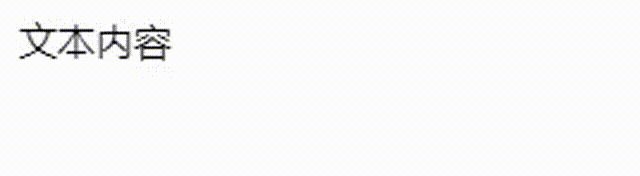
<!DOCTYPE html>
<html>
<head lang="en">
    <meta charset="UTF-8">
    <title></title>
    <link rel="stylesheet" href="animate.css"/>
</head>
<body>
<div class="animated rollIn">文本内容</div>
</body>
</html>
此处animate.css为网上搜集的动画库
更换动画效果时 <div class="animated rollIn">文本内容</div>
animated不变将rollIn更换为库中其他效果即可