样式-微信小程序

一个控件引用多个css样式,样式中间用空格分开
//wxml
<view class="page-section page-section-spacing">
 
 
//wxss
@import "./weui.wxss";
.page-section{
100%;                  //设置元素的宽度。
margin-bottom: 60rpx;   //设置元素的下外边距。
}
.page-section-spacing{
box-sizing: border-box;
padding: 0 80rpx;    //设置 元素的 4 个内边距
}
 
.page-section:last-child{
margin-bottom: 0;
}
选择每个p元素是其父级的最后一个子级。
 view组件是最常用的视图容器。它是一个块级容器组件,主要用于布局展示,是布局中最基本的UI组件。所有复杂的布局都可以通过嵌套view来实现.
 rpx(responsive pixel): 可以根据屏幕宽度进行自适应。
使用@import语句可以导入外联样式表,@import后跟需要导入的外联样式表的相对路径,用;表示语句结束。
 
box-sizing: content-box|border-box|inherit;
content-box:

这是由 CSS2.1 规定的宽度高度行为。

宽度和高度分别应用到元素的内容框。

在宽度和高度之外绘制元素的内边距和边框。

border-box:

为元素设定的宽度和高度决定了元素的边框盒。

就是说,为元素指定的任何内边距和边框都将在已设定的宽度和高度内进行绘制。

通过从已设定的宽度和高度分别减去边框和内边距才能得到内容的宽度和高度。

inherit:

规定应从父元素继承 box-sizing 属性的值。

内联样式

框架组件上支持使用 style、class 属性来控制组件的样式。

  • style:静态的样式统一写到 class 中。style 接收动态的样式,在运行时会进行解析,请尽量避免将静态的样式写进 style 中,以免影响渲染速度。
<view style="color:{{color}};" />
  • class:用于指定样式规则,其属性值是样式规则中类选择器名(样式类名)的集合,样式类名不需要带上.,样式类名之间用空格分隔。
<view class="normal_view" />

 //js

data: {
background: ['demo-text-1', 'demo-text-2', 'demo-text-3'],  //background 数组存放着3个样式名
indicatorDots: true,
vertical: false,
autoplay: false,
circular: false,
interval: 2000,
duration: 500,
previousMargin: 0,
nextMargin: 0
}
.demo-text-1:before{
content: 'A';
position: absolute;
top: 50%;
left: 50%;
transform: translate(-50%, -50%);
}


.demo-text-2:before{
content: 'B';
position: absolute;
top: 50%;
left: 50%;
transform: translate(-50%, -50%);
}


.demo-text-3:before{
content: 'C';
position: absolute;
top: 50%;
left: 50%;
transform: translate(-50%, -50%);
}
 
 
.swiper-item{
display: block;
height: 150px;
}

******************************


******************************

<swiper
indicator-dots="{{indicatorDots}}" autoplay="{{autoplay}}" circular="{{circular}}" vertical="{{vertical}}"
interval="{{interval}}" duration="{{duration}}" previous-margin="{{previousMargin}}px" next-margin="{{nextMargin}}px">
<block wx:for="{{background}}" wx:key="*this">
<swiper-item>
<view class="swiper-item {{item}}"></view>  注:view 引用了两个样式,一个是固定的swiper-item,另一个来自于数组background的样式名
</swiper-item>
</block>
</swiper>
 
通过 {{ }} 的语法把一个变量绑定到界面上,我们称为数据绑定。仅仅通过数据绑定还不够完整的描述状态和界面的关系,还需要 if/elsefor等控制能力,在小程序里边,这些控制能力都用 wx: 开头的属性来表达。
在组件上使用 wx:for 控制属性绑定一个数组,即可使用数组中各项的数据重复渲染该组件。默认数组的当前项的下标变量名默认为 index,数组当前项的变量名默认为 item

使用 wx:for-item 可以指定数组当前元素的变量名,

使用 wx:for-index 可以指定数组当前下标的变量名:

<view wx:for="{{array}}">
{{index}}: {{item.age}}
</view>
 
array: [{age: 10},{age:30},{age:21}]
 

block wx:for

类似 block wx:if,也可以将 wx:for 用在<block/>标签上,以渲染一个包含多节点的结构块。

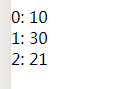
<block wx:for="{{[1, 2, 3]}}">
  <view> {{index}}: </view>
  <view> {{item}} </view>
</block>


wx:key

如果列表中项目的位置会动态改变或者有新的项目添加到列表中,并且希望列表中的项目保持自己的特征和状态(如 input 中的输入内容,switch 的选中状态),需要使用 wx:key 来指定列表中项目的唯一的标识符。

wx:key 的值以两种形式提供

  1. 字符串,代表在 for 循环的 array 中 item 的某个 property,该 property 的值需要是列表中唯一的字符串或数字,且不能动态改变。
  2. 保留关键字 *this 代表在 for 循环中的 item 本身,这种表示需要 item 本身是一个唯一的字符串或者数字。

当数据改变触发渲染层重新渲染的时候,会校正带有 key 的组件,框架会确保他们被重新排序,而不是重新创建,以确保使组件保持自身的状态,并且提高列表渲染时的效率。

如不提供 wx:key,会报一个 warning, 如果明确知道该列表是静态,或者不必关注其顺序,可以选择忽略。

//index.wxml

<view class="container">
<view class="page-body">
<view class="page-section page-section-spacing swiper">
<swiper
indicator-dots="{{indicatorDots}}" autoplay="{{autoplay}}" circular="{{circular}}" vertical="{{vertical}}"
interval="{{interval}}" duration="{{duration}}" previous-margin="{{previousMargin}}px" next-margin="{{nextMargin}}px">
<block wx:for="{{background}}" wx:key="*this">
<swiper-item>
<view class="swiper-item {{item}}"></view>
</swiper-item>
</block>
</swiper>
</view>
<view class="page-section" style="margin-top: 60rpx;margin-bottom: 0;">
<view class="weui-cells weui-cells_after-title">
<view class="weui-cell weui-cell_switch">
<view class="weui-cell__bd">指示点</view>
</view>
<view class="weui-cell weui-cell_switch">
<view class="weui-cell__bd">自动播放</view>
<view class="weui-cell__ft">
<switch checked="{{autoplay}}" bindchange="changeProperty" data-property-name="autoplay" />
</view>
</view>
</view>
</view>
</view>
</view>


//index.wxss
@import "./weui.wxss";
.page-section{
100%;
margin-bottom: 60rpx;
}
 
.page-section:last-child{
margin-bottom: 0;
}
 
//weui.wxss
.page-section{
100%;
margin-bottom: 60rpx;
}

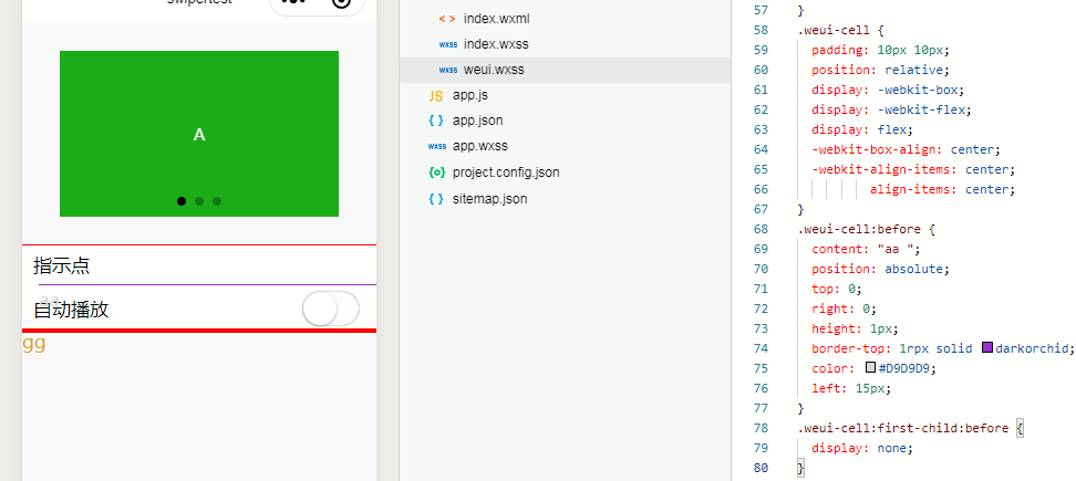
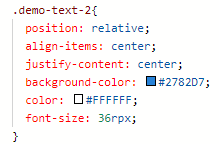
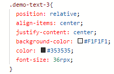
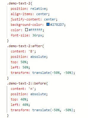
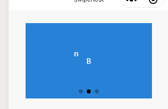
 注释:position  定位,relative,生成相对定位的元素,相对于其正常位置进行定位;,absolute生成绝对定位的元素,相对于 static 定位以外的第一个父元素进行定位

 line-height  使用百分比设置行高,%基于当前字体尺寸的百分比行间距。设置数字,此数字会与当前的字体尺寸相乘来设置行间距。

border-top:设置上边框的样式

height: 设置段落的高度

.weui-cells:before {
content: " ";
position: absolute;
left: 0;
top: 0;
right: 0;
height: 1px;     
border-top: 1rpx solid red;//设置上边框的为高1rpx,实线,红色
color: #D9D9D9;
}
.weui-cells:after {
content: " gg";
position: absolute;
left: 0;
bottom: 0;
right: 0;
height: 1px;
border-bottom: 10rpx solid red;
color: goldenrod;  //设置了cotent内容字体的颜色
}
.weui-cells_after-title {
margin-top: 0;
}


.weui-cell {
padding: 10px 15px;  //设置 元素的 4 个内边距
position: relative;
display: -webkit-box;
display: -webkit-flex;
display: flex;
-webkit-box-align: center;
-webkit-align-items: center;
align-items: center;
}
.weui-cell:before {
content: " ";
position: absolute;
top: 0;
right: 0;
height: 1px;
border-top: 1rpx solid darkorchid;
color: #D9D9D9;
left: 15px;   //left 属性规定元素的左边缘,该属性定义了定位元素左外边距边界与其包含块左边界之间的偏移。
}
.weui-cell:first-child:before {
display: none;           //上图可以看出,第一个孩子的before 不展示
}
 
.weui-cell_switch {
padding-top: 6px;
padding-bottom: 6px;
}
 
.weui-cell__bd {
-webkit-box-flex: 1;
-webkit-flex: 1;
flex: 1;
}
.weui-cell__ft {
text-align: right;
color: #999999;
}
原文地址:https://www.cnblogs.com/playforever/p/12523217.html