页面布局
本章主要讲解布局及装饰组件的基本用法,主要的布局及装饰组件参见下表:
基础布局处理
宽高尺寸处理
列表及表格布局
其他布局处理
布局综合示例
布局及装饰组件的说明如下:
| 组件名称 | 中文名称 | 简单说明 |
|---|---|---|
| Align | 对齐布局 | 指定child的对齐方式 |
| AspectRatio | 调整宽高比 | 根据设置的宽高比调整child |
| Baseline | 基准线布局 | 所有child底部所在的同一条水平线 |
| Center | 居中布局 | child处于水平和垂直方向的中间位置 |
| Colum | 垂直布局 | 对child在垂直方向进行排列 |
| ConstrainedBox | 限定宽高 | 限定child的最大值 |
| Container | 容器布局 | 容器布局是一个组合的Widgt,包含定位和尺寸 |
| FittedBox | 缩放布局 | 缩放及位置调整 |
| FractionallySizeBox | 百分比布局 | 根据现有空间按照百分比调整child的尺寸 |
| GridView | 网格布局 | 对多行多列同时进行操作 |
| IndexedStack | 栈索引布局 | IndexedStack继承自Stack,显示第index个child,其他child都是不可见的 |
| LimitedBox | 限定宽高布局 | 对最大宽高进行限制 |
| ListView | 列表布局 | 用列表方式进行布局,比如多项数据的场景 |
| Offstage | 开关布局 | 控制是否显示组件 |
| OverflowBox | 溢出父容器显示 | 允许child超出父容器的范围显示 |
| Padding | 填充布局 | 处理容器与其child之间的间距 |
| Row | 水平布局 | 对child在水平方向进行排列 |
| SizeBox | 设置具体尺寸 | 用一个特定大小的盒子来限定child宽度和高度 |
| Stack/Alignment | Alignment栈布局 | 根据Alignment组件的属性将child定位在Stack组件上 |
| Stack/Positioned | Positioned栈布局 | 根据Positioned组件的属性将child定位在Stack组件上 |
| Table | 表格布局 | 使用表格的行和列进行布局 |
| Transform | 矩阵转换 | 做矩阵变换,对child做平移、旋转、缩放等操作 |
| Wrap | 按宽高自动换行 | 按宽度或高度,让child自动换行布局 |
基础布局处理
基础布局组件包括容器布局,各种缩放、排列方式的组件,下面分别详述。
Container(容器布局)
Container(容器布局)在Flutter中大量使用,它是一个组合的Widget,内部有绘制Widget、定位Widget和尺寸Widget。
在工程目录的images下放置三张图片,然后在pubspec.yaml中添加图片的位置:

完整的示例代码如下所示:
import 'package:flutter/material.dart';
void main() => runApp(
  MaterialApp(
    title: 'Container容器布局',
    home: LayoutDemo(),
  )
);
class LayoutDemo extends StatelessWidget {
  @override
  Widget build(BuildContext context) {
    return Scaffold(
      appBar: AppBar(title: Text('Container容器布局'),),
      body: container,
    );
  }
  // 返回一个Container对象
  Widget container = new Container(
    // 添加装饰效果
    decoration: BoxDecoration(color: Colors.grey),
    // 子元素指定为一个垂直水平嵌套布局的组件
    child: Column(
      children: [
        Row(
          children: [
            // 使用Expanded防止内容溢出
            Expanded(
              child: Container(
                 150.0,
                height: 150.0,
                // 添加边框样式
                decoration: BoxDecoration(
                  // 上下左右边框设置为宽度10.0,颜色为蓝灰色
                  border: Border.all( 10.0, color: Colors.blueGrey),
                  // 上下左右边框弧度设置为8.0
                  borderRadius: BorderRadius.all(Radius.circular(8.0))
                ),
                // 上下左右增加边距
                margin: EdgeInsets.all(4.0),
                // 添加图片
                child: Image.asset('images/1.jpeg'),
              ),
            ),
            Expanded(
              child: Container(
                 150.0,
                height: 150.0,
                // 添加边框样式
                decoration: BoxDecoration(
                  // 上下左右边框设置为宽度10.0,颜色为蓝灰色
                  border: Border.all( 10.0, color: Colors.blueGrey),
                  // 上下左右边框弧度设置为8.0
                  borderRadius: BorderRadius.all(Radius.circular(8.0))
                ),
                margin: EdgeInsets.all(4.0),
                child: Image.asset('images/2.jpeg'),
              ),
            ),
          ],
        ),
      ],
    ),
  );
}
Center(居中布局)
在Center居中布局中,子元素处于水平和垂直方向的中间位置。
示例代码如下:
import 'package:flutter/material.dart';
void main() => runApp(
  MaterialApp(
    title: 'Center居中布局',
    home: LayoutDemo(),
  )
);
class LayoutDemo extends StatelessWidget{
  @override
  Widget build(BuildContext context) {
    return Scaffold(
      appBar: AppBar(title: Text('Center居中布局'),),
      body: Center(
        child: Text(
          'Hello Flutter',
          style: TextStyle(fontSize: 36.0),
        ),
      ),
    );
  }
}
Padding(填充布局)
Padding即为填充组件,用于处理容器与其子元素之间的间距,与padding属性对应的是magin属性,magin处理容器与其他组件之间的间距。
| 属性名 | 类型 | 说明 |
|---|---|---|
| padding | EdgeInsetsGeometry | 填充值可以使用EdgeInsets方法: EdgeInsets.all(6.0)将容器上下左右填充设置为6.0 EdgeInsets.only()方法来单独设置某一边的间距 |
接下来我们编写例子,容器里嵌套一个容器,两个容器分别添加边框以此来测试Padding值。
import 'package:flutter/material.dart';
void main() => runApp(
  MaterialApp(
    title: 'Padding填充布局',
    home: LayoutDemo(),
  )
);
class LayoutDemo extends StatelessWidget {
  @override
  Widget build(BuildContext context) {
    return Scaffold(
      appBar: AppBar(title: Text('Padding填充布局'),),
      body: Center(
        child: Container(
           300.0,
          height: 300.0,
          padding: EdgeInsets.all(60.0),// 容器上下左右填充设置为60.0
          decoration: BoxDecoration(
            color: Colors.white,
            border: Border.all(
              color: Colors.green,
               8.0
            )
          ),
          child: FlutterLogo(),
        ),
      ),
    );
  }
}
Align(对齐布局)
Align组件即对齐组件,能将子组件按指定方式对齐,并根据子组件的大小调整自己的大小。
| 属性名 | 值 | 说明 |
|---|---|---|
| bottomCenter | (0.5, 1.0) | 底部中心 |
| bottomLeft | (0.0, 1.0) | 左下角 |
| bottomRight | (1.0, 1.0) | 右下角 |
| center | (0.5, 0.5) | 水平垂直居中 |
| centerLeft | (0.0, 0.5) | 左侧缘中心 |
| centerRight | (1.0, 0.5) | 右侧缘中心 |
| topCenter | (0.5, 0.0) | 顶部中心 |
| topLeft | (0.0, 0.0) | 左上角 |
| topRight | (1.0, 0.0) | 右上角 |
我们编写一个例子,将多张图片分别放置在不同的位置。完整的代码如下:
import 'package:flutter/material.dart';
void main() => runApp(
  MaterialApp(
    title: 'Align对齐布局',
    home: LayoutDemo(),
  )
);
class LayoutDemo extends StatelessWidget{
  @override
  Widget build(BuildContext context) {
    return Scaffold(
      appBar: AppBar(title: Text('Align对齐布局'),),
      body: Stack(
        children: [
          // 左上角
          Align(
            alignment: FractionalOffset(0.0, 0.0),
            child: Image.asset('images/1.jpeg',  128.0, height: 128.0,),
          ),
          // 右上角
          Align(
            alignment: FractionalOffset(1.0, 0.0),
            child: Image.asset('images/1.jpeg',  128.0, height: 128.0,),
          ),
          // 水平垂直方向居中
          Align(
            alignment: FractionalOffset.center,
            child: Image.asset('images/1.jpeg',  128.0, height: 128.0,),
          ),
          // 左下角
          Align(
            alignment: FractionalOffset.bottomLeft,
            child: Image.asset('images/1.jpeg',  128.0, height: 128.0,),
          ),
          // 右下角
          Align(
            alignment: FractionalOffset.bottomRight,
            child: Image.asset('images/1.jpeg',  128.0, height: 128.0,),
          ),
        ],
      ),
    );
  }
}
Row(水平布局)
水平布局是一种常用的布局方式,我们主要使用Row组件来完成子组件在水平方向的排列。Row组件常见属性如下所示:
| 属性名 | 类型 | 说明 |
|---|---|---|
| mainAxisAlignment | MainAxisAlignment | 主轴的排列方式 |
| crossAxisAlignment | CrossAxisAlignment | 次轴的排列方式 |
| mainAxisSize | MainAxisSize | 主轴应该占据多少空间。取值max为最大,min为最小 |
| children | List |
组件子元素,它的本质是一个List列表 |
对Row来说,水平方向是主轴,垂直方向是次轴,可以完全参照Web中的Flex布局。
import 'package:flutter/material.dart';
void main() => runApp(
  MaterialApp(
    title: 'Row布局',
    home: LayoutDemo(),
  )
);
class LayoutDemo extends StatelessWidget{
  @override
  Widget build(BuildContext context) {
    return Scaffold(
      appBar: AppBar(title: Text('Row布局'),),
      body: Row(
        children: [
          Expanded(
            child: Text('左侧文本', textAlign: TextAlign.center,),
          ),
          Expanded(
            child: Text('中间文本', textAlign: TextAlign.center,),
          ),
          Expanded(
            child: FittedBox(
              fit: BoxFit.contain,
              child: FlutterLogo(),
            ),
          )
        ],
      ),
    );
  }
}
Column(垂直布局)
垂直布局是一种常用的布局方式,主要使用Column组件来完成对子组件纵向的排列。常见属性如下所示:
| 属性名 | 类型 | 说明 |
|---|---|---|
| mainAxisAlignment | MainAxisAlignment | 主轴的排列方式 |
| crossAxisAlignment | CrossAxisAlignment | 次轴的排列方式 |
| mainAxisSize | MainAxisSize | 主轴应该占据多少空间。取值max为最大,min为最小 |
| children | List |
组件子元素,它的本质是一个List列表 |
对于Column来说,垂直方向是主轴,水平方向是次轴,可以完全参照Web中的Flex布局。
import 'package:flutter/material.dart';
void main() => runApp(
  MaterialApp(
    title: 'Colum布局',
    home: LayoutDemo(),
  )
);
class LayoutDemo extends StatelessWidget{
  @override
  Widget build(BuildContext context) {
    return Scaffold(
      appBar: AppBar(title: Text('Colum布局'),),
      body: Column(
        children: [
          Text('Flutter'),
          Text('垂直布局'),
          Expanded(
            child: FittedBox(
              fit: BoxFit.contain,
              child: FlutterLogo(),
            ),
          )
        ],
      ),
    );
  }
}
若要增加水平方向左对齐,主轴方向最小化处理即可:
class LayoutDemo extends StatelessWidget{
  @override
  Widget build(BuildContext context) {
    return Scaffold(
      appBar: AppBar(title: Text('Colum布局'),),
      body: Column(
        crossAxisAlignment: CrossAxisAlignment.start,
        mainAxisSize: MainAxisSize.min,
        children: [
          Text('Flutter'),
          Text('Flutter'),
          Text('Flutter'),
          Text('Flutter'),
          Text('Flutter'),
          Text('Flutter'),
        ],
      ),
    );
  }
}
FittedBox(缩放布局)
FittedBox组件主要做两件事情,缩放(Scale)和位置调整(Position)。
FittedBox会在自己的尺寸范围内缩放并调整child位置,使chi;d适合其尺寸。
布局行为分两种情况:
如果外部有约束,按照外部约束调整自身尺寸,然后缩放调整child,按照指定的条件进行布局。
如果没有外部约束,则跟child尺寸一致,指定的缩放以及位置属性将不起作用。有fit和alignment两个重要属性,如下所示:
fit:缩放的方式,默认是BoxFit.contain,在FittedBox范围内尽可能大,但是不超出尺寸。
alignment:设置对齐方式,默认属性是Alignment.center,居中显示child。
填充布局的示例代码如下:
import 'package:flutter/material.dart';
void main() => runApp(
    MaterialApp(
      title: 'FittedBox布局',
      home: LayoutDemo(),
    )
);
class LayoutDemo extends StatelessWidget{
  @override
  Widget build(BuildContext context) {
    return Scaffold(
      appBar: AppBar(title: Text('FittedBox布局'),),
      body: Container(
        color: Colors.grey,
         250.0,
        height: 250.0,
        child: FittedBox(
          fit: BoxFit.contain, // 改变填充属性值会得到不同效果
          alignment: Alignment.topLeft,
          child: Text('缩放布局', style: TextStyle(color: Colors.deepOrange),),
        ),
      ),
    );
  }
}
Stack/Alignment
Stack组件的每个子组件要么定位,要么不定位,定位的子组件使用Positioned组件包裹的。Satck组件本身包含所有不定位的子组件,子组件根据alignment属性定位(默认左上角)。
然后根据定位的子组件的top、right、bottom和left属性将它们放置在Stack组件上。
| 属性名 | 类型 | 默认值 | 说明 |
|---|---|---|---|
| alignment | AlignmentGeometry | Alignment.topLeft | 定位位置有以下几种: bootomCenter 底部中间位置 bottomLeft 底部左侧位置 bottomRight 底部右侧位置 center 正中间位置 centerLeft 中间居左位置 centerRight 中间居右位置 topCenter 上部居中位置 topLeft 上部居左位置 topRight 上部居右位置 |
采用Alignment方式布局示例如下:
import 'package:flutter/material.dart';
void main() => runApp(
  MaterialApp(
    title: 'Stack/Alignment',
    home: MyApp(),
  )
);
class MyApp extends StatelessWidget {
  @override
  Widget build(BuildContext context) {
    var stack = new Stack(
      // 子组件左上角对齐
      alignment: Alignment.topLeft,
      // 底部添加一个头像
      children: [
        CircleAvatar(
          backgroundImage: AssetImage('images/1.jpeg'),
          radius: 100.0,
        ),
        Container(
          decoration: BoxDecoration(
            color: Colors.black38,
          ),
          child: Text(
            '我是超级飞侠',
            style: TextStyle(
              fontSize: 22.0,
              fontWeight: FontWeight.bold,
              color: Colors.white
            ),
          ),
        )
      ],
    );
    return Scaffold(
      appBar: AppBar(title: Text('Stack/Alignment'),),
      body: Center(
        child: stack,
      )
    );
  }
}
Stack/Positioned
Positioned组件是用来定位的。Stack使用Positioned布局主要是因为在Stack组件里面需要包裹一个定位组件。
| 属性名 | 类型 | 说明 |
|---|---|---|
| top | double | 子元素相对顶部边界距离 |
| bottom | double | 子元素相对底部边界距离 |
| left | double | 子元素相对左侧边界距离 |
| right | double | 子元素相对右侧边界距离 |
Positioned定位布局示例代码如下:
import 'package:flutter/material.dart';
void main() => runApp(
  MaterialApp(
    title: 'Stack/Positioned',
    home: MyApp(),
  )
);
class MyApp extends StatelessWidget {
  @override
  Widget build(BuildContext context) {
    return Scaffold(
      appBar: AppBar(title: Text('Stack/Positioned'),),
      body: Center(
        // 添加层叠布局
        child: Stack(
          children: [
            // 添加图片
            Container(
              child: Image.asset('images/1.jpeg'),
            ),
            // 设置定位布局
            Positioned(
              bottom: 50.0,
              right: 50.0,
              child: Text(
                'hi flutter',
                style: TextStyle(
                  fontSize: 36.0,
                  fontWeight: FontWeight.bold,
                  fontFamily: 'serif',
                  color: Colors.white
                ),
              ),
            )
          ],
        ),
      ),
    );
  }
}
IndexedStack
IndexedStack继承自Stack,它的作用是显示第index个child,其他child都是不可见的。IndexedStack的尺寸永远是和最大子节点尺寸一致。
import 'package:flutter/material.dart';
void main() => runApp(
    MaterialApp(
      title: 'Stack/Alignment',
      home: MyApp(),
    )
);
class MyApp extends StatelessWidget {
  @override
  Widget build(BuildContext context) {
    var stack = new IndexedStack(
      index: 1, // 设置索引为1则只显示文本内容
      alignment: FractionalOffset(0.2, 0.2),
      children: [
        CircleAvatar(
          backgroundImage: AssetImage('images/1.jpeg'),
          radius: 100.0,
        ),
        Container(
          decoration: BoxDecoration(
            color: Colors.black38,
          ),
          child: Text(
            '我是超级飞侠',
            style: TextStyle(
                fontSize: 22.0,
                fontWeight: FontWeight.bold,
                color: Colors.white
            ),
          ),
        )
      ],
    );
    return Scaffold(
        appBar: AppBar(title: Text('Stack/Alignment'),),
        body: Center(
          child: stack,
        )
    );
  }
}
OverflowBox溢出父容器显示
OverflowBox组件允许子元素child超出父容器的范围显示。当OverflowBox的最大尺寸大于child的时候,child可以完整显示,当其小于child的时候,则以最大尺寸为基准。
| 属性名 | 类型 | 说明 |
|---|---|---|
| alignment | AlignmentGeometry | 对齐方式 |
| minWidth | double | 允许child的最小宽度。如果child宽度小于这个值,则按照最小宽度显示。 |
| maxWidth | double | 允许child的最大宽度。如果child宽度大于这个值,则按照最大宽度显示。 |
| minHeight | double | 允许child的最小高度。如果child宽度小于这个值,则按照最小高度显示。 |
| maxHeight | double | 允许child的最大高度。如果child宽度大于这个值,则按照最大高度显示。 |
接下来我们编写两个容器,上层的容器会溢出下层的容器一定范围。
import 'package:flutter/material.dart';
void main() => runApp(
  MaterialApp(
    title: 'OverflowBox溢出父容器显示',
    home: LayoutDemo(),
  )
);
class LayoutDemo extends StatelessWidget{
  @override
  Widget build(BuildContext context) {
    return Scaffold(
     appBar: AppBar(title: Text('OverflowBox溢出父容器显示'),),
      body: Container(
        color: Colors.green,
         200.0,
        height: 200.0,
        padding: EdgeInsets.all(5.0),
        child: OverflowBox(
          alignment: Alignment.topLeft,
          maxWidth: 300.0,
          maxHeight: 500.0,
          child: Container(
            color: Colors.blueGrey,
             400.0,
            height: 400.0,
          ),
        ),
      ),
    );
  }
}
宽高尺寸处理
对组件具体尺寸的设置有多种方式,这里将详述这类组件。
- SizeBox(设置具体尺寸)
SizeBox组件是一个特定大小的盒子,这个组件强制它的child有特定的宽度和高度。如果宽度或高度为null,将调整自身大小以匹配该维度中的child大小。
| 属性名 | 类型 | 说明 |
|---|---|---|
| width | AlignmentGeometry | 宽度值,如果具体设置了则强制child宽度为此值,如果没设置则根据child宽度调整自身。 |
| height | double | 高度值,如果具体设置了则强制child高度为此值,如果没设置则根据child高度调整自身。 |
接下来使用SizeBox容器,在其中添加一个Card组件并限定宽200、高300的范围内:
import 'package:flutter/material.dart';
void main() => runApp(
  MaterialApp(
    title: 'SizeBox设置具体尺寸',
    home: LayoutDemo(),
  )
);
class LayoutDemo extends StatelessWidget{
  @override
  Widget build(BuildContext context) {
    return Scaffold(
      appBar: AppBar(title: Text('SizeBox设置具体尺寸'),),
      body: SizedBox(
        // 固定宽为200.0,高为300.0
         200.0,
        height: 300.0,
        child: Card(
          child: Text('SizeBox', style: TextStyle(fontSize: 36.0),),
        ),
      )
    );
  }
}
ConstrainedBox(限定最大最小宽高布局)
ConstrainedBox的作用是限定子元素child的最大宽度、最大高度、最小宽度和最小高度。主要属性如下:
| 属性名 | 类型 | 说明 |
|---|---|---|
| constraints | BoxConstraints | 添加child上的额外限制条件,其类型为BoxConstraints(限制各种最大最小宽高) |
| child | Widget | 子元素,任意Widget |
在示例中宽高为300的Container上添加一个约束最大最小宽高的ConstrainedBox。
import 'package:flutter/material.dart';
void main() => runApp(
  MaterialApp(
    title: 'ConstrainedBox限定宽高',
    home: LayoutDemo(),
  )
);
class LayoutDemo extends StatelessWidget{
  @override
  Widget build(BuildContext context) {
    return Scaffold(
      appBar: AppBar(title: Text('ConstrainedBox限定宽高'),),
      body: ConstrainedBox(
        constraints: BoxConstraints(
          minWidth: 150.0,
          minHeight: 150.0,
          maxWidth: 220.0,
          maxHeight: 220.0,
        ),
        child: Container(
           300.0,
          height: 300.0,
          color: Colors.green,
        ),
      ),
    );
  }
}
LimitedBox(限定最大宽高布局)
LimitedBox组件是限制类型的组件,可对最大宽高进行限制。和ConstrainedBox类似,只不过LimitedBox没有最小宽高限制。
| 属性名 | 类型 | 说明 |
|---|---|---|
| maxWidth | double | 限定的最大宽度,默认值是double.infinity |
| maxHeight | double | 限定的最大高度,默认值是double.infinity |
我们添加两个容器,第一个容器宽度为100,高度填满父容器。第二个容器宽度为250,高度填满父容器。
由于父容器使用LimitedBox限定最大宽度为150,所以实际上它的宽度为150。
import 'package:flutter/material.dart';
void main() => runApp(
  MaterialApp(
    title: 'LimitedBox限定宽高布局',
    home: LayoutDemo(),
  )
);
class LayoutDemo extends StatelessWidget{
  @override
  Widget build(BuildContext context) {
    return Scaffold(
      appBar: AppBar(title: Text('LimitedBox限定宽高布局'),),
      body: Row(
        children: [
          Container(
            color: Colors.grey,
             100.0,
          ),
          LimitedBox(
            maxWidth: 150.0, // 设置最大宽度,限定child在此范围内
            child: Container(
              color: Colors.lightGreen,
               250.0,
            ),
          )
        ],
      ),
    );
  }
}
AspectRatio(调整宽高比)
AspectRatio的作用是根据设置调整子元素child的宽高比,Flutter提供此组件,就免去了自定义所带来的麻烦。
AspectRatio适用于需要固定宽高比的请求,它的布局行为分为两种情况:
AspectRatio首先会在布局限制条件允许范围内尽可能扩展,Widget的高度是由宽高和比例决定的。
如果在满足所有限制条件后无法找到可行的尺寸,AspectRatio最终会优先适应布局限制条件而忽略比例。
AspectRatio的主要属性如下所示:
| 属性名 | 类型 | 说明 |
|---|---|---|
| aspectRatio | double | 宽高比,最终可能不会根据这个值去布局,具体看综合因素 |
| child | Widget | 子元素,任意Widget |
定义一个高度为200的区域,内部AspectRatio比例设置为1.5,最终AspectRatio是宽300、高200的区域:
import 'package:flutter/material.dart';
void main() => runApp(
  MaterialApp(
    title: 'AspectRatio调整宽高比例',
    home: LayoutDemo(),
  )
);
class LayoutDemo extends StatelessWidget{
  @override
  Widget build(BuildContext context) {
    return Scaffold(
      appBar: AppBar(title: Text('AspectRatio调整宽高比例'),),
      body: Container(
         200.0,
        child: AspectRatio(
          aspectRatio: 1.5, // 比例可以调整
          child: Container(
            color: Colors.green,
          ),
        ),
      ),
    );
  }
}
FractionallySizeBox(百分比布局)
FractionallySizeBox组件会根据现有空间来调整child的尺寸,所以就算为child设置具体的尺寸也不会生效。
FractionallySizeBox组件主要属性如下:
| 属性名 | 类型 | 说明 |
|---|---|---|
| alignment | AlignmentGeometry | 对齐方式,不能为null |
| widthFactor | double | 宽度因子,宽度乘以该值就是最后的宽度 |
| heightFactor | double | 高度因子,用作计算最后实际高度的 |
示例中有两个容器,底部容器宽高各位200.如果容器宽度因子为0.5,则它实际宽度为100;如果高度因子为1.5,则它实际高度为300。
import 'package:flutter/material.dart';
void main() => runApp(
  MaterialApp(
    title: 'FractionallySizeBox百分比布局',
    home: LayoutDemo(),
  )
);
class LayoutDemo extends StatelessWidget{
  @override
  Widget build(BuildContext context) {
    return Scaffold(
      appBar: AppBar(title: Text('FractionallySizeBox百分比布局'),),
      body: Container(
        color: Colors.blueGrey,
         200.0,
        height: 200.0,
        child: FractionallySizedBox(
          alignment: Alignment.topLeft, // 元素左上角对齐
          widthFactor: 0.5, // 宽度因子
          heightFactor: 1.5, // 高度因子
          child: Container(
            color: Colors.green,
          ),
        ),
      )
    );
  }
}
列表及表格布局
ListView
ListView布局是一种常用的布局方式,ListView结合ListTitle可以布局出一些复杂的列表界面。
import 'package:flutter/material.dart';
void main() => runApp(
  MaterialApp(
    title: 'ListView布局',
    home: MyApp(),
  )
);
class MyApp extends StatelessWidget{
  @override
  Widget build(BuildContext context) {
    List<Widget> list = [
      ListTile(
        title: Text('广州市黄埔大道建中路店', style: TextStyle(fontWeight: FontWeight.w400, fontSize: 18.0),),
        leading: Icon(Icons.fastfood, color: Colors.orange,),
      ),
      ListTile(
        title: Text('广州市白云机场路白云机场店', style: TextStyle(fontWeight: FontWeight.w400, fontSize: 18.0),),
        subtitle: Text('广州市白云区机场路T3航站楼'),
        leading: Icon(Icons.airplay, color: Colors.blue,),
      ),
      ListTile(
        title: Text('广州市中山大学附属医院', style: TextStyle(fontWeight: FontWeight.w400, fontSize: 18.0),),
        subtitle: Text('广州市中山大道45号'),
        leading: Icon(Icons.local_hospital, color: Colors.green,),
      ),
      ListTile(
        title: Text('广州市天河区太平洋数码城', style: TextStyle(fontWeight: FontWeight.w400, fontSize: 18.0),),
        subtitle: Text('广州市天河区岗顶太平洋数码城'),
        leading: Icon(Icons.computer, color: Colors.deepPurple,),
      ),
    ];
    return Scaffold(
      appBar: AppBar(title: Text('ListView布局'),),
      body: Center(
        child: ListView(
          children: list,
        ),
      ),
    );
  }
}
ListView还可以实现长文本的滚动效果,一般用于页面内容较多的场景。
import 'package:flutter/material.dart';
void main() => runApp(
  MaterialApp(
    title: '滚动布局示例',
    home: MyApp(),
  )
);
class MyApp extends StatelessWidget{
  @override
  Widget build(BuildContext context) {
    return Scaffold(
      appBar: AppBar(title: Text('滚动布局示例'),),
      body: ListView(
        children: [
          Center(
            child: Text('\n广州天河区公园', style: TextStyle(fontSize: 30.0),),
          ),
          Center(
            child: Text('天河公园', style: TextStyle(fontSize: 16.0),),
          ),
          Center(
            child: Text(
              '''天河公园,是区属综合性公园,位于广州天河区员村,西靠天府路,南连黄埔大道,北接中山大道来往交通十分便利。
              公园总面积为70.7公顷,水体面积占10公顷。天河公园以自然生态景观为主要特色,公园规划为五个功能区:
              百花园景区、文体娱乐区、老人活动区、森林休憩区、后勤管理区。''',
              style: TextStyle(fontSize: 14.0),
            ),
          ),
        ],
      ),
    );
  }
}
GridView
GridView布局为网格布局,通常用来布局多行多列的情况。接下来编写一个布局的九宫格示例。
import 'package:flutter/material.dart';
void main() => runApp(
  MaterialApp(
    title: 'GridView九宫格',
    home: MyApp(),
  )
);
class MyApp extends StatelessWidget{
  @override
  Widget build(BuildContext context) {
    // 使用generate构建图片列表
    List<Container> _buildGridTitleList(int count){
      return List<Container>.generate(count, (index) => Container(
        child: Image.asset('images/1.jpeg'),
      ));
    }
    // 渲染GridView
    Widget buildGrid(){
      return GridView.extent(
        maxCrossAxisExtent: 150.0, // 次轴宽度
        padding: EdgeInsets.all(4.0), // 内边距
        mainAxisSpacing: 4.0, // 主轴间隙
        crossAxisSpacing: 4.0, // 次轴间隙
        children: _buildGridTitleList(9),
      );
    }
    return Scaffold(
      appBar: AppBar(title: Text('GridView九宫格'),),
      body: Center(
        child: buildGrid(),
      ),
    );
  }
}
Table
表格布局中,每一行的高度由其内容决定,每一列的宽度由columWidths属性单独控制。
| 属性名 | 类型 | 说明 |
|---|---|---|
| columnWidths | Map<int, TableColumnWidth> | 设置每一列的宽度 |
| defaultColumnWidth | TableColumnWidth | 默认的每一列的宽度值,默认情况下均分 |
| textDirection | TextDirection | 文字方向 |
| border | TableBorder | 表格边框 |
| defaultVerticalAlignment | TableCellVerticalAlignment | 默认垂直方向对齐方式: top:放置在顶部 middle:垂直居中 bottom:放置在底部 baseline:文本baseline对齐 fill:充满整个cell |
| textBaseline | TextBaseline | defaultVerticalAlignment为baseline的时候,会用到这个属性 |
接下来编写一个员工基本信息统计的表格,完整代码如下:
import 'package:flutter/material.dart';
void main() => runApp(
  MaterialApp(
    title: 'Table表格布局',
    home: MyApp(),
  )
);
class MyApp extends StatelessWidget {
  @override
  Widget build(BuildContext context) {
    return Scaffold(
      appBar: AppBar(title: Text('Table表格布局'),),
      body: Center(
        child: Table(
          // 设置表格有多少列,并指定列宽Map<int, TableColumnWidth>
          columnWidths: <int, TableColumnWidth>{
            0: FixedColumnWidth(100.0),
            1: FixedColumnWidth(40.0),
            2: FixedColumnWidth(80.0),
            3: FixedColumnWidth(80.0),
          },
          // 设置表格边框样式
          border: TableBorder.all(color: Colors.black38,  2.0, style: BorderStyle.solid),
          children: [
            // 添加第一行数据
            TableRow(
              children: [
                Text('姓名'),
                Text('性别'),
                Text('年龄'),
                Text('身高'),
              ]
            ),
            // 添加第二行数据
            TableRow(
                children: [
                  Text('张三'),
                  Text('男'),
                  Text('26'),
                  Text('172'),
                ]
            ),
            // 添加第三行数据
            TableRow(
                children: [
                  Text('李四'),
                  Text('男'),
                  Text('28'),
                  Text('178'),
                ]
            ),
          ],
        ),
      ),
    );
  }
}
其他布局处理
Transform(矩阵转换)
TransForm的主要作用就是做矩阵变换。Container中矩阵变换就使用了Tranform。它可以对child做平移、旋转及缩放等操作。
| 属性名 | 类型 | 说明 |
|---|---|---|
| tranform | Matrix4 | 一个4x4的矩阵。一些复合操作仅靠三维是不够的,必须采用额外的一维来补充 |
| origin | Offset | 旋转点,相对于左上角定点的偏移。默认旋转点是左上角顶点 |
| alignment | AlignmentGeometry | 对齐方式 |
| transformHitTests | bool | 点击区域是否也做相应的改变 |
接下来编写一个例子,使容器旋转一定的角度,并且用的是Matrix4.rotationZ(0.3)方法进行旋转。
import 'package:flutter/material.dart';
void main() => runApp(
  MaterialApp(
    title: 'Transform矩阵转换',
    home: LayoutDemo(),
  )
);
class LayoutDemo extends StatelessWidget {
  @override
  Widget build(BuildContext context) {
    return Scaffold(
      appBar: AppBar(title: Text('Transform矩阵转换'),),
      body: Center(
        child: Container(
          color: Colors.grey,
          child: Transform(
            alignment: Alignment.topRight,
            transform: Matrix4.rotationZ(0.3),
            child: Container(
              padding: EdgeInsets.all(8.0),
              color: Color(0xFFE8581C),
              child: Text('Transform矩阵转换'),
            ),
          ),
        ),
      ),
    );
  }
}
Baseline(基准线布局)
Baseline基准线是指将所有元素底部放在同一条水平线上。根据child的baseline来调整child的位置。
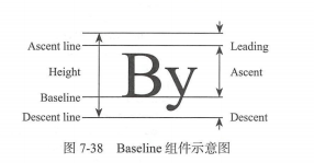
Baseline组件的主要属性如下所示:
| 属性名 | 类型 | 说明 |
|---|---|---|
| baseline | double | baseline数值,必须要有,从顶部算 |
| baselineType | TextBaseline | baseline类型,也是必须要有的,目前有两种类型。 alphabetic:对齐字符底部的水平线 ideographic:对齐表意字符的水平线 |
示例中三个元素在同一个水平线上。baseline也设定相同的值,示例代码如下:
import 'package:flutter/material.dart';
void main() => runApp(
  MaterialApp(
    title: 'Baseline基准线布局',
    home: LayoutDemo(),
  )
);
class LayoutDemo extends StatelessWidget{
  @override
  Widget build(BuildContext context) {
    return Scaffold(
      appBar: AppBar(title: Text('Baseline基准线布局'),),
      body: Row(
        // 水平等间距排列子组件
        mainAxisAlignment: MainAxisAlignment.spaceBetween,
        children: [
          // 设置基准线
          Baseline(
            baseline: 80.0,
            // 对齐字符底部水平线
            baselineType: TextBaseline.alphabetic,
            child: Text('AaBbCc', style: TextStyle(fontSize: 18.0, textBaseline: TextBaseline.alphabetic),),
          ),
          Baseline(
            baseline: 80.0,
            baselineType: TextBaseline.alphabetic,
            child: Container(
               40.0,
              height: 40.0,
              color: Colors.green,
            ),
          ),
          Baseline(
            baseline: 80.0,
            baselineType: TextBaseline.alphabetic,
            child: Text(
              'DeEeFf',
              style: TextStyle(
                fontSize: 26.0,
                textBaseline: TextBaseline.alphabetic
              ),
            ),
          )
        ],
      ),
    );
  }
}
Offstage(控制是否显示组件)
Offstage的作用很简单,通过一个参数来控制child是否显示,也算是比较常用的组件。主要属性如下:
| 属性名 | 类型 | 默认值 | 说明 |
|---|---|---|---|
| offstage | bool | true | 默认为true表示不显示,当为false的时候会显示该组件 |
编写一个控制文本显示隐藏的小示例,需要添加一个控制状态的变量offstage。示例中点击右下角按钮可以显示或隐藏文本内容。
import 'package:flutter/material.dart';
void main() => runApp(MyApp());
class MyApp extends StatelessWidget{
  @override
  Widget build(BuildContext context) {
    final appTitle = 'Offstage控制是否显示组件';
    return MaterialApp(
      title: appTitle,
      home: MyHomePage(title:appTitle),
    );
  }
}
class MyHomePage extends StatefulWidget {
  final String title;
  const MyHomePage({Key key, this.title}) : super(key: key);
  @override
  _MyHomePage createState() => new _MyHomePage();
}
class _MyHomePage extends State<MyHomePage> {
  // 控制状态是否显示文本组件
  bool offstage = true;
  @override
  Widget build(BuildContext context) {
    return Scaffold(
      appBar: AppBar(title: Text(widget.title),),
      body: Center(
        child: Offstage(
          offstage: offstage,
          child: Text('我出来啦!', style: TextStyle(fontSize: 36.0),),
        ),
      ),
      floatingActionButton: FloatingActionButton(
        onPressed: (){
          // 设置是否显示文本组件
          setState(() {
            offstage = !offstage;
          });
        },
        tooltip: "显示隐藏",
        child: Icon(Icons.flip),
      ),
    );
  }
}
Wrap(按宽高自动换行布局)
Wrap使用了Flex中的概念,某种意义上说跟Row、Column更加相似。单行的Wrap跟Row表现几乎一致,单列的Wrap则跟Column表现几乎一致。
但Row和Column都是单行单列的,Wrap却突破了这个限制,主轴空间不足时,则向次轴上去扩展显示。
对于一些需要按宽度和高度让child自动换行布局的场景可以使用Wrap。
| 属性名 | 类型 | 默认值 | 说明 |
|---|---|---|---|
| direction | Axis | Axis.horizontal | 主轴(mainAxis)的方向,默认为水平 |
| alignment | WrapAlignment | 主轴方向上的对齐方式,默认为start | |
| spacing | double | 0.0 | 主轴方向上的间距 |
| runAlignment | WrapAlignment | WrapAlignment.start | run的对齐方式,run可以理解为新的行或列,如果是水平布局的话,run可以理解为新的一行 |
| runSpacing | double | 0.0 | run的间距 |
| crossAxisAlignment | WrapCrossAlignment | WrapCrossAlignment.start | 主轴(crossAxis)方向上的对齐方式 |
| textDirection | TextDirection | 文本方向 | |
| verticalDirection | VerticalDirection | 定义children摆放顺序,默认是down |
接下来在示例中的容器放一些头像。使用Wrap组件包装后,头像可以按从左到右和从上到下的顺序排列头像元素。
import 'package:flutter/material.dart';
void main() => runApp(
  MaterialApp(
    title: 'Wrap按宽高自动换行布局',
    home: MyApp(),
  )
);
class MyApp extends StatelessWidget {
  @override
  Widget build(BuildContext context) {
    return Scaffold(
      appBar: AppBar(title: Text('Wrap按宽高自动换行布局'),),
      body: Wrap(
        spacing: 8.0,// Chip之间的间隙大小
        runSpacing: 4.0, // 行之间的间隙大小
        children: [
          Chip(
            // 添加圆形头像
            avatar: CircleAvatar(
              backgroundColor: Colors.lightGreen.shade800,
              child: Text('西门', style: TextStyle(fontSize: 10.0),),
            ),
            label: Text('西门吹雪'),
          ),
          Chip(
            avatar: CircleAvatar(
              backgroundColor: Colors.lightGreen.shade800,
              child: Text('司空', style: TextStyle(fontSize: 10.0),),
            ),
            label: Text('司空摘星'),
          ),
          Chip(
            avatar: CircleAvatar(
              backgroundColor: Colors.lightGreen.shade800,
              child: Text('婉清', style: TextStyle(fontSize: 10.0),),
            ),
            label: Text('木婉清'),
          ),
          Chip(
            avatar: CircleAvatar(
              backgroundColor: Colors.lightGreen.shade800,
              child: Text('一郎', style: TextStyle(fontSize: 10.0),),
            ),
            label: Text('萧十一郎'),
          ),
        ],
      ),
    );
  }
}
布局综合示例
这里我们通过一个风景区的介绍来讲解布局的综合运用,效果图如下所示:
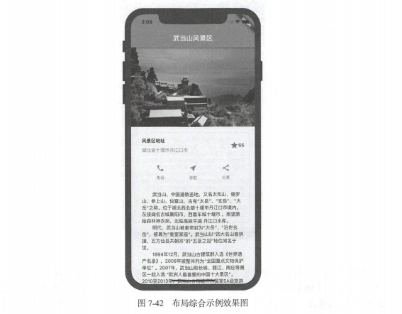
布局分析
整体布局使用垂直布局组件ListView进行滚动布局。一共有四大块:武当山图片、风景区地址、按钮组和景区介绍文本块。
注意:垂直方向使用ListView的原因是文本可能会很长而超出屏幕,如果使用Column则部分文本可能会看不到。
1) 风景区布局
风景区地址从横向上看需要使用一个水平排列的组件Row,水平方向总共有三个Child,分别为左侧文本区域、右侧图标及数字区域。
其中左侧文本区域继续细分需要使用垂直布局组件Column,上下各放置一个文本组件即可。右侧图标及数字是两个组件,所以横向上看是三个组件。
有个问题是左侧和右侧之间的空隙如何处理?这里需要用到Expandaed组件来包裹风景区地址以达到填充空隙的目的。
其中,Expanded组件可以使Row、Column、Flex等子组件在其主轴方向上展开并填充可用空间。必须用在Row、Column、Flex内。
2) 按钮组布局
在横向上用Row组件排列三个按钮布局组件。在纵向上用Column做三个相同的按钮,上面问按钮图标,下面为按钮文本。
完整的代码示例如下:
import 'package:flutter/material.dart';
void main() => runApp(MyApp());
class MyApp extends StatelessWidget{
  @override
  Widget build(BuildContext context) {
    // 风景区地址部分
    Widget addressContainer = Container(
      padding: EdgeInsets.all(32.0),
      child: Row(
        children: [
          // 使用Expanded防止内容溢出
          Expanded(
            child: Column(
              crossAxisAlignment: CrossAxisAlignment.start, // 顶部对齐
              children: [
                Container(
                  padding: EdgeInsets.only(bottom: 8.0),
                  child: Text('风景区地址', style: TextStyle(fontWeight: FontWeight.bold),),
                ),
                Text('湖北省十堰市丹江口市', style: TextStyle(color: Colors.grey[500]),)
              ],
            ),
          ),
          Icon(
            Icons.star,
            color: Colors.red[500],
          ),
          Text('66')
        ],
      ),
    );
    // 构建按钮组中单个按钮,参数为图标及文本
    Column buildButtonColumn(IconData icon, String lable){
      return Column(
        mainAxisSize: MainAxisSize.min, // 垂直方向大小最小化
        mainAxisAlignment: MainAxisAlignment.center, // 垂直方向居中对齐
        children: [
          Icon(icon, color: Colors.lightGreen[600],), // 上面为图标部分
          Container(
            margin: EdgeInsets.only(top: 8.0),
            child: Text(lable, style: TextStyle(fontSize: 12.0, fontWeight: FontWeight.w400, color: Colors.lightGreen[600]),),
          ),
        ],
      );
    }
    // 按钮组部分
    Widget buttonsContainer = Container(
      // 容器横向布局
      child: Row(
        mainAxisAlignment: MainAxisAlignment.spaceEvenly, // 水平方向均匀排列每个元素
        children: [
          buildButtonColumn(Icons.call, '电话'),
          buildButtonColumn(Icons.near_me, '导航'),
          buildButtonColumn(Icons.share, '分析'),
        ],
      ),
    );
    // 风景区介绍文本部分
    Widget textContainer = Container(
      padding: EdgeInsets.all(32.0),
      child: Text(
        '''
          武当山,中国道教圣地,又名大和山、谢罗山、参上山、仙室山 古有“大岳”“玄岳”“大岳”之称。
          位于湖北西北部十堪市丹江口市境内 东接闻名古城襄阳市,西靠车城十堪市,南望原始森林神
          农架,北临高峡平湖丹江口水库
          明代,武当山被皇帝封为“大岳飞“治世玄岳”,被尊为“皇室家庙 武当山以“四大名山皆拱棒,
          五方仙岳共朝宗”的“五岳之冠 地位问名于世。
          1994年12月武当山古建筑群入选《世界遗产名录》, 2006年被整体列为全国重点文物保护单位
          2007年武当山和长城、丽江、周庄等景区一起入选“欧洲人最喜爱的中国十大景区
          2010-2013 年,武当山分别被评为国家 4A 级旅游区、国家森林公园、中国十大避暑名山、海峡两
          岸交流基地 入选最美“国家地质公园
          截至 2013 武当山有古建筑 53 处,建筑面积 2.7 万平方米 建筑遗址 占地面积 20 多万
          平方米,全山保存各类文物 5035 件。
          武当山是道教名山和武当武术的发源地 被称为“亘古无双胜境 天下第一仙山 武当武术,是中
          华武术的重要流派 元未明初,道士张三丰集其大成 开创武当派。
        ''',
        softWrap: true,
      ),
    );
    return MaterialApp(
      title: '武当山风景区',
      // 自定义主题,主题颜色为绿色风格
      theme: ThemeData(
        brightness: Brightness.light, // 应用程序整体主题的亮度
        primaryColor: Colors.lightGreen[600], // App主要部分的背景色
        accentColor: Colors.orange[600], // 前景色(文本,按钮等)
      ),
      home: Scaffold(
        appBar: AppBar(title: Text('武当山风景区', style: TextStyle(color: Colors.white),), centerTitle: true,),
        body: ListView(
          children: [
            // 风景图片填充显示
            Image.asset('images/wudangshan.jpg',  600.0, height: 240.0, fit: BoxFit.cover,),
            addressContainer,
            buttonsContainer,
            textContainer,
          ],
        ),
      ),
    );
  }
}