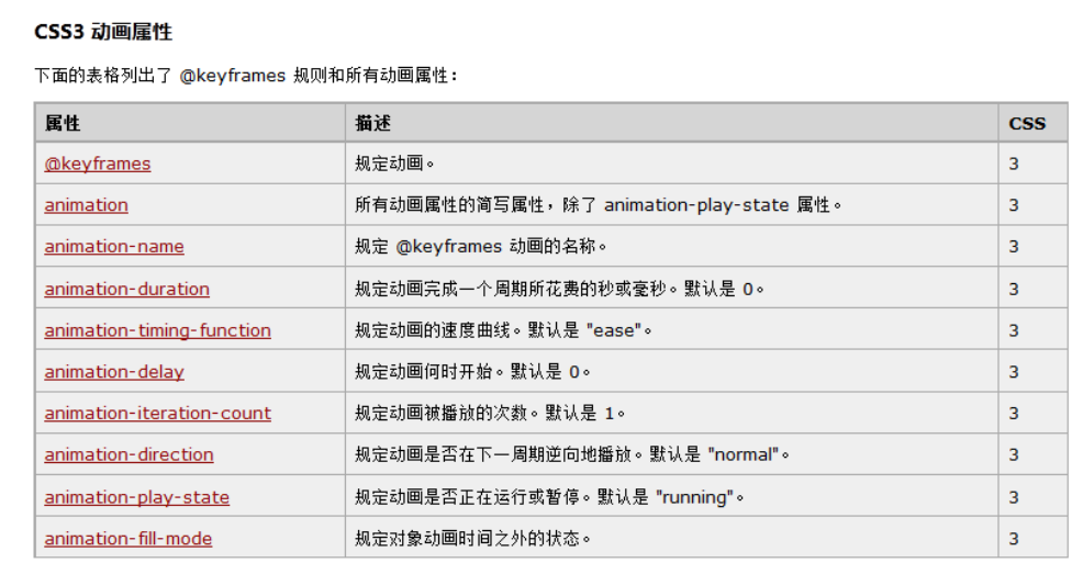
动画是CSS3中具有颠覆性的特征之一,可通过设置多个节点来精确控制一个或一组动画,常用来实现复杂的动画效果。
语法格式:
animation:动画名称 动画时间 运动曲线 何时开始 播放次数 是否反方向;
一、设置动画属性
1、定义动画名称
语法格式:
animation-name:none | ident [,none | ident] *;
-
- 初始值为 none,即没有动画
- 可以自己定义名字,每个名字是用来选择动画,提供动画的属性值。
2、定义动画时间
语法格式:
animation-duration: <time> [,<time>]*;
-
- 默认属性值为 0,意味着动画周期是直接的,不会有动画;
- 当值为负值时,则被视为 0 ;
3、定义动画速度曲线
语法格式:
animation-timing-function: ease | linear | ease-in | ease-out | ease-in-out | cubicbezier(<number>,<number>,<number>,<number>)
-
- ease:平滑过渡
- linear:线性过渡
- ease-in:由慢到快
- ease-out:由快到慢
- ease-in-out:由慢到快再到慢
- cublic-bezier:特殊的立方贝塞尔曲线效果
4、定义动画延迟时间
语法格式:
animation-delay: <time> [,<times>] *;
-
- 该属性定义 CSS 动画延迟播放的时间
- 默认动画延迟时间为 0
5、定义动画播放次数
该属性定义 CSS 动画的播放次数
语法格式:
animation-iteration-count: infinite | <number> [,infinite | <number>] *;
-
- 默认值为1,意味着动画将播放到结束一次;
- infinite:表示无限次,即动画重复;
- 如果取值为非整数,将导致动画结束一个周期的一部分;
- 如果取值为负值,则将导致在交替周期内反向播放动画。
6、定义播放方向
该属性定义 CSS 动画播放方向。
语法格式:
animation-direction: normal | alternate | reverse [,normal | alternate] *;
-
- 默认值为 normal,即动画的每次循环都向前播放;
- alternate:表示第偶数次向前播放,第奇数次反方向播放。
- reverse:每次都反方向播放。
7、定义播放状态
该属性定义动画的状态。
语法格式:
animation-play-state: paused | running
-
- 默认值为 running,表示动画正在播放;
- paused:表示动画已经暂停。
8、定义播放外状态
该属性定义动画外状态。
语法格式:
animation-fill-mode:none | forwards | backwards | both [,none | forwards | backwards | both] *;
-
- none:默认值,不设置对象动画之外的状态;
- forwards:设置对象状态为动画结束时的状态;
- backwards:设置对象状态为动画开始时的状态;
- both:设置对象状态为动画结束或开始的状态。
二、设置关键帧(定义动画)
语法格式:
@keyframes animationname {
      keyframes-selector {
            css-styles;
    }
}
-
- animationname:定义动画的名称;
- keyframes-selector:定义帧的时间未知,也就是动画时长的百分比。合法的值包括 0~100%、from(等价于0%)、to(等价于 100%)。
- css-style:表示一个或多个合法的 CSS样式属性。
Demo:
 1 .animation {
 2   animation-name: goback;
 3   animation-duration: 5s;
 4   animation-timing-function: ease;
 5   animation-iteration-count: infinite;
 6 }
 7 @keyframes goback {
 8   0%{}
 9   49%{
10     transform: translateX(1000px);
11   }
12   55%{
13     transform: translateX(1000px) rotateY(180deg);
14   }
15   95%{
16     transform: translateX(0) rotateY(180deg);
17   }
18   100%{
19     transform: translateX(0) rotateY(0deg);
20   }
21 }