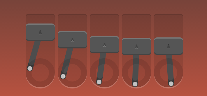
<!doctype html>
<html lang="en">
<head>
    <meta charset="UTF-8">
    <title>Robot</title>
    <link rel="stylesheet" href="style.css">
</head>
<body>
    <div id="robot">
        <div class="piston"><!--外框-->
            <div class="block"><!--字母框-->
                A
                <div class="arm"></div><!--摆杆-->
            </div>
            <div class="rotator"><!--低圈-->

            </div>
        </div>

        <div class="piston"><!--外框-->
            <div class="block"><!--字母框-->
                A
                <div class="arm"></div><!--摆杆-->
            </div>
            <div class="rotator"><!--低圈-->

            </div>
        </div>

        <div class="piston"><!--外框-->
            <div class="block"><!--字母框-->
                A
                <div class="arm"></div><!--摆杆-->
            </div>
            <div class="rotator"><!--低圈-->

            </div>
        </div>

        <div class="piston"><!--外框-->
            <div class="block"><!--字母框-->
                A
                <div class="arm"></div><!--摆杆-->
            </div>
            <div class="rotator"><!--低圈-->

            </div>
        </div>

        <div class="piston"><!--外框-->
            <div class="block"><!--字母框-->
                A
                <div class="arm"></div><!--摆杆-->
            </div>
            <div class="rotator"><!--低圈-->

            </div>
        </div>
    </div>
</body>
</html>
css
/*定义动画*/
/*上下摆动*/
@-webkit-keyframes topbottom{
    0% { margin-top: 0; }
    50% { margin-top: 80px; }
    100% { margin-top: 0; }
}
@keyframes topbottom{
    0% { margin-top: 0; }
    50% { margin-top: 80px; }
    100% { margin-top: 0; }
}
/*左右摇摆*/
@-webkit-keyframes rightleft {
    0% { -webkit-transform: rotate(0); }
    25% { -webkit-transform: rotate(-18deg); }
    50% { -webkit-transform: rotate(0); }
    75% { -webkit-transform: rotate(18deg); }
    100% { -webkit-transform: rotate(0); }
}
@keyframes rightleft {
    0% { -webkit-transform: rotate(0); }
    25% { -webkit-transform: rotate(-18deg); }
    50% { -webkit-transform: rotate(0); }
    75% { -webkit-transform: rotate(18deg); }
    100% { -webkit-transform: rotate(0); }
}
*{
    margin: 0;
    padding: 0;
    list-style: none;
}
img{
    border:none;
}
body{
    text-align: center;
    margin: 60px 0 0;
    background:linear-gradient(to bottom, #333, tomato);
    /*渐变 上到下*/
}
html{
    height: 100%;
}
#robot{
    position: absolute;
    width: 540px;
    height: 250px;
    margin: auto;
    left: 0;
    top: 0;
    bottom: 0;
    right: 0;
    color: #444;
    font-weight: 700;
    text-shadow:0 -1px 1px rgba(0,0,0,0.7),0 1px 1px rgba(255,255,255,0.4);
    /*投影*/
    font-family: 'Oswald', sans-serif;
}
.piston{
    float: left;
    margin-right: 10px;
    position: relative;
    width: 100px;
    height: 250px;
    background: rgba(0,0,0,0.1);
    border-radius: 10px 10px 50px 50px;
    box-shadow: 0 -4px 0 rgba(0,0,0,0.2), 0 4px 0 rgba(255,255,255,0.2);
}
.piston:last-child{
    margin: 0;
}
.block{
    position: relative;
    width: 100px;
    height: 60px;
    line-height: 60px;
    background: #555;
    border-radius: 10px;
    animation:topbottom 1.2s cubic-bezier(0.5,0,0.5,1) infinite;
    /*cubic-bezier动画方式(曲线)*/
    -webkit-animation:topbottom 1.2s cubic-bezier(0.5,0,0.5,1) infinite;
    box-shadow: inset 0 -4px 0 rgba(0,0,0,0.2), inset 0 4px 0 rgba(255,255,255,0.2)
}
.piston:nth-child(1) .block { -webkit-animation-delay: 0s; animation-delay: 0s; }
.piston:nth-child(2) .block { -webkit-animation-delay: .1s; animation-delay: .1s; }
.piston:nth-child(3) .block { -webkit-animation-delay: .2s; animation-delay: .2s; }
.piston:nth-child(4) .block { -webkit-animation-delay: .3s; animation-delay: .3s; }
.piston:nth-child(5) .block { -webkit-animation-delay: .4s; animation-delay: .4s; }
.arm{
    position: absolute;
    top:50%; left:50%;
    margin: -10px 0 0 -10px;
    width: 20px;
    height: 150px;
    background: #555;
    border-radius: 10px;
    box-shadow: inset 0 -22px 0 rgba(0,0,0,.2);
    z-index: -110;
    -webkit-transform-origin: center 10px;
    -webkit-animation: arm 1.2s linear infinite;
    -webkit-animation-delay: inherit;
    transform-origin: center 10px;
    animation: rightleft 1.2s linear infinite;
    animation-delay: inherit;
}
.arm:before,.arm:after{
    content:"";
    position: absolute;
    left: 0;
    right: 0;
    height: 16px;
    width: 16px;
    border-radius: 50%;
    margin: 2px;
    background:#eee;
}
.arm:before{
    top: 0;
}
.arm:after{
    bottom: 0;
}
.rotator{
    position: absolute;
    bottom: 0;
    width: 100px;
    height: 100px;
    border:20px solid rgba(0,0,0,0.1);
    box-sizing:border-box;
    z-index: -110;
    border-radius: 50%;
}