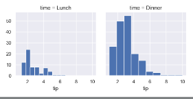
1. sns.Facetgrid 画一个基本的直方图
import numpy as np
import pandas as pd
from scipy import stats, integrate
import matplotlib.pyplot as plt

import seaborn as sns
sns.set(color_codes=True)
np.random.seed(sum(map(ord, 'distributions')))

tips = sns.load_dataset('tips')
# 使用sns.Facetgrid 画一个基本的直方图
g = sns.FacetGrid(tips, col='time')
g.map(plt.hist, 'tip')
plt.show()
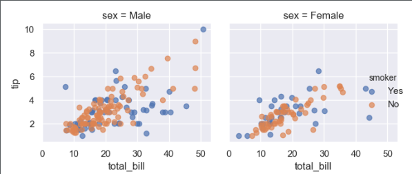
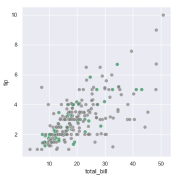
2 . 添加sns.Facetgrid属性hue,画散点图
g = sns.FacetGrid(tips, col='sex', hue='smoker')
g.map(plt.scatter, 'total_bill', 'tip', alpha=0.7)
g.add_legend()
plt.show()
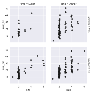
3. 使用color='0.1'来定义颜色, margin_titles=True把标题分开, fit_reg是否画拟合曲线,sns.regplot画回归图
g = sns.FacetGrid(tips, col='time', row='smoker', margin_titles=False)
g.map(sns.regplot, 'size', 'total_bill', color='0.1', fit_reg=False, x_jitter=0.1)
plt.show()
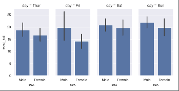
4. 绘制条形图,同时使用Categorical 生成col对应顺序的条形图, row_order 写入新的顺序的排列
g = sns.FacetGrid(tips, col='day', size=4, aspect=0.5)
g.map(sns.barplot, 'sex', 'total_bill')
plt.show()
# 指定col顺序进行画图
from pandas import Categorical
# 打印当前的day的顺序
ordered_days = tips.day.value_counts().index
# 指定顺序
ordered_sys = Categorical(['Thur', 'Fri', 'Sat', 'Sun'])
g = sns.FacetGrid(tips, col='day', size=4, aspect=0.5, row_order=ordered_days)
g.map(sns.barplot, 'sex', 'total_bill')
plt.show()
5. 绘制多变量指定颜色,通过palette添加颜色
pal = {'Lunch':'seagreen', 'Dinner':'gray'}
# size 指定外面的大小
g = sns.FacetGrid(tips, hue='time', palette=pal, size=5)
# s指定圆的大小, linewidth=0.5边缘线的宽度,egecolor边缘的颜色
g.map(plt.scatter, 'total_bill', 'tip', s=50, alpha=0.7, linewidth=0.5, edgecolor='white')
plt.show()
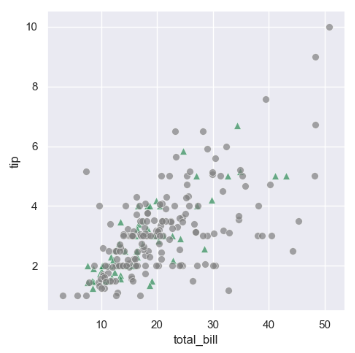
6. hue_kws={'marker':['^', 'o']}
pal = {'Lunch':'seagreen', 'Dinner':'gray'}
# size 指定外面的大小
g = sns.FacetGrid(tips, hue='time', palette=pal, size=5, hue_kws={'marker':['^', 'o']})
# s指定圆的大小, linewidth=0.5边缘线的宽度,egecolor边缘的颜色
g.map(plt.scatter, 'total_bill', 'tip', s=50, alpha=0.7, linewidth=0.5, edgecolor='white')
plt.show()
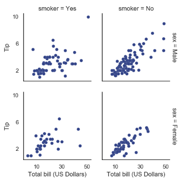
7. 设置set_axis_labels 设置坐标, g.fig.subplots_adjust(wspace=0.2, hspace) 表示子图与子图之间的间隔
with sns.axes_style('white'):
    g = sns.FacetGrid(tips, row='sex', col='smoker', margin_titles=True, size=2.5)

# lw表示球的半径
g.map(plt.scatter, 'total_bill', 'tip', color='#334488', edgecolor='white', lw=0.1)
g.set_axis_labels('Total bill (US Dollars)', 'Tip')
# 设置x轴的范围
g.set(xticks=[10, 30, 50], yticks=[2, 6, 10])
# wspace 和 hspace 设置子图与子图之间的距离
g.fig.subplots_adjust(wspace=0.2, hspace=0.2)
# 调子图的偏移
# g.fig.subplots_adjust(left=)
plt.show()
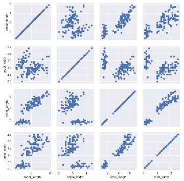
8. sns.PairGrid(iris) # 进行两两变量绘图
g = sns.PairGrid(iris)
g.map(plt.scatter)
plt.show()
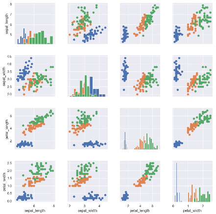
9. 将主对角线和非对角线的画图方式分开
g = sns.PairGrid(iris)
g.map_diag(plt.hist)
g.map_offdiag(plt.scatter)
plt.show()

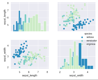
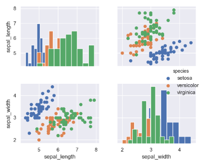
10 多加上一个属性进行画图操作
g = sns.PairGrid(iris, hue='species')
g.map_diag(plt.hist)
g.map_offdiag(plt.scatter)
g.add_legend()
plt.show()
11. 只取其中的两个属性进行画图vars()
g = sns.PairGrid(iris, hue='species', vars=['sepal_length', 'sepal_width'])
g.map_diag(plt.hist)
g.map_offdiag(plt.scatter)
g.add_legend()
plt.show()
12. palette='green_d' 使用渐变色进行画图,取的颜色是整数的
g = sns.PairGrid(iris, hue='species', vars=['sepal_length', 'sepal_width'], palette='GnBu_r')
g.map_diag(plt.hist)
g.map_offdiag(plt.scatter)
g.add_legend()
plt.show()