前七节将Ribbon的功能大致介绍了一番,本节来介绍一些特殊控件的使用
DropDownButton控件
当前控件是显示下拉功能的基本组件,其配合Gallery能实现诸多特殊功能,代码如下所示
|
<Fluent:DropDownButton Header="Pink" Icon="ImagesPink.png" LargeIcon="ImagesPinkLarge.png"> <Fluent:Gallery> <Image Source="ImagesRedLarge.png" Stretch="None" /> <Image Source="ImagesGreenLarge.png" Stretch="None" /> <Image Source="ImagesBlueLarge.png" Stretch="None" /> </Fluent:Gallery> </Fluent:DropDownButton> |
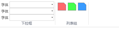
当前主要显示一个下拉控件,显示一些下拉显示,如下图

Gallery 控件
用于显示一个组合列表的功能,其基本代码形式如下:
|
<Fluent:RibbonGroupBox Header="列表组" > <Fluent:Gallery> <Image Source="ImagesRedLarge.png" Stretch="None" /> <Image Source="ImagesGreenLarge.png"Stretch="None" /> <Image Source="ImagesBlueLarge.png" Stretch="None" /> </Fluent:Gallery> </Fluent:RibbonGroupBox> |
其显示效果如图
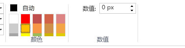
ColorGallery控件
用于实现颜色的选择控件,其继承自Gallery
|
<Fluent:ColorGallery Mode="StandardColors" SelectedColor="{Binding ColorViewModel.StandardColor, Mode=TwoWay}" /> |
其显示效果如图

Spinner控件
|
<Fluent:Spinner KeyTip="KA" InputWidth="75" Format="0 px" Header="数值:" Icon="Images/Warning.png" /> |
其显示效果如图
还有一些不太常用的控件,可以查看源码,细细分析。