1、Qt风格
在设计模式下选择“工具-Form Editor(界面编辑器)-Preview in(预览于)”可以选择Windows风格、Fusion风格等。Qt中的风格是继承自抽象基类QStyle的类,比如QWindowsStyle微软风格、QMotifStyle为Motif风格、QMacStyle为MAC OS风格(只能在MAC OS下使用)。
可以调用QApplication的setStyle()方法来设置程序使用的风格,也可以调用部件的setStyle()方法来设置部件的风格,如下所示。可以使用QStyleFactory::key()方法来获取当前系统所支持的风格。也可以通过子类化Qt风格类获得QStyle类来自定义风格,详见Qt的Style示例程序,关于Qt风格的更多内容可以查看Styles and Style Aware Widgets关键字。


#include "mainwindow.h"
#include <QApplication>
#include <QMotifStyle>

int main(int argc, char *argv[])
{
    QApplication a(argc, argv);
    a.setStyle(new QMotifStyle); //设置程序使用Motif风格

    MainWindow w;
    w.show();

    return a.exec();
}
#include "mainwindow.h"
#include "ui_mainwindow.h"
#include <QWindowsXPStyle>

MainWindow::MainWindow(QWidget *parent) :
    QMainWindow(parent),
    ui(new Ui::MainWindow)
{
    ui->setupUi(this);

    ui->progressBar->setStyle(new QWindowsXPStyle); //进度条使用xp风格(该风格只在xp系统下有效)
}
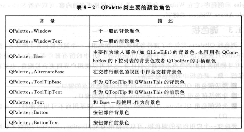
2、调色板
QPalette调色板包含了激活(QPalette::Active)、非激活(QPalette::Inactive)、失效(QPalette::Disabled)3种状态的颜色组。可以通过QApplication的palette()方法来获得当前程序的调色板,然后对其进行设置后调用QApplication的setPalette()来设置当前程序的调色板。也可以使用部件的palette()和setPalette()对部件的调色板进行单独设置,或者通过设计模式下的属性编辑器通过修改palette属性来设置部件的调色板。
#include "mainwindow.h"
#include "ui_mainwindow.h"
#include <QPalette>

MainWindow::MainWindow(QWidget *parent) :
    QMainWindow(parent),
    ui(new Ui::MainWindow)
{
    ui->setupUi(this);

    QPalette pale = ui->pushButton->palette(); //获得按钮当前调色板
    pale.setColor(/*QPalette::ColorGroup::All,*/ QPalette::ButtonText, Qt::red); //设置按钮文本颜色为红色
    pale.setColor(QPalette::ColorGroup::Disabled, QPalette::Button, Qt::green); //设置按钮在失效状态下的背景颜色
    ui->pushButton->setPalette(pale); //使用调色板
}
3、样式表
对于自定义部件外观,使用样式表比调色板要强大的多,它可以很容易的实现应用程序的换肤功能。它受到了HTML的CSS(Cascading Style Sheets层叠样式表)的启发。类似调色板,可以通过QApplication::setStyleSheet()来设置当前程序的样式,也可以使用QWidget::setStyleSheet()设置指定部件(包括其子部件)的样式:
#include "mainwindow.h"
#include "ui_mainwindow.h"

MainWindow::MainWindow(QWidget *parent) :
    QMainWindow(parent),
    ui(new Ui::MainWindow)
{
    ui->setupUi(this);

    ui->horizontalSlider->setStyleSheet("background:blue"); //设置水平滑块背景颜色为蓝色

    ui->pushButton->setStyleSheet("background:yellow;color:blue"); //设置按钮背景色为黄色,文本颜色为蓝色

    setStyleSheet("QPushButton{background:red}QSlider{background:red}");//设置按钮子部件和水平滑块子部件的背景颜色为红色,该行不起作用,因为与前面有冲突

    setStyleSheet("QWidget#centralWidget{background:green}"); //设置对象名为centralWidget的QWidget子部件的背景颜色为绿色
}
也可以在设计模式下设置部件上按钮的样式表,方法为右键-改变样式表-输入QPushButton{}(大括号不能在一行,且光标留在大括号内)-然后就可以选择添加颜色来设置背景颜色、文本颜色、添加资源来使用图片、设置渐变色、字体等的样式。
样式表的样式规则由选择符+声明(属性:值)组成,如QPushButton{background:red}中QPushButton为选择符,{background:red}为声明。多个属性值使用分号隔开,如QPushButton{color:red;background-color:white}。不同的选择符使用相同的声明可以这样来写:QPushButton,QLineEdit{color:red}。
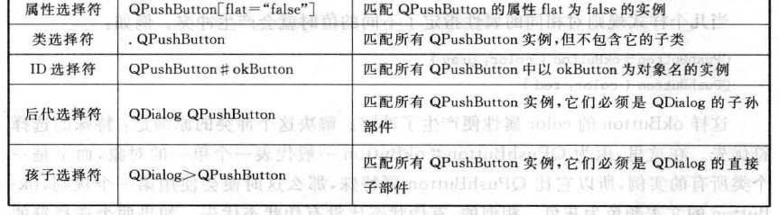
样式表中常用的选择符类型有:

一些部件修改样式可能需要访问它们的子控件,如对QComboBox的下拉按钮改变样式:QComboBox::drop-down{image:url(dropdown.png)},其中drop-down为子控件。
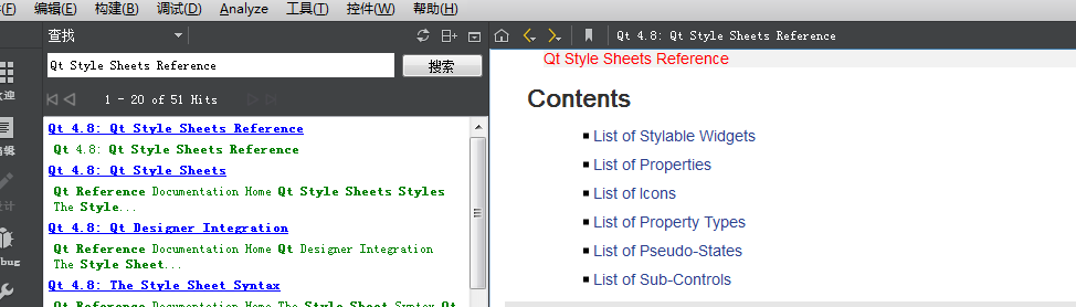
可以在QT帮助中搜索Qt Style Sheets Reference, 如下所示,其中的 List of Stylable Widgets为支持使用样式表的所有部件,List of Properties为样式表中所有的属性,List of Sub-Controls为所有可用的子控件, List Of Pseudo-States为所支持的所有伪状态。 还可以在帮助中输入Qt Style Sheets Examples关键字,其对应的文档中列举了很多常用部件使用样式表进行自绘的方法,在Qt示例程序的Widgets分类下还有一个Style Sheet示例程序。
选择符可以包含伪状态,伪状态出现在选择符之后,用冒号隔离,如QPushButton:hover{color:red}表示鼠标悬停按钮时才应用,QPushButton:!hover{color:red}表示鼠标没有悬停时才应用,QPushButton:hover:checked{color:red}表示鼠标悬停在一个选中按钮上时才应用,QPushButton:hover,QPushButton:checked{color:red}鼠标悬停或按钮选中才应用。
可以使用#来设置样式表只适用于指定ObjectName的对象,如QPushButton#okButton{color:gray}为指定ObjectName为okButton的按钮的文本颜色。样式规则的属性可能会出现冲突,如QPushButton#okButton{color:gray}和QPushButton{color:red}的color属性就产生了冲突,解决冲突的原则是特殊的选择符优先,如QPushButton#okButton优先于QPushButton,另外就是有伪状态比没有伪状态优先,如果都相同的话则后面出现的比前面的优先。当父部件和子部件的样式发生冲突时,部件自己的样式表优先于任何继承的样式表。
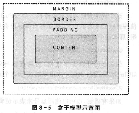
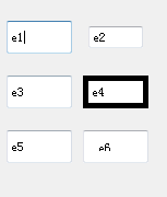
当使用样式表时,每个部件都拥有内容content、填衬padding、边框border、边距margin四个属性,默认margin、padding的值都是0,下面是图示和代码示例及效果:
 QLineEdit* e1 = new QLineEdit(this), *e2 = new QLineEdit(this);
    e1->setGeometry(240, 50, 60, 30);
    e2->setGeometry(310, 50, 60, 30);
    e2->setStyleSheet(" QLineEdit { margin: 5px }");

    QLineEdit* e3 = new QLineEdit(this), *e4 = new QLineEdit(this);
    e3->setGeometry(240, 100, 60, 30);
    e4->setGeometry(310, 100, 60, 30);
    e4->setStyleSheet("QLineEdit{border: 5px solid black}");

    QLineEdit* e5 = new QLineEdit(this), *e6 = new QLineEdit(this);
    e5->setGeometry(240, 150, 60, 30);
    e6->setGeometry(310, 150, 60, 30);
    e6->setStyleSheet("QLineEdit{padding: 10px}");
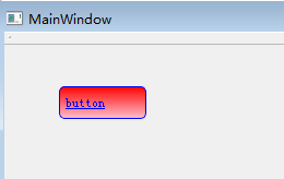
下面是QPushButton使用样式表自绘的一个示例:
#include "mainwindow.h"
#include "ui_mainwindow.h"
#include <QDebug>
#include <QPushButton>

MainWindow::MainWindow(QWidget *parent) :
    QMainWindow(parent),
    ui(new Ui::MainWindow)
{
    ui->setupUi(this);

    QPushButton* btn = new QPushButton("button", this);
    btn->setGeometry(50, 50, 80, 30);
    btn->setStyleSheet("QPushButton{border: 1px solid blue;"
                        "border-radius:5px;"
                        "background-color: qlineargradient(x1: 0, y1: 0, x2: 0, y2: 1,"
                                                          "stop: 0 red, stop: 1 pink);"
                        "color: blue;"
                        "text-align: left;"
                        "padding-left: 5px;"
                        "text-decoration: underline;"
                       "}"

                       "QPushButton:hover{color: green;}"

                       "QPushButton:pressed{background-color: black;}"
                       );
}

MainWindow::~MainWindow()
{
    delete ui;
}
下面是其它的一些样式表属性及其说明:
subcontrol-origin:子控件的坐标区域,默认是padding,其它可以为margin、border、content。
subcontrol-position:示子控件在subcontrol-origin内的对齐方式,取值可以为left、right、top、bottom、center,如:
QSpinBox::up-button {
     image: url(:/images/spinup.png);
     subcontrol-origin: content;
     subcontrol-position: right top;
 }
position:取值可以为relative(默认)和absolute,relative表示left、right、top、bottom是子控件相对于当前位置来偏移指定长度,absolute表示相对于父窗口的左边框,如:
QSpinBox::down-button { left: 2px}。
background-origin:部件的背景区域,取值为margin、border、padding(默认)、content,可以和 background-position或background-image配合使用,如:
 QFrame {
     background-image: url(:/images/header.png);
     background-position: top left;
     background-origin: content;
 }
background-position:背景在background-origin的对齐方式,取值可以为left、top、bottmo、right、center,默认值为top left。
height :子控件或部件的高度。
使用background-image属性来为部件指定一个背景图片,background-clip属性设置可以在边框以外的区域进行绘制,background-origin设置图片原点,background-repeat设置图片重复方式。如果想要背景图片随着部件大小变化应该使用border-image属性。image属性可以在border-image之上绘制一个图片,而且图片不会被缩放,图片对齐方式可以使用image-position属性。
下面为样式表的使用示例,添加图片资源的方法为:首先项目右键添加Qt资源文件(名称可以设置为myResource,路径为当前项目目录,点击确定后可以看到当前项目下有了一个qrc文件)->如果没有弹出资源编辑器页面的话右键点击qrc文件选择open in editor,然后点击下方的“添加”按钮,选择添加前缀,可以编辑前缀名为/image,按下ctrl+s保存->然后再点击下方的"添加按钮",选择添加文件来添加图片文件(图片文件应该在qrc所在目录下或其子目录下),最后按下ctrl+s保存,然后在程序中就可以通过":/image/imageFolder/imageName.png"来使用图片。
#include "mainwindow.h"
#include "ui_mainwindow.h"

MainWindow::MainWindow(QWidget *parent) :
    QMainWindow(parent),
    ui(new Ui::MainWindow)
{
    ui->setupUi(this);

    //设置背景图片
    setStyleSheet("QWidget#centralWidget{border-image:url(:/image/image/beijing.png)}" //使用图片背景

                  "QPushButton{background:rgba(0,255,0,255);" //背景色
                               "border-style:solid;" //边框样式
                               "border-4px;" //边框宽度
                               "border-radius:10px;" //边框圆角
                               "border-color:rgba(255,0,0,255);" //边框颜色
                               "font:bold 14px;" //粗体和字体大小
                               "padding:10px;}" //边衬
                   "QPushButton:hover{background:yellow;" //鼠标悬停时背景色
                                      "border-color:green;" //鼠标悬停时边框色
                                      "color:blue}" //鼠标悬停时文本色

                  "QSlider::handle:horizontal{image:url(:/image/image/sliderHandle.png)}" //水平滑块的手柄使用指定图片
                  );
}
可以通过QApplication::setStyleSheet()设置当前程序的样式来达到换肤的效果,比如下面是将两个不同的样式设置语句保存到了my1.qss和my2.qss文件(qss文件为向项目添加的文本文件,然后打开qrc资源文件添加/qss前缀后再添加这两个qss文件到该前缀下),其中的qApp为全局应用程序对象:
#include "mainwindow.h"
#include "ui_mainwindow.h"
#include <QFile>

MainWindow::MainWindow(QWidget *parent) :
    QMainWindow(parent),
    ui(new Ui::MainWindow)
{
    ui->setupUi(this);

    //初始使用my1.qss中设置的样式
    QFile file(":/qss/my1.qss");
    file.open(QFile::ReadOnly);
    QString styleSheet = file.readAll();
    qApp->setStyleSheet(styleSheet);
}

void MainWindow::on_pushButton_clicked()
{
    //点击按钮后使用my2.qss中设置的样式
    QFile file(":/qss/my2.qss");
    file.open(QFile::ReadOnly);
    QString styleSheet = file.readAll();
    qApp->setStyleSheet(styleSheet);
}
4、不规则窗体
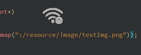
Qt中使用部件遮罩mask来实现不规则窗体,下面使用了一张背景透明的图片来为窗口设置遮罩,其效果如下:
#include "widget.h"
#include "ui_widget.h"
#include <QBitmap>
#include <QPainter>

Widget::Widget(QWidget *parent) :
    QWidget(parent),
    ui(new Ui::Widget)
{
    ui->setupUi(this);

    QPixmap pix;
    pix.load(":/resource/image/testImg.png");
    resize(pix.size());
    setMask(pix.mask());
}

void Widget::paintEvent(QPaintEvent*)
{
    QPainter painter(this);
    painter.drawPixmap(0, 0, QPixmap(":/resource/image/testImg.png"));
}
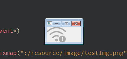
如果上面的setMask()方法注释掉的话其效果如下:
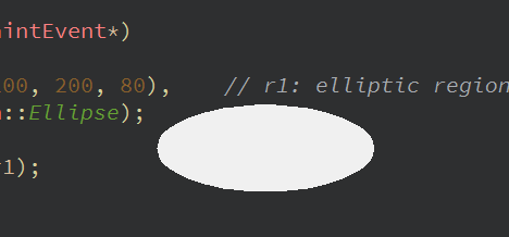
也可以使用QRegion来实现不规则窗体:
#include "widget.h"
#include "ui_widget.h"
#include <QPainter>

Widget::Widget(QWidget *parent) :
    QWidget(parent),
    ui(new Ui::Widget)
{
    ui->setupUi(this);

    QRegion r1(QRect(100, 100, 200, 80), QRegion::Ellipse);
    setMask(r1);
}

void Widget::paintEvent(QPaintEvent*)
{
    QRegion r1(QRect(100, 100, 200, 80),    // r1: elliptic region
                    QRegion::Ellipse);
    QPainter painter(this);
    painter.setClipRegion(r1);
}
5、透明窗体
如果想实现部件窗体的透明显示效果,可以下面代码来设置:
ui->pushButton->setStyleSheet("background:rgba(255,0,0,25.5)"); //设置按钮背景不透明度为10%
如果是顶级部件窗口的话可以使用setWindowOpacity()方法,它还会将子部件设置为透明的:
Widget::Widget(QWidget *parent) :
    QWidget(parent),
    ui(new Ui::Widget)
{
    ui->setupUi(this);

    setWindowOpacity(0.3); //设置窗口(包括其子部件)不透明度为10%
}
如果是想设置窗口100%透明,其上的部件不透明的话可以调用以下两个方法:
Widget::Widget(QWidget *parent) :
    QWidget(parent),
    ui(new Ui::Widget)
{
    ui->setupUi(this);

    setWindowFlags(Qt::FramelessWindowHint);
    setAttribute(Qt::WA_TranslucentBackground);
}
如果想指定窗口的透明度,其上的部件不透明的话可以使用下面方法:
Widget::Widget(QWidget *parent) :
    QWidget(parent),
    ui(new Ui::Widget)
{
    ui->setupUi(this);

    setWindowFlags(Qt::FramelessWindowHint);
    setAttribute(Qt::WA_TranslucentBackground);
}

void Widget::paintEvent(QPaintEvent*)
{
    QPainter painter(this);
    painter.fillRect(rect(), QColor(255, 0, 0, 25)); //设置不透明度为90%
}