一直在美化自己的博客,但是看到别人比自己做的好的就想知道他们是怎么弄的。博客美化之路一直更新,希望把自己的博客做的更加艺术一些。
1 基本设置
若想尝试此样式的可以点击此处下载,另存为之后上传至你自己的博客园文件中,然后在 博客设置->设置->页首Html代码 中添加引用:
也可以复制下来粘贴到博客设置->设置->页面定制CSS代码,同样的效果。
<link type="text/css" rel="stylesheet" href="https://files.cnblogs.com/files/mhq-martin/bundle-SimpleMemory-A5_v29.css"/>
2 自定义“推荐|反对”按钮
这个已经在上面的CSS样式里面,这里展示给大家一下代码。主要用fixed来约束此按钮的位置,将其置于屏幕右下角
#div_digg{
  position:fixed;
  bottom:5px;
  140px;
  right:30px;
  border:2px solid #085;
  padding:10px;
  background-color:#fff;
  opacity:0.3;
  border-radius:5px 5px 5px 5px !important;
  box-shadow:0 0 0 1px #5F5A4B, 1px 1px 6px 1px rgba(10, 10, 0, 0.5);
  transition-duration: 0.5s;
}
#div_digg:hover{
  opacity:1;
}
3 自定义返回顶部小火箭
将下面的样式和Javascript直接复制到 博客设置->设置->页首Html代码:
<style>
#back-top {
     position: fixed;
     bottom: 10px;
     right: 5px;
     z-index: 99;
}
#back-top span {
      50px;
     height: 64px;
     display: block;
     background:url(http://images.cnblogs.com/cnblogs_com/mhq-martin/1211077/t_rocket.png) no-repeat center center;
}
#back-top a{outline:none}
</style>
<script type="text/javascript">
$(function() {
    // hide #back-top first
    $("#back-top").hide();
    // fade in #back-top
    $(window).scroll(function() {
        if ($(this).scrollTop() > 500) {
            $('#back-top').fadeIn();
        } else {
            $('#back-top').fadeOut();
        }
    });
    // scroll body to 0px on click
    $('#back-top a').click(function() {
        $('body,html').animate({
            scrollTop: 0
        }, 800);
        return false;
    });
});
</script>
<p id="back-top" style="display:none"><a href="#top"><span></span></a></p>
4 添加博文目录
在 数据之巅 系列文章中介绍了两种形式的目录导航,按需索取即可。
将下面的Javascript直接复制到 博客设置->设置->页脚Html代码:
<meta name="viewport" content="width=device-width, initial-scale=1.0, maximum-scale=1.0, user-scalable=no">
<script type="text/javascript">
//生成目录索引列表
function GenerateContentList()
{
    var jquery_h3_list = $('#cnblogs_post_body h1');//如果你的章节标题不是h3,只需要将这里的h3换掉即可
    if(jquery_h3_list.length>0)
    {
        var content = '<a name="_labelTop"></a>';
        content    += '<div id="navCategory">';
        content    += '<p style="font-size:16px"><b>阅读目录</b></p>';
        content    += '<ul>';
        for(var i =0;i<jquery_h3_list.length;i++)
        {
            var go_to_top = '<div style="text-align: right"><a href="#_labelTop">回到目录</a><a name="_label' + i + '"></a></div>';
            $(jquery_h3_list[i]).before(go_to_top);
            var li_content = '<li><a href="#_label' + i + '">' + $(jquery_h3_list[i]).text() + '</a></li>';
            content += li_content;
        }
        content    += '</ul>';
        content    += '</div>';
        if($('#cnblogs_post_body').length != 0 )
        {
            $($('#cnblogs_post_body')[0]).prepend(content);
        }
    }
}
GenerateContentList();
</script>
5 添加头像
侧边栏公告出显示自己的头像,首先将想要显示的图片上传至博客相册,然后将下面的引用复制到 博客设置->设置->博客侧边栏公告:
<img src="http://images.cnblogs.com/cnblogs_com/mhq-martin/1211092/o_%e6%b3%b71.jpg" alt="mhq_martin的头像" class="img_avatar" width="250px" style="border-radius:50%">
6 添加自己的博客权限
这个没有做好,希望博客园里的大神指导一下。
首先在博客设置->设置->页首Html代码:
<!--博客权限.-->
<style><!--
* {
 margin:0;
 padding:0;
}
h3 {
 font-size:15px;
 color:#0066CC;
 line-height:1.5em;
}
p {
 font-size:12px;
 text-indent:2em;
 line-height:1.5em;
}
#container {
 background-color:#33FFCC;
 675px;
 height:200px;
 margin:0 auto;
 margin-top:10px;
 padding-right:3px;
 border:1px dotted #666;
 position:relative;
}
#leftContent {
 position:absolute;
 top:2px;
 left:4px;
}
#leftContent img{
 height:192px;
 200px;
 border:1px solid #ccc;
 padding:2px;
}
#rightContent {
 margin-left:220px;
}
--></style>
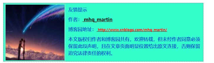
然后每次写完博客后,再点击用HTML编写,末尾加上代码:
<div id="container"> <div id="leftContent"><img src="https://ss1.bdstatic.com/70cFvXSh_Q1YnxGkpoWK1HF6hhy/it/u=747535597,1152462222&fm=27&gp=0.jpg" alt="" /></div> <div id="rightContent"> <h3>友情提示</h3> <h3>作者:<a href="http://www.cnblogs.com/mhq-martin/"> mhq_martin</a></h3> <h3>博客园地址:<a href="http://www.cnblogs.com/mhq-martin/"> <span style="color: red; font-size: xx-small;">http://www.cnblogs.com/mhq-martin/</span></a></h3> <h3>本文版权归作者和博客园共有,欢迎转载,但未经作者同意必须保留此段声明,且在文章页面明显位置给出原文连接,否则保留追究法律责任的权利。</h3> </div> </div>
效果如图:
7 添加博客访问次数
在博客设置->设置->博客侧边栏公告添加:
<!--访问次数.--> <div align ="left" style="font-size:20px;font-weight:bold;">访次: <a href="http://www.amazingcounters.com"><img border="0" src="http://cc.amazingcounters.com/counter.php?i=3219475&c=9658738" alt="AmazingCounters.com"></a> 次</div>
8 添加动态日历
在博客设置->设置->博客侧边栏公告添加:
<!--日历.-->
<embed src="http://www.blogclock.cn/swf/S100032437584a4-4.swf" Width="150px" Height="345px" type="application/x-shockwave-flash" quality="high" wmode="transparent"></embed>
9 添加qq加好友
在博客设置->设置->博客侧边栏公告添加:
<!--qq.--> <a target="_blank" href="http://wpa.qq.com/msgrd?v=3&uin=2713095133&site=qq&menu=yes"><img border="0" src="http://wpa.qq.com/pa?p=1:2713095133:13" alt="有事您Q我" title="有事您Q我"></a>
10 添加 Github 彩带
在博客设置->设置->页首Html代码添加:
<!--Github彩带.-->

<a href="https://github.com/MartinWuQing"><img style="position: absolute; top: 0; right: 0; border: 0; z-index: 999999999" src="https://camo.githubusercontent.com/e7bbb0521b397edbd5fe43e7f760759336b5e05f/68747470733a2f2f73332e616d617a6f6e6177732e636f6d2f6769746875622f726962626f6e732f666f726b6d655f72696768745f677265656e5f3030373230302e706e67" alt="Fork me on GitHub" data-canonical-src="https://s3.amazonaws.com/github/ribbons/forkme_right_green_007200.png"></a>
11 爱心特效
鼠标点击页面出现爱心特效,可在博客设置页面博客侧边栏公告板块添加如下代码:
<!-- 爱心特效 -->
<script type="text/javascript">

(function(window,document,undefined){
        var hearts = [];
        window.requestAnimationFrame = (function(){
                return window.requestAnimationFrame ||
                           window.webkitRequestAnimationFrame ||
                           window.mozRequestAnimationFrame ||
                           window.oRequestAnimationFrame ||
                           window.msRequestAnimationFrame ||
                           function (callback){
                                   setTimeout(callback,1000/60);
                           }
        })();
        init();
        function init(){
                css(".heart{ 10px;height: 10px;position: fixed;background: #f00;transform: rotate(45deg);-webkit-transform: rotate(45deg);-moz-transform: rotate(45deg);}.heart:after,.heart:before{content: ''; inherit;height: inherit;background: inherit;border-radius: 50%;-webkit-border-radius: 50%;-moz-border-radius: 50%;position: absolute;}.heart:after{top: -5px;}.heart:before{left: -5px;}");
                attachEvent();
                gameloop();
        }
        function gameloop(){
                for(var i=0;i<hearts.length;i++){
                    if(hearts[i].alpha <=0){
                            document.body.removeChild(hearts[i].el);
                            hearts.splice(i,1);
                            continue;
                    }
                    hearts[i].y--;
                    hearts[i].scale += 0.004;
                    hearts[i].alpha -= 0.013;
                    hearts[i].el.style.cssText = "left:"+hearts[i].x+"px;top:"+hearts[i].y+"px;opacity:"+hearts[i].alpha+";transform:scale("+hearts[i].scale+","+hearts[i].scale+") rotate(45deg);background:"+hearts[i].color;
            }
            requestAnimationFrame(gameloop);
        }
        function attachEvent(){
                var old = typeof window.onclick==="function" && window.onclick;
                window.onclick = function(event){
                        old && old();
                        createHeart(event);
                }
        }
        function createHeart(event){
            var d = document.createElement("div");
            d.className = "heart";
            hearts.push({
                    el : d,
                    x : event.clientX - 5,
                    y : event.clientY - 5,
                    scale : 1,
                    alpha : 1,
                    color : randomColor()
            });
            document.body.appendChild(d);
    }
    function css(css){
            var style = document.createElement("style");
                style.type="text/css";
                try{
                    style.appendChild(document.createTextNode(css));
                }catch(ex){
                    style.styleSheet.cssText = css;
                }
                document.getElementsByTagName('head')[0].appendChild(style);
    }
        function randomColor(){
                return "rgb("+(~~(Math.random()*255))+","+(~~(Math.random()*255))+","+(~~(Math.random()*255))+")";
        }
})(window,document);

</script>
12 自己重新设置一下背景图片
要实现自定义图片即在后台【页面定制css代码】修改一段简短的代码即可
body {
     background-color: #efefef;
     background-image: url(http://images.cnblogs.com/cnblogs_com/mhq-martin/1211149/o_timg.jpg);
     background-repeat: no-repeat;
     background-attachment: fixed;
     background-position: center 0;
     background-size: cover;
  }
13 修改一级标题、二级标题样式
在博客设置->设置->页面定制CSS代码里面修改也可以:
<style type="text/css">
    #cnblogs_post_body
    {
        color: black;
        font: 0.875em/1.5em "微软雅黑" , "PTSans" , "Arial" ,sans-serif;
        font-size: 16px;
    }
    #cnblogs_post_body h1    {
        background: #2B6695;
        border-radius: 6px 6px 6px 6px;
        box-shadow: 0 0 0 1px #5F5A4B, 1px 1px 6px 1px rgba(10, 10, 0, 0.5);
        color: #FFFFFF;
        font-family: "微软雅黑" , "宋体" , "黑体" ,Arial;
        font-size: 17px;
        font-weight: bold;
        height: 25px;
        line-height: 25px;
        margin: 18px 0 !important;
        padding: 8px 0 5px 5px;
        text-shadow: 2px 2px 3px #222222;
    }
 #cnblogs_post_body h2{
        background: #2B6600;
        border-radius: 6px 6px 6px 6px;
        box-shadow: 0 0 0 1px #5F5A4B, 1px 1px 6px 1px rgba(10, 10, 0, 0.5);
        color: #FFFFFF;
        font-family: "微软雅黑" , "宋体" , "黑体" ,Arial;
        font-size: 13px;
        font-weight: bold;
        height: 24px;
        line-height: 23px;
        margin: 12px 0 !important;
        padding: 5px 0 5px 10px;
        text-shadow: 2px 2px 3px #222222;
    }
</style>
14 评论区
1. 在页首HTML代码区中添加如下代码:
<link type="text/css" rel="stylesheet" href="https://files.cnblogs.com/files/hafiz/feedback.css">
2. 在页脚Html代码中添加如下JS代码:
<script type="text/javascript">
$(function(){
    $('#blogTitle h1').addClass('bounceInLeft animated');
    $('#blogTitle h2').addClass('bounceInRight animated');
    // 删除反对按钮
    $('.buryit').remove();
    initCommentData();
});
function initCommentData() {
    $('.feedbackItem').each(function() {
        var text = $(this).find('.feedbackListSubtitle .layer').text();
        // 将楼层信息放到data里面
        // $(this).find('.blog_comment_body').attr('data-louceng', text.replace(/^#/g, ''));
        if($(this).find('.feedbackListSubtitle .louzhu').length>0) $(this).addClass('myself');
        var avatar = $(this).find('> .feedbackCon > span').html() || 'http://pic.cnitblog.com/face/sample_face.gif';
        $(this).find('> .feedbackCon > .blog_comment_body').append('<img class="user-avatar" src="'+avatar+'"/>')
    });
}

$(document).ajaxComplete(function(event, xhr, settings) {
  // 监听获取评论ajax事件
  if(settings.url.indexOf('/mvc/blog/GetComments.aspx') >= 0) {
    initCommentData();
  }
});
</script>
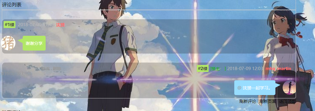
3. 那就能看到仿微信聊天对话样式的评论区了,而且还有一个彩蛋是:鼠标经过评论区头像时,头像旋转。
15 小结
虽然没有像大神那样的前端技术,但是有一颗臭美的心,哈哈,再一次感谢博客园的大佬的帮助。这个博文系列将持续更新,进一步美化自己的博客,也进一步增强自己的前端技术。
参考链接:嘻哈烧饼 数据之巅 Zhaoxi Zhang
