一、背景
1、背景原点(background-origin):
说明:设置元素背景图片的原始起始位置。必须保证背景是background-repeat为no-repeat此属性才会生效。
取值:background-origin: border-box | padding-origin | content-box
1)border-box:从border区域(含border)开始显示背景图像。
2)padding-box:从padding区域(含padding)开始显示背景图像。
3)content-box:从content区域开始显示背景图像。
如下:
<!DOCTYPE html>
<html>
    <head>
        <meta charset="UTF-8">
        <title></title>
        <style type="text/css">
            div{
                width: 200px;
                height: 200px;
                margin-top: 10px;
                padding: 20px;
                background: #ccc url(4.png) no-repeat;
                border: 10px dashed #000;
            }
            .border-box{
                background-origin: border-box;
                -webkit-background-origin: border-box;/*兼容性*/
            }
            .border-padding{
                background-origin: padding-box;
                -webkit-background-origin: padding-box;/*兼容性*/
            }
            .border-content{
                background-origin: content-box;
                -webkit-background-origin: content-box;/*兼容性*/
            }
        </style>
    </head>
    <body>
        <div class="border-box"></div>
        <div class="border-padding"></div>
        <div class="border-content"></div>
    </body>
</html>
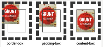
2、背景的显示区域(background-clip):
说明:设定背景图像向外裁剪的区域。
取值: background-clip: border-box | padding-box | content-box | text
border-box:从border区域(不含border)开始向外裁剪背景。
padding-box:从padding区域(不含padding)开始向外裁剪背景。
content-box:从content区域开始向外裁剪背景。
text:从前景内容的形状(比如文字)作为裁剪区域向外裁剪,如此即可实现使用背景作为填充色之类的遮罩效果。


<!DOCTYPE html>
<html>
    <head>
        <meta charset="UTF-8">
        <title></title>
        <style type="text/css">
            div{
                width: 200px;
                height: 200px;
                margin-left: 10px;
                padding: 20px;
                background: #ccc url(4.png) no-repeat;
                border: 10px dashed #000;
            }
            .border-box{
                background-clip: border-box;
            }
            .padding-box{
                background-clip: padding-box;
            }
            .content-box{
                background-clip: content-box;
            }
            .text{
                width: auto;
                height: auto;
                background-repeat: repeat;
                -webkit-text-fill-color: transparent;/*会覆盖color所定义的字体颜色,要加前缀webkit*/
                background-clip: -webkit-text;/*用背景填充文字*/
                font-weight: bold;
                font-size: 60px;
            }
        </style>
    </head>
    <body>
        <div class="border-box"></div>
        <div class="padding-box"></div>
        <div class="content-box"></div>
        <div class="text">从前景内容的形状作为裁剪区域向外裁剪背景</div>
    </body>
</html>
3、背景尺寸(background-size)
说明:设置背景图像的大小。
- 该属性提供2个参数值(特性值cover和contain除外)。
- 如果提供两个,第一个用于定义背景图像的宽度,第二个用于定义背景图像的高度。
- 如果只提供一个,该值将用于定义背景图像的宽度,第2个值默认为auto,即高度为auto,此时背景图以提供的宽度作为参照来进行等比缩放。
取值:background-size: auto | <length> | <percentage> | cover | contain
1)auto:默认值,背景图像的真实大小。
2)<length>(长度值):用长度值指定背景图像大小。不允许负值。
3)<percentage>(百分比):用百分比指定背景图像大小。不允许负值。
4)cover:将背景图像等比缩放到完全覆盖容器,背景图像有可能超出容器。
5)contain: 将背景图像等比缩放到宽度或高度与容器的宽度或高度相等,背景图像始终被包含在容器内。
如下:

<!DOCTYPE html>
<html>
    <head>
        <meta charset="UTF-8">
        <title></title>
        <style type="text/css">
            div{
                width:300px;
                height: 300px;
                margin-left: 10px;
                border: 1px solid black;
                background:url(0.png) no-repeat;
                color: red;
                float: left;/*定义元素向左浮动,即div向左排列*/
            }
            .cover{
                background-size: cover;
            }
            .contain{
                background-size: contain;
            }
        </style>
    </head>
    <body>
        <div>原比例</div>
        <div class="cover">cover将背景图像等比缩放到完全覆盖容器,背景图像有可能超出容</div>
        <div class="contain">contain将背景图像等比缩放到宽度或高度与容器的宽度或高度相等,背景图像始终被包含在容器内</div>
    </body>
</html>
4、背景图像的滚动(background-attachment):
说明:设置背景图像是否固定或者随着页面的其余部分滚动。前题有设置background-image。
取值:background-attachment: scroll | fixed | local
1)scroll:背景图片随页面的其余部分滚动。这是默认。
2)fixed:背景图像相对于窗体固定。
3)local:背景图像相对于元素内容固定,也就是说当元素随元素滚动时背景图像也会跟着滚动,因为背景图像总是要跟着内容。
代码如下:
body
{
    background-image:url('smiley.gif');
    background-repeat:no-repeat;
    background-attachment:fixed;
}
5、背景样式缩写:
背景样式多个属性的缩写:background: color image repeat attachment position/size origin clip
- 一个元素可以设置多重背景图像。
- 每组属性间使用逗号分隔。
- 如果设置的多重背景图之间存在着交集(即存在着重叠关系),前面的背景图会覆盖在后面的背景图之上。
- 如果有size值,需要紧跟position并且用“/”隔开。
如下:
缩写
body{background: #aaa url(img) no-repeat scroll 10px 20px/110px 130px content-box padding-box ;}
拆分:
body{
background-color:#aaa;
background-image:url(test3.jpg);
background-repeat:no-repeat;
background-attachment:scroll;
background-position:,10px 20px;
background-size:110px 130px;
background-origin:content-box;
background-clip:padding-box;
}
5.1、多重背景:
缩写:
body{
background:url(test1.jpg) no-repeat scroll 10px 20px/50px 60px content-box padding-box,
       url(test1.jpg) no-repeat scroll 10px 20px/70px 90px content-box padding-box,
       url(test1.jpg) no-repeat scroll 10px 20px/110px 130px content-box padding-box #aaa;
}
拆分:
body{
background-image:url(test1.jpg),url(test2.jpg),url(test3.jpg);
background-repeat:no-repeat,no-repeat,no-repeat;
background-attachment:scroll,scroll,scroll;
background-position:10px 20px,10px 20px,10px 20px;
background-size:50px 60px,70px 90px,110px 130px;
background-origin:content-box,content-box,content-box;
background-clip:padding-box,padding-box,padding-box;
background-color:#aaa;
}
二、样式列表(list-style)
1、项目符号(list-style-type):控制列表每一项的头部图标。
取值:list-style-type:disc | circle | square | decimal | lower-roman | upper-roman | lower-alpha | upper-alpha | none | armenian | cjk-ideographic | georgian | lower-greek | hebrew | hiragana | hiragana-iroha | katakana | katakana-iroha | lower-latin | upper-latin
disc:实心圆(CSS1)
circle:空心圆(CSS1)
square:实心方块(CSS1)
decimal:阿拉伯数字(CSS1)
lower-roman:小写罗马数字(CSS1)
upper-roman:大写罗马数字(CSS1)
lower-alpha:小写英文字母(CSS1)
upper-alpha:大写英文字母(CSS1)
none:不使用项目符号(CSS1)
armenian:传统的亚美尼亚数字(CSS2)
cjk-ideographic:浅白的表意数字(CSS2)
georgian:传统的乔治数字(CSS2)
lower-greek:基本的希腊小写字母(CSS2)
hebrew:传统的希伯莱数字(CSS2)
hiragana:日文平假名字符(CSS2)
hiragana-iroha:日文平假名序号(CSS2)
katakana:日文片假名字符(CSS2)
katakana-iroha:日文片假名序号(CSS2)
lower-latin:小写拉丁字母(CSS2)
upper-latin:大写拉丁字母(CSS2)
如下
- 实心圆
- 空心圆
- 实心方块
- 不现实项目符号
- 阿拉伯数字
.ul1{list-style-type:disc;}
.ul2{list-style-type:circle;}
.ul3{list-style-type:square;}
.ul4{list-style-type:none;}
.ul5{list-style-type:decimal;}
2、自定义项目符号(list-style-image):用图片来定义列表的每一项的头部图标。
取值:list-style-image: none | url(ulr)
3、项目标记位置(list-style-position):规定列表中列表项目标记的位置
取值:list-style-position: outside | inside
1)outside:列表项目标记放置在文本以外,且环绕文本不根据标记对齐
2)inside:列表项目标记放置在文本以内,且环绕文本根据标记对齐
三、变形样式(transform)
改变元素的大小,透明,旋转角度,扭曲度等。
取值:transform: none | <transform-function>+
transform-function包含以下几个方法: