临近毕业了,一大波毕业照又要来袭了!如何使用CSS3属性制作出自己的网页版照片墙呢?
闲话少说,先来看看效果图
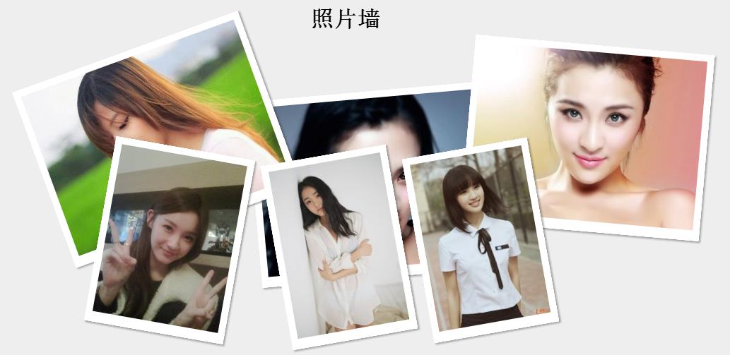
效果要求:
1,照片要求有一定的白色边框。
2,照片都要有一定的倾斜角度。
3,鼠标移动到一张照片上时,图片会旋转并摆正显示。
4,当移动到下面被遮挡的照片时,下面的照片会显示在最上层。
<!DOCTYPE html >
<head>
<meta http-equiv="Content-Type" content="text/html; charset=utf-8" />
<title>照片墙效果</title>
<link href="pic.css" rel="stylesheet" />
</head>
<body>
<div class="container">
<h1>照片墙</h1>
<img src="images/01.jpg" class="pic1" />
<img src="images/02.jpg" class="pic2" />
<img src="images/03.jpg" class="pic3" />
<img src="images/04.jpg" class="pic4" />
<img src="images/05.jpg" class="pic5" />
<img src="images/06.jpg" class="pic6" />
</div>
</body>
</html>
css文件
body{
margin:0
padding:0;
background-color:#eee;
}
h1{
text-align:center;
}
.container{
1300px;
height:800px;
margin:60px auto;
position:relative/*使得照片定位参照容器*/
}
.container img{
background:#FFF;
padding:10px 10px 15px;
position:absolute;
box-shadow:2px 2px 3px rgba(50, 50, 50, 0.4);
-moz-transition:all 0.5s ease-in;
-webkit-transition:all 0.5s ease-in;
transition:all 0.5s ease-in;
z-index:1;
}
.container img:hover{
box-shadow:15px 15px 20px rgba(50, 50, 50, 0.4);
-webkit-transform:rotate(0deg) scale(1.20);
-moz-transform:rotate(0deg) scale(1.20);
transform:rotate(0deg) scale(1.20);
z-index:2;
}
.pic1{
-webkit-transform: rotate(-5deg);
-moz-transform: rotate(-5deg);
transform: rotate(-5deg);
position: absolute;
left: 519px;
top: 121px;
}
.pic2{
-webkit-transform: rotate(-20deg);
-moz-transform: rotate(-20deg);
transform: rotate(-20deg);
position: absolute;
left: 212px;
top: 57px;
}
.pic3
{
-webkit-transform: rotate(5deg);
-moz-transform: rotate(5deg);
transform: rotate(5deg);
position: absolute;
z-index: 1;
top: 55px;
right: 139px;
}
.pic4
{
-webkit-transform: rotate(-10deg);
-moz-transform: rotate(-10deg);
transform: rotate(-10deg);
left:750px;
top:200px;
}
.pic5
{
-webkit-transform: rotate(-10deg);
-moz-transform: rotate(-10deg);
transform: rotate(-10deg);
left: 550px;
top: 210px;
}
.pic6
{
-webkit-transform: rotate(10deg);
-moz-transform: rotate(10deg);
transform: rotate(10deg);
position: absolute;
left: 300px;
top: 200px;
}
总结一下实现技术的关键点
1.定位position:照片外包裹层设置为relative,照片设置为absolute,使得照片定位会参照外面包裹层定位。
2,z-index属性:照片在原始摆放时会有部分重叠,当鼠标移动到上时,我们需要使得它在最上面显示,所以我们先把所有照片的z-index设置为1,当鼠标移动到时,即hover:我们把他们z-index设置成2就可以了
3,把照片公有属性定义到img{}之中,再把每张照片私有属性设置到具体每一张照片之中,如pic1{}
还在等什么,快给你女朋友做一个绚丽的照片墙吧!