在此次制作过程中,我引用了jquery进行了dom操作,代码如下
<!doctype html>
<html lang="en">
<head>
    <meta charset="UTF-8">
    <title>making-cube</title>
    <style>
   .container{width: 200px;height: 200px;
     position: relative;perspective:1000px;margin-top: 100px;}
   #cube{width: 100%;height: 100%;
         position: absolute;transform-style:preserve-3d;
       transition:all 0.5s;
    }
/*      #cube:hover{ transform: translateZ( -100px ) rotateY(  -90deg ); }
*/    #cube figure{
        text-align: center; font-size: 48px;font-weight: 700;color: white;
        width: 196px;height: 196px;display: block;
        position: absolute;border:2px solid black;line-height: 196px;
    }
     .back{background-color: red;opacity: 0.5}
     .front{background-color: blue;opacity: 0.5}
     .left{background-color: green;opacity: 0.5}
     .right{background-color: yellow;opacity: 0.5}
     .top{background-color: purple;opacity: 0.5}
     .bottom{background-color: orange;opacity: 0.5}
    /*3D立方体,我们需要旋转6个面中的5个,*/
  /*  #cube .front{transform:rotateY(0deg);}*/
    #cube .front{transform:rotateY(0deg) translateZ( 100px );}
    #cube .back{transform:rotateX(180deg) translateZ( 100px );}
    #cube .right{transform:rotateY(90deg) translateZ( 100px );}
    #cube .left{transform:rotateY(-90deg) translateZ( 100px );}
    #cube .top{transform:rotateX(90deg) translateZ( 100px );}
    #cube .bottom{transform:rotateX(-90deg) translateZ( 100px );}
    article {
        margin-top: 100px;
    }

    #cube.show-front  { transform: translateZ( -100px ) rotateY(    0deg ); }
    #cube.show-back   { transform: translateZ( -100px ) rotateX( -180deg ); }
    #cube.show-right  { transform: translateZ( -100px ) rotateY(  -90deg ); }
    #cube.show-left   { transform: translateZ( -100px ) rotateY(   90deg ); }
    #cube.show-top    { transform: translateZ( -100px ) rotateX(  -90deg ); }
    #cube.show-bottom { transform: translateZ( -100px ) rotateX(   90deg ); }
     </style>
</head>
<body>
    <section class="container">
        <div id="cube">
            <figure class="front">1</figure>
            <figure class="back">2</figure>
            <figure class="right">3</figure>
            <figure class="left">4</figure>
            <figure class="top">5</figure>
            <figure class="bottom">6</figure>
        </div>
    </section>

    <article>
     <button class='show-front'>show  1</button>
     <button class='show-back'>show  2</button>
     <button class='show-right'>show  3</button>
     <button class='show-left'>show  4</button>
     <button class='show-top'>show  5</button>
     <button class='show-bottom'>show  6</button>
    </article>

   <script src='../js/jquery.js'></script>
   <script>
        $('article').on('click', 'button', function(event) {
            event.preventDefault();
               $("#cube").removeClass();
          $("#cube").addClass($(this).prop('class')) ;
        });
   </script>
</body>
</html>
效果如下:
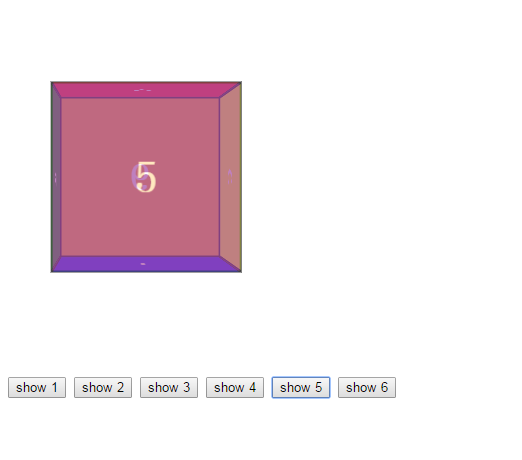
当点击button时,能够切换到不同的面,且具有过渡的效果。
兼容性: 如果你的浏览器版本比较低,针对chrome,safari opera,transform属性 可以加前缀 -webkit, 低版本firefox, transform加属性-moz,
ie浏览器,transform等属性可以加-ms
参考资料:
http://www.htmleaf.com/ziliaoku/qianduanjiaocheng/transform.html