Bootstrap Introduction
Bootstrap 相对于CSS, JS
就像PPT模板相对于PPT
说白了就是前人已经做好了(pre-build)很多模板,你可以直接拿来主义
Bootstarp 4
Two ways to use it
1. download
you will see a bunch of files
Bootstarp.min.css means they are minified
2. CDN(Content Delivery Network)
we can directly copy this code into index.html

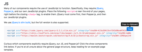
Because JS would be read after CSS, it be put in the bottom of body part
 1 <!DOCTYPE html>
 2 <html>
 3 <head>
 4     <title>Bootstrap</title>
 5     <link rel="stylesheet" href="https://maxcdn.bootstrapcdn.com/bootstrap/4.0.0/css/bootstrap.min.css" integrity="sha384-Gn5384xqQ1aoWXA+058RXPxPg6fy4IWvTNh0E263XmFcJlSAwiGgFAW/dAiS6JXm" crossorigin="anonymous">
 6
 7 </head>
 8 <body>
 9     <script src="https://code.jquery.com/jquery-3.2.1.slim.min.js" integrity="sha384-KJ3o2DKtIkvYIK3UENzmM7KCkRr/rE9/Qpg6aAZGJwFDMVNA/GpGFF93hXpG5KkN" crossorigin="anonymous"></script>
10     <script src="https://cdnjs.cloudflare.com/ajax/libs/popper.js/1.12.9/umd/popper.min.js" integrity="sha384-ApNbgh9B+Y1QKtv3Rn7W3mgPxhU9K/ScQsAP7hUibX39j7fakFPskvXusvfa0b4Q" crossorigin="anonymous"></script>
11     <script src="https://maxcdn.bootstrapcdn.com/bootstrap/4.0.0/js/bootstrap.min.js" integrity="sha384-JZR6Spejh4U02d8jOt6vLEHfe/JQGiRRSQQxSfFWpi1MquVdAyjUar5+76PVCmYl" crossorigin="anonymous"></script>
12 </body>
13 </html>
next step,
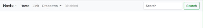
if we would like to add Navbar in our website
copy the code into your html file directly
 1 <!DOCTYPE html>
 2 <html>
 3 <head>
 4     <title>Bootstrap</title>
 5     <link rel="stylesheet" href="https://maxcdn.bootstrapcdn.com/bootstrap/4.0.0/css/bootstrap.min.css" integrity="sha384-Gn5384xqQ1aoWXA+058RXPxPg6fy4IWvTNh0E263XmFcJlSAwiGgFAW/dAiS6JXm" crossorigin="anonymous">
 6
 7 </head>
 8 <body>
 9
10 <nav class="navbar navbar-expand-lg navbar-light bg-light">
11   <a class="navbar-brand" href="#">Navbar</a>
12   <button class="navbar-toggler" type="button" data-toggle="collapse" data-target="#navbarSupportedContent" aria-controls="navbarSupportedContent" aria-expanded="false" aria-label="Toggle navigation">
13     <span class="navbar-toggler-icon"></span>
14   </button>
15
16   <div class="collapse navbar-collapse" id="navbarSupportedContent">
17     <ul class="navbar-nav mr-auto">
18       <li class="nav-item active">
19         <a class="nav-link" href="#">Home <span class="sr-only">(current)</span></a>
20       </li>
21       <li class="nav-item">
22         <a class="nav-link" href="#">Link</a>
23       </li>
24       <li class="nav-item dropdown">
25         <a class="nav-link dropdown-toggle" href="#" id="navbarDropdown" role="button" data-toggle="dropdown" aria-haspopup="true" aria-expanded="false">
26           Dropdown
27         </a>
28         <div class="dropdown-menu" aria-labelledby="navbarDropdown">
29           <a class="dropdown-item" href="#">Action</a>
30           <a class="dropdown-item" href="#">Another action</a>
31           <div class="dropdown-divider"></div>
32           <a class="dropdown-item" href="#">Something else here</a>
33         </div>
34       </li>
35       <li class="nav-item">
36         <a class="nav-link disabled" href="#">Disabled</a>
37       </li>
38     </ul>
39     <form class="form-inline my-2 my-lg-0">
40       <input class="form-control mr-sm-2" type="search" placeholder="Search" aria-label="Search">
41       <button class="btn btn-outline-success my-2 my-sm-0" type="submit">Search</button>
42     </form>
43   </div>
44 </nav>
45     <script src="https://code.jquery.com/jquery-3.2.1.slim.min.js" integrity="sha384-KJ3o2DKtIkvYIK3UENzmM7KCkRr/rE9/Qpg6aAZGJwFDMVNA/GpGFF93hXpG5KkN" crossorigin="anonymous"></script>
46     <script src="https://cdnjs.cloudflare.com/ajax/libs/popper.js/1.12.9/umd/popper.min.js" integrity="sha384-ApNbgh9B+Y1QKtv3Rn7W3mgPxhU9K/ScQsAP7hUibX39j7fakFPskvXusvfa0b4Q" crossorigin="anonymous"></script>
47     <script src="https://maxcdn.bootstrapcdn.com/bootstrap/4.0.0/js/bootstrap.min.js" integrity="sha384-JZR6Spejh4U02d8jOt6vLEHfe/JQGiRRSQQxSfFWpi1MquVdAyjUar5+76PVCmYl" crossorigin="anonymous"></script>
48 </body>
49 </html>
Then beautiful Navbar is shown
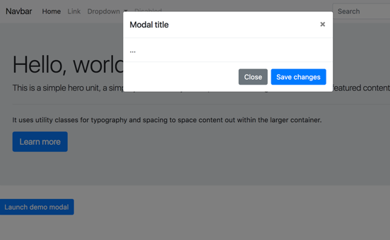
Use the same step,
we can add Jumbotron ['dʒʌmbəutrɔn] n. 电视机的超大屏幕
and modal
You may notice that when we click the button
we have our own modal, which proves this is JS
How can we add our own custom look ?
For example, I would like to change Launch demo modal button's color
We can search buttons code, and edit the Launch demo modal's button code
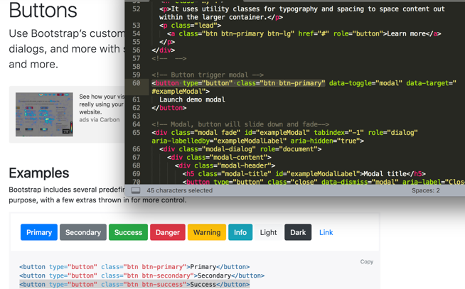
Or we can change it in the style.css file
.btn-success{
    background-color: orange;
}
Bootstrap 4 Grid
This is the reason why bootstrap is so popular.
Boootstrap allowed us to create very responsive website using these ideas of columns
 1   <div class="container">
 2     <div class="row">
 3         <div class="col col-sm-6" >
 4           1 of 2
 5         </div>
 6         <div class="col col-sm-3" >
 7           2 of 2
 8         </div>
 9          </div>
10   </div>
.col{
    background-color: grey;
    border: 2px solid black;
}
The web site would be shown like this,

Bootstrap has the idea of a grid system and this grid system has 12 lines
col-sm-6 : 1 of 2 part covers 6/12
col-sm-3 : 2 of 2 part covers 3/12
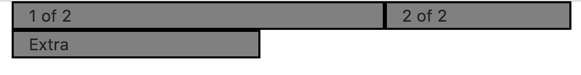
 1   <div class="container">
 2     <div class="row">
 3         <div class="col col-sm-6" >
 4           1 of 2
 5         </div>
 6         <div class="col col-sm-3" >
 7           2 of 2
 8         </div>
 9         <div class="col col-sm-3" >
10           Extra
11         </div>
12          </div>
13   </div>
The web site would be shown like this,

But what if the sum of these three is over 12 ?
 1  <div class="container">
 2     <div class="row">
 3         <div class="col col-sm-6" >
 4           1 of 2
 5         </div>
 6         <div class="col col-sm-3" >
 7           2 of 2
 8         </div>
 9         <div class="col col-sm-4" >
10           Extra
11         </div>
12          </div>
13   </div>
The web site would be shown like this,
 1   <div class="container">
 2     <div class="row">
 3         <div class="col col-sm-6 col-md-12 col-lg-12" >
 4           1 of 2
 5         </div>
 6         <div class="col col-sm-3 col-md-6 col-lg-12" >
 7           2 of 2
 8         </div>
 9         <div class="col col-sm-4 col-md-6 col-lg-12" >
10           Extra
11         </div>
12          </div>
13   </div>
If the size of the window is medium then I want the whole 12 grid system to the first div, 6/12 gird to the second, 6/12 to the third.
Same logic as col-lg-12.
This is how you can create really responsive websites. And the biggest selling feature of bootstrap is that it make sure our website look good no matter what screen size.
Putting Your Website Online
github.io
DEVELOPER FUNDAMENTALS:IV
Try to use free templates:
Animate.css (https://daneden.github.io/animate.css/)
So it is very rare when build something from scratch
Create-tim(https://www.creative-tim.com/)
有已经搭好的web模板