支持向量机是一个点离决策边界越近,离决策面越远的问题
求解的过程主要是通过拉格朗日乘子法,来求解带约束的优化问题,在问题中涉及两个方面,一个是线性的,一个是非线性的,非线性的有
我们平时比较常见的高斯核函数(径向基函数),他的主要做法就是把低维的数据变成高维数据,通过^2的方法
在支持向量基中的参数有 svc__C(松弛因子)和svc__gamma 两个参数,两个参数越大,模型的复杂度也越大
接下来我们使用一组人脸数据来进行模型,我们会进行参数调节
第一步数据载入
from sklearn.datasets import fetch_lfw_people  #从datasets数据包中获取数据
import pandas as pd
import matplotlib.pyplot as plt
faces = fetch_lfw_people(min_faces_per_person=60) #不小于60张图片
print(faces.target_names) #输出照片里的人物名字
print(faces.images.shape) #输出照片的大小, 639张, 62*47表示的是像素点,每个像素点代表的是一个数据
第二步 取前15张图片,画成3行5列的图片

fig, ax = plt.subplots(3, 5)
for i, axi in enumerate(ax.flat):
    axi.imshow(faces.images[i], cmap='bone') # cmap 表示配色方案,bone表示苍白的
    axi.set(xticks=[], yticks=[], xlabel=faces.target_names[faces.target[i]])  #faces.target[i]对应着0和1标签,
    # target_names 的 key 是 0和1...,value是名字
plt.show()
第三步:通过make_pipeline 连接pca,svm函数
from sklearn.svm import SVC from sklearn.decomposition import PCA from sklearn.pipeline import make_pipelinepca = PCA(n_components=150, whiten=True, random_state=42) #whiten确保无相关的输出
svc = SVC(kernel='rbf', class_weight='balanced') #核函数为径向基函数
model = make_pipeline(pca, svc) #连接两个函数, 函数按照先后顺序执行
第四步: 通过GridSearchCV调节svc__C 和 svc__gamma 参数,.best_estimator获得训练好的模型
#把函数分为训练集和测试集 from sklearn.model_selection import train_test_splitXtrain, Xtest, Ytrain, Ytest = train_test_split(faces.data, faces.target, random_state=40)
#参数调整svc__C和svc__gamma
from sklearn.model_selection import GridSearchCV#备选参数
param_grid = {'svc__C':[1, 5, 10],
'svc__gamma':[0.0001, 0.0005, 0.001]}grid = GridSearchCV(model, param_grid) #第一个参数是model(模型), 第二个参数是param_grid 需要调整的参数
print(Xtrain.shape, Ytrain.shape)
grid.fit(Xtrain, Ytrain) #建立模型
print(grid.best_params_) #输出模型的参数组合
model = grid.best_estimator_ #输出最好的模型
yfit = model.predict(Xtest) #用当前最好的模型做预测
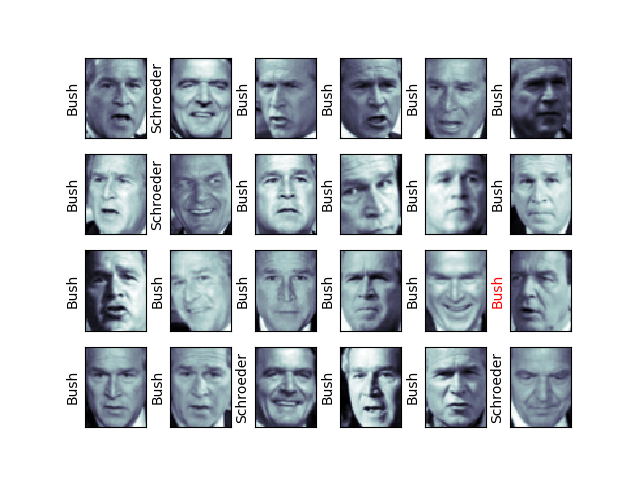
第五步:对预测结果画图,这里画了4*6的图
fig , ax = plt.subplots(4, 6) #画出24副图,呈现4行6列的摆放形式for i, axi in enumerate(ax.flat):
axi.imshow(Xtest[i].reshape(62, 47), cmap='bone')
axi.set(xticks=[], yticks=[])
axi.set_ylabel(faces.target_names[yfit[i]].split()[-1], #取名字的后一个字符,如果预测结果与真实结果相同,贤黑色,否则显红色
color='black'if yfit[i]==Ytest[i] else 'red')plt.show()
fig.suptitle('Predicted Names; Incorrect Labels in Red', size=14) #加上标题from sklearn.metrics import classification_report #输出精确度,召回值
print(classification_report(Ytest, yfit, target_names=faces.target_names))
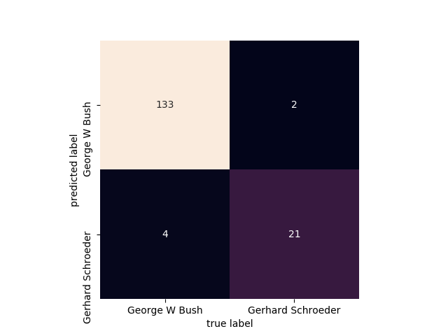
第六步:画出一个混淆矩阵的图
from sklearn.metrics import  confusion_matrix  #做混淆矩阵
import seaborn as sns
mat = confusion_matrix(Ytest, yfit)   #Ytest表示待测标签, yfit表示预测结果

sns.heatmap(mat.T, square=True, annot=True, fmt='d', cbar=False,
            xticklabels=faces.target_names,
            yticklabels=faces.target_names)
plt.xlabel('true label')
plt.ylabel('predicted label')
plt.show()