效果图

原理剖析
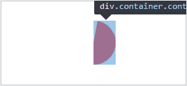
1.先完成这样一个会旋转半圆(这个很简单吧)。

2.overflow: hidden;
在这个半圆所在的地方加上一个包容块。
3.在中间定位一个白色的圆形做遮挡。

4.接着以同样的方式完成另一半圆。
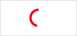
5.使用animate配合时间完成衔接。
其他逻辑可能需要你通过角度进行 js 编码。

源码
<!DOCTYPE html>
<html>
<head>
    <meta charset="UTF-8">
    <title>环形进度条</title>
    <style>
        .wrapper {
            position: absolute;
            top: 0;
            right: 0;
            bottom: 0;
            left: 0;
            width: 4em;
            height: 4em;
            margin: auto;
        }
        .container {
            position: absolute;
            top: 0;
            bottom: 0;
            width: 2em;
            overflow: hidden;
        }
        .halfCir {
            width: 2em;
            height: 4em;
            background: red;
        }
        .container1 {
            left: 2em;
        }
        .container1 .halfCir {
            left: 0;
            border-radius: 0 4em 4em 0;
            transform-origin: 0 50%;
            animation: halfCir1 4s infinite linear;
        }
        .container2 {
            left: 0;
        }
        .container2 .halfCir {
            border-radius: 4em 0 0 4em;
            transform-origin: 2em 2em;
            animation: halfCir2 4s infinite linear;
        }
        @keyframes halfCir1 {
            50%, 100% {
                transform: rotateZ(180deg);
            }
        }
        @keyframes halfCir2 {
            0%, 50% {
                transform: rotateZ(0);
            }
            100% {
                transform: rotateZ(180deg);
            }
        }
        .wrapper::after {
            position: absolute;
            top: 0.5em;
            left: 0.5em;
            width: 3em;
            height: 3em;
            background: #fff;
            border-radius: 50%;
            content: "";
        }
        .cir {
            position: absolute;
            top: 0;
            right: 0;
            left: 0;
            width: 0.5em;
            height: 0.5em;
            margin: auto;
            background: red;
            border-radius: 50%;
        }
        .cir2 {
            transform-origin: 50% 2em;
            animation: cir2 4s infinite linear;
        }
        @keyframes cir2 {
            100% {
                transform: rotateZ(360deg);
            }
        }
    </style>
</head>
<body>
    <div class="wrapper">
        <div class="container container1">
            <div class="halfCir"></div>
        </div>
        <div class="container container2">
            <div class="halfCir"></div>
        </div>
        <div class="cir cir1"></div>
        <div class="cir cir2"></div>
    </div>
</body>
</html>
Vue 组件版
// index.vue
<cirle-progess
    :circleDiam="100"
    :circleColor="'#ddd'"
    :progressSize="10"
    :progressColor="'#ffaa00'"
    :coverColor="'#fff'"
    :text="'25%'"
    :textColor="'#333'"
    :textSize="28"
    :value="25"
    :cssUnit="'px'"
></circle-progess>

// CircleProgess.vue
<template>
    <view :style="circle">
        <view :style="[circleBlock, circleBlockLeft]">
            <view :style="[circleBlockProgress, circleBlockProgressLeft]">
                <view :style="[circleBlockProgressRadius, circleBlockProgressRadiusLeft]"></view>
            </view>
        </view>
        <view :style="[circleBlock, circleBlockRight]">
            <view :style="[circleBlockProgress, circleBlockProgressRight]">
                <view :style="[circleBlockProgressRadius, circleBlockProgressRadiusRight]"></view>
            </view>
        </view>
        <view :style="circleCover">{{ text }}</view>
    </view>
</template>

<script>
    export default {
        name: 'CircleProgess',
        props: {
            circleDiam: {    // 环形圆的直径
                type: Number,
                default: 100
            },
            circleColor: {   // 无进度条区域的颜色
                type: String,
                default: '#fff'
            },
            progressSize: {  // 进度条的粗细
                type: Number,
                default: 10
            },
            progressColor: { // 进度条的颜色
                type: String,
                default: '#409EFF'
            },
            coverColor: {    // 遮盖圆的颜色
                type: String,
                default: '#fff'
            },
            text: {          // 中心文字
                type: String,
                default: ''
            },
            textSize: {      // 中心文字大小
                type: Number,
                default: 16
            },
            textColor: {     // 中心文字颜色
                type: String,
                default: '#333'
            },
            value: {         // 百分比数值
                type: Number,
                default: 60
            },
            cssUnit: {       // css单位
                type: String,
                default: 'px'
            }
        },
        computed: {
            circle() {
                return {
                    position: 'relative',
                     this.circleDiam + this.cssUnit,
                    height: this.circleDiam + this.cssUnit,
                    backgroundColor: this.circleColor,
                    borderRadius: '50%',
                    overflow: 'hidden'
                }
            },
            circleBlock() {
                return {
                    position: 'absolute',
                     this.circleDiam / 2 + this.cssUnit,
                    height: this.circleDiam + this.cssUnit,
                    overflow: 'hidden'
                }
            },
            circleBlockLeft() {
                return {
                    left: 0
                }
            },
            circleBlockRight() {
                return {
                    right: 0
                }
            },
            circleBlockProgress() {
                return {
                    position: 'absolute',
                     this.circleDiam / 2 + this.cssUnit,
                    height: this.circleDiam + this.cssUnit
                }
            },
            circleBlockProgressLeft() {
                const val = this.value > 50 ? -180 + (this.value - 50) * 3.6 : -180
                return {
                    backgroundColor: this.progressColor,
                    transformOrigin: '100% 50%',
                    transform: 'rotate(' + val + 'deg)'
                }
            },
            circleBlockProgressRight() {
                const val = this.value > 50 ? 0 : -180 + (this.value * 3.6)
                return {
                    backgroundColor: this.progressColor,
                    transformOrigin: '0% 50%',
                    transform: 'rotate(' + val + 'deg)'
                }
            },
            circleBlockProgressRadius() {
                return {
                    position: 'absolute',
                     this.progressSize + this.cssUnit,
                    height: this.progressSize + this.cssUnit,
                    borderRadius: '50%'
                }
            },
            circleBlockProgressRadiusLeft() {
                const backgroundColor = this.value > 50 ? this.progressColor : this.circleColor
                const right = this.progressSize / 2
                return {
                    top: 0,
                    right: '-' + right + this.cssUnit,
                    backgroundColor: backgroundColor
                }
            },
            circleBlockProgressRadiusRight() {
                const backgroundColor = this.value > 0 ? this.progressColor : this.circleColor
                const left = this.progressSize / 2
                return {
                    bottom: 0,
                    left: '-' + left + this.cssUnit,
                    backgroundColor: backgroundColor
                }
            },
            circleCover() {
                return {
                    position: 'absolute',
                    top: 0,
                    right: 0,
                    bottom: 0,
                    left: 0,
                     this.circleDiam - this.progressSize * 2 + this.cssUnit,
                    height: this.circleDiam - this.progressSize * 2 + this.cssUnit,
                    margin: 'auto',
                    backgroundColor: this.coverColor,
                    borderRadius: '50%',
                    color: this.textColor,
                    fontSize: this.textSize + this.cssUnit,
                    textAlign: 'center',
                    lineHeight: this.circleDiam - this.progressSize * 2 + this.cssUnit,
                    zIndex: 1
                }
            }
        }
    }
</script>