移动布局
设备: 手机 & ipad
系统: 安卓 & ios
内置: 安卓系统的内置浏览器是谷歌 ios内置safari浏览器 他们的内核都是webkit 不考虑兼容性,需要考虑的是安卓和ios的区别
弹性布局
*分两部分 分别是弹性父级 弹性子元素
*给父级设置display: flex; 或者 display: inline-flex;
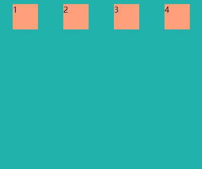
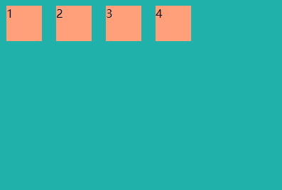
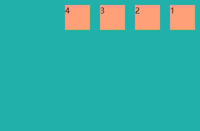
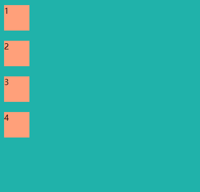
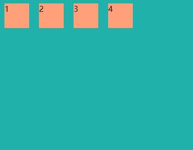
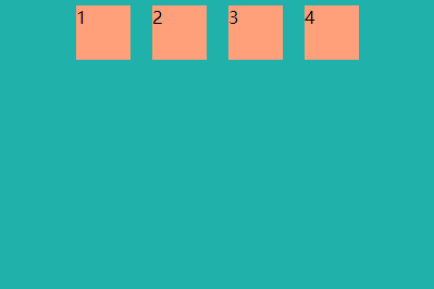
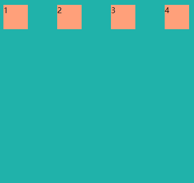
1.flex-direction: row | row-reverse | column | column-reverse;
*属性指定了弹性子元素在父容器中的位置
row: 横向从左到右
row-reverse: 反转横向排列
column: 纵向排列
column-reverse: 反转纵向排列

2.justify-content: flex-start | flex-end | center | space-between | space-around;
*内容对齐属性应用在弹性容器上,把弹性项沿着弹性容器的主轴线(main axis)对齐
flex-start: 弹性项目向行头紧挨着填充。这个是默认值
flex-end: 弹性项目向行尾紧挨着填充
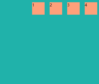
center: 弹性项目居中紧挨着填充
space-between: 弹性项目平均分布在该行上
space-around: 弹性项目平均分布在该行上,两边留有一半的间隔空间