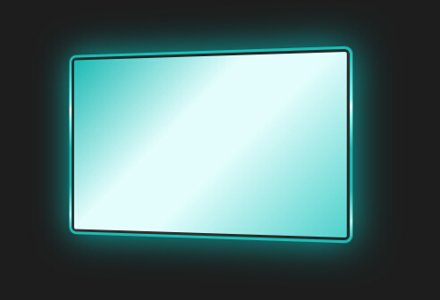
今天给大家带来一款纯css3实现的发光屏幕旋转特效。该屏幕由纯css3实现带发光旋转特效,效果图如下:
实现的代码。
html代码:
 <div class="screen">
    </div>
css3代码:
*{
    margin: 0;
    padding: 0;
}
*,
*:before,
*:after {
  -webkit-box-sizing: border-box;
     -moz-box-sizing: border-box;
          box-sizing: border-box;
}
html,body{
    height: 100%;
}
html{
    background-color: #1d1d1d;
}
body{
    position: relative;
    margin: 0;
    padding: 0;
  transform-style: preserve-3d;

  -webkit-perspective: 500px;
          perspective: 500px;
}

/*Screen*/
.screen{
    position: absolute;
    top: 50%;
    left: 50%;
    width: 320px;
    height: 210px;
    margin-top: -105px;
    margin-left: -160px;

    border-radius: 8px;
    box-shadow: 0 0 80px #0caba8;
    overflow: hidden;
    z-index: 100000;

    -webkit-animation: screenMove01 2s,
                       boxShine     2.5s 2s infinite alternate ,
                       screenMove02 5s infinite alternate linear;

       -moz-animation: screenMove01 2s,
                       boxShine     2.5s 2s infinite alternate ,
                       screenMove02 5s infinite alternate linear;

         -o-animation: screenMove01 2s,
                       boxShine     2.5s 2s infinite alternate ,
                       screenMove02 5s infinite alternate linear;

            animation: screenMove01 2s,
                       boxShine     2.5s 2s infinite alternate ,
                       screenMove02 5s infinite alternate linear;
}
.screen::before{
    display: block;
    content:"";
    position: absolute;
    top: 0;
    left: 0;
    width: 320px;
    height: 210px;

    border-width: 5px;
    border-style: solid;
  border-image: -webkit-linear-gradient(to bottom, rgba(29,186,180,1) 0%, rgba(126,252,247,1) 26%, rgba(227,253,252,1) 30%, rgba(126,252,247,1) 36%, rgba(29,186,180,1) 52%, rgba(29,186,180,1) 74%, rgba(164,247,244,1) 91%, rgba(29,186,180,1) 100%) 1;
  border-image:    -moz-linear-gradient(to bottom, rgba(29,186,180,1) 0%, rgba(126,252,247,1) 26%, rgba(227,253,252,1) 30%, rgba(126,252,247,1) 36%, rgba(29,186,180,1) 52%, rgba(29,186,180,1) 74%, rgba(164,247,244,1) 91%, rgba(29,186,180,1) 100%) 1;
  border-image:      -o-linear-gradient(to bottom, rgba(29,186,180,1) 0%, rgba(126,252,247,1) 26%, rgba(227,253,252,1) 30%, rgba(126,252,247,1) 36%, rgba(29,186,180,1) 52%, rgba(29,186,180,1) 74%, rgba(164,247,244,1) 91%, rgba(29,186,180,1) 100%) 1;
  border-image:         linear-gradient(to bottom, rgba(29,186,180,1) 0%, rgba(126,252,247,1) 26%, rgba(227,253,252,1) 30%, rgba(126,252,247,1) 36%, rgba(29,186,180,1) 52%, rgba(29,186,180,1) 74%, rgba(164,247,244,1) 91%, rgba(29,186,180,1) 100%) 1;
}
.screen::after{
    display: block;
    content:"";
    position: absolute;
    top: 3px;
    left: 3px;
    width: 314px;
    height: 204px;

    border: 3px solid #1d1d1d;
    border-color:rgba(29,29,29,0.9);
    border-radius: 5px;
    background: -webkit-linear-gradient( 135deg, rgba(29,186,180,1) 0%, rgba(227,253,252,1) 17%, rgba(227,253,252,1) 25%, rgba(42,197,191,1) 48%, rgba(126,252,247,1) 93%, rgba(29,186,180,1) 100%);
  background:    -moz-linear-gradient( 135deg, rgba(29,186,180,1) 0%, rgba(227,253,252,1) 17%, rgba(227,253,252,1) 25%, rgba(42,197,191,1) 48%, rgba(126,252,247,1) 93%, rgba(29,186,180,1) 100%);
  background:      -o-linear-gradient( 135deg, rgba(29,186,180,1) 0%, rgba(227,253,252,1) 17%, rgba(227,253,252,1) 25%, rgba(42,197,191,1) 48%, rgba(126,252,247,1) 93%, rgba(29,186,180,1) 100%);
  background:         linear-gradient( 135deg, rgba(29,186,180,1) 0%, rgba(227,253,252,1) 17%, rgba(227,253,252,1) 25%, rgba(42,197,191,1) 48%, rgba(126,252,247,1) 93%, rgba(29,186,180,1) 100%);


    -webkit-background-size: 300% 300%;
     -moz-background-size: 300% 300%;
         -o-background-size: 300% 300%;
      -ms-background-size: 300% 300%;
            background-size: 300% 300%;


    -webkit-animation: bgShine 5s  infinite alternate linear;
       -moz-animation: bgShine 5s  infinite alternate linear;
           -o-animation: bgShine 5s  infinite alternate linear;
              animation: bgShine 5s  infinite alternate linear;
}
/**/


/*Animation*/

/*screenMove01*/
@-webkit-keyframes screenMove01 {
    0%   {opacity: 0; top: 100%; transform: rotateY(0deg);}
    100% {opacity: 1; top: 50%;  transform: rotateY(-30deg);}
}
@-moz-keyframes screenMove01 {
    0%   {opacity: 0; top: 100%; transform: rotateY(0deg);}
    100% {opacity: 1; top: 50%;  transform: rotateY(-30deg);}
}
@-o-keyframes screenMove01 {
    0%   {opacity: 0; top: 100%; transform: rotateY(0deg);}
    100% {opacity: 1; top: 50%;  transform: rotateY(-30deg);}
}
@keyframes screenMove01 {
    0%   {opacity: 0; top: 100%; transform: rotateY(0deg);}
    100% {opacity: 1; top: 50%;  transform: rotateY(-30deg);}
}
/**/


/*screenMove02*/
@-webkit-keyframes screenMove02 {
    0%   {transform: rotateY(-30deg);}
    100% {transform: rotateY(30deg);}
}
@-moz-keyframes screenMove02 {
    0%   {transform: rotateY(-30deg);}
    100% {transform: rotateY(30deg);}
}
@-o-keyframes screenMove02 {
    0%   {transform: rotateY(-30deg);}
    100% {transform: rotateY(30deg);}
}
@keyframes screenMove02 {
    0%   {transform: rotateY(-30deg);}
    100% {transform: rotateY(30deg);}
}
/**/


/*box shine*/
@-webkit-keyframes boxShine {
    0%   {box-shadow: 0 0 50px #0caba8;}
    100% {box-shadow: 0 0 200px #0caba8;}
}
@-moz-keyframes boxShine {
    0%   {box-shadow: 0 0 50px #0caba8;}
    100% {box-shadow: 0 0 200px #0caba8;}
}
@-o-keyframes boxShine {
    0%   {box-shadow: 0 0 50px #0caba8;}
    100% {box-shadow: 0 0 200px #0caba8;}
}
@keyframes boxShine {
    0%   {box-shadow: 0 0 50px #0caba8;}
    100% {box-shadow: 0 0 200px #0caba8;}
}
/**/


/*bg shine*/
@-webkit-keyframes bgShine {
    0%   {-webkit-background-size: 300% 300%;}
    100% {-webkit-background-size: 100% 100%;}
}
@-moz-keyframes bgShine {
    0%   {-moz-background-size: 300% 300%;}
    100% {-moz-background-size: 100% 100%;}
}
@-o-keyframes bgShine {
    0%   {-o-background-size: 300% 300%;}
    100% {-o-background-size: 100% 100%;}
}
@keyframes bgShine {
    0%   {background-size: 300% 300%;}
    100% {background-size: 100% 100%;}
}
注:本文爱编程原创文章,转载请注明原文地址:http://www.w2bc.com/Article/11771