分析
主要还是运用CSS3的transition, animation, transform还有渐变背景等特性。
- 由于按钮在鼠标进入时有不同的样式,所以要对其:hover状态运用另外的背景样式
- 通过对按钮的:after状态添加一个内容为空的元素,并给其一个边框,这样在鼠标进入后我们让这个隐藏的空元素变大直到淡出,就得到我们看到的效果了

构建基本按钮样式
做为例子,我们的页面会很简单,就放一个a标签作为按钮,然后对其写样式让它看起来更像一个按钮。并定义好:after元素。
 1 <style type="text/css">
 2     .button{
 3     cursor: pointer;
 4     text-decoration: none;
 5     padding: 10px;
 6     color: #fff;
 7     border-radius: 10px;
 8     position: absolute;
 9     top: 100px;
10     left: 48%;
11     background: linear-gradient(#93c, #50c);
12     border:1px solid purple;
13     }
14     .button:after{
15     content: "";
16     position: absolute;
17     top: 0;
18     left: 0;
19     width: 100%;
20     height: 100%;
21     border-radius: 10px;
22     opacity: 0;
23     border:1px solid purple;
24     }
25     .button:hover{
26         background: linear-gradient(#b5e, #93c);
27     }
28 </style>
29 <body>
30     <a class="button" href="javascript:void(0);" >Fake Button</a>
31 </body>
添加动画
首先用keyframes定义动画
 1 @-webkit-keyframes boom {
 2     0% {
 3         opacity: 0
 4     }
 5     5% {
 6         opacity: 1
 7     }
 8     100% {
 9         -webkit-transform: scale(1.3);
10         transform: scale(1.3);
11         opacity: 0
12     }
13 }
14 @keyframes boom {
15     0% {
16         opacity: 0
17     }
18     5% {
19         opacity: 1
20     }
21     100% {
22         transform: scale(1.3);
23         transform: scale(1.3);
24         opacity: 0
25     }
26 }
再将其运用到按钮后面隐藏的元素上
 .button:hover:after {
     -webkit-animation: boom 0.5s ease;
     animation: boom 0.5s ease;
}
扩展
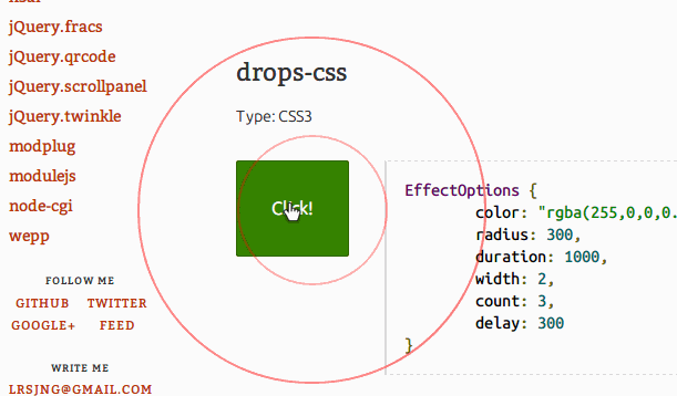
另外,我还发现一个jQuery插件jQuery.twinkle专门做这样的效果,因为是通过js做的,所以原理跟上面的完全不一样,但这个插件提供的效果丰富,且很炫很有创意,大家可以去欣赏下。下面是一个效果的截图。