CSS Rounded Corners
它是用来画圆角的, 假设有 1 给正方形, 100px.
border-top-left-radius: 30px;
before  after
after 
也可以用 percentage.

如果是正方形, 4 个角 50% 就变成圆形了.
常见的圆角按钮:

它是依据高度的 50% 来设定的, 不可以写 border-radius: 50%. 这个意思是 width 50%, height 50%, 正确的是全部 height 50%
 <-- 错误的
正确的写法是 border-radius: calc(100px / 2); 必须要知道高度才行.
CSS Border Images
border: 10px solid transparent;
border-image: url(border.png) 30 round;
让 border-color 变成 transparent 加上 border-image 就可以了.
30 表示 where to slice the image
round 表示图片重复, 另一个是 stretched 拉紧.
image

round (repeat)
stretched
CSS Multiple Backgrounds
background image 是可以 multiple 的

用逗号分开 1, 2
越靠前的越在上层, 用户越看见.
shorthand 的写法

Background Size
backgroud size 可以控制 background image 大小
background-size: 100px 80px;
也可以写 contain or cover
Background-origin Property
set background image render 位置
background-origin: content-box
border-box, 从 border 开始
padding-box (default), 从 padding 开始
content-box, 从内容开始
Background-clip Property
和 origin 一样, 也是 border-box, padding-box, content-box, 只是它是用来做 paint 的, 比如 color
background-clip: content-box;
CSS Color Keywords
transparent, currentcolor, inherit
transparent 相对于 rgba(0,0,0,0)
currentcolor 对应 color 属性值
inherit 就是跟 parent
CSS Gradients
Gradients 是渐变 color
3 大种类:
Linear Gradients (goes down/up/left/right/diagonally)
Radial Gradients (defined by their center)
Conic Gradients (rotated around a center point)
Linear Gradients

background-image: linear-gradient(to left, red, yellow);
它是 background-image 来的哦, 不是 color
最少 2 种颜色才能渐变.
默认是 top to bottom, 有很多 pattern, 比如 left to right, diagonal (对角线), degree 等
background-image: linear-gradient(to right, red 50%, yellow);
red 50% 从开始一直是纯红色到 50%, 然后渐变去黄色

background-image: linear-gradient(to right, red 25%, yellow 50%);
表示开始到 25% 纯红, 然后渐变去黄, 从 50% 的位置开始变成纯黄

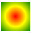
Radial Gradients
Conic Gradients

CSS Shadow Effects
Text Shadow
h1 {
  text-shadow: 2px 2px 5px red;
}
分别代表: horizontal, vertical, blur, color

没有 blur 的情况下, shadow 就是这样的, 看得出原理了.
通过逗号就可以写 multiple shadow 了.
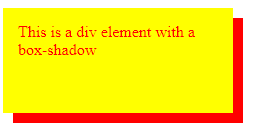
Box Shadow
div {
  box-shadow: 10px 10px 5px 12px grey inset;
}
horizontal, vertical, blur, spread radius, color
horizontal, vertical 可以了解为 offset
blur 是指颜色展开 gradient 多长, 比如这个是 blur 100px 的意思

spread 非常像 border, 但不像 blur 那样是 gradient, 它是真实的颜色. 下面是 spread 20px blur 20px 的效果, blue 会在 spread 之后发生.

特别的地方是, 它的 default color 不是 background-color 而是 color (字体颜色) 哦.
spread radius 是让影子更大,
before 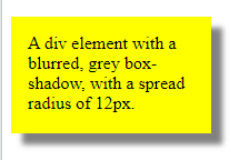 after
after 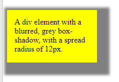
inset 是让 shadow 在里面, 效果很奇葩的
before 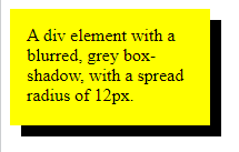 after
after 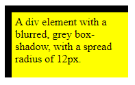
也是可以 multiple shadow 哦
常见的用法
box-shadow: 0 0 8px 0px red;
效果, 左边发光

material 3 card


  box-shadow: 0 1px 2px 0 rgba($color: black, $alpha: 0.3),
    0 2px 6px 2px rgba($color: black, $alpha: 0.15);
效果

CSS Text Effects
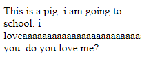
什么时候 text 会 overflow?
一个有 width 的 p, 如果内容超过了. 它会自动 new line.
p {
  width: 200px;
}
white-space: nowrap;
可以禁止 auto new lin, then 它就会 overflow

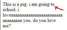
overflow: hidden;
overflow 之后字就被 cut 掉了
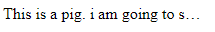
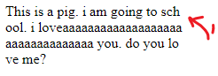
ellipsis
默认是 clip 就是剪掉
text-overflow: ellipsis;
ellipsis 就会变成点点点
单个 word 太长, 也会 text overflow
就算没有 nowrap, 字太长也会 text overflow
word-wrap
word-wrap: break-word;
通过 break-word 可以强制 new line
word-break
word-break: break-all;
默认是 keep-all, 就是完整的 word 才可以 new line.
break-all 就是只要碰到边就把任何字给 break 了. 对比 word-wrap 只有在遇到超长字才会 break word.
第 1 张是 keep-all, 第 2 张是 break-all
CSS Web Fonts
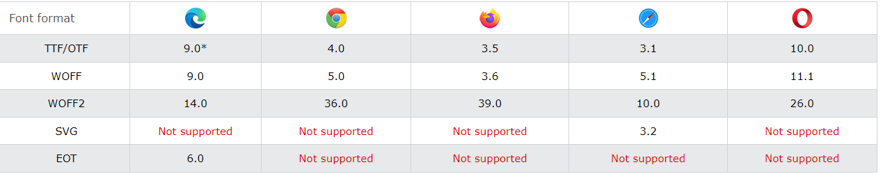
电脑常用的是 TTF/OTF
TTF 比较古老, Apple, Microsoft 一起出的, OTF 基于 TTF 是 MIcrosoft 出的.
Web 通常用 WOFF, 基于 TTF/OTF 做过优化. 新版是 WOFF2.
之前有提过, 要嘛用 build-in 字体, 要嘛 font-awesome, google font.(通过 link url)
如果要用自家的那么就需要 @font-face, 其实 font-awesome 和 google font 的 link url 也是 build @font-face 来的.
@font-face {
  font-family: myFirstFont;
  src: url(sansation_light.woff);
}

div {
  font-family: myFirstFont;
}
Bold 要另外写.
@font-face {
  font-family: myFirstFont;
  src: url(sansation_bold.woff);
  font-weight: bold;
}
所以通常会有很多 @font-face 的. 看你要用到多少种.
CSS 2D Transforms
translate(x,y)
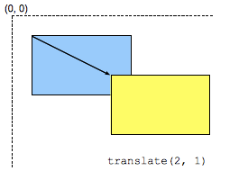
放 minus 就是往左和上移动.
rotate(20deg)
旋转 20 度
scaleX(2)
x 是 width, default value 是 1 , 2 就是放大一倍 x2 的意思
scaleY(0.5)
y 是 height, 0.5 就是缩小了一倍 x0.5 的意思
scale(x,y)
x, y 一起 set
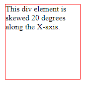
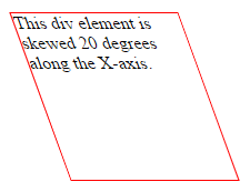
skewX(20deg), skewY(), skew()
skewX 是这样的效果, 不知道什么场景会用到啦.
matrix(scaleX(1),skewY(0),skewX(0),scaleY(1),translateX(0),translateY(0))
一起 set. 没有就放 default value 0,
Apply Multiple 2D Transforms
要 set 多个就用空格做分隔符
transform: scaleX(0.5) scaleY(0.5);
CSS 3D Transforms
rotateX(10deg), rotateY(10deg), rotateZ(10deg)
效果看不懂, 只知道它和 2D 的 rotate(10deg) 差很多.
CSS Transitions
5 个属性可以用
transition-property
transition-property: width;
watch propety width, 改变的时候就会有 animation
transition-delay
trasition-delay: 1s
delay 1 秒才触发
transition-duration
transition-duration: 1s
整个 animation 过程用时 1 秒
transition-timing-function
过度的体验, 比如 ease-in, ease-out 那些

transition
shorthand property
transition: width 2s linear 1s;
property, duration, function, delay
Apply Multiple
transition: width 1s, height 1s;
transition-property: width, height;
transition-duration: 1s, 1s;
property, shorthand 写法都是加逗号
CSS Animations
@keyframes
animation 过程的 style
@keyframes example {
  from {background-color: red;}
  to {background-color: yellow;}
}
@keyframes example {
  0%   {background-color:red; left:0px; top:0px;}
  25%  {background-color:yellow; left:200px; top:0px;}
  50%  {background-color:blue; left:200px; top:200px;}
  75%  {background-color:green; left:0px; top:200px;}
  100% {background-color:red; left:0px; top:0px;}
}
可以写任何 style property, % 就是 duration 到那个 % 时要出什么 style
animation-name, duration, delay, timing-function
div:hover {
  animation-name: example;
  animation-duration: 4s;
  animation-delay: 2s;
  animation-timing-function: ease-in-out;
}
name 对应 @keyframes 的名字, duration, delay, timing-function 和 transition 一样.
animation-iteration-count
animation 跑完, 就会回到原本的 style. 要跑多几次就用 iteration
animation-iteration-count: 2;
animation-iteration-count: infinite; 无限次
animation-direction
normal, reverse, alternate, alternate-reverse
reverse 是从最后一个 @keyframes style 跑到第一个, 反过来执行.
alternate 是在最少跑 2 次才有用的, 第 1 次正常跑, 第 2 次 reverse 跑, 以此类推
alternate-reverse 是第一次跑 reverse, 第 2 次正常跑
animation-fill-mode
animation 跑完, 就会回到原本的 style.

by default, animation 的 style, 只会在 animation 过程中有效, 之前, 之后都不会有, 但 fill-mode 可以调.
animation-fill-mode: none, forwards, backwards, both
forwards 是跑完 animation 后把最后一个 keyframs's style apply 去 element. (注: apply 了就 lock 着了, 无法用 js 之类的去改它哦)
backwards 是当 delay 期间, 它会提前去拿 first keyframe's style 去 apply.
both 是 2 forwards + backwards
animation
shorthand property
animation: example 5s linear 2s infinite alternate;
animation-name, duration, timing-function, delay, iteration, direction (没有 fill-mode)
CSS Styling Images
Filters
img {
  filter: grayscale(100%); // 黑白照
  filter: blur(4px); // 变萌
}
还有许多 effects, 但常用的就只有上面 2 个, 更多参考.
Flip image
镜子效果是通过 scaleX 来做的.
img:hover {
  transform: scaleX(-1);
}

CSS The object-fit Property
object-fit 用来设定当具体的图片比 img element width, height 大 (同时 aspect ratio 也不一样) 的情况下要如果显示.
contain
上下或左右黑黑, 图片完整保留, 只是变小了.
cover
没有黑黑, 但是图片被 clip 了, 也变小了. (它会尽可能保留中间的内容)
fill
这个是 default, 图片会变形走样.
none
跟 cover 有点像, 只是它不会变小, 它就直接 clip 中间.
scale-down
the image is scaled down to the smallest version of none or contain. (不是很明白)
真实的情况下, 大部分 img element 只会设置 width 或 height, 比较少情况 2 个都 set. 如果只是 set 其中 1 个, 那么是不需要 object-fit 设定的, 图片会自动按比例缩写.
CSS The object-position Property
object-position 通常搭配 cover 来用, 由于 cover 默认是取中心, 可能不一定美. 那么就可以通过 object-position 来调整.
object-position: 50% 100%;
用 % 来控制, horizontal, vertical (通常指需要控制 1 边, 另一边就放 100% 可以了)
percent 的玩法是上面这样.
CSS Masking
masking 是在图片上盖一层东西, 可以是一张图, 或者一个遮罩层.
它可以做出这些效果
<div class="mask1">
    <img src="img_5terre.jpg" alt="Cinque Terre" width="600" height="400">
</div>
.mask1 {
  -webkit-mask-image: url(w3logo.png);
  mask-image: url(w3logo.png);
  -webkit-mask-repeat: no-repeat;
  mask-repeat: no-repeat;
}
CSS Variables - The var() Function
var(name, fallback value)
:root {
  --blue: #1e90ff;
}

body { background-color: var(--blue, red); }
Local variable
button {
  --blue: #0000ff; /* local variable will override global */
  color: var(--blue);
}
Modify by Javascript
<script>
// Get the root element
var r = document.querySelector(':root');

// Create a function for getting a variable value
function myFunction_get() {
  // Get the styles (properties and values) for the root
  var rs = getComputedStyle(r);
  // Alert the value of the --blue variable
  alert("The value of --blue is: " + rs.getPropertyValue('--blue'));
}

// Create a function for setting a variable value
function myFunction_set() {
  // Set the value of variable --blue to another value (in this case "lightblue")
  r.style.setProperty('--blue', 'lightblue');
}
</script>
Modify by Media Query
@media screen and (min- 450px) {
   :root {
    --blue: lightblue;
  }
}
CSS Media Queries
CSS2 Introduced Media Types, TV, printer, computer, handset 等, 不过最后只有 printer 支持的比较好.
CSS3 Introduced Media Queries 它不是通过 type, 而是匹配
width, height of the viewport
width, height of the device
orientation, resolution
格式:
@media not|only mediatype and (expressions) {
  CSS-Code;
}
写 link 也是一个方式
<link rel="stylesheet" media="mediatype and|not|only (expressions)" href="print.css">
举例:
@media screen and (min- 480px)
min-width 就相等于 screen 必须超过或等于 480. 就运行下面的 style
反着看就好理解了. min 相等于 >=, max 相等于 <=
CSS Flex Container
Figma 的 Auto Layout 就是用 flex 实现的.
原理是 container + items 来实现布局.
flex-direction
column, row, column-reverse, row-reverse.
打直, 或者打横排列
缺点是只能选一边, 有些场景会排不了, 得要用 grid.
flex-wrap
wrap, nowrap
wrap 是当 item 超出 container 时会 new line, 类似 word-wrap.
nowrap 则会强行挤压 item.
flex-flow
flex-flow 是 shorthand for direction 和 wrap
flex-flow: row wrap;
justify-content
center, flex-start, flex-end, space-around, space-between
horizontal 左中右 align, 还有左右分开.
align-items
center, flex start, flex-end, stretch (拉紧), baseline
vertical 上中下 align, stretch 是上到下覆盖完
align-content
align content 是当有超过 1 个 row 的时候用的
space-between, space-around, stretch, center, flex-start, flex-end
它表达的是多个 row, align-items 和 justify-content 表达的是 1 个 row.
flex 实现居中
用 center 就可以了.
.flex-container {
  display: flex;
  height: 300px;
  justify-content: center;
  align-items: center;
}
CSS Flex Items
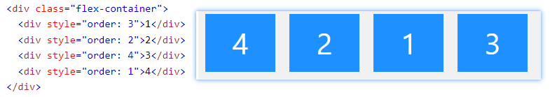
order
flex-grow
用来做比例
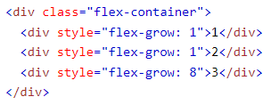
1,1,8 相等于 width 10%, 10%, 80%
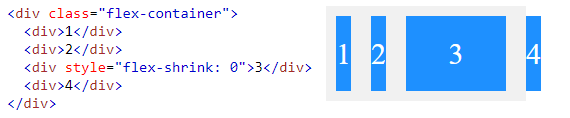
flex-shrink
当 container 小的时候, 会自动压缩 item, shrink 0 可以阻止它
flex-basis
The flex-basis property specifies the initial length of a flex item.
<div style="flex-basis: 200px">3</div>
不是很清楚什么用, 效果和给 width 200px 一样.
flex
shorthand of flex-grow, flex-shrink, and flex-basis
flex: 0 0 200px
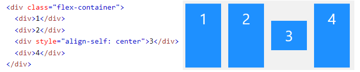
align-self
align-self 就是特别设置一个 item 要怎样 vertical align