<!DOCTYPE html>
<html>
<head>
<meta charset="utf-8">
<meta http-equiv="X-UA-Compatible" content="IE=edge,chrome=1">
<title>Examples</title>
<meta name="description" content="">
<meta name="keywords" content="">
<link href="" rel="stylesheet">
<script type="text/javascript" src="js/jquery-3.2.1.min.js"></script>
<style type="text/css">
.choose {
position: relative;
}
.choose .radio {
position: relative;
display: inline-block;
font-weight: 400;
color: #0c4757;
padding-left: 25px;
cursor: pointer;
}
.choose .radio input {
position: absolute;
left: -9999px;
}
.choose .radio i {
display: block;
position: absolute;
top: 3px;
left: 0;
15px;
height: 15px;
outline: 0;
border: 1px solid #e4e4e4;
background: #ffffff;
border-radius: 50%;
transition: border-color .3s;
-webkit-transition: border-color .3s;
}
.choose .radio input + i:after {
position: absolute;
content: '';
top: -1px;
left: -1px;
17px;
height: 17px;
border-radius: 50%;
background: url(img/cli.png) no-repeat 3px 5px #1AB394;/*第一种方法*/
/*background: url(img/click_btn.png);
background-size: 100% 100%;*//*第二种方法*/
opacity: 0;
transition: opacity .1s;
-webkit-transition: opacity .1s;
}
.choose .radio input:checked + i:after {
opacity: 1;
}
</style>
</head>
<body>
<div class="choose">
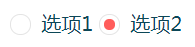
<label class="radio">选项1<input type="radio" name="radio" value="1" checked><i></i></label>
<label class="radio">选项2<input type="radio" value="2" name="radio"><i></i></label>
</div>
<script type="text/javascript">
$(function(){
$(".radio").find('input').click(function(){
$(this).parent('label').siblings('label').find('input').removeAttr('checked') && $(this).attr('checked', 'checked');
console.log($('input[type="radio"]:checked').val())
})
})
</script>
</body>
</html>

第二种样式,只需更改一下部分:
.choose .radio input + i:after {
    position: absolute;
    content: '';
    top: 3px;
    left: 3px;
     9px;
    height: 9px;
    border-radius: 50%;
    background-color: #ff5d5b;
    opacity: 0;
    transition: opacity .1s;
    -webkit-transition: opacity .1s;
}
参考:https://www.cnblogs.com/xinjie-just/p/5911086.html