前言
介于很多前端小伙伴对于css3的动画的运动速度不太理解,今天就分享一款可以在线调试的贝塞尔曲线,附上链接,http://cubic-bezier.com/#.17,.67,.83,.67
规则
1. ease 对应自定义cubic-bezier(.25,.01,.25,1),效果为先慢后快再慢; 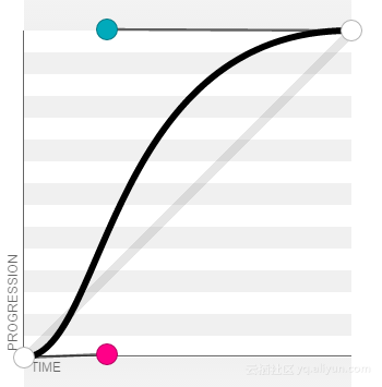
2. linear 对应自定义cubic-bezier(0,0,1,1),效果为匀速直线; 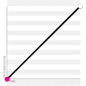
3. ease-in 对应自定义cubic-bezier(.42,0,1,1),效果为先慢后快; 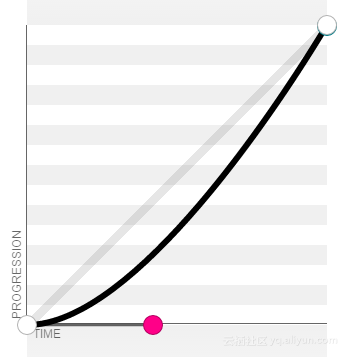
4. ease-out 对应自定义cubic-bezier(0,0,.58,1),效果为先快后慢; 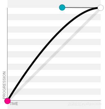
5. ease-in-out 对应自定义cubic-bezier(.42,0,.58,1),效果为先慢后快再慢。 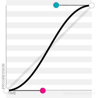
用法
<!DOCTYPE html>
<html lang="zh-cn">
<head>
  <meta charset="UTF-8">
  <title>demo</title>

  <style>
    .linear {
       50px;
      height: 50px;
      background-color: #ff0000;
      -webkit-transition:  all 2s linear;
         -moz-transition:  all 2s linear;
           -o-transition:  all 2s linear;
              transition:  all 2s linear;
    }
    .linear:hover {
      -webkit-transform:  translateX(100px);
         -moz-transform:  translateX(100px);
           -o-transform:  translateX(100px);
              transform:  translateX(100px);
    }

    .custom {
       50px;
      height: 50px;
      background-color: #00ff00;
      -webkit-transition:  all 2s cubic-bezier(.94,-0.25,.32,1.31);
         -moz-transition:  all 2s cubic-bezier(.94,-0.25,.32,1.31);
           -o-transition:  all 2s cubic-bezier(.94,-0.25,.32,1.31);
              transition:  all 2s cubic-bezier(.94,-0.25,.32,1.31);
    }
    .custom:hover {
      -webkit-transform:  translateX(200px);
         -moz-transform:  translateX(200px);
           -o-transform:  translateX(200px);
              transform:  translateX(200px);
    }
  </style>
</head>
<body>
  <div class="linear"></div>
  <div class="custom"></div>
</body>
</html>