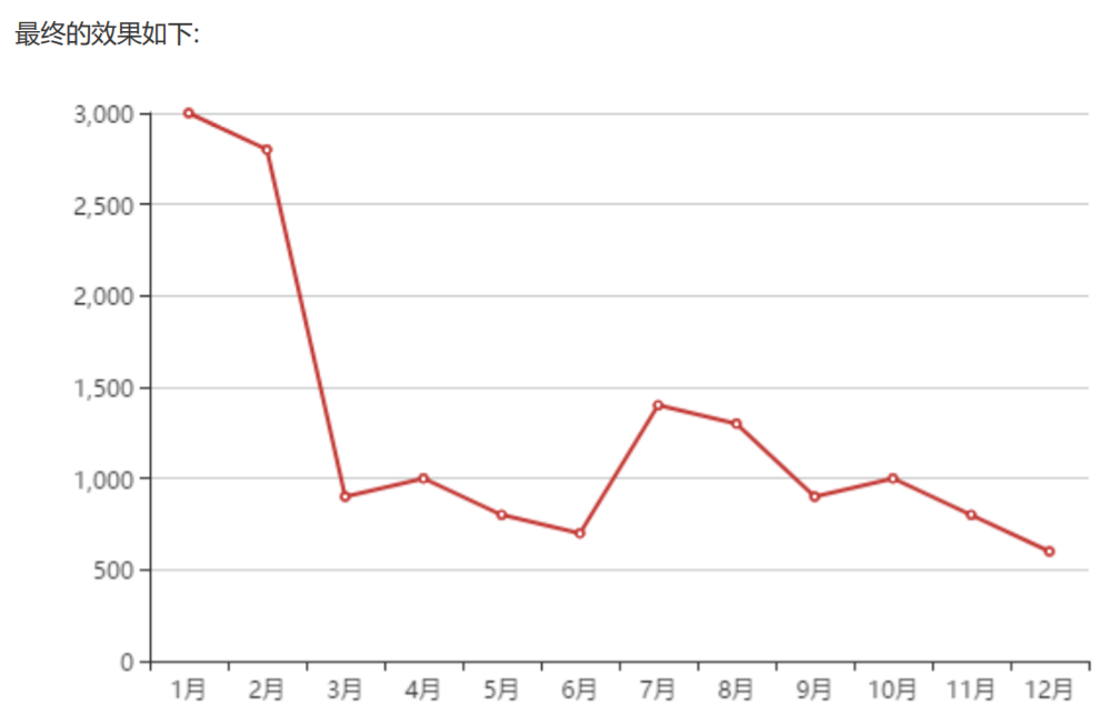
3.2.1.折线图的实现步骤
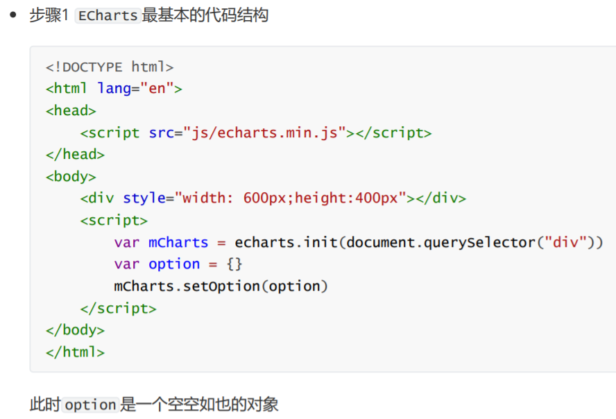
07.折线图的实现.html
<!DOCTYPE html>
<html lang="en">
<head>
<meta charset="UTF-8">
<meta name="viewport" content="width=device-width, initial-scale=1.0">
<meta http-equiv="X-UA-Compatible" content="ie=edge">
<title>Document</title>
<script src="lib/echarts.min.js"></script>
</head>
<body>
<div style=" 600px;height: 400px"></div>
<script>
//1. ECharts最基本的代码结构
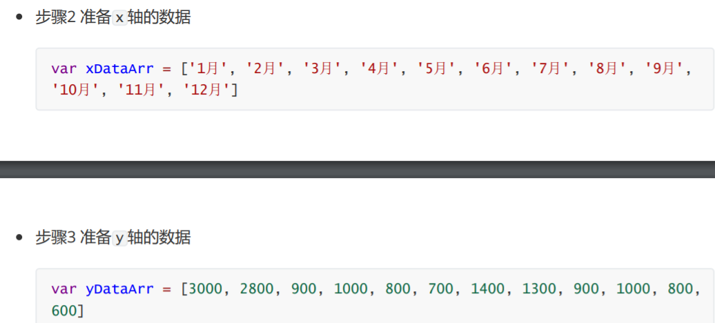
//2. x轴数据:['1月', '2月', '3月', '4月', '5月', '6月', '7月', '8月', '9月', '10月', '11月', '12月']
//3. y轴数据:[3000, 2800, 900, 1000, 800, 700, 1400, 1300, 900, 1000, 800, 600]
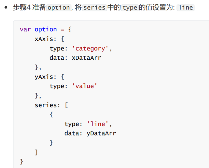
//4. 将type的值设置为line
var mCharts = echarts.init(document.querySelector('div'))
var xDataArr = ['1月', '2月', '3月', '4月', '5月', '6月', '7月', '8月', '9月', '10月', '11月', '12月']
var yDataArr = [3000, 2800, 900, 1000, 800, 700, 1400, 1300, 900, 1000, 800, 600]
var option = {
xAxis: {
type: 'category',
data: xDataArr
},
yAxis: {
type: 'value'
},
series: [
{
name: '康师傅',
data: yDataArr,
type: 'line' // 设置图表类型为 折线图
}
]
}
mCharts.setOption(option)
</script>
</body>
</html>
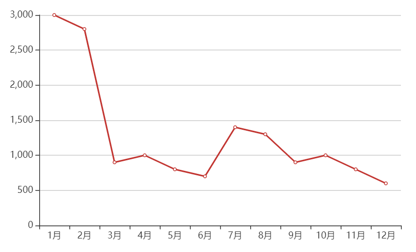
3.2.2.折线图的常见效果

08.折线图的常见效果.html
<!DOCTYPE html>
<html lang="en">
<head>
<meta charset="UTF-8">
<meta name="viewport" content="width=device-width, initial-scale=1.0">
<meta http-equiv="X-UA-Compatible" content="ie=edge">
<title>Document</title>
<script src="lib/echarts.min.js"></script>
</head>
<body>
<div style=" 600px;height: 400px"></div>
<script>
//1. ECharts最基本的代码结构
//2. x轴数据:['1月', '2月', '3月', '4月', '5月', '6月', '7月', '8月', '9月', '10月', '11月', '12月']
//3. y轴数据:[3000, 2800, 900, 1000, 800, 700, 1400, 1300, 900, 1000, 800, 600]
//4. 将type的值设置为line
var mCharts = echarts.init(document.querySelector('div'))
var xDataArr = ['1月', '2月', '3月', '4月', '5月', '6月', '7月', '8月', '9月', '10月', '11月', '12月']
var yDataArr = [3000, 2800, 900, 1000, 800, 700, 1400, 1300, 900, 1000, 800, 600]
var option = {
xAxis: {
type: 'category',
data: xDataArr
},
yAxis: {
type: 'value'
},
series: [
{
name: '康师傅',
data: yDataArr,
type: 'line',
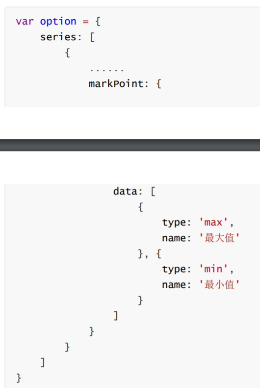
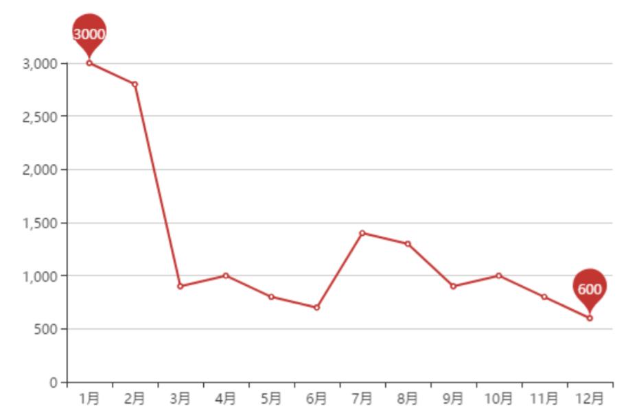
markPoint: { // 标记点
data: [
{ type: 'max' },
{ type: 'min' }
]
},
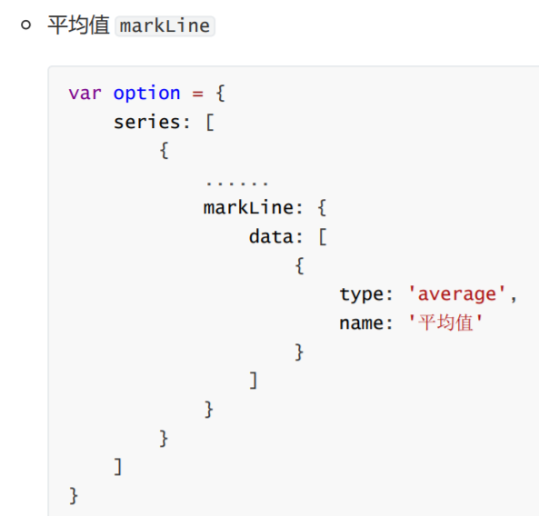
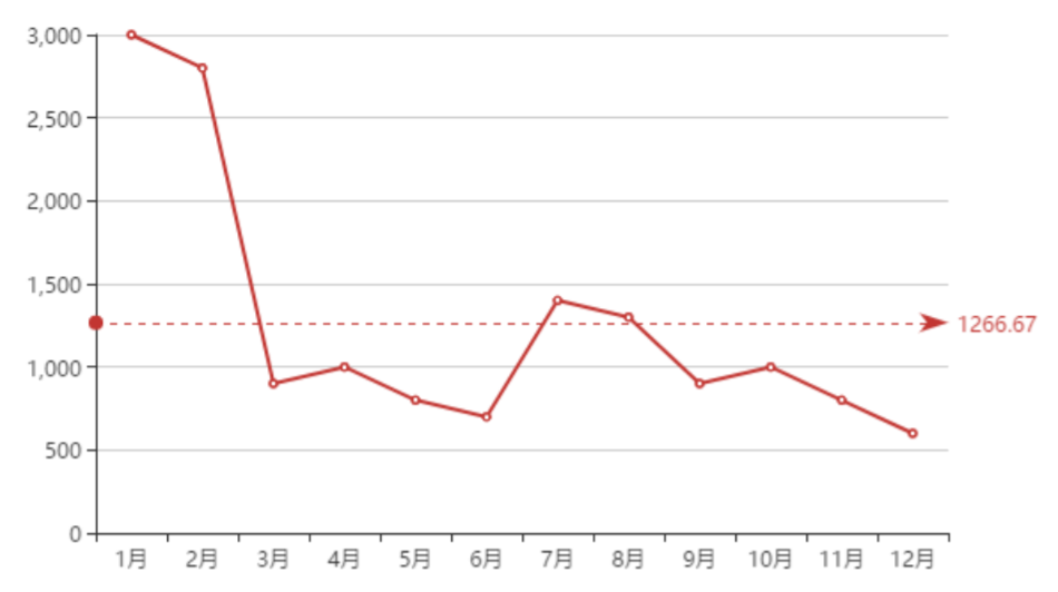
markLine: { // 标记线
data: [
{ type: 'average' }
]
},
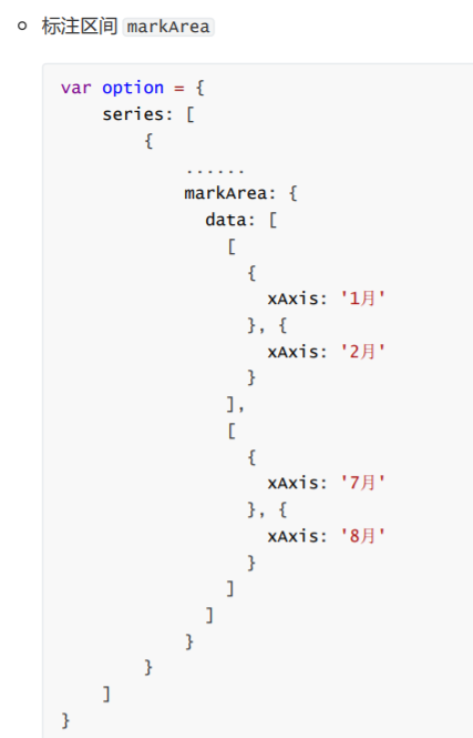
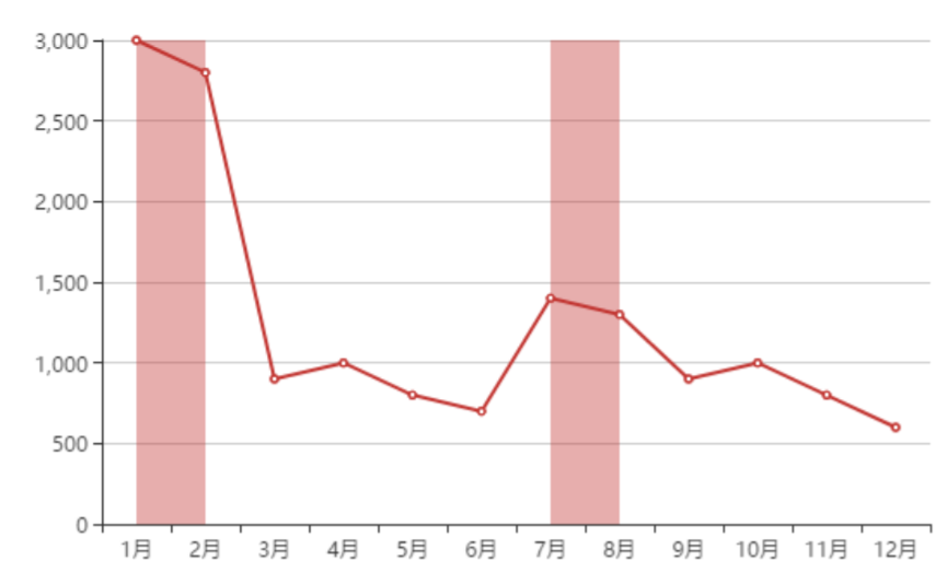
markArea: { // 标记区域
data: [
[
{ xAxis: '1月' },
{ xAxis: '2月' }
],
[
{ xAxis: '7月' },
{ xAxis: '8月' }
]
]
},
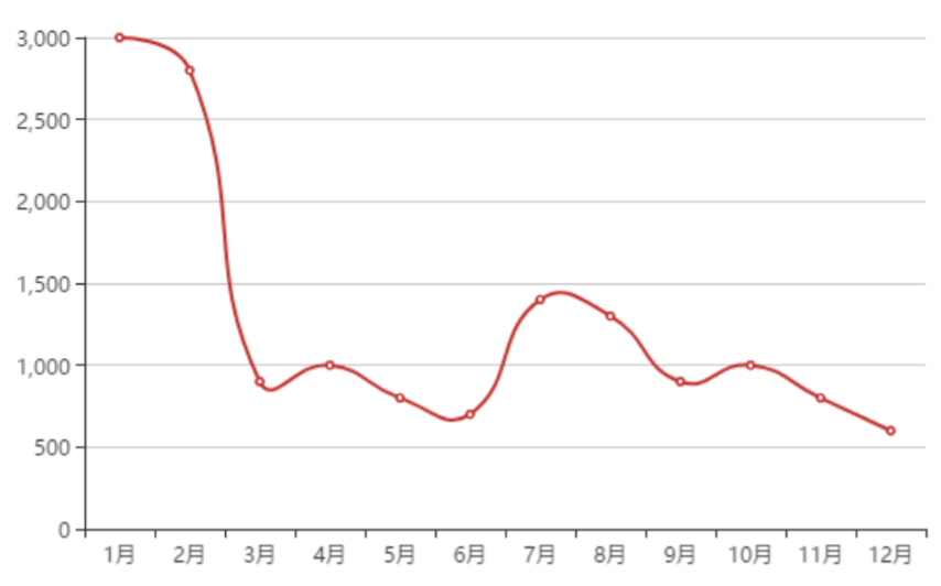
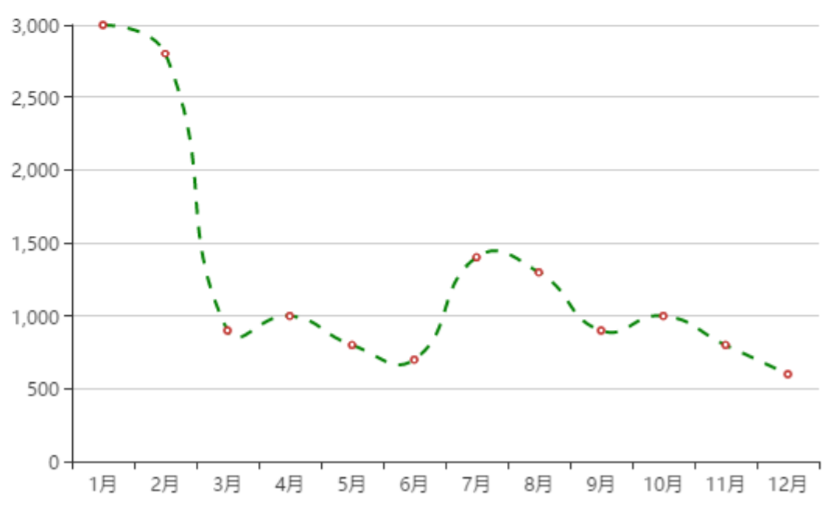
smooth: true, // 是否为平滑线
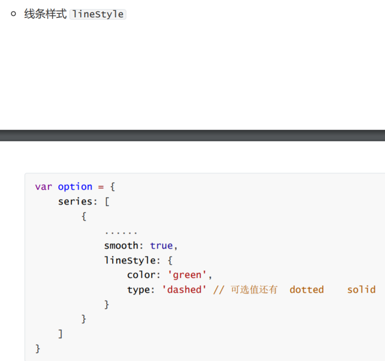
lineStyle: { // 线的样式设置
color: 'green',
type: 'solid' // dashed dotted solid
},
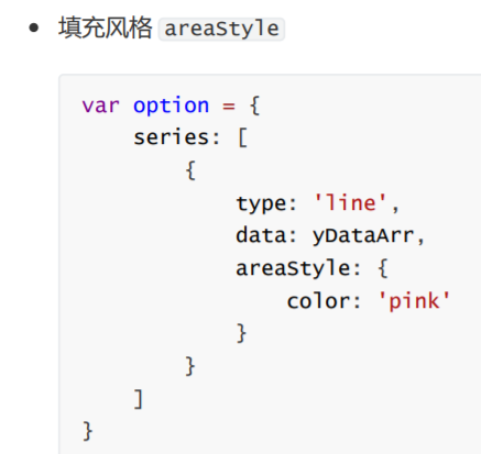
areaStyle: { // 线和x轴形成的区域设置
color: 'pink'
}
}
]
}
mCharts.setOption(option)
</script>
</body>
</html>
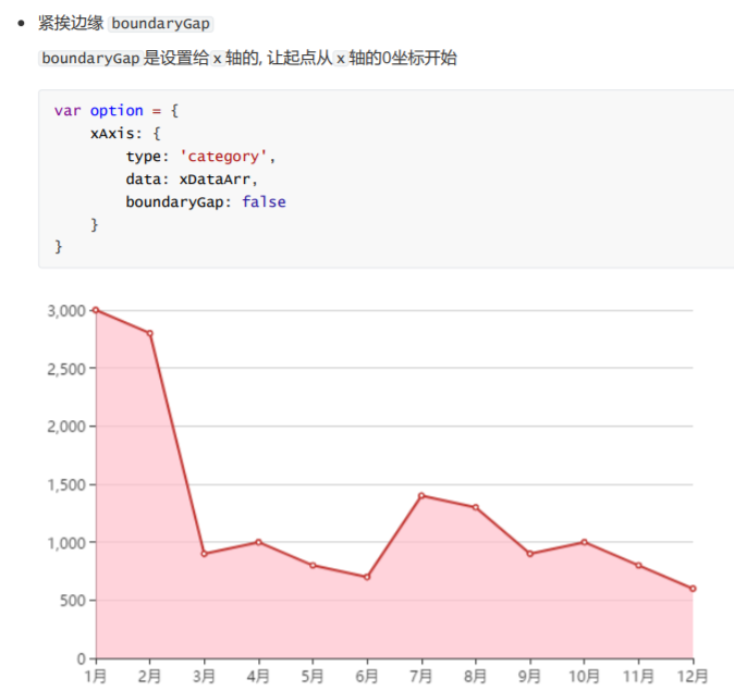
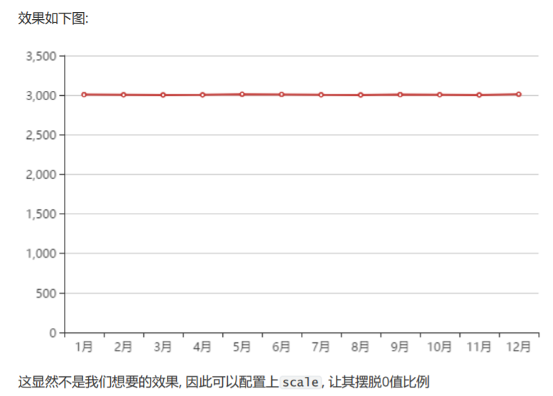
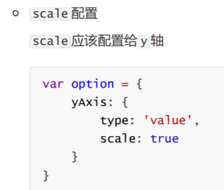
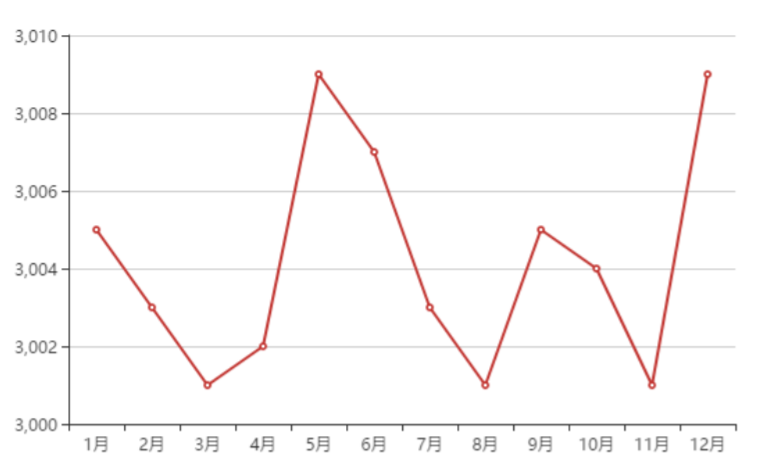
- 紧挨边缘 boundaryGap
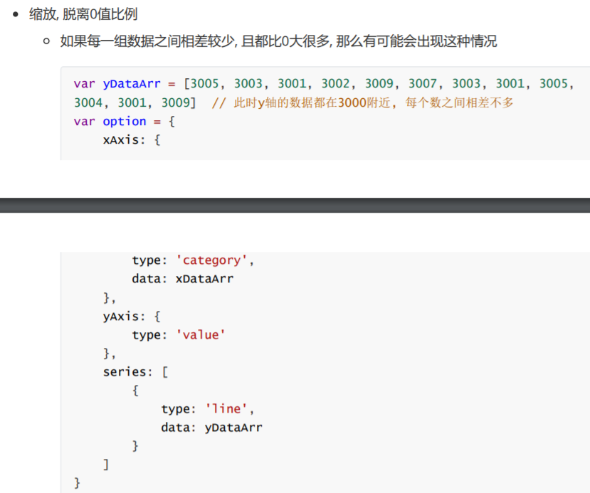
- 缩放, 脱离0值比例
09.折线图的常见效果.html
<!DOCTYPE html>
<html lang="en">

<head>
  <meta charset="UTF-8">
  <meta name="viewport" content="width=device-width, initial-scale=1.0">
  <meta http-equiv="X-UA-Compatible" content="ie=edge">
  <title>Document</title>
  <script src="lib/echarts.min.js"></script>
</head>

<body>
  <div style=" 600px;height: 400px"></div>
  <script>
    var mCharts = echarts.init(document.querySelector('div'))
    var xDataArr = ['1月', '2月', '3月', '4月', '5月', '6月', '7月', '8月', '9月', '10月', '11月', '12月']
    // var yDataArr = [3000, 2800, 900, 1000, 800, 700, 1400, 1300, 900, 1000, 800, 600]
    var yDataArr = [3005, 3003, 3001, 3002, 3009, 3007, 3003, 3001, 3005, 3004, 3001, 3009]

    var option = {
      xAxis: {
        type: 'category',
        data: xDataArr,
        boundaryGap: false // x轴的第1个元素是否与y轴有距离 【设置给x轴】
      },
      yAxis: {
        type: 'value',
        scale: true // 缩放, 脱离0值比例 【设置给y轴】
      },
      series: [
        {
          name: '康师傅',
          data: yDataArr,
          type: 'line'
        }
      ]
    }
    mCharts.setOption(option)
  </script>
</body>

</html>
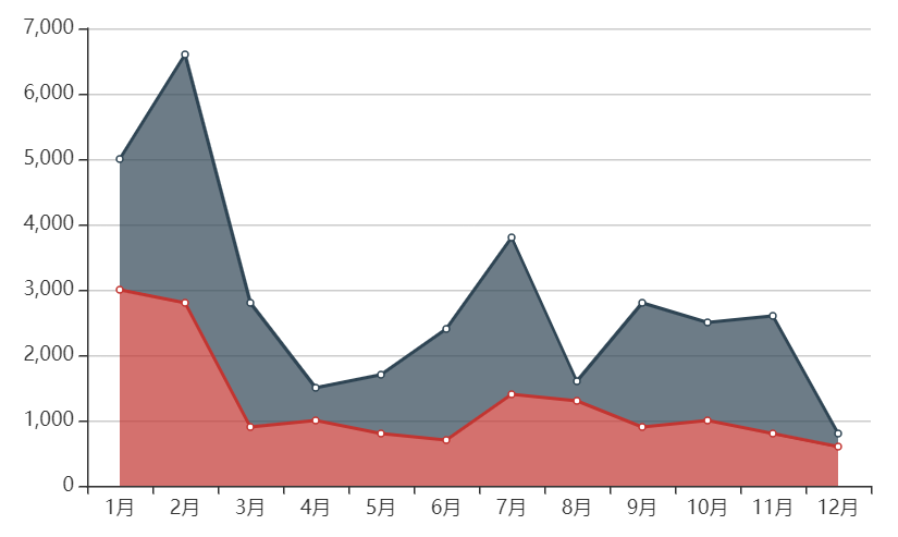
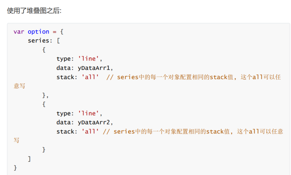
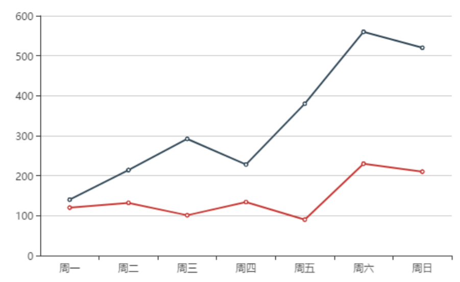
- 堆叠图


10.折线图的常见效果_堆叠图.html
<!DOCTYPE html>
<html lang="en">

<head>
  <meta charset="UTF-8">
  <meta name="viewport" content="width=device-width, initial-scale=1.0">
  <meta http-equiv="X-UA-Compatible" content="ie=edge">
  <title>Document</title>
  <script src="lib/echarts.min.js"></script>
</head>

<body>
  <div style=" 600px;height: 400px"></div>
  <script>
    var mCharts = echarts.init(document.querySelector("div"))
    var xDataArr = ['1月', '2月', '3月', '4月', '5月', '6月', '7月', '8月', '9月', '10月', '11月', '12月']
    var yDataArr = [3000, 2800, 900, 1000, 800, 700, 1400, 1300, 900, 1000, 800, 600]
    var yDataArr2 = [2000, 3800, 1900, 500, 900, 1700, 2400, 300, 1900, 1500, 1800, 200]

    var option = {
      xAxis: {
        type: 'category',
        data: xDataArr
      },
      yAxis: {
        type: 'value',
      },
      series: [
        {
          type: 'line',
          data: yDataArr,
          stack: 'all', // 堆叠图的设置 【堆叠图的stack的值要一样】
          areaStyle: {}
        },
        {
          type: 'line',
          data: yDataArr2,
          stack: 'all', // 堆叠图的设置 【堆叠图的stack的值要一样】
          areaStyle: {}
        }
      ]
    }
    mCharts.setOption(option)
  </script>
</body>

</html>