前提:
本次开发小程序使用的是WePY 1.x的版本(由于时间比较紧急,遂用前辈已开发完的项目进行二次开发,不然我本人更倾向采用 WePY 2.x版本开发), 此次开发中有折线图与圆饼图的需求,
如生成以下的折线图:

解决方案: 经查找决定使用 echarts(一个基于 JavaScript 的开源可视化图表库)开发
下面就本次使用的方案进行讲解 :
1.进入 echarts官网,搜索小程序, 就会用小程序专门使用的一套方案

2. 去github中的 ecomfe/echarts-for-weixin 下载(ec-canvas)这个包
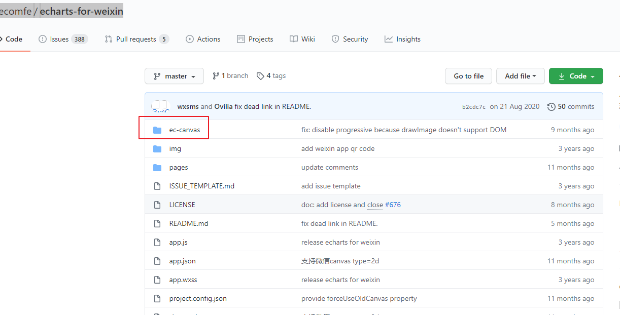
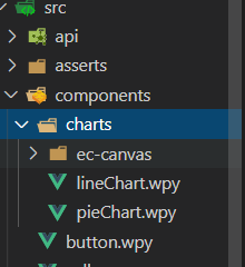
3..将下载好的包放到项目的 components 中, 将需要生成的折线图做成一个组件, 提高代码的可维护性
lineChart.wpy 组件编写:


 1 <template>
 2   <view class="line__chart">
 3     <ec_canvas
 4       id="mychart-dom-bar"
 5       canvas-id="mychart-bar"
 6       ec="{{ ec }}"
 7       bind:init="echartInit"
 8     ></ec_canvas>
 9   </view>
10 </template>
11
12 <script>
13 import wepy from 'wepy';
14 import echarts from './ec-canvas/echarts.js';
15
16 export default class LineChart extends wepy.component {
17   data = {
18     ec: {},
19   };
20
21   methods = {
22     echartInit(e) {
23       this.initChart(e.detail.canvas, e.detail.width, e.detail.height);
24     },
25   };
26
27   initChart(canvas, width, height) {
28     const chart = echarts.init(canvas, null, {
29        width,
30       height: height,
31     });
32     canvas.setChart(chart);
33
34     const option = {
35       xAxis: {
36         type: 'category',
37         data: ['1', '2', '3', '4', '5'],
38         axisTick: {
39           show: false,
40         },
41         axisLabel: {
42           color: '#666',
43           fontWeight: 800,
44         },
45       },
46      legend: {
47         data: ['体温异常人数', '体温正常人数']
48     },
49       yAxis: {
50         type: 'value',
51         interval: 20,
52         max: 300,
53         show: true,
54       },
55       series: [
56         {
57           name: "体温异常人数",
58           data: [12,5,16,7,4],
59           type: 'line',
60           lineStyle: {
61             color: '#ff6147',
62              1,
63           },
64           // showSymbol: false,
65         },
66         {
67           name: "体温正常人数",
68           data: [55,100,150,100,120],
69           type: 'line',
70           lineStyle: {
71             color: '#237dff',
72              1,
73           },
74         },
75       ],
76     };
77
78     chart.setOption(option);
79     return chart;
80   }
81 }
82 </script>
83
84 <style lang="less">
85 .line__chart {
86    100%;
87   height: 600rpx;
88   margin: 0 auto;
89 }
90 </style>
关键点:
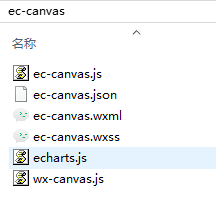
在组件中需要引用 echarts
4.页面上引用
 1 <template>
 2   <view class="page-index">
 3         <view class="chart_box">
 4             <LineChart></LineChart>
 5         </view>
 6   </view>
 7 </template>
 8
 9 <script>
10 import wepy from 'wepy';
11 import LineChart from '../../components/charts/lineChart';
12 export default class Index extends wepy.page {
13   config = {
14     navigationBarTitleText: '数据中心',
15     navigationBarBackgroundColor: '#fff',
16     navigationBarTextStyle: 'black',
17     usingComponents: {
18       ec_canvas: '../../components/charts/ec-canvas/ec-canvas',
19     },
20   };
21
22   components = {
23     LineChart,
24   };
25 }
26 </script>
关键点:
需要在 使用折线图的页面中配置 config的 usingComponents
1 config = {
2     navigationBarTitleText: '数据中心',
3     navigationBarBackgroundColor: '#fff',
4     navigationBarTextStyle: 'black',
5     usingComponents: {
6       ec_canvas: '../../components/charts/ec-canvas/ec-canvas',
7     },
8   };
5.遇到打包问题: 此时折线图就已经可以在本地小程序中显示了,但是当你想要打包发版时,会发现包很大,其中ec-canvas这个包就占 1.13M,一一检查,发现 echarts.js这个包就占 1.12M
显而易见,解决方案就是减少echarts.js 这个包的体积
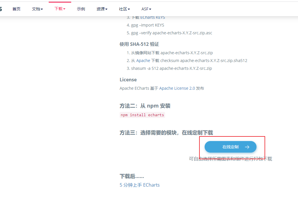
点进去勾选所用到的图表, 坐标系,组件, 再勾选 工具集,代码压缩 ,最后下载即可,你会发现,下载的就是 echarts.js
替换项目中的文件,完美地解决了这个问题, 为了以防万一, 在小程序的工具中勾选 上传代码时自动压缩样式, 上传代码时自动压缩混淆
此时就可以上传代码包