Ref:
Cameron D. - HTML5, JavaScript and jQuery (Programmer to Programmer) - 2015
http://www.runoob.com/svg/svg-path.html
MacLees N. - jQuery for Designers Beginner’s Guide - 2012
jQuery for Designers 2014
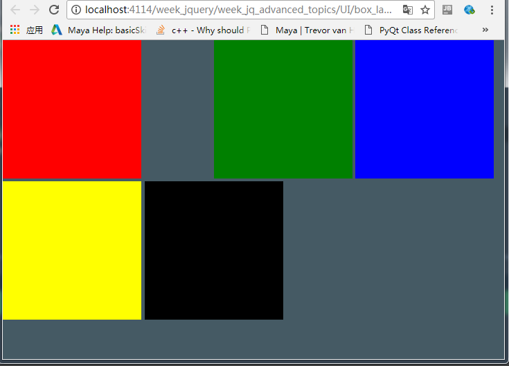
<1> CSS Responsive box
关键字:display:inline-block;
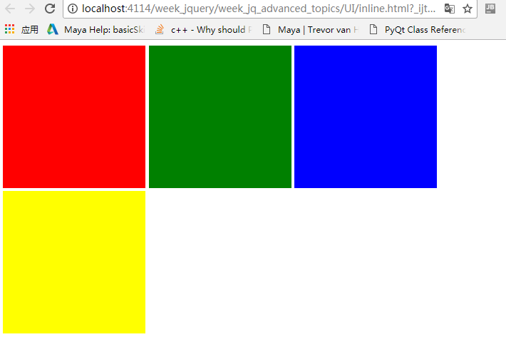
html:


<!DOCTYPE html>
<html lang="en">
<head>
    <meta charset="utf-8">
    <style>
        .box {
            height:200px;
            width:200px;
            display:inline-block;
        }
    </style>
</head>
<body>
<div class="box" style="background:red"></div>
<div id="middleBox" class="box" style="background:green"></div>
<div id="thirdBox" class="box" style="background:blue"></div>
<div id="lastBox" class="box" style="background:yellow"></div>

</body>
</html>
如果要把绿色的立方体移动50px,把蓝色向右推动50px,在这种静态布局是不可能的.先试试position:relative.
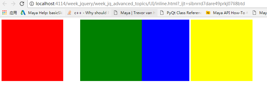
<!DOCTYPE html>
<html lang="en">
<head>
    <meta charset="utf-8">
    <style>
        .box {
            height:200px;
            width:200px;
            display:inline-block;
        }
        #middleBox{
            position: relative;
            left:50px;
        }

    </style>
</head>
<body>
<div class="box" style="background:red"></div>
<div id="middleBox" class="box" style="background:green"></div>
<div id="thirdBox" class="box" style="background:blue"></div>
<div id="lastBox" class="box" style="background:yellow"></div>

</body>
</html>
position设置为relative,意思就在现在的位置作为基础,然后再做移动。
position设置为absolute:
<!DOCTYPE html>
<html lang="en">
<head>
    <meta charset="utf-8">
    <style>
        .box {
            height:200px;
            width:200px;
            display:inline-block;
        }
        #middleBox{
            position: absolute;
            left:150px;
            top:150px;
        }

    </style>
</head>
<body>
<div class="box" style="background:red"></div>
<div id="middleBox" class="box" style="background:green"></div>
<div id="thirdBox" class="box" style="background:blue"></div>
<div id="fourthBox" class="box" style="background:yellow"></div>
<div id="lastBox" class="box" style="background:black"></div>
</body>
</html>
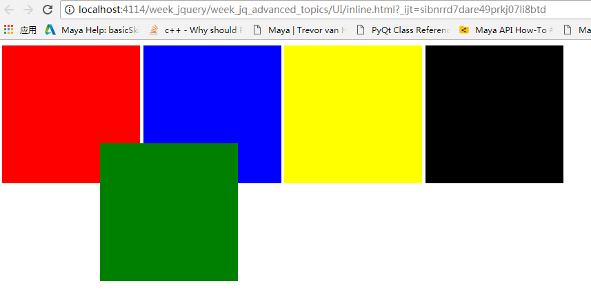
要把绿色放入下面写:z-index:-1;
margin-left:100px;
left:100px;区别就是,margin-left是会把下一个节点往右边推动.
<!DOCTYPE html>
<html lang="en">
<head>
    <meta charset="utf-8">
    <style>
        body{
            margin: 0;
            background-color: #455a64;
        }
        .box {
            height:200px;
            width:200px;
            display:inline-block;
        }
        #middleBox{
            position: relative;
            margin-left: 100px;
        }

    </style>
</head>
<body>
<div class="box" style="background:red"></div>
<div id="middleBox" class="box" style="background:green"></div>
<div id="thirdBox" class="box" style="background:blue"></div>
<div id="fourthBox" class="box" style="background:yellow"></div>
<div id="lastBox" class="box" style="background:black"></div>
</body>
</html>
<2>居中
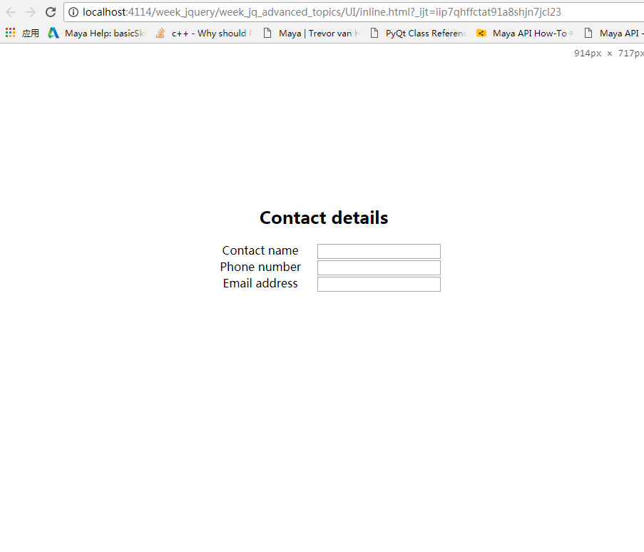
复杂的整个元素居中方案:
<!DOCTYPE html>
<html lang="en">
<head>
    <meta charset="utf-8">
    <style>
        label {
            width:150px;
            display: inline-block;
            vertical-align: top;
        }
        #contactDetails{
            position:absolute;
            width: 400px;
            height: 200px;
            text-align: center;
            top:50%;
            left: 50%;
            margin-top: -150px;
            margin-left: -200px;
        }
    </style>
</head>
<body>

<div id="contactDetails"><h2>Contact details</h2>
    <form method="post">
        <div class="formRow">
            <label for="contactName">Contact name</label>
            <input name="contactName" id="contactName" type="text"/>
        </div>

        <div class="formRow">
            <label for="phoneNumber">Phone number</label>
            <input name="phoneNumber" id="phoneNumber" type="text"/>
        </div>
        <div class="formRow">
            <label for="emailAddress">Email address</label>
            <input name="emailAddress" id="emailAddress" type="text"/>
        </div>
    </form>
</div>

</body>
</html>
水平居中是最简单的:
.box{
    margin: 0 auto;
    width:300px;
    height:200px;
}
<3>UI/CSS
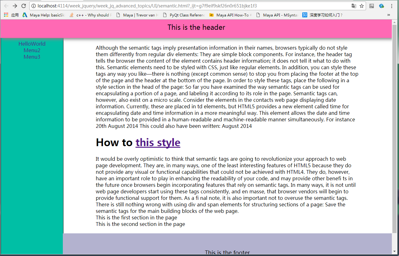
一个网页的简单构造v1:
<1>顶部为固定的:
<!DOCTYPE html>
<html lang="en">
<head>
    <meta charset="UTF-8">
    <title>Title</title>
    <style>
        body{
            min-height:100%;
            margin:0;
            padding:0;
            position:relative;
        }
        header {
            padding-top: 20px;
            padding-bottom: 20px;
            width:100%;
            background:hotpink;
            text-align:center;
            top:-10px;
            left: 0px;
            position: fixed;
            box-shadow: 5px 5px 15px #888888;
        }
        footer{
            width:100%;
            background:#B3B2CF;
            text-align:center;
        }
        header {
            font-size:22px;
        }
        aside {
            position:fixed;
            float:left;
            width:200px;
            height:100%;
            border: 1px solid black;
            padding-top: 40px;
            left: 0; !important;
            z-index: -1;
            background-color: #00bfa5;
        }
        footer {
            clear: both;
            margin-top: 100px;
            font-size:18px;
            z-index: -1;
            padding-top: 50px;
            padding-bottom: 50px;
        }
        main{
            position: absolute;
            left: 200px;
        }
        .container{
            width: 80%;
            margin: 0 auto;  /* make container objects to center*/
            top:80px;
            position: relative;
            z-index: -1;
        }

        .sidebar-nav{
            padding-top: 10px;
        }
        .sidebar-nav-ul{
            list-style: none;
            display:block;
            padding: 0;
            text-align: center;
        }
        .sidebar-nav-ul li a{
            text-decoration:none
        }


    </style>
</head>
<body>

<header>This is the header</header>
<aside>
    <div class="sidebar-nav">
        <ul class="sidebar-nav-ul">
            <li><a href="">HelloWorld</a></li>
            <li><a href="">Menu2</a></li>
            <li><a href="">Menu3</a></li>
        </ul>
    </div>
</aside>

<main>
    <div class="container">
        <div class="TextArea">
            Although the semantic tags imply presentation information in their names, browsers typically
            do not style them differently from regular  div elements: They are simple  block components. For
            instance, the  header tag tells the browser the content of the element contains header information; it
            does not tell it what to do with this.
            Semantic elements need to be styled with CSS, just like regular elements. In addition, you can style
            these tags any way you like—there is nothing (except common sense) to stop you from placing the
            footer at the top of the page and the  header at the bottom of the page.
            In order to style these tags, place the following in a  style section in the  head of the page:

            So far you have examined the way semantic tags can be used for encapsulating a portion of a
            page, and labeling it according to its role in the page. Semantic tags can, however, also exist on a
            micro scale.
            Consider the elements in the contacts web page displaying date information. Currently, these are
            placed in  td elements, but HTML5 provides a new element called  time for encapsulating date and
            time information in a more meaningful way. This element allows the date and time information to
            be provided in a human-readable and machine-readable manner simultaneously. For instance
            <time datetime="2014-08-20">20th August 2014</time>
            This could also have been written:
            <time datetime="2014-08-20">August 2014</time>
        </div>

        <div>
            <h1>
                How to <a href="https://segmentfault.com/q/1010000006896298?_ea=1171298">this style</a>
            </h1>
            It would be overly optimistic to think that semantic tags are going to revolutionize your approach to
            web page development. They are, in many ways, one of the least interesting features of HTML5 because
            they do not provide any visual or functional capabilities that could not be achieved with HTML4.
            They do, however, have an important role to play in enhancing the readability of your code, and
            may provide other benefi ts in the future once browsers begin incorporating features that rely on
            semantic tags. In many ways, it is not until web page developers start using these tags consistently,
            and en masse, that browser vendors will begin to provide functional support for them.
            As a fi nal note, it is also important not to overuse the semantic tags. There is still nothing wrong
            with using  div and  span elements for structuring sections of a page: Save the semantic tags for the
            main building blocks of the web page.
        </div>


        <section>This is the first section in the page</section>
        <section>This is the second section in the page</section>

    </div>
    <footer>
        This is the footer
    </footer>

</main>


</body>
</html>
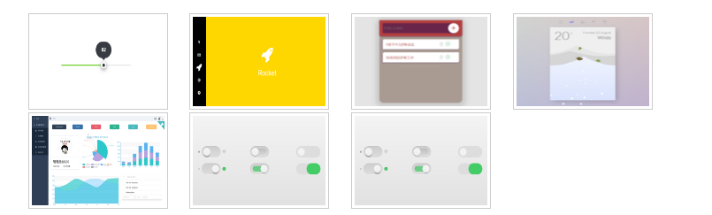
<2>Responsive imgs:
html:
<ul class="thumbs">
        <li><img src="imgs/1.png"></li>
        <li><img src="imgs/2.png"></li>
        <li><img src="imgs/3.png"></li>
        <li><img src="imgs/4.png"></li>
        <li><img src="imgs/5.png"></li>
        <li><img src="imgs/6.png"></li>
        <li><img src="imgs/6.png"></li>
</ul>
css:
.thumbs li{
    width: 25%;
    height: 140px;
    display: inline;
    padding: 10px;
}
.thumbs li img{
    width: 150px;
    height: 101px;
    padding: 3px;
    border: 1px solid #ccc;
    background-color: #fff;
    position: relative;
}
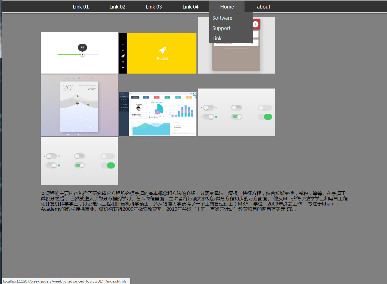
<3>: dropdown with fix header:
css:
@import url("../../../normalize.css");

body{
    background-color: gray;
}


.nav-bar{
    background-color: #333;
    border-bottom: 2px solid #cccccc;
    width: 100%;
    height: 40px;
    position: fixed;
    box-shadow: 3px 3px 5px #555555;
}
.nav-list{
    list-style: none;
    padding-left: 0;
    margin: 0 auto; /*hide top margin*/
    width: 900px;  /* if set to 80%, will responsive */
}


.nav-list > li {
    margin: 0 auto;
    width: 120px;
    height: 40px;
    display: inline-block;
}

.nav-list > li > a{
    text-decoration: none;
    color:white;
    position: absolute;

    width: inherit;
    height: inherit;
    text-align: center;

    /* very import */
    padding-top: 12px;
    box-sizing: border-box;
}


.nav-list >li >a:hover{
    background-color: #555;
}


.dropdown{
    display: none;
    position: absolute;
    top:40px;
    padding-left: 0;
    width: 150px;
    list-style: none;
    z-index: 100000;
}
.dropdown li{
    background-color: #555;
    position: relative;
    width: 150px;
    height: 35px;
}
.dropdown li a{
    color:#ddd;
    text-decoration: none;
    position: absolute;
    width: 150px;
    height: 35px;
    padding: 10px 0 0 10px;
    box-sizing: border-box;
}
.dropdown li a:hover{
    background-color: #777;
}


.container{
    padding-top: 40px;
    width: 80%;
    margin: 0 auto;
}


/* thumbnails*/
.thumbs{
    list-style: none;
    padding-left: 0;
}
.thumbs li{
    width: 25%;
    height: 25%;
    display: inline;
}
.thumbs li img{
    width: 25%;
    height: 25%;
}
js:
$(document).ready(function () {
        $('li').has('.dropdown').hover(
            function () {
                $(this).find('.dropdown').slideDown(150);
            },
            function () {
                $(this).find('.dropdown').slideUp(150);
            });

   $('.thumbs > li > img').hover(
       function () {
           $(this).animate({
               "160px",
               height:"110px"
           },500)
       },
       function () {
           $(this).animate({
               "150",
               height:"101px"
           },500)
       }
   )

});
html:
<!DOCTYPE html>
<html lang="en">
<head>
    <meta charset="UTF-8">
    <title>Title</title>
    <link rel="stylesheet" href="index.css">
    <link rel="stylesheet" href="../../../normalize.css">
    <script src="../../../jquery/jquery-3.2.1.min.js"></script>
    <script src="index.js"></script>

</head>
<body>

<nav class="nav-bar">
    <ul class="nav-list">
        <li><a href="#">Link 01</a></li>
        <li><a href="#">Link 02</a></li>
        <li><a href="#">Link 03</a></li>
        <li><a href="#">Link 04</a></li>
        <li><a href="#">Home</a>
            <ul class="dropdown">
                <li><a>Software</a></li>
                <li><a>Support</a></li>
                <li><a>Link</a></li>
            </ul>
        </li>
        <li><a href="#!">about</a></li>
    </ul>
</nav>


<div class="container">
    <ul class="thumbs">
        <li><img src="imgs/1.png"></li>
        <li><img src="imgs/2.png"></li>
        <li><img src="imgs/3.png"></li>
        <li><img src="imgs/4.png"></li>
        <li><img src="imgs/5.png"></li>
        <li><img src="imgs/6.png"></li>
        <li><img src="imgs/6.png"></li>
    </ul>

    <p>
        本课程的主要内容包括了研究微分方程所必须掌握的基本概念和方法的介绍:分离变量法,复根,特征方程,拉普拉斯变换,卷积,等等。在掌握了微积分之后,
        自然就进入了微分方程的学习。在本课程里面,主讲者将带领大家初涉微分方程初步的方方面面。
        他从MIT获得了数学学士和电气工程和计算机科学学士,以及电气工程和计算机科学硕士,还从哈佛大学获得了一个工商管理硕士(MBA)学位。2009年辞去工作,
        专注于Khan Academy的教学传播事业。该机构获得2009年微软教育奖,2010年谷歌‘十的一百次方计划’教育项目的两百万美元资助。
    </p>
</div>

</body>
</html>
<4> SVG
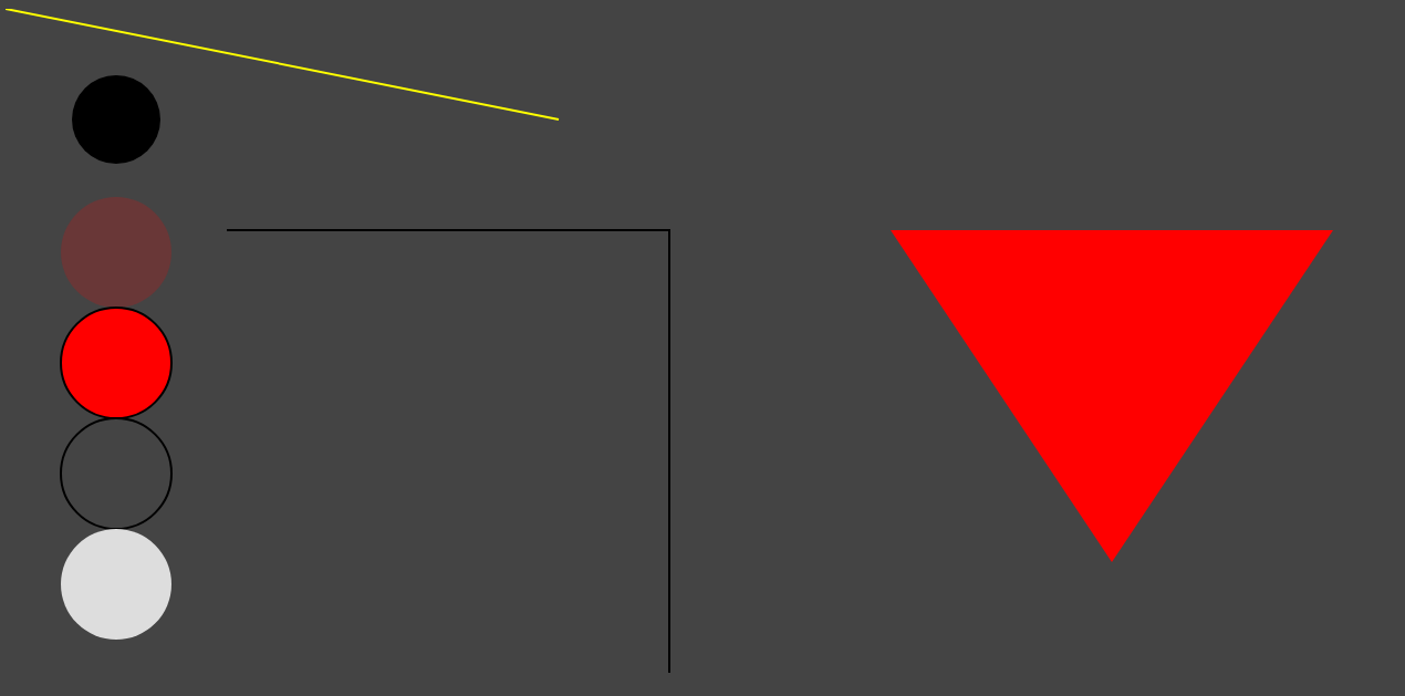
<1>基本图形1:
html:
<!DOCTYPE html>
<html lang="en">
<head>
    <meta charset="UTF-8">
    <title>Title</title>
</head>
<body style="background-color: #444444;">


<svg width="100%" height="800">
    <circle r="40" cx="100" cy="100" stroke-width="1" ></circle>
    <circle r="50" cx="100" cy="220" fill="red" fill-opacity="0.2"></circle>
    <circle r="50" cx="100" cy="320" fill="red" stroke-width="2" stroke="black"></circle>
    <circle r="50" cx="100" cy="420" fill-opacity="0" stroke-width="2" stroke="black"></circle>
    <circle r="50" cx="100" cy="520" style="fill: #dddddd;cursor: all-scroll;"></circle>


    <line x1="0" y1="0" x2="500" y2="100" style="stroke- 2; stroke: yellow;"> </line>
    <polygon points="800,200 1200,200 1000,500" style="fill: red;"></polygon>

    <polyline points="200,200 600,200 600,600 " style="stroke:black;stroke- 2; fill:none;"></polyline>
</svg>

<p>hello ssfdsfdss </p>

</body>
</html>