1.css引入
直接在块里定义style,如<div style="color:red;"></div>;仅影响这一个块儿。

在head里面引入,会影响整个html,如:
<style>
   div {
       color:red;
}
</style>

在head里引入外部css文件,只要引入了就作用于html,
<link rel="stylesheet" href="css1.css" />
css1.css里的内容:
   div {
       color:red;
}
管的范围越小优先级越高。
2.css选择器
2.1 标签选择器
在head里定义一个

<style>
   div {
       color:red;
}
</style>
,这个是把当前html的所有div标签都使用该样式。
2.2 id选择器
<style>
   #i1 {
       color:red;
}
</style>
将id="i1"的标签使用该样式
2.3 类选择器
<style>
   .c1 {
       color:red;
}
</style>

将class="c1"的标签使用该样式
2.4 层级选择器
<style>
   .c2 div p .c1 {
       color:red;
}
</style>

将class="c2"的标签下面的div标签下面的p标签下面的class="c1"的标签使用该样式
2.5 多类选择器
<style>
   .c3 .c4 .c5 {
       color:red;
}
</style>

将class="c3、c4、c5"的标签应用该样式
2.6 属性选择器
<head>
    <style>
        .c1[xing="zhang"]{
            color:red;
        }
    </style>
</head>
<body>
    <div>
        <div class="c1" xing="zhang">1</div>
        <div class="c1">1</div>
        <div class="c1" xing="li">1</div>
        <div class="c1" xing="zhang">1</div>
    </div>
</body>
3.css基本样式
<head>
    <title>test2</title>
    <!--link rel="stylesheet" href="css1.css" /-->
    <style>
        .c1{
            # 颜色可以用编码或者数字或者字母形式。
            background-color:red;
            color:#FFB6C1;
            #background-color:rgb(25,180,10);
            font-size:55px;
            # 高度只能指定像素;宽度可以指定像素或者百分比。
            height:100px
            100px;
            # 必须有宽度和高度,才能显示图片内容;默认会用图片将指定区域填满,使用了no-repeat参数后,就只显示一张图片。
            background-image:url('image/1.gif');
            background-repeat:no-repeat;
        }
        .img{
            height:100px;
            100px;
            background-image:url('image/1.gif');
            #background-position的作用就是抠图,把一个大图扣的只显示一小块儿图。
            background-position:50px -58px;

        }
    </style>
</head>


<body>
    <div class="c1">张</div>
    # 百分比是受限于父模块的总宽度的,比如父模块总宽度是500px那子1的宽度是100px,子2的宽度是400px。float的作用是让子1和子2拼接成一行,不然子1和子2会显示为两行,试试效果。
    <div style="500px">
        <div style="20%;background-color:green;float:left">子1</div>
        <div style="80%;background-color:yellow;float:left">子2</div>
    </div>
    <div class="img">

    </div>

    # 只写一个border就是四周都有框;solid是实心的,dashed是虚线的;必须得有高度,不然就是一条线;
    # border-top就是只有上面有框;border-left就是只有左边有框。
    <div style="border:1px solid red; height:10px"></div>
    <div style="border:1px dashed red; height:10px"></div>
    <div style="border-top:5px dashed red;"></div>

    #display:none ,将标签内容和标签占用的位置都隐藏了
    <div style="display:none;background-color:red;">content</div>

    # 将块级标签转化为内联标签
    <div style="display:inline;background-color:red;">content</div>

    # 将内联标签变成块级标签
    <span style="display:clock;background-color:red;">content</span>

    #将标签的内容隐藏,位置还在页面显示,空白。
    <div style="visibility:hidden;background-color:red;">content</div>

    <br/>
    # 内联标签是无法用height和width改变高度和宽度的
    <span style="background-color:red;height:500px;200px;">span-test</span>
    <br/>
    # display:inline-block,使其既具有内联标签的属性(自己的字符占多少位置,样式就占多少位置),又具有块级标签的属性(可以定义高度、宽度等。)
    <span style="display:inline-block;background-color:red;height:500px;200px;">span-test</span>
</body>
cursor:设置鼠标样式,鼠标放到超链接上变成小手,放到文本上变成竖杠等。
4.边距
默认的话,组件与组件之间是没有距离的,一直堆叠和拼接,需要用边距来调整。

画红线的这些就是用边距实现的,不然会紧贴着。
<!DOCTYPE html>
<html lang="en">
<head>
    <title>fazhan</title>
</head>

<body>
    <div style="height:70px;border:1px solid red;">
                # 内边距,调整自己标签的位置
        <div style="padding:30px;height:35px;background-color:green;">

        </div>
    </div>

    <div style="height:100px;background-color:green;border:1px solid red;">
                # 外边距,调整自己与父标签的相对位置
        <div style="margin-top:30px;">

            <input />
            <input />
            <input />
        </div>
    </div>
</body>
</html>
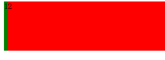
5. 漂浮
# 20%和30%会分为两行显示
<div style="500px;background-color:red;">
        <div style="20%;background-color:green">fdsf</div>
        <div style="30%;background-color:blue">dfdf</div>
    </div>

    <br/>
    <br/>
    <br/>
# 因为使用了float,所以20%和30%会拼接到一行上,而且父标签的样式会消失。
    <div style="500px;background-color:red;">
        <div style="20%;background-color:green;float:left;">fdsf</div>
        <div style="30%;background-color:blue;float:left;">dfdf</div>
    </div>


    <br/>
    <br/>
    <br/>
# 使用了clear:both,20%和30%不仅会显示到一行上,而且父标签的样式还在。clear:both要加在所有漂浮标签的后面,这是一种low的方法,但是可以解决问题。
    <div style="500px;background-color:red;">
        <div style="20%;background-color:green;float:left;">fdsf</div>
        <div style="30%;background-color:blue;float:left;">dfdf</div>
        <div style="clear:both;"></div>
    </div>
6. 位置
<body>
    <div style="height:5000px;background-color:green"></div>

    # position:fixed,固定标签在屏幕的固定位置,top、bottom、left、right,用像素来指定位置,如果是负值就会出区域;指定该标签显示在屏幕的固定位置,屏幕滚动,标签也跟着滚动。
    <a href="https://www.baidu.com" style="position:fixed;right:100px;bottom:100px;">返回顶部</a>

    # 将标签固定到一个位置,如果滚动屏幕,标签不跟着屏幕走。
    <a href="https://www.baidu.com" style="position:absolute;right:100px;bottom:100px;">绝对返回顶部</a>

    #这样做不能把gogogo放到边框的右下角,而是放到了屏幕的右下角;
    <div style="height:300px;300px;border:1px solid red;">
        <div style="position:absolute;right:0;bottom:0;">gogogo</div>
    </div>

    # 因为第一个div里有position:relative,所以gogogo会放在边框里的右下角;如果在第二个div里也加上position:relative,那gogogo就会放到第二个div的右下角。
    <div style="height:300px;300px;border:1px solid red;position:relative">
        <div style="height:100px;100px;background-color:black;">
            <div style="position:absolute;right:0;bottom:0;color:red">gogogo</div>
        </div>
    </div>
</body>
7. 将对话框放到屏幕中间、背景透明度、组件优先级
<head>
    <title>fazhan</title>

    # 目的:让屏幕中间显示一个可以输入的文本框。
    # top:50%;left:50%;使该标签的左上角位于屏幕的正中间位置。
    # margin-left:-150px;margin-top:-200px; 如果想让标签框位于屏幕的正中间,需要先让标签的左上角位于屏幕正中间,然后向左移动一半宽的距离,向上移动一半高的距离。
    # opacity设置透明度,1是不透明;
    # z-index,设置组件优先级,优先级高的会覆盖优先级低的组件。
    <style>
        .model{
            height:400px;
            300px;
            background-color:green;
            position:fixed;
            top:50%;
            left:50%;
            margin-left:-150px;
            margin-top:-200px;
            z-index:10;
        }

        .shadow1{
            position:fixed;
            top:0;
            left:0;
            right:0;
            bottom:0;
            background-color:black;
            opacity:0.4;
            z-index:9;
        }
    </style>
</head>

<body>
    <input type="botton" value="按钮" />

    <div class="shadow1"></div>
    <div class="model">
        <input type="text" />
        <input type="text" />
        <input type="text" />
        <input type="text" />
    </div>
</body>
8. 网站头设计
8.1

篮框与浏览器上左右没有间距,标题一、二、三在稍微居中的位置展示。
<!DOCTYPE html>
<html lang="en">
<head>
    <title>fazhan</title>
    <!-- body ,margin:0表示body里的所有组件的边距是0,不然组件的上下左右默认是有一个边距的。-->
    <style>

        body{
            margin:0;
        }
        .pg-header{
                height: 44px;
                background-color: #2459a2;
        }
        .w{
            980px;
            margin:0 auto;
        }
    </style>
</head>

<body>
    <div class="pg-header">
        <div class="w">
        <!-- 标题一到三默认是在屏幕的最左端显示,如果想让他们居中显示,可以先建立一个980像素宽的div,然后把
         标题一到三加到这个980像素宽的div上,然后让这个980像素宽的div居中,使用margin:0 auto就可以让div居中-->
            <a>标题一</a>
            <a>标题二</a>
            <a>标题三</a>
        </div>

    </div>
    <div class="pg-body"></div>
    <div class="pg-footer"></div>
</body>
</html>
8.2
<!DOCTYPE html>
<html lang="en">
<head>
    <title>fazhan</title>
    <style>
    <!-- line-height: 44px,将文字置于44px高的居中位置;list-style-type:none,取消列表前面的小黑点;padding:0 10px 0 10px,将本组件移动,位置分别为上、右、下、左;cursor:pointer,使鼠标变成小手;
    ul li:hover,鼠标移动上去后,显示代码里的效果。
    -->
        body{
            margin:0;
        }
        .pg-header{
                height: 44px;
                background-color: #2459a2;
                line-height: 44px;
        }
        .w{
            980px;
            margin:0 auto;
        }
        ul{
            margin:0;
            list-style-type:none;
        }
        ul li{
            float:left;
            padding:0 10px 0 10px;
            color: white;
            cursor:pointer;
        }
        ul li:hover{
            background-color:green;
        }
    </style>
</head>

<body>
    <div class="pg-header">
        <div class="w">
            <ul>
                <li>菜单一</li>
                <li>菜单二</li>
                <li>菜单三</li>
            </ul>
        </div>

    </div>
    <div class="pg-body"></div>
        <img src="2.jpg" style="height:500px;100px;">
    <div class="pg-footer"></div>

</body>
</html>
9. 写出加减商品的框
<!DOCTYPE html>
<html lang="en">
<head>
    <!-- 使框里的文本左右方向居中,高低居中需要用line-height:npx; -->
    <!-- 内联标签不能设置宽高,为了高度居中,需要设置高度,所以将内联标签改为块级标签-->
    <!-- margin:0、padding:0使组件的内外边框都为0,适合组件堆叠-->
    <!-- 使用了display:inline-block的组件,默认会增加3px的宽度,所以如果想让组件与组件之间无缝结合的话,需要去掉3px,float:left。-->
    <!-- img标签默认是有边框的,只不过默认不显示;当把img放到a标签内,chrome和firefox依然会自动将边框去掉了,如果用IE打开,可能就会出现边框,所以为了保险起见,对所有的a标签都要使用style{ border:0;}-->
    <!-- a标签内的文字默认是蓝色的,点击后变成蓝色的。-->
    <title>fazhan</title>
    <style>
        .inp{
            border:0;
            border-left:1px solid #dddddd;
            border-right:1px solid #dddddd;
            height:25px;
            20px;
            margin:0;
            padding:0;
            float:left;
        }
        .sp{

            display:inline-block;
            text-align:center;
            margin-left:-3px;
            float:left;
            height:25px;
            25px;
            line-height:25px;
        }
    </style>
</head>

<body>
    <div style="border:1px solid #dddddd;display:inline-block;">
        <span class="sp">-</span>
        <input class="inp" type="text" />
        <span class="sp">+</span>
    </div>
</body>
</html>
10.网页标题一直置顶
<!DOCTYPE html>
<html lang="en">
    <head>
        .pg-header{
            48px;
            position:fixed;
            top:0;
            left:0;
            right:0;
            background-color:red;
        }

        .pg-body{
            height:2000px;
#margin-top,为了防止body的内容被header挡住。
            margin-top:48px;
        }
    </head>
    <body>
        <div class="pg-header">fdsafdsf</div>
        <div class="pg-body">fdafsdfd</div>
    </body>
</html>
11.文本框的特效
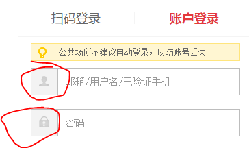
左边有个小头像和小锁子
<!DOCTYPE html>
<html lang="en">
    <head>
        <style>
            .icon-name{
                background-image:url('jdxiaotu.png');
                background-position:590px 339px;
                height:16px;
                16px;
                display:inline-block;
            }
        </style>


    </head>
    <body>
        <div style="200px;position:relative;">
                        # padding的部分不能输入了
            <input style="180px;padding-right:20px;" />
            <span class="icon-name" style="position:absolute;top:2px;right:0;"></span>
        </div>
    </body>
</html>
12. font awesome
<!DOCTYPE html>
<html lang="en">
    <head>
        # 下载了font awesome,解压到一个目录,然后在html的head里引用css样式。
        # font-awesome.css与font-awesome-min.css它俩的内容一样,只不过前者将代码分行了,更清晰,后者把代码写成了一行,
        # 占用字节小。所以开发时选择前者,方便查看,上线时用后者,更轻便。
        <link rel="stylesheet" href="plugins/font-awesome-4.6.3/css/font-awesome.css">
    </head>
    <body>
        # 到http://fontawesome.io/icon找到需要的图标,然后直接将代码添加到html里就行了,如果想改变颜色,可以加
        # style="color:red"等。
        <i class="fa fa-address-book" aria-hidden="true"></i>
    </body>
</html>
13. 关于伪类的补充
13.1 .c1:hover
13.2 .c2:before
# 在块儿的内容前加上666
.c2:before{
            content:'666';
        }
13.3 .c2:after
# 在块儿的内容后加上777
.c2:after{
            content:'777';
        }
13.4 伪类after的主要应用
前面讲到过,如果div使用了float:left使组件漂浮了,则父div的样式都会消失,除非新加一个<div style="clear:both;"></div>。
页面的元素很多,如果每个float:left都对应着一个clear:both的div,那就太费劲了,所以需要定义一个样式类,这个样式类就用到了after,等于是在每个div后面加上一个“clear:both”。
<!DOCTYPE html>
<html lang="en">
<head>
    <title>fazhan</title>
    <style>
        .left{
            float:left;
        }
        .clearfix:after{
            content:'.';
            visibility:hidden;
        }
    </style>
</head>

<body>
    <div class="clearfix" style="background-color:red;">
        <div class="left">1</div>
        <div class="left">2</div>
        <!--div style="clear:both"></div-->
    </div>
</body>
</html>
上面的代码实现了既让父div拥有样式,又实现了让子div漂浮,但是如果子div设置了高度,父div不会跟着增高,试试下面代码的效果,
<!DOCTYPE html>
<html lang="en">
<head>
    <title>fazhan</title>
    <style>
        .left{
            float:left;
        }
        .clearfix:after{
            content:'.';
            visibility:hidden;
        }
    </style>
</head>

<body>
    <div class="clearfix" style="background-color:red;">
        <div class="left" style="height:100px;background-color:green;">1</div>
        <div class="left">2</div>
        <!--div style="clear:both"></div-->
    </div>
</body>
</html>
页面效果:
 ,子div的绿色背景凸出来了,父div的高度没有跟着变化。所以需要继续调整代码,往下看,
<!DOCTYPE html>
<html lang="en">
<head>
    <title>fazhan</title>
    <style>
        .left{
            float:left;
        }
        .clearfix:after{
            content:'.';
            clear:both;
            visibility:hidden;
            display:block;
            height:0;
        }
    </style>
</head>

<body>
    <div class="clearfix" style="background-color:red;">
        <div class="left" style="height:100px;background-color:green;">1</div>
        <div class="left">2</div>
        <!--div style="clear:both"></div-->
    </div>
</body>
</html>
页面效果:
 ,如此就达到目的了,这个效果可以作为网站页面的背景,给网站的主页面加一个背景色,然后只要添加组件就撑大背景。注:一般都习惯把这个伪类起名为“clear:fix”。
14. css总结
CSS
    存在形式:
        直接放到标签里;优先级最高;只作用于此标签。
        在head的style里定义;优先级居中;作用于整个html。
        css文件导入;优先级最低;作用于所有导入了的html。
        同样优先级的样式,后面的样式会覆盖前面的样式;用chrome调试模式查看时,有些样式代码中间划着一个横线,这就是被覆盖了。
        最牛的,color:red !important;任谁也覆盖不了的样式,一般用在display:none这类的样式上,需要隐藏的时候,无论如何都能做到隐藏。

    选择器:
        标签选择器
        class选择器
        ID选择器
        层级选择器
        组合选择器
        属性选择器

    样式:
        color,width,height
        需要注意一点,如果要用width的百分比,一定要在它的上层加一个div,并且给上层div指定一个宽度(居中的话就是margin:0 auto;)
        如果不这样做,当浏览器缩小的比内容页还小时,不会出现滚动条,而是把多余的东西显示到屏幕外面去了。正确使用如下例:
        <div class="main" style="980px;margin:0 auto;">
            <div style="20%;float:left;backgroud-color:red;">fdfsdfdfdfdfdasfdsfdsfdasf</divd>
            <div style="80%;float:left;backgroud-color:green;">fdfsdfdfadsfasfdasf</divd>
        </div>

        cursor

        backgroud-color

        opacity,透明度,值为1是不透明

        position:
            fixed
            absolute
            relative && absolute

        z-index

        padding补充:
            input标签padding出去的部分是不可写的。

        伪类:
            hover
            before
            after
15. 使用css的border做出小三角
<html lang="en">
<head>
    <title>fazhan</title>
    <style>

        .clearfix{
            display:inline-block;
            border-top:15px solid red;
                        # transparent是透明色。
            border-right:15px solid transparent;
            border-bottom:15px solid transparent;
            border-left:15px solid transparent;
        }
    </style>
</head>

<body>
    <div class="clearfix">

    </div>
</body>
</html>
16. 做出阴影效果
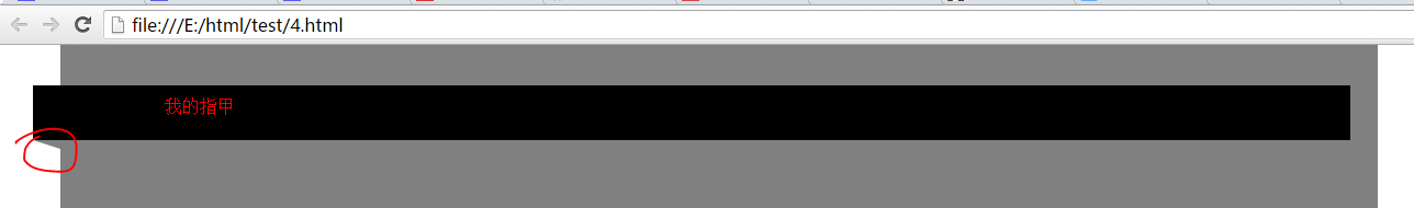
<!DOCTYPE html>
<html lang="en">
<head>
    <title>fazhan</title>
    <meta charset="UTF-8" />
    <style>
        body{
            margin:0;
        }
        .clearfix{
            display:inline-block;
            border-top:8px solid gray;
            border-right:25px solid transparent;
            border-bottom:8px solid transparent;
            border-left:25px solid transparent;
            position:absolute;
            top:170px;
            margin-left:-25px;

        }
        .main{
            background-color:gray;
            height:2000px;
            1200px;
            margin:0 auto;


        }
        .tiaoxing{
            background-color:black;
            height:50px;
            1200px;
            margin-left:-25px;
            position:absolute;
            top:120px;

        }
    </style>
</head>

<body>
    <div class="main">
        <div class="tiaoxing">
            <span style="color:red;position:absolute;top:20%;left:10%">我的指甲</span>
        </div>
        <div class="clearfix">

        </div>
    </div>

</body>
</html>
17.后台管理布局
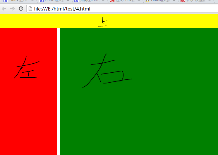 不同于网站前端主页面(中间是内容,两边是空白),后台管理界面一般是这种上面一个菜单、左边一个菜单、右边是内容的布局。
后台布局的主要展示如上图,有两种不同的左侧菜单显示,一种是滑动滚轮时上面和左侧菜单跟着移动,一种是滑动滚轮时上面和左侧菜单固定不动。
17.1 滚轮滚动时,上面和左侧的菜单栏也跟着移动
<!DOCTYPE html>
<html lang="en">
<head>
    <title>fazhan</title>
    <meta charset="UTF-8" />
    <style>
        body{
            margin:0;
        }
        .pg-header{
            height:48px;
            background-color:yellow;
        }
        .pg-body .pg-main-menu{
            200px;
            position:absolute;
            top:48px;
            bottom:0;
            background-color:red;
        }
        .pg-body .pg-main-content{
            position:absolute;
            top:48px;
            left:210px;
            right: 0;
#没有指定bottom:0,则页面内容占多少,就显示多少,页面没有内容,则显示空白(也没有背景色:绿。)
            background-color:green;
        }
    </style>
</head>

<body>
    <div class="pg-header">

    </div>
    <div class="pg-body">
        <div class="pg-main-menu">

        </div>

        <div class="pg-main-content">

#页面内容很多,超过了单页高度,所以会自动出现滚动条,滑动滚轮的时候,左侧的菜单也跟着移动,随着滚轮往下走,左侧菜单会消失。            fdsafdfdasfdasfdasfdasfds<br>fdsafdfdasfdasfdasfdasfds<br>fdsafdfdasfdasfdasfdasfds<br>fdsafdfdasfdasfdasfdasfds<br>fdsafdfdasfdasfdasfdasfds<br>fdsafdfdasfdasfdasfdasfds<br>fdsafdfdasfdasfdasfdasfds<br>
            fdsafdfdasfdasfdasfdasfds<br>fdsafdfdasfdasfdasfdasfds<br>fdsafdfdasfdasfdasfdasfds<br>fdsafdfdasfdasfdasfdasfds<br>fdsafdfdasfdasfdasfdasfds<br>fdsafdfdasfdasfdasfdasfds<br>fdsafdfdasfdasfdasfdasfds<br>
            fdsafdfdasfdasfdasfdasfds<br>fdsafdfdasfdasfdasfdasfds<br>fdsafdfdasfdasfdasfdasfds<br>fdsafdfdasfdasfdasfdasfds<br>fdsafdfdasfdasfdasfdasfds<br>fdsafdfdasfdasfdasfdasfds<br>fdsafdfdasfdasfdasfdasfds<br>
            fdsafdfdasfdasfdasfdasfds<br>fdsafdfdasfdasfdasfdasfds<br>fdsafdfdasfdasfdasfdasfds<br>fdsafdfdasfdasfdasfdasfds<br>fdsafdfdasfdasfdasfdasfds<br>fdsafdfdasfdasfdasfdasfds<br>fdsafdfdasfdasfdasfdasfds<br>
            fdsafdfdasfdasfdasfdasfds<br>fdsafdfdasfdasfdasfdasfds<br>fdsafdfdasfdasfdasfdasfds<br>fdsafdfdasfdasfdasfdasfds<br>fdsafdfdasfdasfdasfdasfds<br>fdsafdfdasfdasfdasfdasfds<br>fdsafdfdasfdasfdasfdasfds<br>fdsafdfdasfdasfdasfdasfds<br>fdsafdfdasfdasfdasfdasfds<br>fdsafdfdasfdasfdasfdasfds<br>fdsafdfdasfdasfdasfdasfds<br>fdsafdfdasfdasfdasfdasfds<br>fdsafdfdasfdasfdasfdasfds<br>fdsafdfdasfdasfdasfdasfds<br>
            fdsafdfdasfdasfdasfdasfds<br>fdsafdfdasfdasfdasfdasfds<br>fdsafdfdasfdasfdasfdasfds<br>fdsafdfdasfdasfdasfdasfds<br>fdsafdfdasfdasfdasfdasfds<br>fdsafdfdasfdasfdasfdasfds<br>fdsafdfdasfdasfdasfdasfds<br>
            fdsafdfdasfdasfdasfdasfds<br>fdsafdfdasfdasfdasfdasfds<br>fdsafdfdasfdasfdasfdasfds<br>fdsafdfdasfdasfdasfdasfds<br>fdsafdfdasfdasfdasfdasfds<br>fdsafdfdasfdasfdasfdasfds<br>fdsafdfdasfdasfdasfdasfds<br>
            fdsafdfdasfdasfdasfdasfds<br>fdsafdfdasfdasfdasfdasfds<br>fdsafdfdasfdasfdasfdasfds<br>fdsafdfdasfdasfdasfdasfds<br>fdsafdfdasfdasfdasfdasfds<br>fdsafdfdasfdasfdasfdasfds<br>fdsafdfdasfdasfdasfdasfds<br>
            fdsafdfdasfdasfdasfdasfds<br>fdsafdfdasfdasfdasfdasfds<br>fdsafdfdasfdasfdasfdasfds<br>fdsafdfdasfdasfdasfdasfds<br>fdsafdfdasfdasfdasfdasfds<br>fdsafdfdasfdasfdasfdasfds<br>fdsafdfdasfdasfdasfdasfds<br>
        </div>
    </div>


</body>
</html>
17.2 滚轮滚动时,上面和左侧的菜单栏固定不动
<!DOCTYPE html>
<html lang="en">
<head>
    <title>fazhan</title>
    <meta charset="UTF-8" />
    <style>
        body{
            margin:0;
        }
        .pg-header{
            height:48px;
            background-color:yellow;
        }
        .pg-body .pg-main-menu{
            200px;
            position:absolute;
            top:48px;
            bottom:0;
            background-color:red;
        }
        .pg-body .pg-main-content{
            position:absolute;
            top:48px;
            left:210px;
            right: 0;
# 对比上面的代码,加了bottom和overflow;
# overflow:auto,当页面内容超过单屏时,在右侧出现滚轮,滑动滚轮只会影响当前div,所以上面和左侧的菜单是固定的。
            bottom:0;
            overflow:auto;
            background-color:green;
        }
    </style>
</head>

<body>
    <div class="pg-header">

    </div>
    <div class="pg-body">
        <div class="pg-main-menu">

        </div>

        <div class="pg-main-content">
            fdsafdfdasfdasfdasfdasfds<br>fdsafdfdasfdasfdasfdasfds<br>fdsafdfdasfdasfdasfdasfds<br>fdsafdfdasfdasfdasfdasfds<br>fdsafdfdasfdasfdasfdasfds<br>fdsafdfdasfdasfdasfdasfds<br>fdsafdfdasfdasfdasfdasfds<br>
            fdsafdfdasfdasfdasfdasfds<br>fdsafdfdasfdasfdasfdasfds<br>fdsafdfdasfdasfdasfdasfds<br>fdsafdfdasfdasfdasfdasfds<br>fdsafdfdasfdasfdasfdasfds<br>fdsafdfdasfdasfdasfdasfds<br>fdsafdfdasfdasfdasfdasfds<br>
            fdsafdfdasfdasfdasfdasfds<br>fdsafdfdasfdasfdasfdasfds<br>fdsafdfdasfdasfdasfdasfds<br>fdsafdfdasfdasfdasfdasfds<br>fdsafdfdasfdasfdasfdasfds<br>fdsafdfdasfdasfdasfdasfds<br>fdsafdfdasfdasfdasfdasfds<br>
            fdsafdfdasfdasfdasfdasfds<br>fdsafdfdasfdasfdasfdasfds<br>fdsafdfdasfdasfdasfdasfds<br>fdsafdfdasfdasfdasfdasfds<br>fdsafdfdasfdasfdasfdasfds<br>fdsafdfdasfdasfdasfdasfds<br>fdsafdfdasfdasfdasfdasfds<br>
            fdsafdfdasfdasfdasfdasfds<br>fdsafdfdasfdasfdasfdasfds<br>fdsafdfdasfdasfdasfdasfds<br>fdsafdfdasfdasfdasfdasfds<br>fdsafdfdasfdasfdasfdasfds<br>fdsafdfdasfdasfdasfdasfds<br>fdsafdfdasfdasfdasfdasfds<br>fdsafdfdasfdasfdasfdasfds<br>fdsafdfdasfdasfdasfdasfds<br>fdsafdfdasfdasfdasfdasfds<br>fdsafdfdasfdasfdasfdasfds<br>fdsafdfdasfdasfdasfdasfds<br>fdsafdfdasfdasfdasfdasfds<br>fdsafdfdasfdasfdasfdasfds<br>
            fdsafdfdasfdasfdasfdasfds<br>fdsafdfdasfdasfdasfdasfds<br>fdsafdfdasfdasfdasfdasfds<br>fdsafdfdasfdasfdasfdasfds<br>fdsafdfdasfdasfdasfdasfds<br>fdsafdfdasfdasfdasfdasfds<br>fdsafdfdasfdasfdasfdasfds<br>
            fdsafdfdasfdasfdasfdasfds<br>fdsafdfdasfdasfdasfdasfds<br>fdsafdfdasfdasfdasfdasfds<br>fdsafdfdasfdasfdasfdasfds<br>fdsafdfdasfdasfdasfdasfds<br>fdsafdfdasfdasfdasfdasfds<br>fdsafdfdasfdasfdasfdasfds<br>
            fdsafdfdasfdasfdasfdasfds<br>fdsafdfdasfdasfdasfdasfds<br>fdsafdfdasfdasfdasfdasfds<br>fdsafdfdasfdasfdasfdasfds<br>fdsafdfdasfdasfdasfdasfds<br>fdsafdfdasfdasfdasfdasfds<br>fdsafdfdasfdasfdasfdasfds<br>
            fdsafdfdasfdasfdasfdasfds<br>fdsafdfdasfdasfdasfdasfds<br>fdsafdfdasfdasfdasfdasfds<br>fdsafdfdasfdasfdasfdasfds<br>fdsafdfdasfdasfdasfdasfds<br>fdsafdfdasfdasfdasfdasfds<br>fdsafdfdasfdasfdasfdasfds<br>
        </div>
    </div>


</body>
</html>