前些天做页面时候遇到这样一个问题,将input框用position:fixed固定定位在最底部的时候,当Input获取焦点的时候,input框离开了手机软键盘,而不是吸附在软键盘上,效果如下图: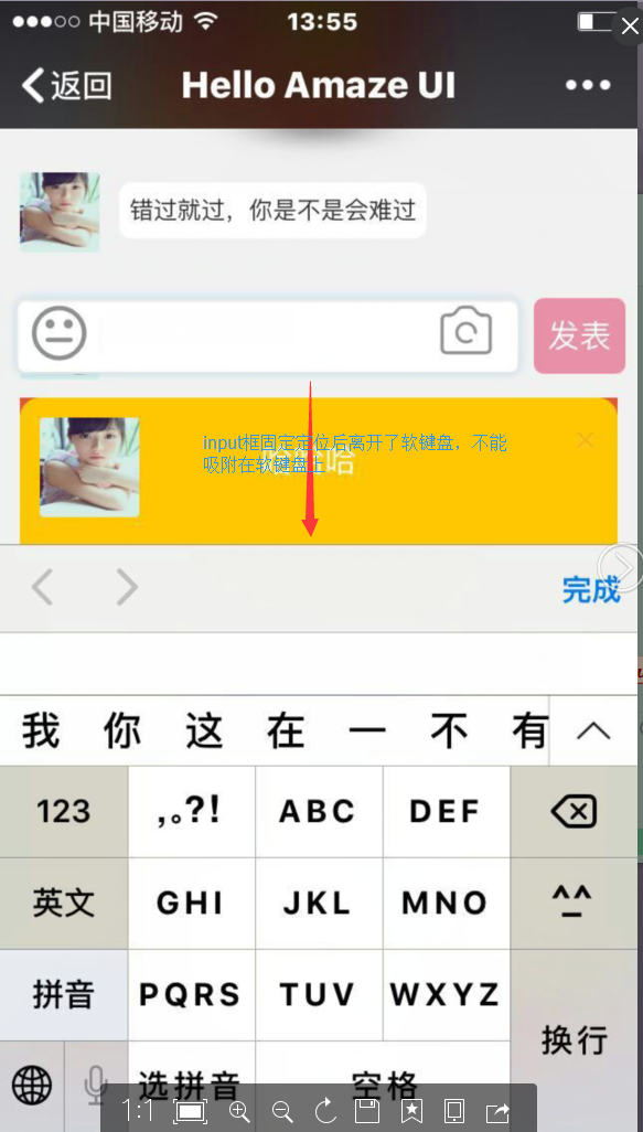
找了很多方法尝试,最后是用css解决的。
就是给input框所在div的以外代码块一个position: fixed; top: 0px; bottom: -20px; overflow:scroll; 100%
例如你的代码结构是这样的:
<style>
.footer{position:fixed; bottom:0}
</style>
<div class="head"></div>
<div class="main"></div>
<div class="footer"><input type="input"></div>
那么你可以这样解决Input框不吸附软键盘的问题
<style>
.footer{position:fixed; bottom:0}
.main{position: fixed; top: 0px; bottom: -20px; overflow:scroll; 100%}
</style>
<div class="head"></div>
<div class="main"></div>
<div class="footer"><input type="input"></div>
其中top,bottom的值根据需要自己给值。希望可以帮到大家