- 浮动 float
- 用法
- 特点
- 浮动起来
- 不占位置(脱标)
- 如果多个盒子都使用了浮动, 会在一行上显示
- 尽量用 display: inline-block; 来转 行内块
- 作用
<!DOCTYPE html>
<html>
<head>
<meta charset="utf-8">
<title></title>
<style type="text/css">
.box{
width: 400px;
height: 300px;
background: #eee;
}
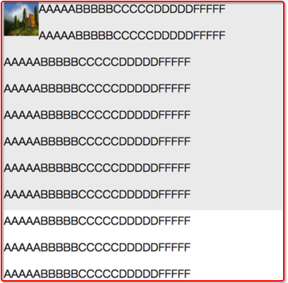
.box img{
width: 50px;
height: 50px;
float: left;
}
</style>
</head>
<body>
<div class="box">
<img src="1.jpg">
<p>AAAAABBBBBCCCCCDDDDDFFFFF</p>
<p>AAAAABBBBBCCCCCDDDDDFFFFF</p>
<p>AAAAABBBBBCCCCCDDDDDFFFFF</p>
<p>AAAAABBBBBCCCCCDDDDDFFFFF</p>
<p>AAAAABBBBBCCCCCDDDDDFFFFF</p>
<p>AAAAABBBBBCCCCCDDDDDFFFFF</p>
<p>AAAAABBBBBCCCCCDDDDDFFFFF</p>
<p>AAAAABBBBBCCCCCDDDDDFFFFF</p>
<p>AAAAABBBBBCCCCCDDDDDFFFFF</p>
<p>AAAAABBBBBCCCCCDDDDDFFFFF</p>
<p>AAAAABBBBBCCCCCDDDDDFFFFF</p>
<p>AAAAABBBBBCCCCCDDDDDFFFFF</p>
<p>AAAAABBBBBCCCCCDDDDDFFFFF</p>
<p>AAAAABBBBBCCCCCDDDDDFFFFF</p>
</div>
</body>
</html>
<!DOCTYPE html>
<html>
<head>
    <meta charset="utf-8">
    <title></title>
    <style type="text/css">

        body,ul,li{
            margin: 0;
            padding: 0;
        }

        ul,li{
            list-style: none;
        }

        .nav{
            width: 400px;
            height: 40px;
            background: pink;
            margin: 20px auto;
        }

        .nav ul li{
            float: left;
        }

        .nav ul li a{
            display: inline-block;
            height: 40px;
            font: 14px/40px 微软雅黑;
            text-decoration: none;
            padding: 0 20px;
        }

        .nav ul li a:hover{
            background: #aaa;
        }

    </style>
</head>
<body>

    <div class="nav">
        <ul>
            <li>
                <a href="#">百度</a>
            </li>

            <li>
                <a href="#">百度一下</a>
            </li>

            <li>
                <a href="#">Google</a>
            </li>
        </ul>
    </div>

</body>
</html>

<!DOCTYPE html>
<html>
<head>
<meta charset="utf-8">
<title></title>
<style type="text/css">
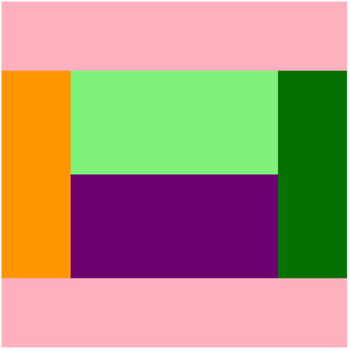
.header,.main,.footer{
width: 500px;
}
.header,.footer{
height: 100px;
background: pink;
}
.main{
height: 300px;
background: blue;
}
.left,.right{
width: 100px;
height: 300px;
}
.left{
background: orange;
float: left;
}
.content{
width: 300px;
height: 300px;
background: yellow;
float: left;
}
.right{
background: green;
float: right;
}
.content-top,.content-bottom{
height: 150px;
}
.content-top{
background: lightgreen;
}
.content-bottom{
background: purple;
}
</style>
</head>
<body>
<div class="header"></div>
<div class="main">
<div class="left"></div>
<div class="content">
<div class="content-top"></div>
<div class="content-bottom"></div>
</div>
<div class="right"></div>
</div>
<div class="footer"></div>
</body>
</html>
- 清除浮动
- 清除不是删除浮动
- 清除浮动是清除浮动产生的不良影响
- 注意: 不给外边的父盒子设置高度时, 里边的子盒子浮动时, 会让页面布局产生混乱
- 额外标签法: 在浮动元素后边加一个标签, 清除浮动
    <div class="left-bar"></div>
    <div class="right-bar"></div>
    <div style="clear:both;"></div>
-
- 在外边的父盒子上使用: overflow: hidden;
        .conent{
            overflow: hidden;
             500px;
        }
    <style type="text/css">

        .clearfix:after{
            content: ".";
            display: block;
            height: 0;
            line-height: 0;
            visibility: hidden;
            clear: both;
        }

        .clearfix{
            zoom: 1;
        }

    </style>
- overflow
- overflow: hidden; 会将出了盒子的内容裁掉
- overflow: auto; 当内容出了盒子之外, 会自动生成滚动条, 如果内容没有超过盒子, 则不生成滚动条
- overflow: scroll; 不管内容有没有出盒子, 都会生成滚动条
- overflow: visible; 内容出了盒子也会显示, 不生成滚动条
- 定位 position
- 定位方向: left | right | top | bottom
- 静态定位: 静态定位. 默认值, 就是文档流
-
<!DOCTYPE html>
<html>
<head>
    <meta charset="utf-8">
    <title></title>
    <style type="text/css">

        body{
            margin: 0;
        }

        .father{
            width: 300px;
            height: 300px;
            background: green;
            position: absolute;
        }

        .box{
            width: 100px;
            height: 100px;
            background: red;
            /*静态定位*/
            /*position: static;*/

            /*绝对定位*/
            position: absolute;
            right: 100px;
        }

        .box1{
            width: 200px;
            height: 200px;
            background: green;
        }

        .baby{
            position: absolute;
            width: 100px;
            height: 100px;
            background: orange;

            /*调整元素的层叠顺序 默认值是 0~99, 值越大, 元素越在上面*/
            z-index: 2;
        }

        .baby1{
            position: absolute;
            width: 100px;
            height: 100px;
            background: red;
        }
    </style>
</head>

<body>
    <div class="father">
        <div class="box"></div>
    </div>

    <span class="baby"></span>

    <span class="baby1"></span>

    <!-- <div class="box1"></div> -->

</body>
</html>
- 绝对定位: position: absolute;
- 特点
- 元素使用绝对定位之后不占据原来的位置(脱标)
- 元素用使用绝对定位, 位置是从浏览器出发.
- 嵌套的盒子, 父盒子没有使用定位, 子盒子绝对定位, 子盒子是从浏览器出发的.
- 嵌套的盒子, 父盒子使用定位, 子盒子绝对定位, 子盒子是从父元素的位置出发的.
- 给行内元素使用绝对定位之后, 转换为行内块(不推荐使用)
- 相对定位: position: relative;
- 特点
- 位置从自身出发
- 还占据原来的位置(不脱标)
- 子绝父相(父元素相对定位, 子元素绝对定位)
- 行内元素使用相对定位不能转行内块
-
<!DOCTYPE html>
<html>
<head>
    <meta charset="utf-8">
    <title></title>
    <style type="text/css">

        .father{
            width: 500px;
            height: 500px;
            background: #eee;
        }

        .red,.green{
            width: 100px;
            height: 100px;
        }

        .red{
            background: red;
            position: relative;
            left: 200px;
        }

        .green{
            background: green;
        }
    </style>
</head>
<body>

    <div class="father">
        <div class="red"></div>
    </div>
    <!-- <div class="green"></div> -->

</body>
</html>
- 固定定位: position: fixed;
- 特点
- 元素使用固定定位之后不占据原来的位置(脱标)
- 元素用使用固定定位, 位置是从浏览器出发.
- 给行内元素使用固定定位之后, 转换为行内块(不推荐使用)
-
<!DOCTYPE html>
<html>
<head>
    <meta charset="utf-8">
    <title></title>
    <style type="text/css">
        .box,.box1{
            width: 100px;
            height: 100px;
        }

        .box{
            background: red;
            position: fixed;
            bottom: 5px;
            right: 5px;
        }

        .box1{
            background: green;
        }

        span{
            background: red;
            position: fixed;
            bottom: 5px;
            right: 5px;
        }


    </style>
</head>
<body>

    <div class="box"></div>
    <div class="box1"></div>


    <span></span>

</body>
</html>