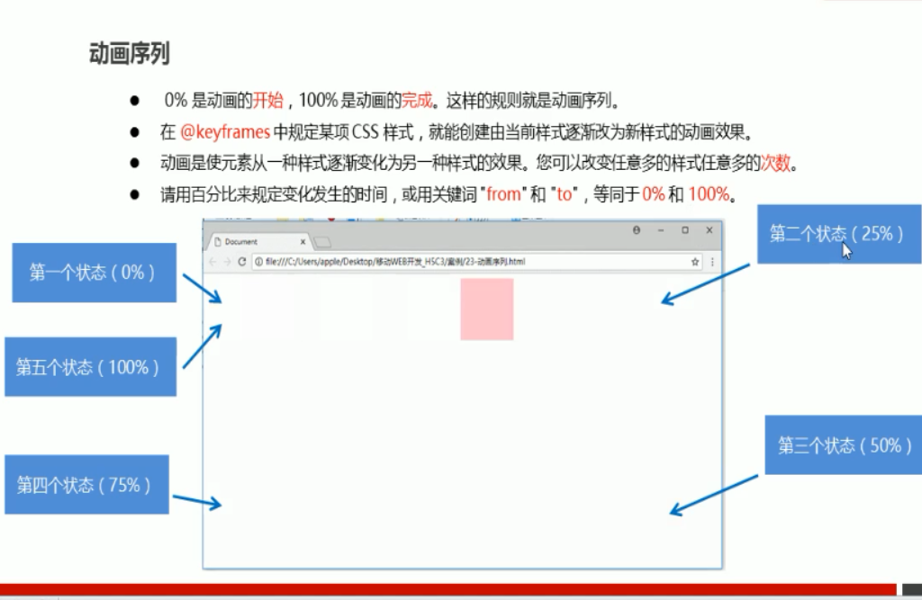
@keyframes move {
0% {
transform: translate(0, 0);
}
25% {
transform: translate(500px, 0);
}
50% {
transform: translate(500px, 500px);
}
75% {
transform: translate(0, 500px);
}
100% {
transform: translate(0, 0);
}
}
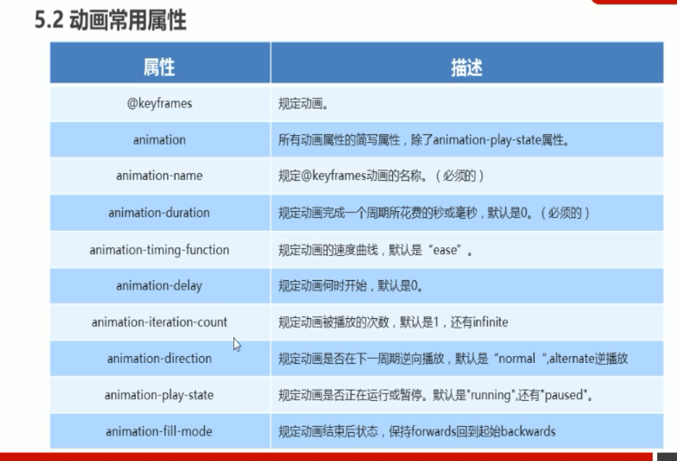
animation-name: move;
animation-duration: 10s;


@keyframes move {
0% {
transform: translate(0, 0);
}
100% {
transform: translate(1000px, 0);
}
}
div {
100px;
height: 100px;
background-color: pink;
/* 动画名称 */
animation-name: move;
/* 持续时间 */
animation-duration: 2s;
/* 运动曲线 */
animation-timing-function: ease;
/* 何时开始 */
animation-delay: 1s;
/* 重复次数 iteration 重复的 count 次数 iteration 无限次播放*/
/* animation-iteration-count: infinite; */
/* 是否反方向播放 默认是 normal 反方向就写alternate*/
/* animation-direction: alternate; */
/* 动画结束后的状态 默认的是 backwards 回到起始状态, forwards 停留在结束状态 */
animation-fill-mode: forwards;
}
div:hover {
/* 鼠标经过div 停止状态 鼠标离开 继续动画 */
animation-play-state: paused;
}