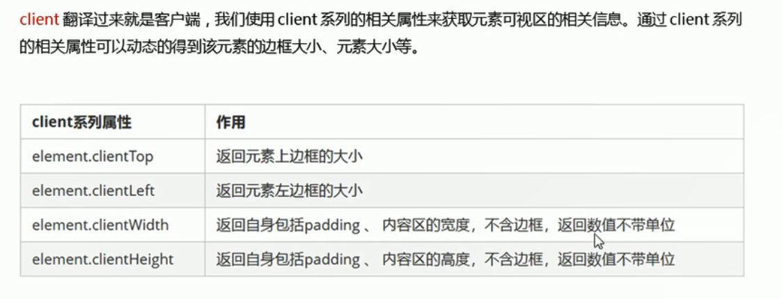
2 元素可视区client系列
2.1 概念
<head>
    <meta charset="UTF-8">
    <meta name="viewport" content="width=device-width, initial-scale=1.0">
    <title>Document</title>
    <style>
        div {
             200px;
            height: 200px;
            background-color: pink;
            border: 1px solid red;
            padding: 10px;
        }
    </style>
</head>

<body>
    <div></div>
    <script>
        var div = document.querySelector('div');
        console.log(div.clientWidth); //220 不包含边框!!!
    </script>
</body>
2.2 淘宝flexible.js文件的分析
2.2.1 立即执行函数
淘宝flexible.js文件里面有这样一个函数
(function flexible(window, document) {}(window, document))
这是一个立即执行函数,淘宝所有的js代码都写在这个立即执行函数中,一引入这个js文件就立即执行。立即执行函数最大的作用就是独立创建了一个作用域,立马所有的变量都是局部变量,如果还引入了其他的js文件,也不会和本js文件出现变量名冲突的问题。
<script>
    //普通函数
    function fn() {
        console.log(1);
    }
    //立即执行函数:不需要调用,立马能够自己执行的函数
    //写法1   (function(形参){})(实参)
    //写法2   (function(){}())
    //1.
    (function(a, b) {
        console.log(a + b); //3

    })(1, 2); //多个立即函数之间需要用分号隔开
    //2.
    (function(a, b) {
        console.log(a + b); //6

    }(2, 3));
    //其中的匿名函数可以改为非匿名函数
    (function sum(a, b) {
        console.log(a + b); //6

    }(2, 3));
    //3. 立即执行函数最大的作用就是独立创建了一个作用域,立马所有的变量都是局部变量,作用域之间不会有命名冲突的情况
</script>
2.2.2 window.devicePixelRatio像素比
- 设备像素比返回了设备上的物理像素和当前设备CSS像素的一个比值, 这个数值告诉浏览器多少屏幕实际的像素点被用来画了一个CSS像素点。-
- window.devicePixelRatio = 物理像素 / css像素
<body>
    <script>
        console.log(window.devicePixelRatio); //在ip6/7/8中打印2     在pc端打印1
    </script>
</body>
2.2.3 pageshow

- 综上:在火狐浏览器中,前进和后退按钮,并不能重新加载页面
pageshow 是我们重新加载页面触发的事件
<body>
    <script>
        //1
        // 非火狐浏览器:点击连接之后,按返回键回到当前页面触发load事件,当前页面会重新加载,弹出11。但是在火狐浏览器中有往返换成,点击前进后退之后不会触发load,页面不会重新加载,不会弹出11
        // window.addEventListener('load', function() {
        //     alert(11);

        // })

        //2 解决方案pageshow
        window.addEventListener('pageshow', function(e) { //pageshow在页面显示时触发
            alert(11);
            console.log(e.persisted); //false   说明不是缓存中的页面触发了该事件

        })
    </script>
    <a href="http://www.itcast.cn">连接</a>
</body>
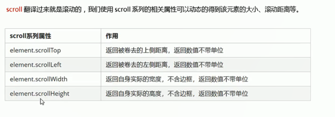
3 元素滚动scroll系列
3.1 元素scroll系列属性
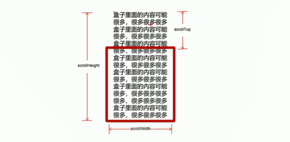
对于scrollHeight和scrollWidth
<style>
    div {
         200px;
        height: 200px;
        background-color: pink;
        border: 1px solid red;
        padding: 10px;
    }
</style>
- 情况1:
<body>
    <div>
        我是内容
    </div>
    <script>
        var div = document.querySelector('div');
        console.log(div.scrollHeight); //220  不含边框
        console.log(div.clientHeight);//220 不含边框
    </script>
</body>
- 情况2
<body>
    <div>
        我是内容我是内容我是内容我是内容我是内容我是内容我是内容我是内容我是内容我是内容我是内容我是内容我是内容我是内容我是内容我是内容我是内容我是内容我是内容我是内容我是内容我是内容我是内容我是内容我是内容我是内容我是内容我是内容我是内容我是内容我是内容我是内容我是内容我是内容我是内容我是内容我是内容
    </div>
    <script>
        var div = document.querySelector('div');
        console.log(div.scrollHeight); //279  不含边框  scroll得到的是内容的高度
        console.log(div.clientHeight); //220  不含边框
    </script>
</body>

对于scrollTop和scrollLeft

<head>
    <meta charset="UTF-8">
    <meta name="viewport" content="width=device-width, initial-scale=1.0">
    <title>Document</title>
    <style>
        div {
             200px;
            height: 200px;
            background-color: pink;
            border: 1px solid red;
            padding: 10px;
            overflow: auto;
            /*根据内容的多少自动添加滚动条*/
        }
    </style>
</head>

<body>
    <div>
        我是内容我是内容我是内容我是内容我是内容我是内容我是内容我是内容我是内容我是内容我是内容我是内容我是内容我是内容我是内容我是内容我是内容我是内容我是内容我是内容我是内容我是内容我是内容我是内容我是内容我是内容我是内容我是内容我是内容我是内容我是内容我是内容我是内容我是内容我是内容我是内容我是内容
    </div>
    <script>
        //scroll滚动事件,当拉动滚动条会触发的事件
        div.addEventListener('scroll', function() {
            console.log(div.scrollTop);//拖动滚动条的时候,不断打印高度

        })
    </script>
</body>
3.2 案例:仿淘宝固定右侧侧边栏
- 思路

- 案例分析
<style>
    .slider-bar {
        position: absolute;
        left: 50%;
        top: 300px;
        margin-left: 600px;
         45px;
        height: 130px;
        background-color: pink;
    }

    .w {
         1200px;
        margin: 10px auto;
    }

    .header {
        height: 150px;
        background-color: purple;
    }

    .banner {
        height: 250px;
        background-color: skyblue;
    }

    .main {
        height: 1000px;
        background-color: yellowgreen;
    }

    span {
        display: none;
        /*先将返回顶部隐藏起来*/
        position: absolute;
        bottom: 0;
    }
</style>
<body>
<div class="slider-bar">
<span class="goBack">返回顶部</span>
</div>
<div class="header w">头部区域</div>
<div class="banner w">banner区域</div>
<div class="main w">主体部分</div>
<script>
//1. 获取元素
var sliderbar = document.querySelector('.slider-bar');
var banner = document.querySelector('.banner');
//被卷去头部的大小 一定要写在滚动的外面
var bannerTop = banner.offsetTop; //offsetTop返回元素相对于带有定位的父元素上方的偏移
//改为固定定位后侧边栏会跳一下,这是由于侧边栏样式中的top: 300px;导致的。解决方案如下:
var sliderbarTop = sliderbar.offsetTop - bannerTop;
//获取元素
var main = document.querySelector('.main');
var goBack = document.querySelector('.goBack');
var mainTop = main.offsetTop;
console.log(mainTop);
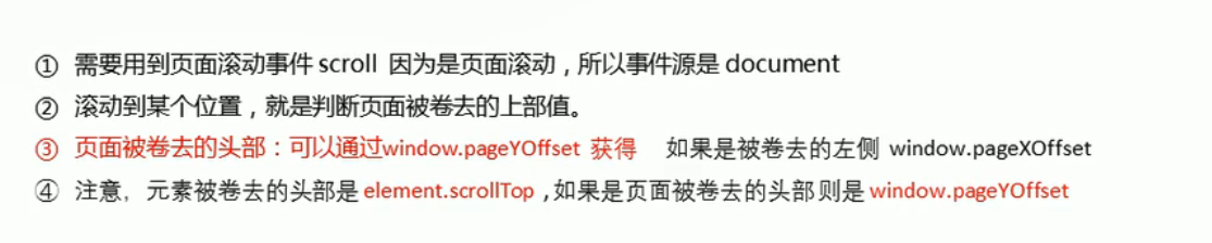
//2. 添加页面滚动事件 页面滚动所以必须为document添加
document.addEventListener('scroll', function() {
//window.pageYOffset 页面被卷去的头部
// console.log(window.pageYOffset); //检测得到172px的时候比较适合 将侧边栏改为固定定位
//3. 当banner滚动到页面顶部时,侧边栏改为固定定位
if (window.pageYOffset >= bannerTop) {
sliderbar.style.position = 'fixed';
//改为固定定位后侧边栏会跳一下,这是由于侧边栏样式中的top: 300px;导致的。解决方案如下:
sliderbar.style.top = sliderbarTop + 'px';
} else {
sliderbar.style.position = 'absolute';
sliderbar.style.top = '300px'; //变成绝对定位后再将top值复原为300px
}
//4.当main滚动到页面顶部时,侧边栏出现返回顶部字样
if (window.pageYOffset >= mainTop) {
goBack.style.display = 'block';
} else {
goBack.style.display = 'none';
}
})
</script>
</body>
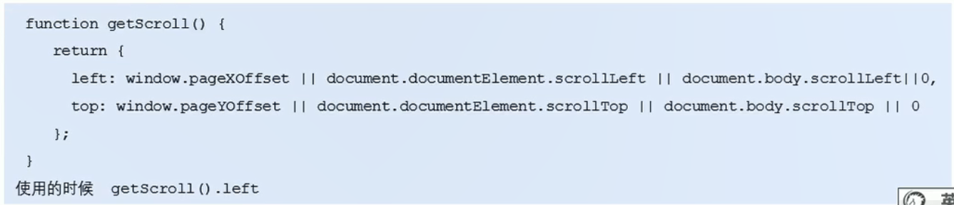
3.3 页面被卷去的头部兼容性问题解决方案

- DTD是指这句话
- 兼容性方案如下
三大系列总结
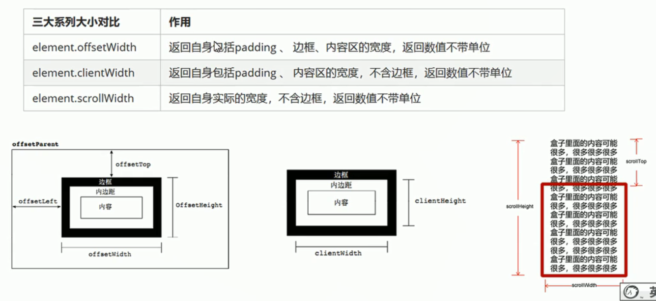
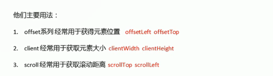
它们最常用于:
知识点补充
mouseenter和mouseover的区别

<body>
    <div class="father">
        <div class="son"></div>
    </div>
    <script>
        var father = document.querySelector('.father');
        var son = document.querySelector('.son');
        father.addEventListener('mousenter', function() { //经过父盒子打印11,再经过父盒子中的子盒子,不再打印
            //若是mouseover,经过父盒子打印11,再经过父盒子中的子盒子又打印一次11
            console.log(11);

        })
    </script>
</body>