基本概念:
CSS position属性用于指定一个元素在文档中的定位方式。top,right,bottom和left决定了该元素的最终位置。
HTML文档流(normal flow):将窗体自上而下分成一行行,并在每行中按从左至右的顺序排放元素,即为文档流。
定位类型关键字
static | relative | absolute | fixed | sticky
position static
解释
静态定位,指定元素使用正常的布局行为,即元素在文档常规流中当前的布局位置。此时,top,right,bottom,left和z-index属性无效
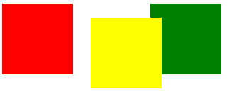
position relative
解释
元素遵循正常文档流,此时元素会先放置在未添加定位时的位置,设置top,right,bottom,left,z-index等时,在不改变页面布局的前提下调整元素位置(因此会在此元素未添加定位时所在位置留下空白),
其实,相对定位相对的是它原本在文档流中的位置而进行的偏移。margin,padding也可以设置。
position:relative对table-*-group,table-row,table-column,table-cell,table-caption元素无效。
示例
<!DOCTYPE html>
<html>
<head>
<title>position</title>
<style>
.box { 100px;height: 100px;display: inline-block;}
.red {background-color: red;}
.yellow {position:relative;top: 20px;left: 20px;background-color: yellow;}
.green {background-color: green;}
</style>
</head>
<body>
<div class="box red"></div>
<div class="box yellow"></div>
<div class="box green"></div>
</body>
</html>
预览
position absolute
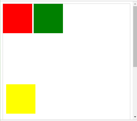
解释
元素会脱离正常文档流,并不为元素预留空间,通过指定元素相对于最近的非static定位祖先元素的偏移,来确定元素位置。绝对定位的元素可以设置外边距(margins),且不会与其他边距合并,但是padding不行。
示例
<!DOCTYPE html>
<html>
<head>
<title>position</title>
<style>
body {position: relative;border: 1px solid #ccc;}
.box { 100px;height: 100px;display: inline-block;}
.red {background-color: red;}
.yellow {position:absolute;top: 20px;left: 20px;background-color: yellow;}
.green {background-color: green;}
</style>
</head>
<body>
<div class="box red"></div>
<div class="box yellow"></div>
<div class="box green"></div>
</body>
</html>
预览

position fixed
解释
元素会脱离正常文档流,并不为元素预留空间,而是通过指定元素相对于屏幕视口(viewport)的位置来指定元素位置。元素的位置在屏幕滚动时不会改变。打印时,元素会出现在每页的固定位置,fixed属性会创建
新的层叠上下文。当元素祖先的transform,perspective,或者filter属性非none时,容器视口改为该祖先。
示例
<!DOCTYPE html>
<html>
<head>
<title>position</title>
<style>
body {position: relative;border: 1px solid #ccc;height: 700px;}
.box { 100px;height: 100px;display: inline-block;}
.red {background-color: red;}
.yellow {position:fixed;bottom: 20px;left: 20px;background-color: yellow;}
.green {background-color: green;}
</style>
</head>
<body>
<div class="box red"></div>
<div class="box yellow"></div>
<div class="box green"></div>
</body>
</html>
预览
position sticky
解释
元素根据正常文档流进行定位,然后相对它的最近滚动祖先,和内容块,包括table-related元素,基于top,right,bottom和left的值进行便宜。偏移值不会影响任何其他元素的位置。
position sticky总是会创建一个新的层叠上下文。需要注意的是,一个sticky元素会固定在离它最近的一个拥有滚动机制的祖先(即该祖先元素的overflw是hidden,scroll,auto或overlay时)上,即便这个祖先不
是真的滚动祖先。这个机制,组织了所有'sticky'行为。
示例
<!DOCTYPE html>
<html>
<head>
<title>position</title>
<style>
* {
  box-sizing: border-box;
}
dl {
  margin: 0;
  padding: 24px 0 0 0;
}
dt {
  background: #B8C1C8;
  border-bottom: 1px solid #989EA4;
  border-top: 1px solid #717D85;
  color: #FFF;
  font: bold 18px/21px Helvetica, Arial, sans-serif;
  margin: 0;
  padding: 2px 0 0 12px;
  position: -webkit-sticky;
  position: sticky;
  top: -1px;
}
dd {
  font: bold 20px/45px Helvetica, Arial, sans-serif;
  margin: 0;
  padding: 0 0 0 12px;
  white-space: nowrap;
}
dd + dd {
  border-top: 1px solid #CCC
}
</style>
</head>
<body>
<div>
<dl>
	<dt>A</dt>
	<dd>Andrew W.K.</dd>
	<dd>Apparat</dd>
	<dd>Arcade Fire</dd>
	<dd>At The Drive-In</dd>
	<dd>Aziz Ansari</dd>
</dl>
<dl>
    <dt>C</dt>
	<dd>Chromeo</dd>
	<dd>Common</dd>
	<dd>Converge</dd>
	<dd>Crystal Castles</dd>
	<dd>Cursive</dd>
</dl>
<dl>
	<dt>E</dt>
	<dd>Explosions In The Sky</dd>
</dl>
<dl>
	<dt>T</dt>
	<dd>Ted Leo & The Pharmacists</dd>
	<dd>T-Pain</dd>
	<dd>Thrice</dd>
	<dd>TV On The Radio</dd>
	<dd>Two Gallants</dd>
</dl>
</div>
</body>
</html>

参考:
https://developer.mozilla.org/zh-CN/docs/Web/CSS/position