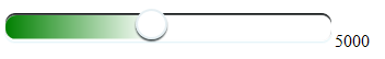
写这个页面只是为了记录各个浏览器修改input type="range" 默认样式的方法,有需要的朋友们可以参考下。
注:在chrome浏览器中进度条不显示颜色,需要自己设置。
<!DOCTYPE html>
<html lang="en">
<head>
<meta charset="UTF-8">
<meta name="viewport" content="width=device-width, initial-scale=1.0">
<meta http-equiv="X-UA-Compatible" content="ie=edge">
<title>Document</title>
<style>
input[type='range'] {
-webkit-appearance: none;
300px;
border-radius: 10px;
/*这个属性设置使填充进度条时的图形为圆角*/
}
/* chrome */
input[type='range']::-webkit-slider-thumb {
-webkit-appearance: none;
}
input[type='range']::-webkit-slider-runnable-track {
height: 25px;
border-radius: 10px;
/*将轨道设为圆角的*/
box-shadow: 0 1px 1px #def3f8, inset 0 0.125em 0.125em #0d1112;
/*轨道内置阴影效果*/
}
input[type='range']:focus {
outline: none;
}
input[type='range']::-webkit-slider-thumb {
-webkit-appearance: none;
height: 30px;
30px;
margin-top: -3px;
/*使滑块超出轨道部分的偏移量相等*/
background: #ffffff;
border-radius: 50%;
/*外观设置为圆形*/
border: solid 0.125em rgba(205, 224, 230, 0.5);
/*设置边框*/
box-shadow: 0 0.125em 0.125em #3b4547;
/*添加底部阴影*/
}
/* ----firefox---- */
input[type='range']::-moz-range-track {
height: 25px;
border-radius: 10px;
/*将轨道设为圆角的*/
box-shadow: 0 1px 1px #def3f8, inset 0 0.125em 0.125em #0d1112;
/*轨道内置阴影效果*/
}
input[type='range']::-moz-range-thumb {
-webkit-appearance: none;
height: 25px;
25px;
margin-top: -5px;
/*使滑块超出轨道部分的偏移量相等*/
background: #ffffff;
border-radius: 50%;
/*外观设置为圆形*/
border: solid 0.125em rgba(205, 224, 230, 0.5);
/*设置边框*/
box-shadow: 0 0.125em 0.125em #3b4547;
/*添加底部阴影*/
}
input[type='range']::-moz-range-progress {
background: linear-gradient(to right, green, white 100%, white);
height: 24px;
border-radius: 10px;
}
/* ----ie---- */
input[type='range']::-ms-track {
height: 25px;
border-radius: 10px;
box-shadow: 0 1px 1px #def3f8, inset 0 0.125em 0.125em #0d1112;
border-color: transparent;
/*去除原有边框*/
color: transparent;
/*去除轨道内的竖线*/
}
input[type='range']::-ms-thumb {
border: solid 0.125em rgba(205, 224, 230, 0.5);
height: 25px;
25px;
border-radius: 50%;
background: #ffffff;
margin-top: -5px;
box-shadow: 0 0.125em 0.125em #3b4547;
}
input[type='range']::-ms-fill-lower {
/*进度条已填充的部分*/
height: 22px;
border-radius: 10px;
background: linear-gradient(to right, green, white 100%, white);
}
input[type='range']::-ms-fill-upper {
/*进度条未填充的部分*/
height: 22px;
border-radius: 10px;
background: #ffffff;
}
input[type='range']:focus::-ms-fill-lower {
background: linear-gradient(to right, green, white 100%, white);
}
input[type='range']:focus::-ms-fill-upper {
background: #ffffff;
}
</style>
</head>
<body>
<input type="range" max="10000" min="1000" value="5000" id="range" onmousemove="anxia()" /><span
id="rangespan"></span>
<br />
<script>
function anxia() {
document.getElementById(
'rangespan'
).innerHTML = document.getElementById('range').value
}
</script>
</body>
</html>