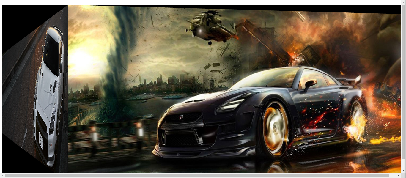
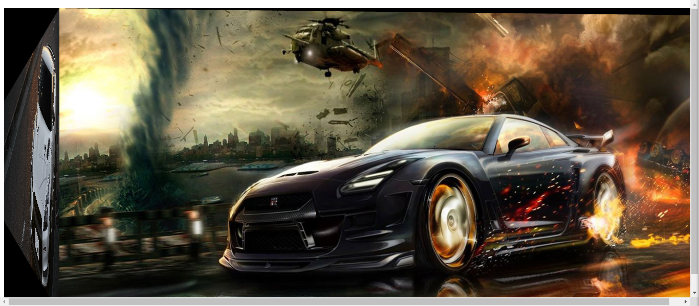
这里分享一个半立体感的大图轮播特效,效果比较好,不会出现bug
首先是代码部分
<div id="slider" class="zzjs_net">
<ul>
<li><a href="" target="_blank"><img src="images/bg1_1.jpg"  alt="" /></a></li>
<li><a href="" target="_blank"><img src="images/bg5_1.jpg" /></a></li>
<li><a href="" target="_blank"><img src="images/bg6_1.jpg"  alt="" /></a></li>
<li><a href="" target="_blank"><img src="images/tu3_1.jpg"  alt="" /></a></li>
</ul>
</div>
<ul id="nav" class="nav">
</ul>
其次是JS部分:
var HR = {
 $ : function(i) {return document.getElementById(i)},
 $$ : function(c, p) {return p.getElementsByTagName(c)},
 ce : function(i, t) {
  var o = document.createElement(i);
  t.appendChild(o);
  return o;
 }
}
HR.slider3D = function () {
 var init = function (o) {
  this.o = o;
  var wp = HR.$(o.id), ul = HR.$$('ul', wp)[0], li = this.li = HR.$$('li', ul);
  this.l = li.length;
  this.w = wp.offsetWidth;
  this.h = wp.offsetHeight;
  this.at = o.auto? o.auto : 4;
  var con = this.con = HR.ce('div', wp);
  con.style.cssText = 'position:absolute;left:0;top:0;'+this.w+'px;height:'+this.h+'px';
  ul.style['display'] = 'none';
  this.a1 = HR.ce('a', con);
  this.a1.style.cssText = 'position:absolute;left:0;top:0;overflow:hidden';
  this.a2 = HR.ce('a', con);
  this.a2.style.cssText = 'position:absolute;top:0;right:0;overflow:hidden';
  this.a1.innerHTML = this.a2.innerHTML = '<img alt="" />';
  this.img = HR.$$('img', ul);
  this.s = o.maskSize ? o.maskSize : 5;
  this.mask11 = HR.ce('span', this.a1);
  this.mask12 = HR.ce('span', this.a1);
  this.mask21 = HR.ce('span', this.a2);
  this.mask22 = HR.ce('span', this.a2);
  this.pos(0);
 }
 init.prototype = {
  pos : function (i) {
   clearInterval(this.li[i].a); clearInterval(this.au); this.au = 0; this.cur = i;
   var navli = HR.$$('li', HR.$(this.o.navId));
   for (var j=0; j<navli.length; j++) {
    navli[j].className = i == j ? 'cur' : '';
   }
   var img1 = HR.$$('img', this.a1)[0], img2 = HR.$$('img', this.a2)[0], _this = this;
   img1.src = i==0 ? this.img[this.l-1].src : this.img[i-1].src;
   img1.width = this.w;
   img2.src = this.img[i].src;
   img2.width = 0;
   img1.height = img2.height = this.h;
   this.mask11.style.cssText = 'position:absolute;left:0;top:0;font-size:0;overflow:hidden;0;height:0;border-color:black transparent transparent black;border-style:solid dashed dashed solid;border-0 '+this.w/2+'px';
   this.mask12.style.cssText = 'position:absolute;left:0;bottom:0;font-size:0;overflow:hidden;0;height:0;border-color:transparent transparent black black;border-style:dashed dashed solid solid;border-0 '+this.w/2+'px';
   this.mask21.style.cssText = 'position:absolute;right:0;top:0;font-size:0;overflow:hidden;0;height:0;border-color:black black transparent transparent;border-style:solid solid dashed dashed;border-0px';
   this.mask22.style.cssText = 'position:absolute;right:0;bottom:0;font-size:0;overflow:hidden;0;height:0;border-color:transparent black black transparent;border-style:dashed solid solid dashed;border-0px';
   this.li[i].a = setInterval(function(){_this.anim(i)}, 20);
  },
  anim : function (i) {
   var w1 = HR.$$('img', this.a1)[0].width, w2  = HR.$$('img', this.a2)[0].width;
   if (w2 == this.w) {
    clearInterval(this.li[i].a);
    HR.$$('img', this.a1)[0].width = 0;
    HR.$$('img', this.a2)[0].width = this.w;
    this.mask11.style.borderLeftWidth = this.mask11.style.borderRightWidth = this.mask12.style.borderLeftWidth = this.mask12.style.borderRightWidth = '0px';
    this.mask11.style.borderTopWidth = this.mask11.style.borderBottomWidth = this.mask12.style.borderTopWidth = this.mask12.style.borderBottomWidth = this.h/this.s + 'px';
    this.mask21.style.borderLeftWidth = this.mask21.style.borderRightWidth = this.mask22.style.borderLeftWidth = this.mask22.style.borderRightWidth = this.w/2 + 'px';
    this.mask21.style.borderTopWidth = this.mask21.style.borderBottomWidth = this.mask22.style.borderTopWidth = this.mask22.style.borderBottomWidth = '0px';
   }else {
    HR.$$('img', this.a1)[0].width -= Math.ceil((this.w-w2)*.13);
    HR.$$('img', this.a2)[0].width += Math.ceil((this.w-w2)*.13);
    this.mask11.style.borderLeftWidth = this.mask11.style.borderRightWidth = this.mask12.style.borderLeftWidth = this.mask12.style.borderRightWidth = HR.$$('img', this.a1)[0].width/2 + 'px';
    this.mask11.style.borderTopWidth = this.mask11.style.borderBottomWidth = this.mask12.style.borderTopWidth = this.mask12.style.borderBottomWidth = HR.$$('img', this.a2)[0].width*this.h/(this.s*this.w) + 'px';
    this.mask21.style.borderLeftWidth = this.mask21.style.borderRightWidth = this.mask22.style.borderLeftWidth = this.mask22.style.borderRightWidth = HR.$$('img', this.a2)[0].width/2 + 'px';
    this.mask21.style.borderTopWidth = this.mask21.style.borderBottomWidth = this.mask22.style.borderTopWidth = this.mask22.style.borderBottomWidth = this.h/this.s - HR.$$('img', this.a2)[0].width*this.h/(this.s*this.w) + 'px';
    if (!this.au) this.auto();
   }
  },
  auto : function () {
   var _this = this;
   this.au = setInterval(function(){_this.move()}, this.at*1000);
  },
  move : function () {
   var n = this.cur==this.l-1 ? 0 : this.cur+1;
   this.pos(n);
  }
 }
 return init;
}();
var mySlider = new HR.slider3D({
 id: 'slider',
 maskSize: 6,
 navId: 'nav',
 auto: 4
})
然后是CSS部分:
.zzjs_net {
 1366px;
height: 599px;
overflow: hidden;
position: absolute;
}
.zzjs__net {
position: absolute;
background: #ccc;
top: 50%;
left: 50%;
border-radius: 4px;
-moz-border-radius: 4px;
-webkit-border-radius: 4px;
padding: 0 20px 6px 10px;
_padding: 0 20px 2px 10px;
}
.nav li {
float: left;
margin-left: 10px;
font-size: 20px;
font-weight: bold;
font-family: tahoma;
color: #22739e;
cursor: pointer;
height: 22px;
}
.nav li.cur{color: #ff7a00}
.next {
position:absolute;
top: 0;
left:0px;
padding: 4px 8px;
color: #ff7a00;
background: #ccc;
height: 20px;
border-radius: 4px;
-moz-border-radius: 4px;
-webkit-border-radius: 4px;
cursor: pointer;
}
效果如下: