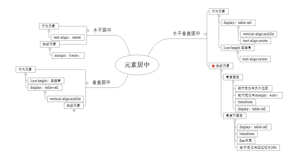
来源:CSS水平、垂直居中
小tip: margin:auto实现绝对定位元素的水平垂直居中
要实现如图中所示的效果:
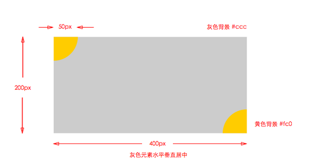
<style>
.cicle{
    width:50px;
    height:50px;
    background-color: #fc0;
}
.one{
    -moz-border-radius:0  0 100% 0;
    -webkit-border-radius:0  0 100% 0;
    border-radius:0  0 100% 0;
}
.two{
    -moz-border-radius:50px 0 0 0;
    -webkit-border-radius:50px 0 0 0;
    border-radius:50px 0 0 0;
}
</style>
<body>
    <div class="container">
        <div class="cicle left"></div>
        <div class="cicle right"</div>
    </div>
</body>
关于四分之一圆的实现问题请看CSS3 border-radius 属性以及border-radius测试,先看使两个四分之一圆位于矩形的左上角和右下角有两种定位方法:
(1)绝对定位:
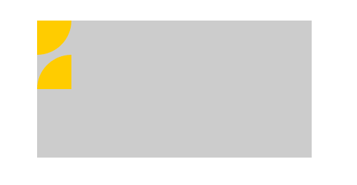
矩形和扇形都设置position:absolute,相对于矩形定位,两个扇形脱离普通流,重叠于左上角,如图:

左上角的不用移动,右下角的相对于矩形定位,right、bottom均为0即可。
(2)相对定位:
两个扇形设置position:relative,相对定位的元素不会脱离普通流,left、top等属性也是相对于元素在普通流中的位置进行定位,未定位的扇形位置如图所示:
所以右下角的扇形的属性为“left:350px;top:100px;”
接下来要实现灰色矩形水平垂直居中,我首先想到的就是利用绝对定位,后来看了其他人的答案,发现了其他几种方法(包括但不限于任务四的解决方法,主要是元素的水平垂直居中问题),现总结如下:
一、position方式:
主要就是矩形设置绝对定位,相对于body对象定位,但水平垂直居中效果的实现又有几个不同的方法:
(1)负外边距方式(宽高固定):
.container{

    background-color: #ccc;

    position:absolute;

    height:200px; width:400px;

    left:50%; top:50%;

    margin:-100px 0 0 -200px;     /*负外边距分别为宽高的一半*/

}
矩形设置position:absolute,矩形相对于body对象进行绝对定位,设置left和top属性均为50%,同时设置margin-left和margin-top分别为矩形宽度、高度的一半,这样就可以实现矩形水平垂直居中了。
这个方法需要提前知道元素的尺寸,否则margin负值的调整无法精确。
(2)margin:auto方式(宽高固定):
.container {

    width: 400px; height: 200px;

    position: absolute;

     left: 0; top: 0; right: 0; bottom: 0;

    margin: auto;

}
这种方法也可以实现水平垂直居中,简单来说就是:在普通流(normal flow)中,margin:auto的效果等同于margin-top:0;margin-bottom:0。 position:absolute;使container跳出了普通流,为container设置top: 0; left: 0; bottom: 0; right: 0;将给浏览器重新分配一个边界框,但是此时该块区域将填充其父元素的所有可用空间(父元素一般为body或者声明为position:relative;的容器),所以给内容块设置一个高度height或宽度width,能够防止内容块占据所有的可用空间,促使浏览器根据新的边界框重新计算margin:auto。
总而言之:绝对定位元素不在普通内容流中渲染,因此margin:auto可以使内容在通过top: 0; left: 0; bottom: 0;right: 0;设置的边界内垂直居中。
(3)transform方式(宽高无限制):
.container {

    width: 400px; height: 200px;

    position: absolute;

     left: 50%; top: 50%;

    transform: translate(-50%, -50%);

}
CSS3中transform属性的translate值表示的是相对于自身大小的偏移量,所以无论绝对定位元素的尺寸是多少,这种方法的显示效果都是水平垂直居中的(如果不设置宽高,container会被内容撑开居中显示,如果没有内容,container不显示)。当要求矩形高度是根据内容动态变化的时候可以用这种方式,但是兼容性不好。
(4)left/right/top/bottom均为25%(宽高不固定):
.container{
    position: absolute;
    top:25%;
    bottom:25%;
    right:25%;
    left:25%;
}
这种方法矩形尺寸会随着浏览器窗口变化而变化,但始终是水平垂直居中的。
二、display:table方式:
<style>
html,body{
    height:100%;
    width:100%;
}
.parent{
     display:table;
     height:100%;
     width:100%;
}
.inner{
    display:table-cell;
    vertical-align: middle;
}
.container{
    background-color: #ccc;
    width:400px; height:200px;
    margin:0 auto;
}
</style>
<div class="parent">
     <div class="inner">
            <div class="container">
                  <div class="cicle one"></div>
                  <div class="cicle two"></div>
            </div>
   </div>
</div>
display属性定义建立布局时元素生成的显示框类型。display:table表示parent元素会作为块级表格来显示,display:table-cell表示inner元素会作为一个表格单元格显示,而vertical-align:middle使得表单元格中的内容垂直居中显示,container再设置margin:0 auto;就达到了水平垂直居中要求。
那么为什么html/body/parent都设置width:100%;height:100%;呢?
因为矩形要求是相对于整个浏览器窗口垂直居中,所以parent尺寸设置为width:100%;height:100%;就可以了, 但是《css权威指南》指出height/width百分数是相对于包含块的,parent的height/width相对于body,但由于body没有设置height/width,《css权威指南》又指出,如果没有显示声明包含块的height/width,百分数高度会重置为auto,所以上面parent的width/height设置为任何值都跟没设置一样,也就是要设置parent为宽高100%,必须设置其上一级div也就是body的宽度或高度,否则无效。同理由于body宽高设置的是100%,如果没有显式设置html,body还是相当于没设置。又因为html尺寸由浏览器窗口控制,所以html,body,div都要设置height/width为100%。
总之:要设置div100%显示,必须设置其上一级div的宽度或高度,否则无效。
三、flex方式:
html,body,.parent{
    width:100%;
    height:100%;
 }
.inner{
    display: -moz-box;                      /* Firefox */
    display: -ms-flexbox;                   /* IE10 */
    display: -webkit-box;                   /* Safari */
    display: -webkit-flex;                  /* Chrome, WebKit */
    display: box;
    display: flexbox;
    display: flex;
    width: 100%;  height: 100%;
    justify-content: center;
    align-items: center;
}
.container{
    position: relative;
    width:400px;
    height:200px;
    background-color: #ccc;
}
Justify-content设置弹性盒子元素在主轴(横轴)方向上的对齐方式。center表示 弹性盒子元素将向行中间位置对齐,该行的子元素将相互对齐并在行中居中对齐;
align-items定义flex子项在flex容器的当前行的侧轴(纵轴)方向上的对齐方式。center表示弹性盒子元素在该行的侧轴(纵轴)上居中放置。
总结: