python 可视化 二维坐标标注等等
基本画图操作:

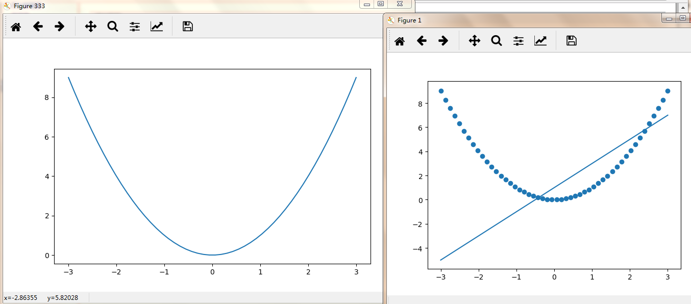
import matplotlib.pyplot as plt
import numpy as np

x = np.linspace(-3,3,50)
y1 = 2*x+1
y2 = x**2#x的平方

plt.figure()
plt.plot(x,y1) #画线
plt.scatter(x,y2) #画点

plt.figure(num=333,figsize=(8,5))#图333
plt.plot(x,y2)

plt.show()
设置图例:
import matplotlib.pyplot as plt
import numpy as np
x = np.linspace(-3,3,50)
y1 = 2*x+1
y2 = x**2#x的平方
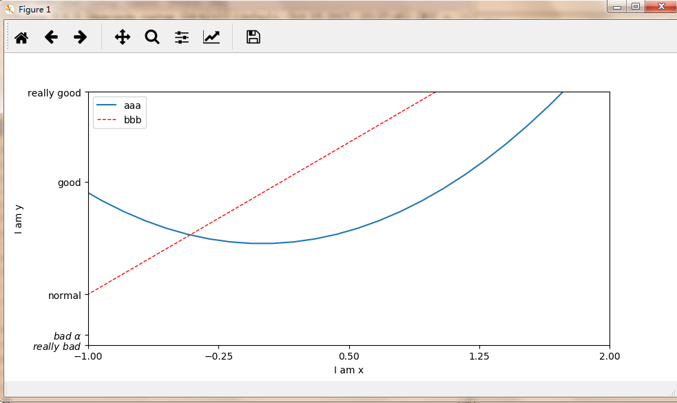
plt.figure()
plt.xlim((-1,2))
plt.ylim((-2,3))
plt.xlabel('I am x')
plt.ylabel('I am y')
new_ticks = np.linspace(-1,2,5)#5为5个单位
print(new_ticks)
plt.xticks(new_ticks)
#用r(正则表达)和$框起来可以转换为计算机可以读的字体
#加空格转义为空格,加alpha能够输出 真正的alpha
plt.yticks([-2,-1.8,-1,1.22,3,],
[r'$really bad$',r'$bad alpha$','normal','good','really good'])
l1,=plt.plot(x,y2,label='up')#画线
l2,=plt.plot(x,y1,color='red',linewidth=1.0,linestyle='--',label='dowm')#‘--’为虚线
#loc可以为upper right等等
#要传到handles要加,用了labels后就不用l1,l2本身的label
plt.legend(handles=[l1,l2,],labels=['aaa','bbb'],loc='best')
plt.show()
设置坐标轴位置:
import matplotlib.pyplot as plt
import numpy as np
x = np.linspace(-3,3,50)
y1 = 2*x+1
y2 = x**2#x的平方
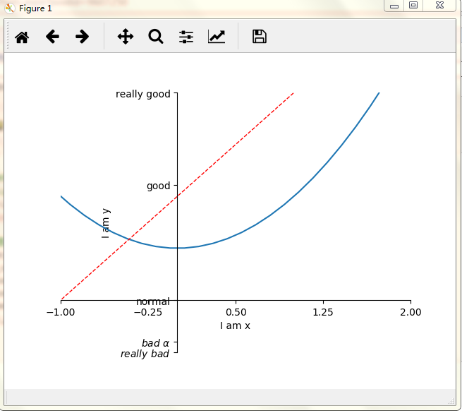
plt.figure()
plt.plot(x,y2)
plt.plot(x,y1,color='red',linewidth=1.0,linestyle='--')
plt.xlim((-1,2))
plt.ylim((-2,3))
plt.xlabel('I am x')
plt.ylabel('I am y')
new_ticks = np.linspace(-1,2,5)#5为5个单位
print(new_ticks)
plt.xticks(new_ticks)
#用r(正则表达)和$框起来可以转换为计算机可以读的字体
#加空格转义为空格,加alpha能够输出 真正的alpha
plt.yticks([-2,-1.8,-1,1.22,3,],
[r'$really bad$',r'$bad alpha$','normal','good','really good'])
ax = plt.gca()#ax为上图
ax.spines['right'].set_color('none')#删除右边缘黑框
ax.spines['top'].set_color('none')#删除上边缘黑框
ax.xaxis.set_ticks_position('bottom')#令x轴为底边缘
ax.yaxis.set_ticks_position('left')#令y轴为左边缘
ax.spines['bottom'].set_position(('data',-1))#将底边缘放到 y轴数据-1的位置
ax.spines['left'].set_position(('data',0))#将左边缘放到 y轴数据-1的位置
plt.show()
标注:
import matplotlib.pyplot as plt
import numpy as np

x = np.linspace(-3,3,50)
y = 2*x+1

plt.figure(num=1,figsize=(8,5),)
plt.plot(x,y,)


ax = plt.gca()#ax为上图
ax.spines['right'].set_color('none')#删除右边缘黑框
ax.spines['top'].set_color('none')#删除上边缘黑框
ax.xaxis.set_ticks_position('bottom')#令x轴为底边缘
ax.yaxis.set_ticks_position('left')#令y轴为左边缘
ax.spines['bottom'].set_position(('data',0))#将底边缘放到 y轴数据-1的位置
ax.spines['left'].set_position(('data',0))#将左边缘放到 y轴数据-1的位置


#添加标注
x0 =1
y0 = 2*x0+1
plt.scatter(x0,y0,s=50,color='b')#b代表blue
#plot(x列表,y列表)
plt.plot([x0,x0],[y0,y0],'k--',lw=2.5) #k代表黑色,lw为线宽

#model 1
#annotate标注
#xy为基准点
#textcoords='offset point'代表以这个点为基准,标注在这个点的基础上x+30,y-30
#arrowprops描述箭头,线的弧度等信息
#xycoords='data' xy的坐标是基于data的
plt.annotate(r'$2x+1=%s$' % y0,xy=(x0,y0),xycoords='data',xytext=(+30,-30),
             textcoords='offset points',fontsize=16,
             arrowprops=dict(arrowstyle='->',connectionstyle='arc3,rad=.2'))

#mothod 2
plt.text(-3.7,3,r'$This is the some text. mu sigma_i alpha_t$',
         fontdict={'size':16, 'color':'r'})


plt.show()

(1)annotate语法说明 :annotate(s='str' ,xy=(x,y) ,xytext=(l1,l2) ,..)
s 为注释文本内容
xy 为被注释的坐标点
xytext 为注释文字的坐标位置
xycoords 参数如下:
- figure points points from the lower left of the figure 点在图左下方
- figure pixels pixels from the lower left of the figure 图左下角的像素
- figure fraction fraction of figure from lower left 左下角数字部分
- axes points points from lower left corner of axes 从左下角点的坐标
- axes pixels pixels from lower left corner of axes 从左下角的像素坐标
- axes fraction fraction of axes from lower left 左下角部分
- data use the coordinate system of the object being annotated(default) 使用的坐标系统被注释的对象(默认)
- polar(theta,r) if not native ‘data’ coordinates t
extcoords 设置注释文字偏移量
| 参数 | 坐标系 |
| 'figure points' | 距离图形左下角的点数量 |
| 'figure pixels' | 距离图形左下角的像素数量 |
| 'figure fraction' | 0,0 是图形左下角,1,1 是右上角 |
| 'axes points' | 距离轴域左下角的点数量 |
| 'axes pixels' | 距离轴域左下角的像素数量 |
| 'axes fraction' | 0,0 是轴域左下角,1,1 是右上角 |
| 'data' | 使用轴域数据坐标系 |
arrowprops #箭头参数,参数类型为字典dict
- width the width of the arrow in points 点箭头的宽度
- headwidth the width of the base of the arrow head in points 在点的箭头底座的宽度
- headlength the length of the arrow head in points 点箭头的长度
- shrink fraction of total length to ‘shrink’ from both ends 总长度为分数“缩水”从两端
- facecolor 箭头颜色
bbox给标题增加外框 ,常用参数如下:
- boxstyle方框外形
- facecolor(简写fc)背景颜色
- edgecolor(简写ec)边框线条颜色
- edgewidth边框线条大小
bbox=dict(boxstyle='round,pad=0.5', fc='yellow', ec='k',lw=1 ,alpha=0.5) #fc为facecolor,ec为edgecolor,lw为lineweight
设置不透明度:
import matplotlib.pyplot as plt
import numpy as np

x = np.linspace(-3,3,50)
y = 0.1*x

plt.figure()
#alpha为设置不透明深度
plt.plot(x,y,linewidth=10,alpha=0.7)
plt.ylim(-2,2)


#建立坐标系
ax = plt.gca()#ax为上图
ax.spines['right'].set_color('none')#删除右边缘黑框
ax.spines['top'].set_color('none')#删除上边缘黑框
ax.xaxis.set_ticks_position('bottom')#令x轴为底边缘
ax.yaxis.set_ticks_position('left')#令y轴为左边缘
ax.spines['bottom'].set_position(('data',0))#将底边缘放到 y轴数据-1的位置
ax.spines['left'].set_position(('data',0))#将左边缘放到 y轴数据-1的位置


#解决线太粗把坐标挡住的问题
for label in ax.get_xticklabels() + ax.get_yticklabels():
    label.set_fontsize(18)
    label.set_bbox(dict(facecolor='yellow', edgecolor='None', alpha=0.7))
plt.show()
