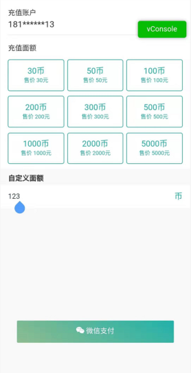
最近做了一个移动端项目,页面主体是由form表单和底部fixed定位的按钮组成,当用户进行表单输入时,手机软键盘弹起,此时页面的尺寸发生变化,底部fixed定位的元素自然也会上移,可能就会覆盖页面中的某些元素。具体情形,如下图所示(按钮将文字覆盖了):


解决方案:
上面提到,产生这种情况的原因是软键盘弹起,窗口尺寸发生变化,那么就通过监听尺寸的方式解决一下这个问题(当键盘弹出时,将按钮隐藏;键盘收回时,将按钮显示出来):
- data中声明数据:
data() {
    return {
        docmHeight: document.documentElement.clientHeight ||document.body.clientHeight,
        showHeight: document.documentElement.clientHeight ||document.body.clientHeight,
        hideshow:true  //显示或者隐藏footer
    }
}
- 监听页面高度:
watch: {
    //监听显示高度
    showHeight:function() {
        if(this.docmHeight > this.showHeight){
            //隐藏
            this.hideshow=false
        }else{
            //显示
            this.hideshow=true
        }
    }
},

mounted() {
    //监听事件
    window.onresize = ()=>{
        return(()=>{
            this.showHeight = document.documentElement.clientHeight || document.body.clientHeight;
        })()
    }
}
- 设置元素的显示与隐藏:
<el-button v-show="hideshow">确认操作</el-button>
这样,按钮就能正常显示了: