Mobile Tutorial: Using Layout to Adjust Different Form Sizes or Orientations (iOS and Android)
Go Up to Mobile Tutorials: Delphi Mobile Application Development (iOS and Android)
This tutorial describes a general strategy for using one common form for different form factors (such as phone or tablet), without using different forms for each form factor.
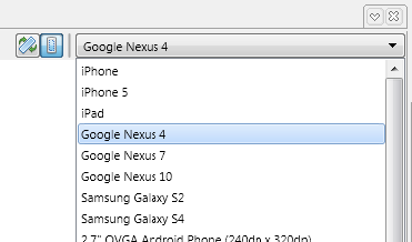
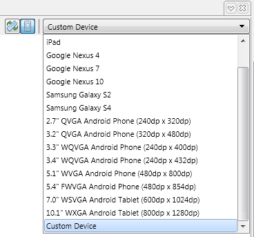
In the FireMonkey Mobile Form Designer, you can preview the user interface without running the application on a device — just change the device or orientation in the dropdown at the upper right corner:
For more information, see Mobile Device Settings.
Contents[hide] |
Every FireMonkey Component Can Have an Owner, a Parent, and Children
First, every FireMonkey component has the idea of Owner, Parent, and Children. If you place a component on a form, the form becomes the owner and parent of the component.
If you add components (for example, a Button, Label, and others) to another component (for example, a ToolBar), the ToolBar is both parent and owner of the Button, Label, and others. You can see this parent-child relationship graphically represented in the tree view in the Structure View.
The Layout for a child is defined as a value relative to its parent. In the following picture, Label1 is the child of Toolbar1, and the Layout of Label1 is relative to Toolbar1.
Using Common Layout-Related Properties of a FireMonkey Component
Using the Align Property
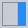
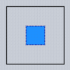
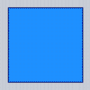
A control's Align property determines whether it is automatically repositioned and/or resized along its parent's four sides or center, both initially and as the parent is resized. The default value for the Align property is alNone, which means that no automatic calculations are performed: the control stays where it is placed.
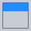
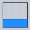
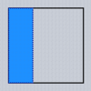
Typical values for the Align property are as follows (Dodgerblue indicates the area for the child):
| alNone | alTop | alBottom | alLeft | alRight | alCenter | alClient |
 |
 |
 |
 |
 |
 |
 |
If you use an Align value of alTop, alBottom, alLeft, or alRight for one component, the Align properties for other components use the remaining area.
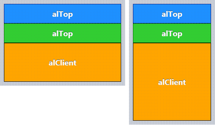
The size and shape of the remaining area (alClient) also changes based on the orientation of the device, and based on the form factor (iPhone or iPad).
The following pictures show the layout for landscape (horizontal) and for portrait (vertical) when you have two (2) components that use alTop, and one (1) component that uses alClient.
Using the Margins Property
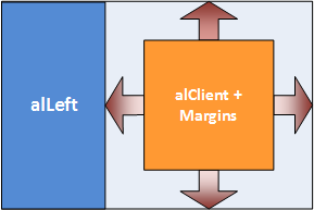
Margins ensure separation between controls automatically positioned by a parent.
In the following picture, the right side of the component (alClient) uses the Margins property to ensure space around the component.
Using the Padding Property
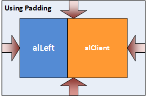
Padding sets aside space on the interior of the parent's content box. In the Object Inspector, you can set values (in pixels) for the Padding:
- Left
- Right
- Bottom
- Top
In the following picture, the parent component (which contains two regions) uses the Padding property to ensure space inside the parent component:
Using the Anchors Property
Anchors are needed when a control must maintain its position at a certain distance from the edges of its parent, or must stretch while maintaining the original distance between its edges and the edges of its parent. Anchored controls 'stick' to the sides of containers and stretch, if so specified.
Anchors Property for the Edit Control
If you have an Edit control on top of a ToolBar, you may want to keep a fixed distance between the right edge of the Edit Control and the edge of the form (ToolBar). Anchors enable you to specify that a control is to remain fixed in relation to the sides of its parent.
If you want the Edit control to maintain the same relative position in relation to the ToolBar (its parent), you can set the Anchors property to akLeft, akTop, akRight. When the ToolBar is resized, the Edit control is resized according to the Anchors settings:
iOS
Android
Anchors Property for Button Control
If you have a Button control at the right end of the ToolBar, you may want to keep the same distance between the right edge of the Button control and the edge of the Form. However, you might not want to maintain the same distance between the left edge of the Button control and the left edge of the Form. In this case, you can set the Anchors property to akTop, akRight(de-select akLeft), so that the Button control maintains the same distances with the ToolBar (parent) for Top and Right.
iOS:
Android:
Using the TLayout Component
TLayout, a component that is not visible at run time, can be used to group its child controls to be manipulated as a whole. For example, you can set the visibility of a group of controls at one time by setting the Visible property of the layout. TLayout does not automatically set any of the properties of its children.
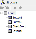
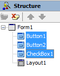
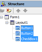
To make selected controls children of TLayout, use the Structure View.
Highlight the controls you want to move. Then drag the group of controls over the control that should be the parent, and drop the controls there. In the Structure View, the group of controls are now children of the new parent:
| 1. Initial State | 2. Highlight the Controls to Move | 3. Drag onto Parent |
|---|---|---|
You can use Align, Padding, Margins, Anchors, and other properties of TLayout to define the layout for a specific area. You can use the TLayout component just like the DIV tag in HTML.
Working with a Busy Interface: Using a TVertScrollBox Component
In general, you do not want your form to have too many items, which can force users to scroll the user interface. In many cases, you can use a TabControl component with several pages to avoid any scrolling.
If you need to place many items on your form, you can use a TVertScrollBox component to define a scrolling area as described here:
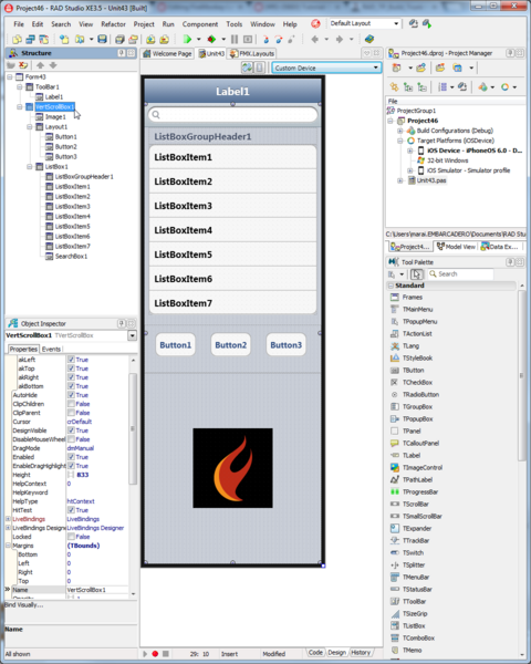
- Select Custom Device on FireMonkey Mobile Form Designer.
- Change the size of the Custom Device by dragging the edge of the designer to the shape and size you want.
- Drop a TVertScrollBox component, and set its Align property to alClient. This causes the TVertScrollBox to fill the client area.
- Locate components on the TVertScrollBox component:
You can scroll this form at run time as you swipe the user interface.
See Also
- Mobile Tutorial: Using LiveBindings to Populate a ListView (iOS and Android)
- Mobile Tutorial: Using ListBox Components to Display a Table View (iOS and Android)
- Mobile Tutorial: Using Location Sensors (iOS and Android)
- Tutorial: Using FireMonkey Layouts
- FireMonkey Layouts Strategies
- Arranging FireMonkey Controls
- Gestures in FireMonkey
