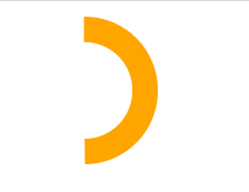
方式一:
<div style="
     50px;
    height: 50px;
    border: 13px solid orange;
    border-radius: 50px;
    clip-path: polygon(50% 0%, 100% 0%, 100% 3600%, 50% 50%);
    -webkit-clip-path: polygon(50% 0%, 100% 0%, 100% 3600%, 50% 50%);
"></div>
效果:
方式二:
</head>
<style>
.circle {
position: relative;
box-sizing: border-box;
}
.big {
140px;
height: 140px;
border-radius: 50%;
position: absolute;
margin: auto;
/*以下五个属性为水平垂直居中的方法*/
left: 0;
top: 200px;
right: 0;
bottom: 0;
box-sizing: border-box;
}
.small {
136px;
height: 136px;
border: 10px solid #9DDBE8;
border-radius: 50%;
position: absolute;
margin: auto;
/*以下五个属性为水平垂直居中的方法*/
left: 0;
top: 200px;
right: 0;
bottom: 0;
box-sizing: border-box;
border-bottom-color: transparent;
}
</style>
</head>
<body>
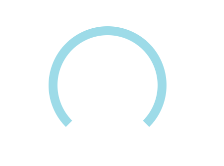
<div class="circle">
<div class="big"></div>
<div class="small"></div>
</div>
</body>
效果: