Text
The Text control displays a non-interactive piece of text to the user. This can be used to provide captions or labels for other GUI controls or to display instructions or other text.
文本控件向用户显示一个非交互式的文本片段。 它可以作为其他GUI控件提供标题或标签,或作为说明文本,或者其他用途。
Properties
属性
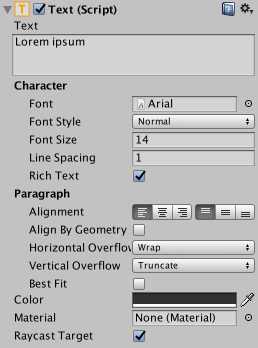
| Property: | Function: |
|---|---|
| Text | The text displayed by the control. |
| Character | |
| Font | The Font used to display the text. |
| Font Style | The style applied to the text. The options are Normal, Bold, Italic and Bold And Italic. |
| Font Size | The size of the displayed text. |
| Line Spacing | The vertical separation between lines of text. |
| Rich Text | Should markup elements in the text be interpreted as Rich Text styling? |
| Paragraph | |
| Alignment | The horizontal and vertical alignment of the text. |
| Align by Geometry | Use the extents of glyph geometry to perform horizontal alignment rather than glyph metrics. |
| Horizontal Overflow | The method used to handle the situation where the text is too wide to fit in the rectangle. The options are Wrap and Overflow. |
| Vertical Overflow | The method used to handle the situation where wrapped text is too tall to fit in the rectangle. The options are Truncate and Overflow. |
| Best Fit | Should Unity ignore the size properties and simply try to fit the text to the control’s rectangle? |
| Color | The color used to render the text. |
| Material | The Material used to render the text. |
| 属性 | 功能 |
|---|---|
| Text | 由控件显示的文本 |
| Character | |
| Font | 用于显示文本的字体 |
| Font Style | 应用于文本的样式。 选项是正常,粗体,斜体或粗体加斜体 |
| Font Size | 文字的大小 |
| Line Spacing | 行间距 |
| Rich Text | 文本中的标记元素是否应该被解释为Rich Text样式 |
| Paragraph | |
| Alignment | 文本的水平和垂直对齐 |
| Align by Geometry |
使用字形几何的范围来执行水平对齐而不是字形度量 |
| Horizontal Overflow | 该方法用于处理文本太宽以至于无法放入矩形区域的情况。 选项是Wrap和Overflow |
| Vertical Overflow |
该方法用于处理文本太高以至于无法放入矩形区域的情况。选项是Truncate和Overflow |
| Best Fit | Unity是否要忽略尺寸属性,只是简单地将文本放到控件的矩形区域中 |
| Color | 文本的颜色 |
| Material | 文本的Material |
A default text element looks like this:
默认的文本元素如下所示:
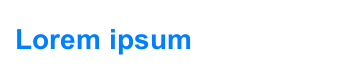
A Text element.
Details
详细
Some controls (such as Buttons and Toggles) have textual descriptions built-in. For controls that have no implicit text (such as Sliders), you can indicate the purpose using a label created with a Text control. Text is also useful for lists of instructions, story text, conversations and legal disclaimers.
有一些空间(比如Buttons 和 Toggles)有内置的文本。对于没有隐式文本的控件(比如Sliders),你可以创建一个Text控件来达到目的。Text还可以用来显示说明列表、故事、对话和免责声明
The Text control offers the usual parameters for font size, style, etc, and text alignment. When the Rich Text option is enabled, markup elements within the text will be treated as styling information, so you can have just a single word or short section in boldface or in a different color, say (see the page about Rich Text for details of the markup scheme).
Text提供字体大小、样式、文本对齐等常用参数。当Rich Text被选中,text中的标签元素会被当做样式信息,所以你可以只让一个字或者一小段话加粗或者改变颜色(在关于Rich Text的页面中获得关于标签的更多信息)
Hints
提示