Interaction Components
This section covers components in the UI system that handles interaction, such as mouse or touch events and interaction using a keyboard or controller.
The interaction components are not visible on their own, and must be combined with one or more visual elements in order to work correctly.
这一节包括了UI系统中处理交互的组件,比如鼠标、触摸事件,还有使用键盘或控制器的交互
交互组件自己是不可见得,必须和一个或多个可见的组件结合才能正常工作
Common Functionality
通用功能
Most of the interaction components have some things in common. They are selectables, which means they have shared built-in functionality for visualising transitions between states (normal, highlighted, pressed, disabled), and for navigation to other selectables using keyboard or controller. This shared functionality is described on the Selectable page.
The interaction components have at least one UnityEvent that is invoked when user interacts with the component in specific way. The UI system catches and logs any exceptions that propagate out of code attached to UnityEvent.
大部分的交互组件有一些通用的部分。他们是可以被选择的,也就是说他们共享了内置的功能来实现可视状态的转换(普通、高亮、按下、不可用),还实现了通过键盘或控制器导航到其他的selectble组件。这些共享的功能在Selectable中有详细说明。(Selectable在源码中是很多可交互组件的基类,毕竟很多基础功能是通用的)
当用户用特定的方法和可交互组件交互的时候,至少有一个UnityEvent会被调用。UI系统会捕获并且记录所有从附加到UnityEvent的代码中传出的异常
Button
按钮
A Button has an OnClick UnityEvent to define what it will do when clicked.
按钮有一个OnClick事件来定义它被点击后会发生什么
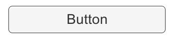
See the Button page for details on using the Button component.
在Button页面查看使用Button组件的详细方法
Toggle
切换键
A Toggle has an Is On checkbox that determines whether the Toggle is currently on or off. This value is flipped when the user clicks the Toggle, and a visual checkmark can be turned on or off accordingly. It also has an OnValueCHanged UnityEvent to define what it will do when the value is changed.
切换键有一个复选框决定了这个选择键是否打开。在用户按下这个Toggle的时候,这个值会反过来,然后一个可视化的选择标记也会跟着变化。它还有一个OnValueChanged事件来定义当复选框的值变化时做什么
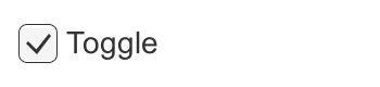
See the Toggle page for details on using the Toggle component.
在Toggle页面查看使用Toggle组件的详细方法
Toggle Group
切换按键组
A Toggle Group can be used to group a set of Toggles that are mutually exclusive. Toggles that belong to the same group are constrained so that only one of them can be selected at a time - selecting one of them automatically deselects all the others.
Toggle Group可以用来把一组Toggle分为一组,他们之间是互斥的。属于同一组的Toggle被限制了,在同一时间只有一个可以被选中-选中其中一个会自动关闭其它的
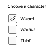
See the Toggle Group page for details on using the Toggle Group component.
在Toggle Group页面查看使用Toggle Group组件的详细方法
Slider
滑块
A Slider has a decimal number Value that the user can drag between a minimum and maximum value. It can be either horizontal or vertical. It also has a OnValueChanged UnityEvent to define what it will do when the value is changed.
滑块有意个小数值,用户可以在最小值和最大值之间拖拽。它可以是水平的也可以是垂直的。它还有一个OnValueChanged事件来定义这个值改变之后要做什么
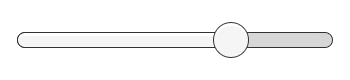
See the Slider page for details on using the Slider component.
在Slider页面查看使用Slider组件的详细方法
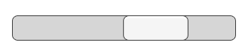
Scrollbar
滑动条
A Scrollbar has a decimal number Value between 0 and 1. When the user drags the scrollbar, the value changes accordingly.
Scrollbars are often used together with a Scroll Rect and a Mask to create a scroll view. The Scrollbar has a Size value between 0 and 1 that determines how big the handle is as a fraction of the entire scrollbar length. This is often controlled from another component to indicate how big a proportion of the content in a scroll view is visible. The Scroll Rect component can automatically do this.
The Scrollbar can be either horizontal or vertical. It also has a OnValueChanged UnityEvent to define what it will do when the value is changed.
滑动条有一个在0-1之间的小数值。当用户拖拽ScrollBar的时候,这个值相应地改变
Scrollbars 经常和ScrollRect和Mask一起创建一个Scroll View。scroll bar有一个尺寸值在0和1之间,决定了把手占整个scrollbar长度的分数值。这一般由其他组件控制来表明在ScrollView中可见的内容占总内容的百分比。Scroll Rect组件可以自动设置它。
See the Scrollbar page for details on using the Scrollbar component.
在Slider页面查看使用Slider组件的详细方法
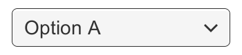
Dropdown
下拉菜单
A Dropdown has a list of options to choose from. A text string and optionally an image can be specified for each option, and can be set either in the Inspector or dynamically from code. It has a OnValueChanged UnityEvent to define what it will do when the currently chosen option is changed.
Dropdown 有一列选项可以选择。每个选项可以指定文字和图片(可选),这些可以在inspector中设置,也可以动态地在代码里设置。它还有一个Onvaluechange的事件来定义当选项改变时做什么
See the Dropdown page for details on using the Dropdown component.
在DropDown页面查看使用DropDown组件的详细方法
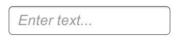
Input Field
输入栏
An Input Field is used to make the text of a Text Element editable by the user. It has a UnityEvent to define what it will do when the text content is changed, and an another to define what it will do when the user has finished editing it.
Input Filed 用来让文字元素的文字可以被用户编辑。它定义了文字内容改变的事件和文字编辑结束两个事件,来定义这两种情况下分别做什么。
See the Input Field page for details on using the Input Field component.
在Input Filed页面查看使用Input Files组件的详细方法
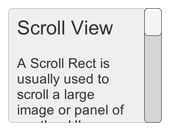
Scroll Rect (Scroll View)
滚动的矩形(滚动视图)
A Scroll Rect can be used when content that takes up a lot of space needs to be displayed in a small area. The Scroll Rect provides functionality to scroll over this content.
Usually a Scroll Rect is combined with a Mask in order to create a scroll view, where only the scrollable content inside the Scroll Rect is visible. It can also additionally be combined with one or two Scrollbars that can be dragged to scroll horizontally or vertically.
Scroll Rect用于内容占用很大地地方但是要现实在一个很小的区域。Scroll Rect提供了滚动内容的功能
一般情况下,Scroll Rect和Mask结合创建一个srcoll view,只有在Srcoll Rect 内的内容是可见的。通过结合1个或2个Scroll Bar它还被拖拽着滚动,它还可以被拖拽着水平或垂直滚动
See the Scroll Rect page for details on using the Scroll Rect component.
在Scroll Rect页面查看使用Scroll Rect组件的详细方法