一、transform
1.1 2D转换
通过 CSS3 转换,能够对元素进行移动、缩放、转动、拉长或拉伸。
1.旋转,deg表示角度。负的为逆时针转动,默认沿着中心点旋转。可以利用 transform-origin 设置旋转原点。
transform: rotate(30deg);

2.用来设置变形原点,变形时以这个点为基准点,默认为50% 50%。
transform-origin: 100% 0;
3.平移变形,两个参数分别为横向偏移量和纵向偏移量。偏移量也可以是百分比,表示偏移相对自身尺寸的百分比。
transform:translate(50%,50%);
通过这个属性可以使元素水平和垂直居中:
position: absolute;
left: 50%;
top: 50%;
transform: translate(-50%,-50%);
4.缩放变形,两个参数分别表示横向缩放量和纵向缩放量,小于1表示缩小,大于1表示放大,总之缩放之后为原尺寸的多少倍 ,变形会使元素中的内容也变形。
transform: scale(1.3,1.3);
1.2 3D转换
沿X轴旋转 :
transform: rotateX(-180deg);
类似的,还有 rotateY( ); rotateZ( );
总之,以上2D转换的效果都有相应的3D转换,比如3D旋转,平移,缩放。
设置视野距离:
perspective: 200px;
二、css3过渡:transition
transition 用来设置元素过渡。
1.至少要设置两项:过渡的样式和过渡时间。还可以设置过渡的速率,速率默认为ease-in-out(开始和结束块,中间慢)。linear指匀速。
2.如果多个样式需要同时过渡,则过渡的名称写为all,基本上和外观相关的样式都可以过渡。(但不是所有,例如display,tex-talign等就不能)。
常用的是 transition:transform 1s。
3.要过渡的属性必须有初始值,才能过渡。
border: solid 0 red;
4.过渡只能实现简单的动画,从一个状态到另一个状态,不能设置中间状态。
上面的动画CSS部分代码:
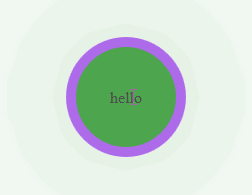
#box{
    width: 100px;
    height: 100px;
    background-color: pink;
    margin: 40px auto;
    border: solid 0 red;
    text-align: center;
    line-height: 100px;
    box-shadow: 4px 4px 4px gray;
    transition: all 2s;
}
#box:hover{
    transform: rotate(360deg);
    background-color: green;
    border:solid 10px blueviolet;
    opacity: 0.7;
    border-radius: 50%;
    box-shadow: 0 0 200px green;
}
三、关键帧动画:animation与keyframes
查看动画效果的网站animation.css。
animation设置元素的动画样式。要显示动画,至少要设置动画名字和动画时间
animation-name: move;
/* 动画单次执行时间 */
animation-duration: 2s;
/* 动画结束时,让元素保持动画开始/结束时的样式 */
animation-fill-mode: both;
/* 动画速率,每两个关键帧之间动画的速率 */
animation-timing-function:linear;
/* 延迟时间 ,可以设置为负值,表示提前开始(如果设置了-0.7s,则动画从0.7处开始执行*/
animation-delay:10s;
/* 设置动画重复次数,infinite表示无穷次 */
animation-iteration-count:infinite;
/* 设置动画执行方向,reverse表示反向 */
animation-direction: reverse;
/*设置动画状态,running为执行状态,pause为暂停状态 */
animation-play-state: paused;
/* 回到原始位置 */
animation: none;
关键帧@keyframes
创建一个关键帧动画,空格后面是是动画名字,{}中设定每一个关键帧的样式状态。
@keyframes move{
    0% {left:0;top: 0;}
    25% {left: 50px;top: 0;}
    50% {left: 50px;top: 50px;}
    75% {left: 100px;top: 50px;}
    100% {left: 100px;top: 100px;}
}

css过渡和动画的区别和联系:
它们都能实现动画。过渡只能在元素样式发生改变时为这个改变添加动画,不能设置多个关键帧。
而关键帧动画是一种动画方式,能详细设置每个关键帧状态,一个动画设计完成时,可以添加到多个元素上。
关键帧比过渡强大。过渡能做的关键帧都能做。而过渡写起来相对比较简单。


附华为官网的动画效果,纯css制作:

贴上代码:
       *{
            margin: 0;
            padding: 0;
        }
        .wrap{
            width: 412px;
            height: 455px;
            overflow: hidden;
            position: relative;
        }
        .wrap:hover img{
            transform: translatex(-30px);
        }
        .wrap:hover .title{
            transform: translateY(-30px);
        }
        .wrap:hover .des{
            transform: translateY(-20px);
            opacity: 1;
        }
        .wrap:hover .mask{
            background-color: rgba(0, 0,0, 0.5);
            transition: all 0.7s;
        }
        .bg{
            width: 110%;
            max-width: 110%;
            transition: transform 0.7s ease-in-out;
        }
        /* 灰色蒙版 */
        .mask{
            position: absolute;
            left: 0;
            top: 0;
            width: 100%;
            height: 100%;
            background-color: rgba(0, 0,0, 0);
        }
        .intro{
            width:60%;
            position: absolute;
            color: white;
            left: 0;
            bottom: 0;
            margin-bottom: 60px;
            padding: 0 0 0 40px;
        }
        .intro .title{
            font-size: 30px;
            font-weight: 400;
            margin-bottom: 10px;
            transition: transform 0.7s;
        }
        .intro .des{
            font-size: 16px;
            opacity: 0;
            transform: translateY(100px);
            transition: all 0.7s;
        }
html:
<div class="wrap">
    <img class="bg" src="images/bg.jpg" alt="">
    <div class="mask"></div>
    <div class="intro">
        <h3 class="title">迎接未来世界的正确姿势</h3>
        <p class="des">人工智能应用于医疗、金融、制造、能源、教育等垂直行业,必将与重大的社会经济变革、教育变革、思想变革、文化变革等同步,成为下一次工业革命的核心驱动力。</p>
    </div>
</div>