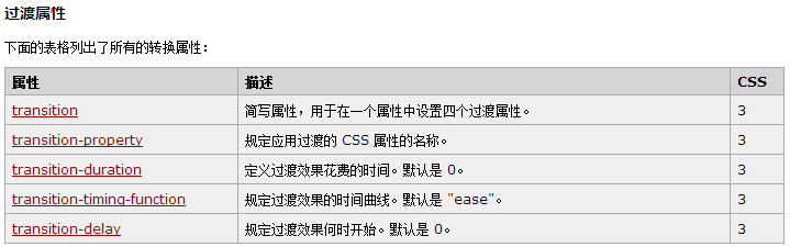
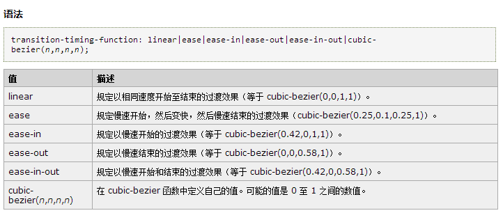
 1 <!DOCTYPE html>
 2 <html>
 3 <head>
 4 <style>
 5 div
 6 {
 7 width:100px;
 8 height:100px;
 9 background:yellow;
10 transition:width 2s, height 2s;
11 -moz-transition:width 2s, height 2s, -moz-transform 2s; /* Firefox 4 */
12 -webkit-transition:width 2s, height 2s, -webkit-transform 2s; /* Safari and Chrome */
13 -o-transition:width 2s, height 2s, -o-transform 2s; /* Opera */
14 }
15
16 div:hover
17 {
18 width:200px;
19 height:200px;
20 transform:rotate(180deg);
21 -moz-transform:rotate(180deg); /* Firefox 4 */
22 -webkit-transform:rotate(180deg); /* Safari and Chrome */
23 -o-transform:rotate(180deg); /* Opera */
24 }
25 </style>
26 </head>
27 <body>
28
29 <div>请把鼠标指针放到黄色的 div 元素上,来查看过渡效果。</div>
30
31 <p><b>注释:</b>本例在 Internet Explorer 中无效。</p>
32
33 </body>
34 </html>