学习JavaScirpt30的笔记!
有意思!
2-------> CSS clock
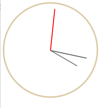
效果是这样的.... 这是改良过后的 版本....
话不多说,直接来看代码。
首先是html部分
<div class="clock">
        <div class="clock-face">
            <div class="hand hour-hand"></div>
            <div class="hand min-hand"></div>
            <div class="hand second-hand"></div>
        </div>
    </div>
最外层的 clock 来作为底部的圆环。
变化都是在 clock-face 里面的。
之后就是三个 div指针啦。
下面是CSS 部分
  .clock{

        width: 300px;
        height: 300px;
        border-radius: 50%;
        border:5px solid #dca;

    }

    .clock-face{
        width: 90%;
        margin: 0 auto;
        height: 300px;
        position: relative;
    }

    .hand{
        width: 50%;
        height: 3px;

        position: absolute;
        top: 50%;
        transform: rotate(-90deg);
        transform-origin: 0%;
        left: 50%;


        transition-timing-function: cubic-bezier(0, 1.74, 0.77, 0.87);

    }

    .second-hand{

        transition-duration: .05s;
        background-color:red;
    }

    .min-hand{
        width: 120px;
        transition-duration: .05s;
        background-color:#666;
    }

    .hour-hand{
        width: 100px;
        transition-duration: .05s;
        background-color:gray;
    }
最需要关注的地方就是这里
   .hand{
        width: 50%;
        height: 3px;

        position: absolute;
        top: 50%;
        transform: rotate(-90deg);
        transform-origin: 0%;
        left: 50%;


        transition-timing-function: cubic-bezier(0, 1.74, 0.77, 0.87);

    }
transform-origin: 0%;
transform-Origin属性允许您更改转换元素的位置。
2D转换元素可以改变元素的X和Y轴。 3D转换元素,还可以更改元素的Z轴。
transform-origin: 0%;设置为0 其实就是以hand的开始部分为圆点来旋转指针。
如果我们将transform-origin 设置为50%,看看是什么样子的效果。
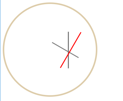
..整指针都是以width = 50% 的地方开始旋转的。
视频里面的 transform-origin 是100%。 因为他没有设置每个指针的长度,默认都是一样长的。所以设置为100%的话是没有什么影响的。
但是如果想要设长度,考虑到div 的 position: absolute; 的时候。 他是自动向左靠拢的。如果我们以100%的origin来设置他的话,就会出现这样的情况。
指针们并没有共用圆心。所以给origin 设置为0%,(同时要调整圆心的位置 left:50%)。
接下来看js
          const secondHand = document.querySelector('.second-hand');
          const minHand = document.querySelector('.min-hand');
          const hourHand = document.querySelector('.hour-hand');


          function setDate(){
                const now= new Date();
                const seconds = now.getSeconds();
                const secondsDegrees = ((seconds/60)*360-90);

                const mins = now.getMinutes();
                const minsDegrees=((mins/60)*360-90);

                const hours = now.getHours();
                const hoursDegrees=((hours/12)*360-90);

               if(seconds==0){
                   secondHand.style.transitionDuration='0s';

               }
               else{
                   secondHand.style.transitionDuration='.1s';

               }


               if(mins==0){
                   minHand.style.transitionDuration='0s';
               }else{
                   minHand.style.transitionDuration='.05s';
               }

               if(hours==0){
                   hourHand.transitionDuration='0s';
               }else{
                   hourHand.transitionDuration='.05s';
               }


               secondHand.style.transform = `rotate(${secondsDegrees}deg)`;

               minHand.style.transform = `rotate(${minsDegrees}deg)`;

               hourHand.style.transform = `rotate(${hoursDegrees}deg)`;


                console.log(seconds);

          }

          setInterval(setDate,1000);
核心部分是这里
 const now= new Date();
 const seconds = now.getSeconds();
 const secondsDegrees = ((seconds/60)*360-90);

利用了js里的date 直接获取了当前的秒数(简单粗暴..)
然后计算出每次 指针的偏移量  (秒数/60s)*360°-90°;
为什么要-90°?? 因为如果不-90°,那么这个指针的起始位置就不是12点 ,而是3点!

视频里面是+90°, 因为他使用的origin 是100%,而我使用的是 0%,两个的圆点不一样,旋转的方向是一样的。相当于我是从3点的位置开始 ,而视频里面是从9点的位置开始,
而我们都想要他从12点的位置开始,所以才需要+-90°。

然后用定时器每秒调用 setDate(),大家可能看到了有这样的三个判断。
          if(seconds==0){
                   secondHand.style.transitionDuration='0s';

               }
               else{
                   secondHand.style.transitionDuration='.1s';

               }


               if(mins==0){
                   minHand.style.transitionDuration='0s';
               }else{
                   minHand.style.transitionDuration='.05s';
               }

               if(hours==0){
                   hourHand.transitionDuration='0s';
               }else{
                   hourHand.transitionDuration='.05s';
               }
这其实是对视频里面代码的改进...因为 每次从59s-->60s 的这个时候,其实second 的值是 59-->0.而这个时候如果 继续让 transition-Duration 有值的话。
就会出现指针快速的绕了一圈的效果,影响视觉体验,所以在0s的时候把 transition-Duration 设置为0 ,可以跳过这个旋转的动画,直接过渡,之后再将其
设置回来,就可以了。
但是我觉得....这样的判断和操作会不会对浏览器的性能是一种消耗,因为其实只需要在0s的时候设置1次,1s的时候再设置回来。之后的58s内都不需要对其进行
操作...
如果有大佬有更好的写法,希望告知,谢谢~!!