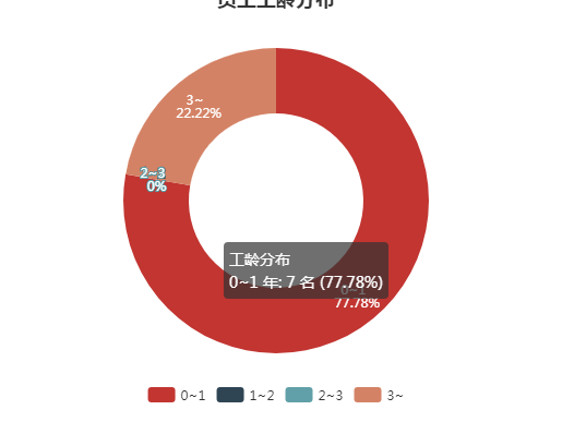
效果图:
设置数据:
 option4: {
          title: {
            text: '员工工龄分布',
            subtext: '',
            left: 'center'
          },
          tooltip: {
            trigger: 'item',
            // 暂时先处理成这个样子,
            formatter: '{a} <br/>{b} 年: {c} 名 ({d}%)'
        // {a} =>series[0].name
       // {b} =>series[0].data[0].name
       // {c} =>series[0].data[0].value
       // {d}% =>所占的比例

          },
          legend: {
            bottom: 10,
            left: 'center',
            // data: ['1年以下', '1~2年', '2~3年', '3年以上']
            data: []
          },
          series: [{
            name: '工龄分布',
            type: 'pie',
            radius: ['40%', '70%'],
            avoidLabelOverlap: false,
            label: {
              normal: {
                show: true,
                position: 'inner',
                formatter: '{b}
 {d}%'
              },
              emphasis: {
                show: true,
                textStyle: {
                  fontSize: '14'
                }
              }
            },
            labelLine: {
              normal: {
                show: false
              }
            },
            data: [{name: 0-1, value: 7}]
          }]
        }