数据来源于:https://data.cityofnewyork.us/Education/2005-2010-Graduation-Outcomes-By-Borough/avir-tzek
数据理解
原数据其实是有点乱的,第一列Demographic可以说是一些标签吧,有English Language Learners和English Proficient Students,有Special Education和General Education,有Asian、Black、Hispanic、white,有Female和Male,有Borough Total(这个便是总的了,只可惜我当初没发现,而是把男女加在一起来算总的的,哎哎哎走了弯路)
第二列便是所谓的Borough,一共有5个镇Bronx、Brooklyn、Manhattan、Queens、Staten Island
第三列Cohort,年份;第三列Total Cohort,本年到毕业年所有的人数
第四列Total Grads - n,本年毕业的人数。
其他的列基本上就是毕业生中再区分类别的人数及比例了。本文没用到,便不再描述了。
数据预处理
library(dplyr)
library(ggplot2)

dat=read.csv("Graduation.csv",header=T)
dat$Cohort=as.factor(dat$Cohort)#将年份转换成因子类型
dat=dat[,c(1,2,3,4,5)] #以下只取前5列进行分析
dat_df=tbl_df(dat)
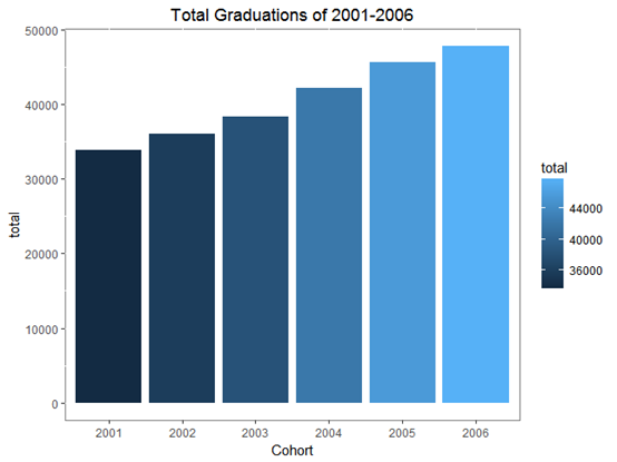
每年的毕业生总人数
borough_total=dat[dat$Demographic=="Borough Total",] #筛选出统计总数的行
borough_total_df=tbl_df(borough_total)
by_Cohort=group_by(borough_total_df,Cohort)
total=summarise(by_Cohort,total=sum(Total.Grads...n))

ggplot(total,aes(x=Cohort,y=total))
  +geom_col(aes(fill=total))
  +theme(plot.title = element_text(hjust = 0.5),panel.background = element_rect(fill = "white", colour = "grey50"))
  +labs(title = "Total Graduations of 2001-2006")

毕业生男女分布
female=dat[dat$Demographic=="Female",]
male=dat[dat$Demographic=="Male",]

female_df=tbl_df(female)
by_Cohort_fe=group_by(female_df,Cohort)
female_tol=summarise(by_Cohort_fe,total=sum(Total.Grads...n))
female_tol$sex="female"
male_df=tbl_df(male)
by_Cohort_male=group_by(male_df,Cohort)
male_tol=summarise(by_Cohort_male,total=sum(Total.Grads...n))
male_tol$sex="male"

s1=rbind(female_tol,male_tol) #其实这里也可以先把female和male合并,然后做groupby
names(s1)=c("Cohort","num","sex")

ggplot(s1,aes(x=Cohort,y=num,fill = factor(sex)))+geom_col(position = "dodge")+theme(legend.title=element_blank(),plot.title = element_text(hjust = 0.5),panel.background = element_rect(fill = "white", colour = "grey50"))+labs(title = "female & male graduations of 2001-2006")

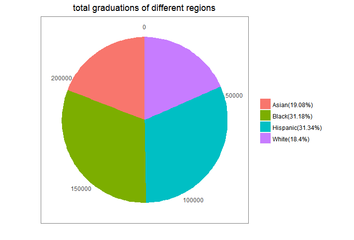
不同ethnic groups所占比例
这里计算的是Asian、Black、Hispanic、White这四种在2001-2006毕业的总人数占6年总毕业生人数的比例。
by_Demographic=group_by(dat_df,Demographic)
Demographic=summarise(by_Demographic,num=sum(Total.Grads...n))
bing=Demographic[c(1,2,8,11),]
bing$rat=paste(bing$Demographic,"(",round(bing$num/sum(bing$num)*100,2),"%)",sep="")

ggplot(bing,aes(x="",y=num,fill=Demographic))+geom_bar(stat="identity",width=1)+coord_polar(theta = "y")+labs(x="",y="",title="total graduations of different regions")+theme(axis.ticks = element_blank(),plot.title = element_text(hjust = 0.5),panel.background = element_rect(fill = "white", colour = "grey50"),legend.title = element_blank())+scale_fill_discrete(breaks=bing$Demographic,labels=bing$rat)

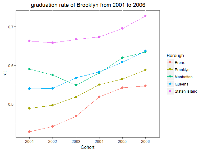
不同城镇的毕业人数及毕业率
毕业人数
by_year_Borough=group_by(borough_total_df,Cohort,Borough)
year_Borough_num=summarise(by_year_Borough,gra=sum(Total.Grads...n),all=sum(Total.Cohort))
year_Borough_num$rat=year_Borough_num$gra/year_Borough_num$all

ggplot(year_Borough_num,aes(x=Cohort,y=gra,fill=factor(Borough)))+geom_col(position = "dodge")+theme(legend.title=element_blank(),plot.title = element_text(hjust = 0.5),panel.background = element_rect(fill = "white", colour = "grey50"))+labs(title = " graduations of different boroughs of 2001-2006")

毕业率
ggplot(year_Borough_num,aes(x=Cohort,y=rat,group=Borough,color=Borough))+geom_line()+geom_point(size=4, shape=20)+theme(plot.title = element_text(hjust = 0.5),panel.background = element_rect(fill = "white", colour = "grey50"))+labs(title = " graduation rate of Brooklyn from 2001 to 2006")
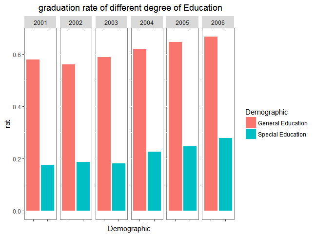
不同Education
by_Demographic_Cohort=group_by(dat_df,Demographic,Cohort)
Demographic_Cohort=summarise(by_Demographic_Cohort,num=sum(Total.Grads...n),all=sum(Total.Cohort))
Demographic_Cohort$rat=Demographic_Cohort$num/Demographic_Cohort$all

#不同教育 Special Education"  General Education
Demographic_Cohort_education=Demographic_Cohort[Demographic_Cohort$Demographic=="Special Education"|Demographic_Cohort$Demographic=="General Education",]
ggplot(Demographic_Cohort_education,aes(x=Demographic,y=rat))+geom_col(aes(fill=Demographic))+facet_grid(. ~ Cohort)+theme(plot.title = element_text(hjust = 0.5),panel.background = element_rect(fill = "white", colour = "grey50"),axis.text.x = element_blank())+labs(title = " graduation rate of different degree of Education"
不同English
#不同英文程度English Proficient Students  English Language Learners
Demographic_Cohort_english=Demographic_Cohort[Demographic_Cohort$Demographic=="English Proficient Students"|Demographic_Cohort$Demographic=="English Language Learners",]
ggplot(Demographic_Cohort_english,aes(x=Demographic,y=rat))+geom_col(aes(fill=Cohort))+theme(plot.title = element_text(hjust = 0.5),panel.background = element_rect(fill = "white", colour = "grey50"))+labs(title = " graduation rate of different degree of English")
