border-image简介
border-image是CSS3中的新特性。目前几乎所有的主流浏览器都已经支持该特性,详情请移步border-image的兼容性。border-image属性及使用说明
border-image的属性有6个,分别为border-image-source, border-image-slice, border-image-width, border-image-outset 和border-image-repeat。通常是使用简写,比如:border-image:url(picture.jpg) 10 10 stretch表示使用picture这张图片,这里的10是指图像的偏移量,stretch表示拉伸图像。
图片地址:border-image-source
- 属性名称:border-image-source
- 值:none | <image>
-
初始值:none
初始值为none,如果设置了初始值为none,那么盒子边框的值就会应用到border-style的值。下面是设置引入外部地址图片的代码:
.border-image{
  border:2px solid #ddd;
  border-image-source:url(picture.png);//调用picture图片
}
图片剪切:border-image-slice
- 属性名称:border-image-slice
- 值:[<number>|<percentage>]{1,4} && fill ?
-
初始值:none
第一值<number>是一个纯数字,如1,2,3….。第二值<percentage>是一个百分数,百分比作为单位。需要注意<number>是没有单位的,因为默认单位就是像素(px)了。{1,4}代表前面的数字至少出现一次,最多出现4次,如果不指定值,也不会报错,只不过这样的剪切就没有意义了。fill为可选属性值,假如指定,那么中间第九块不是透明块,假如不指定,那么为透明图片处理。
border-image-slice用于制定图形的上部、右部、下部、左部的偏移量,它是按照九宫格的格式来把图像分为9个区域:四个角、四个边区和一个中间区域。其规则符合CSS普遍的方位规则(与margin,padding等或border-width方位规则一致),即上、右、下、左顺时针,再附上剪切的含义。
九宫格的示意图:
比如:
border-image-slice:30% 35% 40% 30%;示意可以用下图表示:
比如:
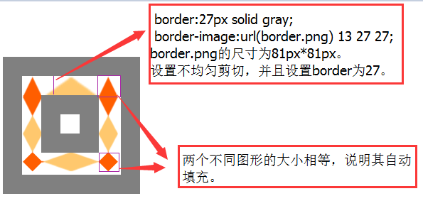
border-image-slice:27 27 27 27;示意可以用下图表示:
结论:将图形划分为九个局域后,1、2、3和4局域的图形会根据盒子大小自动调整水平和垂直方向上的长度,5、6、7和8区域的图形调整由border-image-repeat的值决定,9局域会双向拉伸(同时也受fill的影响)。
验证结论的代码:


<!DOCTYPE html>
<html>
<head>
<style>
    #sn{
      width:139px;
      height:139px;
      border:27px solid gray;
    }
    #sn1{
    width:81px;
    height:81px;
    border:27px solid gray;
    -moz-border-image: url(border.png) 13 27 27; /* Old Firefox */
    -webkit-border-image: url(border.png) 13 27 27; /* Safari */
    -o-border-image: url(border.png) 13 27 27; /* Opera */
    border-image:url(border.png) 13 27 27;
    }
    #sn2{
      width:27px;
      height:27px;
      border:27px solid gray;
      }
</style>
</head>
<body>
<div id="sn"><div id="sn1"><div id="sn2"></div></div></div>
</body>
</html>
”-o-border-image、-moz-border-image和-webkit-border-image”是让不支持该属性的浏览器兼容,读者可以根据自己的需要自行设置。
代码运行结果:
边宽图像宽度:border-image-width
- 属性名称: border-image-width
- 属性值:[<number>|<percentage>|<length>][1,4]
-
初始值:1
border-image-width的作用就是代替盒子本身的边框宽度border-width。假如指定,那么边框图片宽度就由border-image-width来确定,假如不指定,那么图片边框宽度就由border-width来确定。border-image-width可以用具体像素、数字(表示几倍)和百分比来表示,最少1个值,最多4个值,分别代表上右下左图片边框宽度。
.border-image{
  border:27px solid gray;
  border-image-source:url(border.png);
  border-image-slice:27;
  border-image-width:27px 1 10% 10px;//边框图片宽度设置为top:27px,right:1倍,bottom:10%,left:27px,因此这些值将代替20px成为图片边框宽度。
}
边框图片外凸border-image-outset
- 属性名称:border-image-outset
- 值: [ <length> | <number> ]{1,4}
-
初始值:0
border-image-outset的作用就让边框背景延伸到盒子外。有两个属性值length和number,前者是具体的像素单位,后者是数字,最少1个值,最多4个,分别代表上右下左图片边框向外延伸的距离。
.border-image{
            border:27px solid #000;  //盒子边框宽度为27px
            border-image-source:url(border.png);
            border-image-outset:27px 27px 27px 27px; //边框图片向设置为27px,那么背景图将会从盒子最外边界向外上右下左各延伸27px。
}
效果图:

边框图片重复border-image-repeat
- 属性名称:border-image-repeat
- 值:[<stretch>|<round>|<repeat>][1,2]
-
初始值:stretch
border-image-repeat可以设置边框图片的重复类型,其默认值为stretch,是拉伸的意思,4个角4个区域分别做水平和垂直方向的拉伸,来填补边框的间隙;repeat是就是让4个角4个区域做完水平和垂直方向的复制图像,把边框之间的空隙填满;而round[环绕]是把4个角和4个区域分成均等区域,然后用背景图片切好能铺满整个边框空隙,不能多也不能少,正好合适。
.border-image-stretch{
    border:27px solid #000;
    border-image-source:url(picture.png);
    border-image-slice:27 27 27 27;
    border-image-repeat:stretch;
}/*拉伸*/
.border-image-round{
    border:27px solid #000;
    border-image-source:url(picture.png);
    border-image-slice:27 27 27 27;
    border-image-repeat:round;
}/*环绕*/
.border-image-repeat{
    border:27px solid #000;
    border-image-source:url(picture.png);
    border-image-slice:27 27 27 27;
    border-image-repeat:repeat;
}/*重复*/
效果图:

border-image的一些实例
圆角效果
效果展示: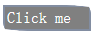
使用图片:
使用代码:
      #exp{
        width:80px;
        border:2px solid transparent;
        border-image:url(rounded_corner.png);
        border-image-slice:5;
        border-image-outset:2px;
        background:gray;
        color:white;
      }
多边框效果
效果展示: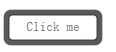
使用图片:
使用代码:
      #nexp{
        width:100px;
        border:10px solid gray;
        border-image:url(border_round.png);
        border-image-slice:20;
        background:white;
        color:gray;
      }
选项卡效果
效果展示: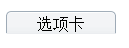
使用图片:
使用代码:
     #nche{
        width:100px;
        border-style:solid;
        border-width:5px 5px 0px;
        boder-color:gray;
        border-image:url(border_tab.png) 5 5 0 fill;
        text-align:center;
      }
投影效果
效果展示:
使用图片:

使用代码:

<!DOCTYPE html>
<html>
<head>
<style>
   #pche{
      border-style:solid;
      border-width:2px 5px 6px 2px;
      border-image:url(border_shade.png) 2 5 6 2;
      border-color:orange;
    }
</style>
</head>
<body>
    <img src="mm1.jpg" id="pche">
</body>
</html>